↗ arXiv ↗ Hugging Face ↗ Papers with Code
TL;DR#
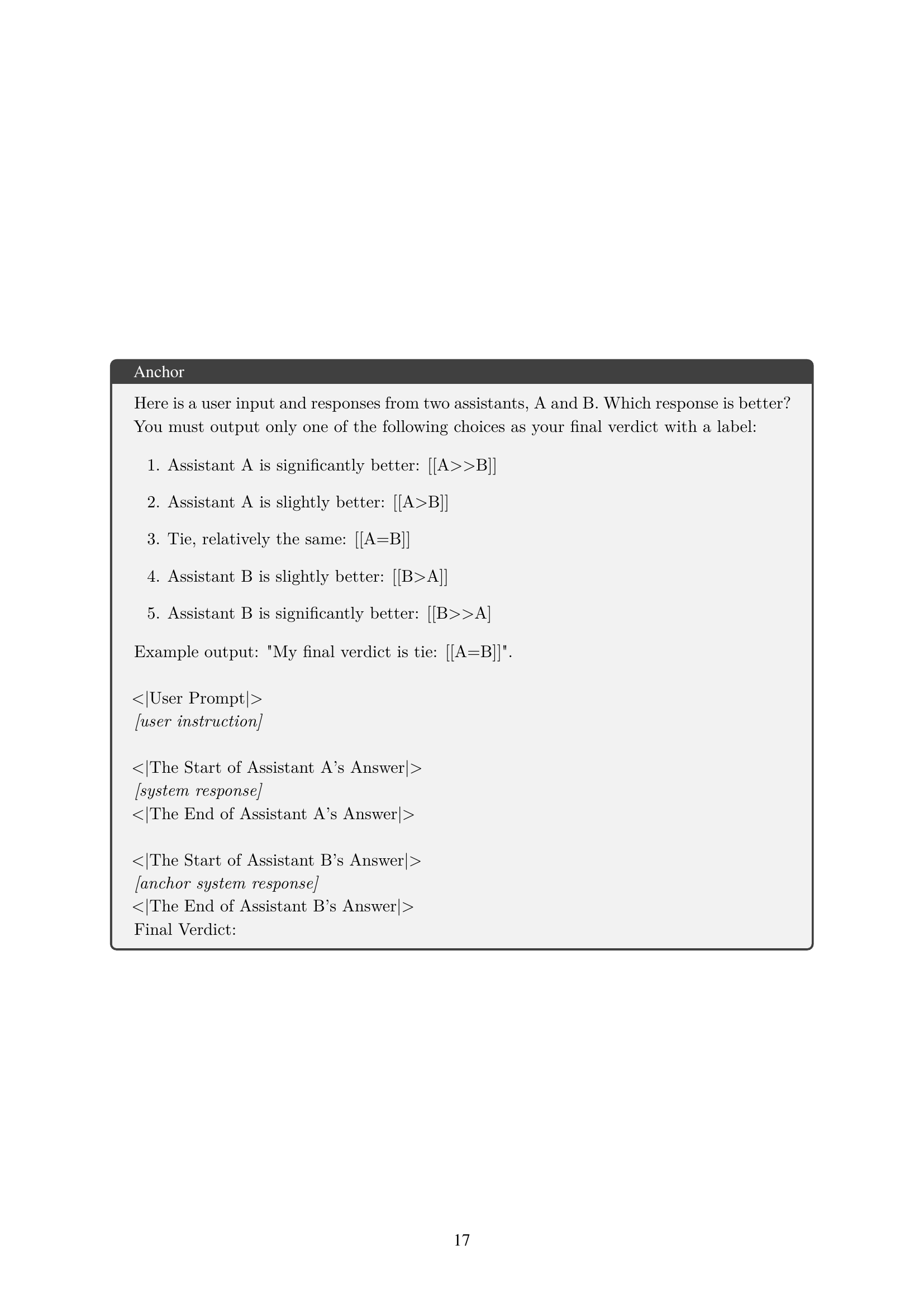
Current LLM evaluation often focuses on individual response quality, ignoring crucial system-level ranking aspects. This leads to inaccurate model comparisons and suboptimal decisions. This paper tackles this issue.
The researchers propose JuStRank, a novel benchmark that evaluates LLMs’ ability to rank systems by comparing their rankings to human-based rankings. JuStRank analyzes judges’ behavior, revealing critical aspects like decisiveness and bias. The findings demonstrate that instance-level performance isn’t sufficient for accurate system-level rankings, providing crucial insights for LLM-based evaluations and highlighting the need for system-level benchmarks.
Key Takeaways#
Why does it matter?#
This paper is crucial for researchers working with LLMs because it introduces the first large-scale benchmark, JuStRank, for evaluating LLMs’ ability to rank systems effectively. This addresses a critical gap in current LLM evaluation methods, which often focus solely on individual response quality. JuStRank reveals new judge qualities like decisiveness and bias, impacting model ranking accuracy, informing best practices for LLM-based evaluations.
Visual Insights#

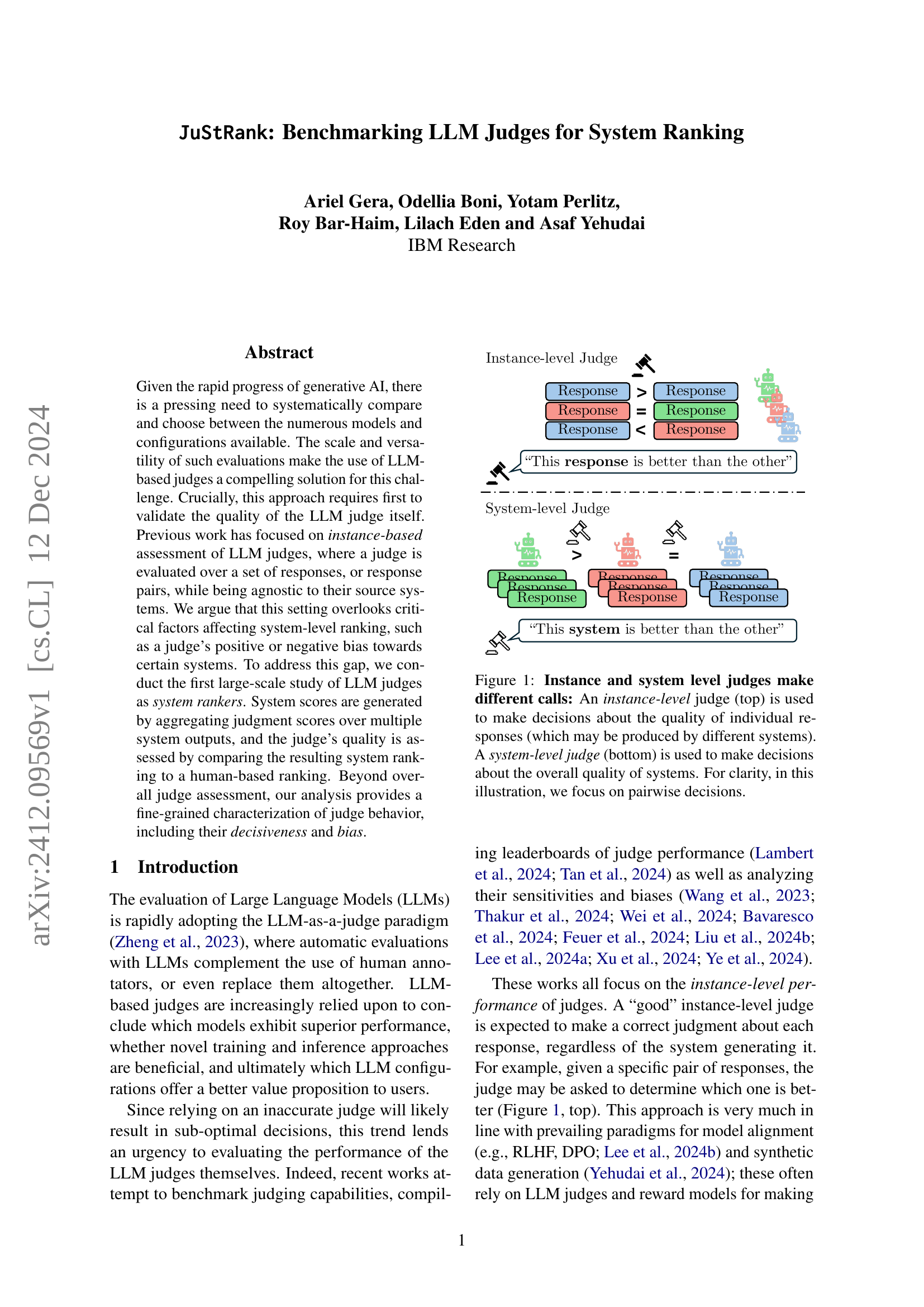
🔼 The figure illustrates the difference between instance-level and system-level judges. An instance-level judge assesses the quality of individual responses without considering the underlying system, while a system-level judge compares the overall quality of different systems based on their respective responses. The figure uses a pairwise comparison example for clarity, showing how different decisions are reached at the two levels.
read the caption
Figure 1: Instance and system level judges make different calls: An instance-level judge (top) is used to make decisions about the quality of individual responses (which may be produced by different systems). A system-level judge (bottom) is used to make decisions about the overall quality of systems. For clarity, in this illustration, we focus on pairwise decisions.
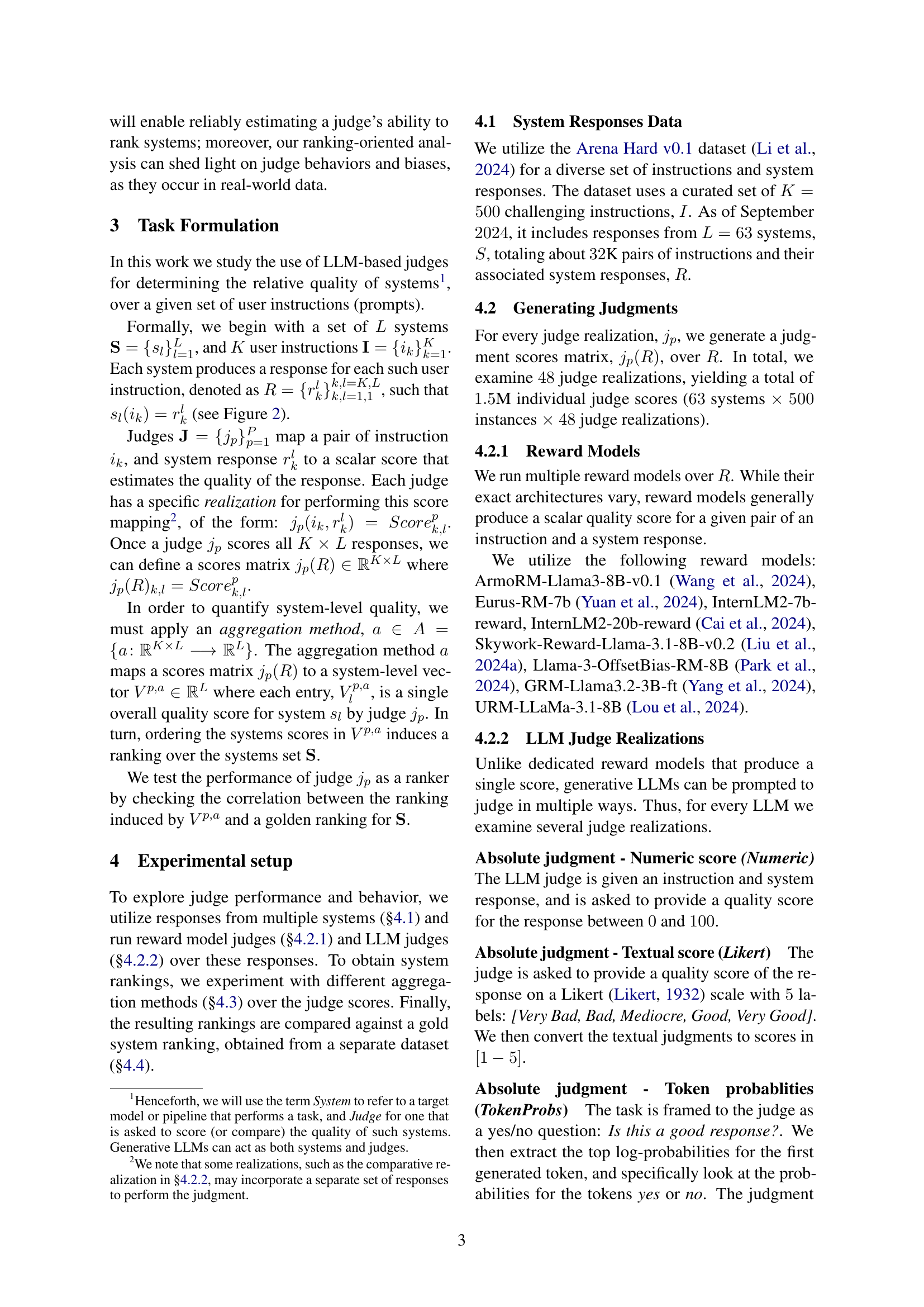
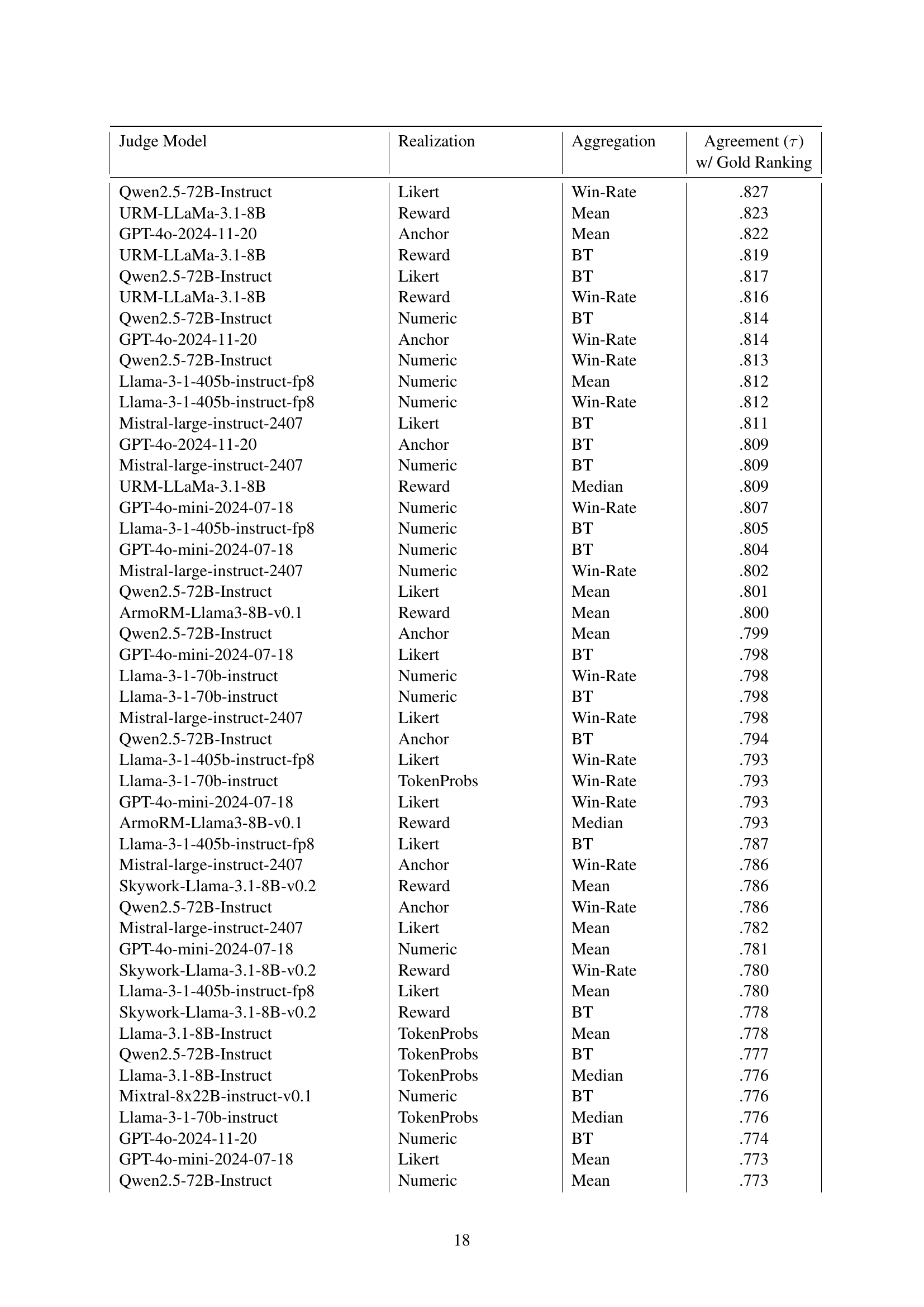
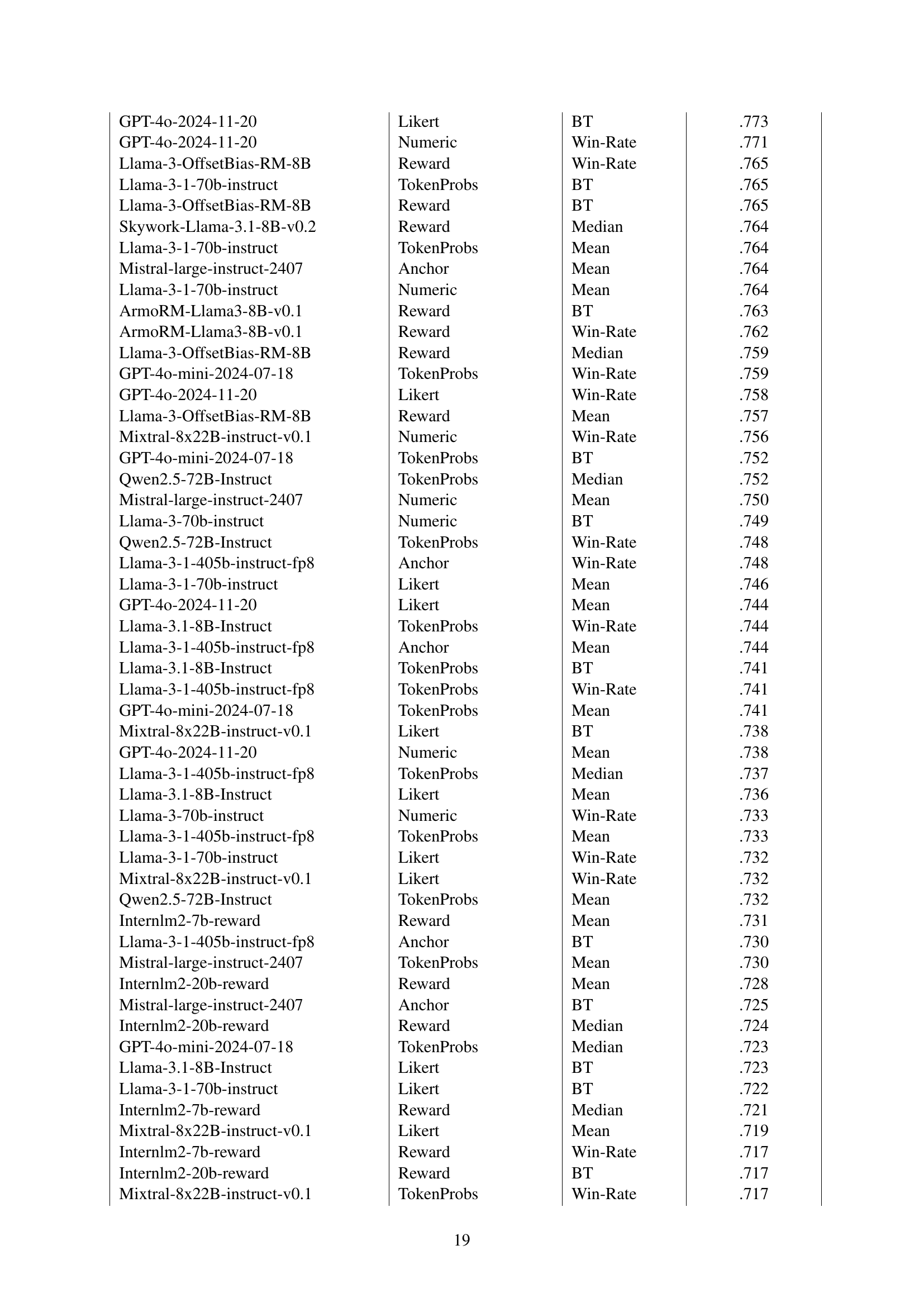
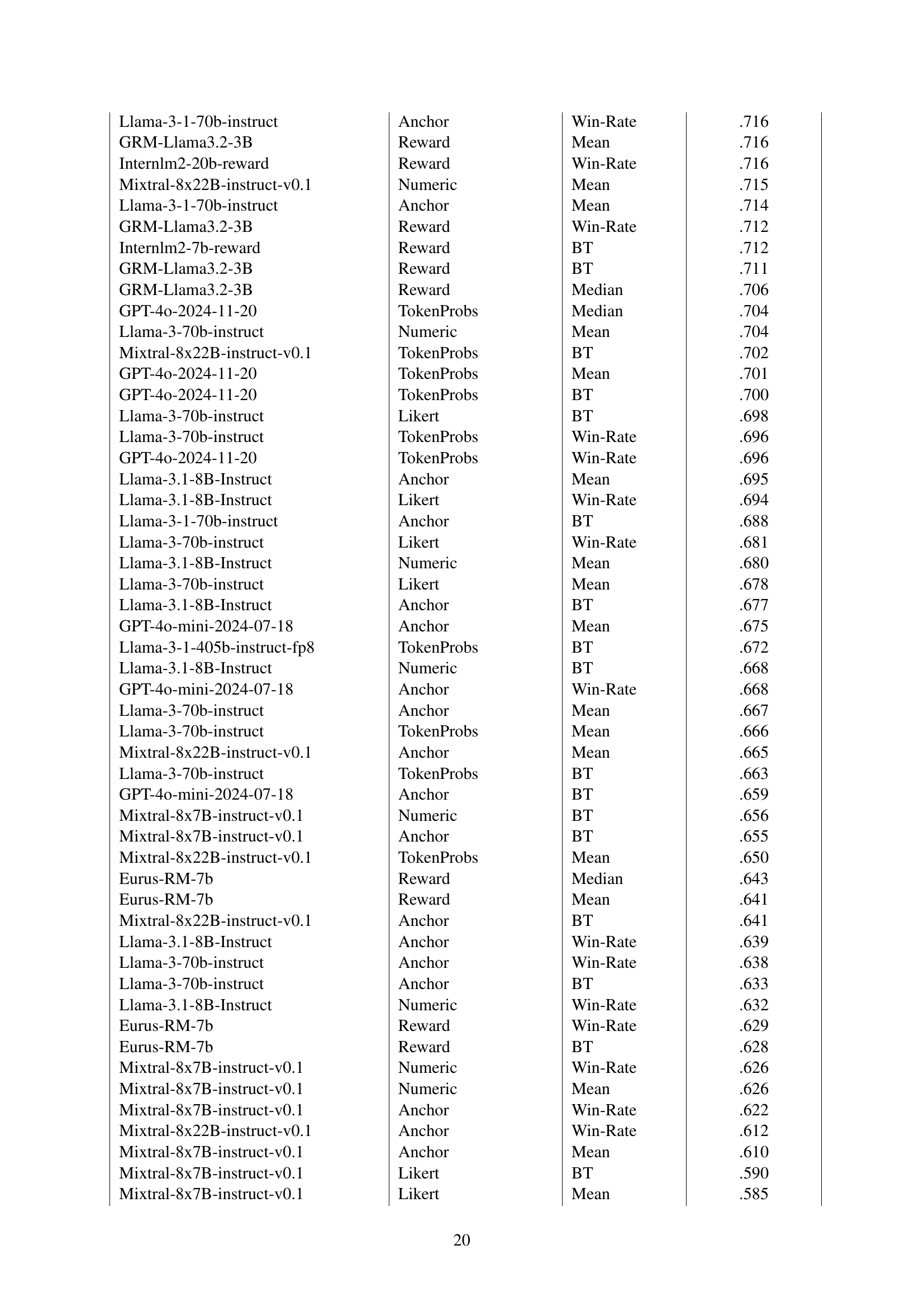
| Judge Model | Realization | Aggregation | Agreement (τ) with Gold Ranking |
|---|---|---|---|
| Qwen2.5-72B-Instruct | Likert | Win-Rate | .83 |
| URM-LLaMa-3.1-8B | Reward | Mean | .82 |
| GPT-4o-2024-11-20 | Anchor | Mean | .82 |
| Llama-3-1-405b-instruct-fp8 | Numeric | Mean | .81 |
| Mistral-large-instruct-2407 | Likert | BT | .81 |
| GPT-4o-mini-2024-07-18 | Numeric | Win-Rate | .81 |
| ArmoRM-Llama3-8B-v0.1 | Reward | Mean | .80 |
| Llama-3-1-70b-instruct | Numeric | Win-Rate | .80 |
| Skywork-Llama-3.1-8B-v0.2 | Reward | Mean | .79 |
| Llama-3.1-8B-Instruct | TokenProbs | Mean | .78 |
🔼 This table presents the top 10 performing Large Language Models (LLMs) and reward models, ranked by their accuracy in generating system rankings that align with human-generated rankings from the Chatbot Arena dataset. The ranking is determined using Kendall’s Tau correlation. For each model, only the single best-performing combination of realization (how the model was used for judgment) and aggregation method (how individual scores were combined to get a system-level score) is shown. The full results, including the performance of all 48 models and all combinations of realizations and aggregation methods, can be found in Appendix Table LABEL:tab:leaderboard_full.
read the caption
Table 1: Top 10 judges by ranking performance. Judges are sorted by the Kendall’s Tau correlation between their overall system ranking and the gold ranking from Chatbot Arena (§4.4). For every judge model, only the best-performing realization and aggregation method is shown. For the full results, refer to Appendix Table LABEL:tab:leaderboard_full.
In-depth insights#
LLM Judge Benchmarks#
LLM Judge Benchmarks are crucial for evaluating the reliability and effectiveness of large language models (LLMs) used for automated evaluation. A robust benchmark should assess judges across multiple dimensions, including instance-level accuracy (judging individual responses), system-level ranking ability (comparing systems based on aggregated responses), and bias detection (identifying preferential treatment of specific systems). Benchmark design should consider the aggregation methods used to combine instance-level scores into system-level rankings. It should also consider factors like response diversity and the potential for overfitting to specific systems. High-quality benchmarks require large-scale datasets with human-evaluated ground truth, allowing for rigorous correlation analysis between human and LLM judgements. The scope of the benchmark should account for the diversity of LLMs, prompts, and tasks involved, ensuring the results generalize to real-world applications. Finally, transparent reporting of benchmark methodology and limitations is essential for ensuring reproducibility and appropriate interpretation of results.
System-Level Ranking#
System-level ranking in AI model evaluation presents a significant advancement over instance-based methods. Instead of assessing individual responses in isolation, it focuses on the overall performance of entire systems, considering multiple outputs and their aggregate quality. This holistic approach is crucial because a system’s effectiveness depends not only on individual response quality but also on its consistency, robustness, and ability to handle diverse inputs. By aggregating scores across multiple system outputs, system-level ranking offers a more reliable and comprehensive evaluation of AI models. This approach better reflects real-world applications where consistent and high-quality performance across various tasks is paramount. However, system-level ranking necessitates careful consideration of potential biases in the evaluation process, including inherent biases in the judging mechanism or the dataset used. Therefore, robust validation of the ranking methodology is critical to ensure reliable and fair comparisons of AI systems.
Judge Behavior Analysis#
A thoughtful analysis of judge behavior in the context of large language model (LLM) evaluation is crucial. It moves beyond simple accuracy metrics to explore underlying trends. Decisiveness, the tendency of judges to strongly favor one response over another, and bias, whether inherent or toward specific systems, significantly influence ranking outcomes. Examining the distribution of judge scores helps reveal these patterns, going beyond simple accuracy rates. Further investigation of correlation between judge characteristics and their ranking performance is also important. By understanding the interplay between these factors, we can build more reliable and robust LLM evaluation frameworks. This necessitates developing improved methods for evaluating judges at a system-level, as opposed to the typical instance-level assessments.
Decisiveness and Bias#
The concepts of “Decisiveness” and “Bias” in the context of LLM-based judges for system ranking are crucial. Decisiveness refers to the extent to which a judge amplifies differences between systems. A highly decisive judge might consistently assign extreme scores (e.g., very high or very low), exaggerating performance gaps. Conversely, a less decisive judge may produce more moderate scores, potentially obscuring real differences. Bias, on the other hand, indicates a judge’s unfair preference for certain systems, leading to skewed rankings. This bias can be positive (favoring specific systems) or negative (disfavoring specific systems). The study’s analysis reveals an interesting interplay between these two traits. High decisiveness can amplify existing bias, creating even more inaccurate rankings. Conversely, a less decisive judge might mitigate bias, producing results closer to a human-based gold standard. Therefore, understanding and mitigating both decisiveness and bias are key to improving the reliability and accuracy of LLM-based system evaluations.
JuStRank Limitations#
The limitations section of JuStRank, a system for benchmarking LLMs used for system ranking, would critically examine several aspects. Firstly, the reliance on a specific subset of Chatbot Arena data for ground truth introduces bias, since the full dataset might offer a different ranking. The dependence on English Hard Prompts also limits generalizability to other languages and tasks. Secondly, the study’s focus on specific prompt phrasings within the LLM judge realizations affects the results. LLM’s responses can be highly sensitive to prompt variations, making it crucial to explore the effects of varying prompts to evaluate the system’s robustness. Thirdly, the subjective nature of human preferences, as used to establish the gold standard system rankings, introduces noise and biases; human judgments are not uniformly consistent across all systems being evaluated. Finally, additional factors like the aggregation method used and inherent limitations in pairwise comparisons could also impact the results. Therefore, a thorough analysis of the method’s limitations, potential biases, and impact on system-level ranking accuracy is crucial for building trust and improving the overall evaluation framework.
More visual insights#
More on figures

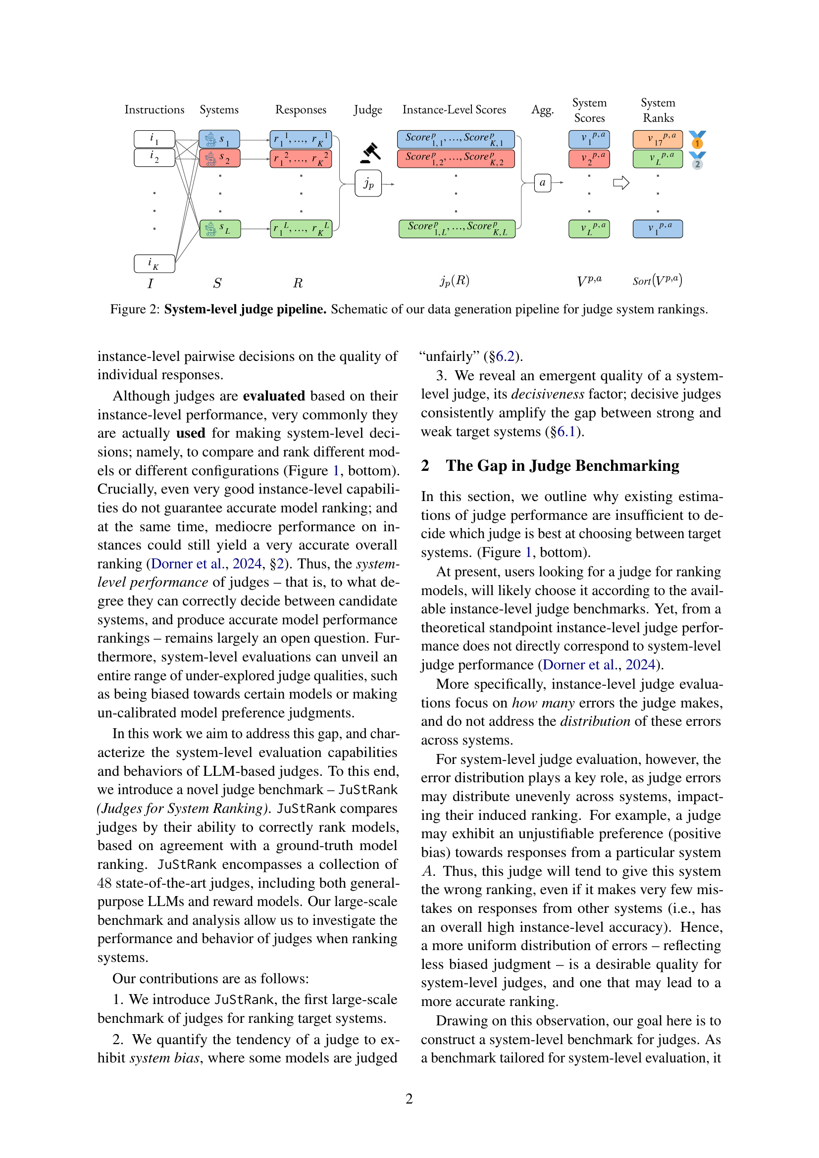
🔼 This figure illustrates the process of generating system rankings using Large Language Models (LLMs) as judges. The pipeline starts with a set of instructions or prompts. These prompts are given to multiple systems, each of which produces a response for each prompt. A judge (LLM) then evaluates the responses, assigning a score to each response based on its quality. These individual scores are aggregated to generate an overall system score. The systems are then ranked based on their aggregated scores, which provides a system-level ranking based on the LLM’s evaluation.
read the caption
Figure 2: System-level judge pipeline. Schematic of our data generation pipeline for judge system rankings.
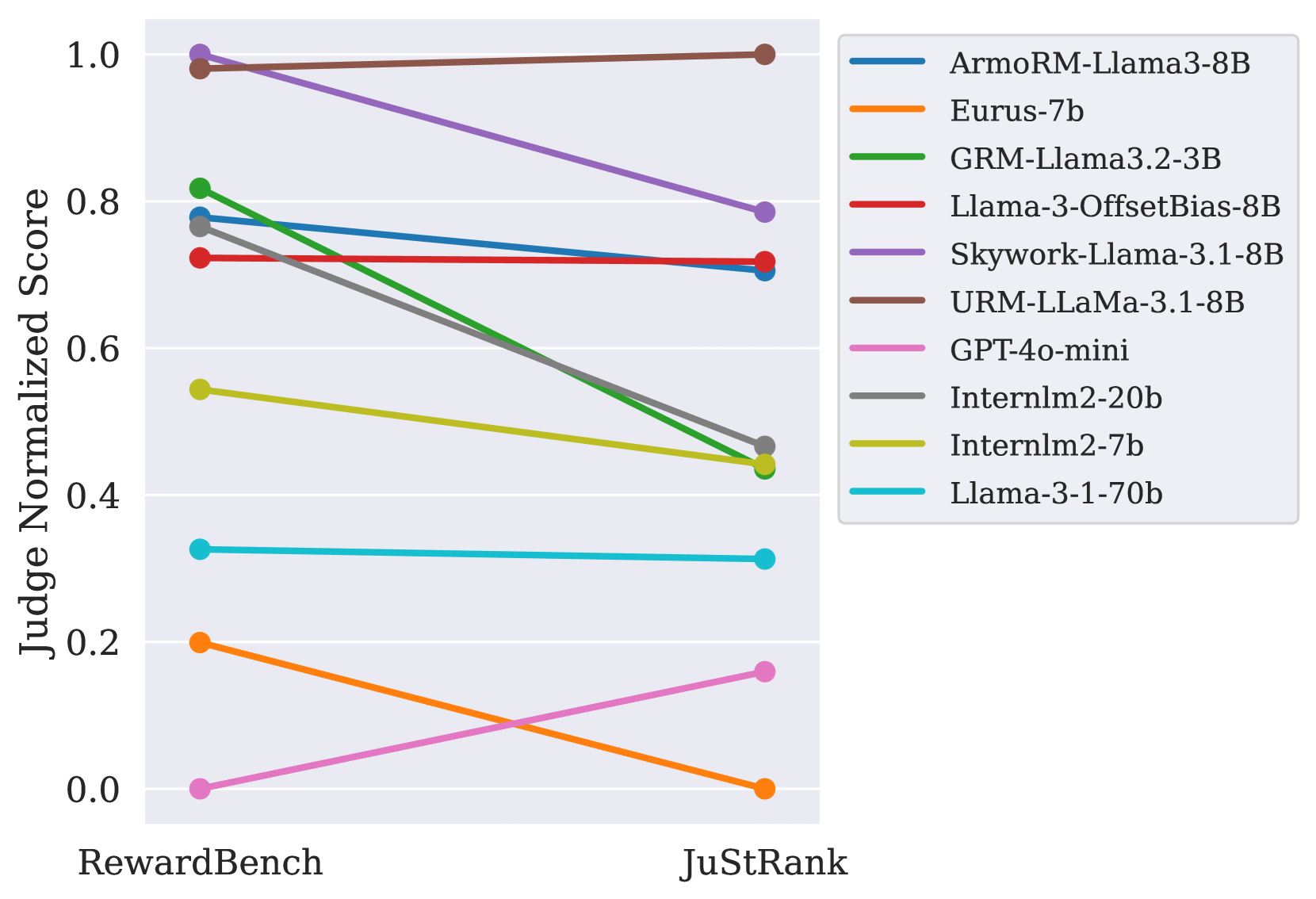
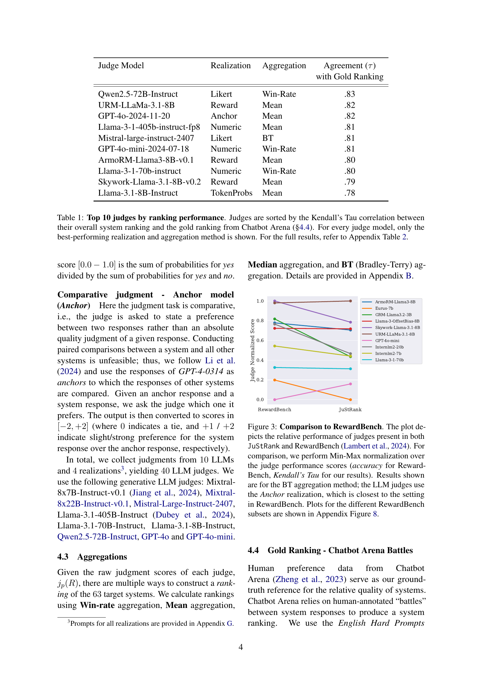
🔼 This figure compares the performance of LLMs as judges for system ranking in JuStRank and RewardBench. It shows that higher instance-level accuracy (as measured in RewardBench) doesn’t always translate to better system-level ranking in JuStRank. The plot uses Kendall’s Tau correlation for JuStRank and accuracy for RewardBench, with Min-Max normalization applied for easy comparison. Results focus on the Bradley-Terry (BT) aggregation method and the ‘Anchor’ realization for LLMs in JuStRank, as this aligns most closely with the RewardBench setup. Additional comparisons using other RewardBench subsets can be found in Appendix Figure 8.
read the caption
Figure 3: Comparison to RewardBench. The plot depicts the relative performance of judges present in both JuStRank and RewardBench Lambert et al. (2024). For comparison, we perform Min-Max normalization over the judge performance scores (accuracy for RewardBench, Kendall’s Tau for our results). Results shown are for the BT aggregation method; the LLM judges use the Anchor realization, which is closest to the setting in RewardBench. Plots for the different RewardBench subsets are shown in Appendix Figure 8.

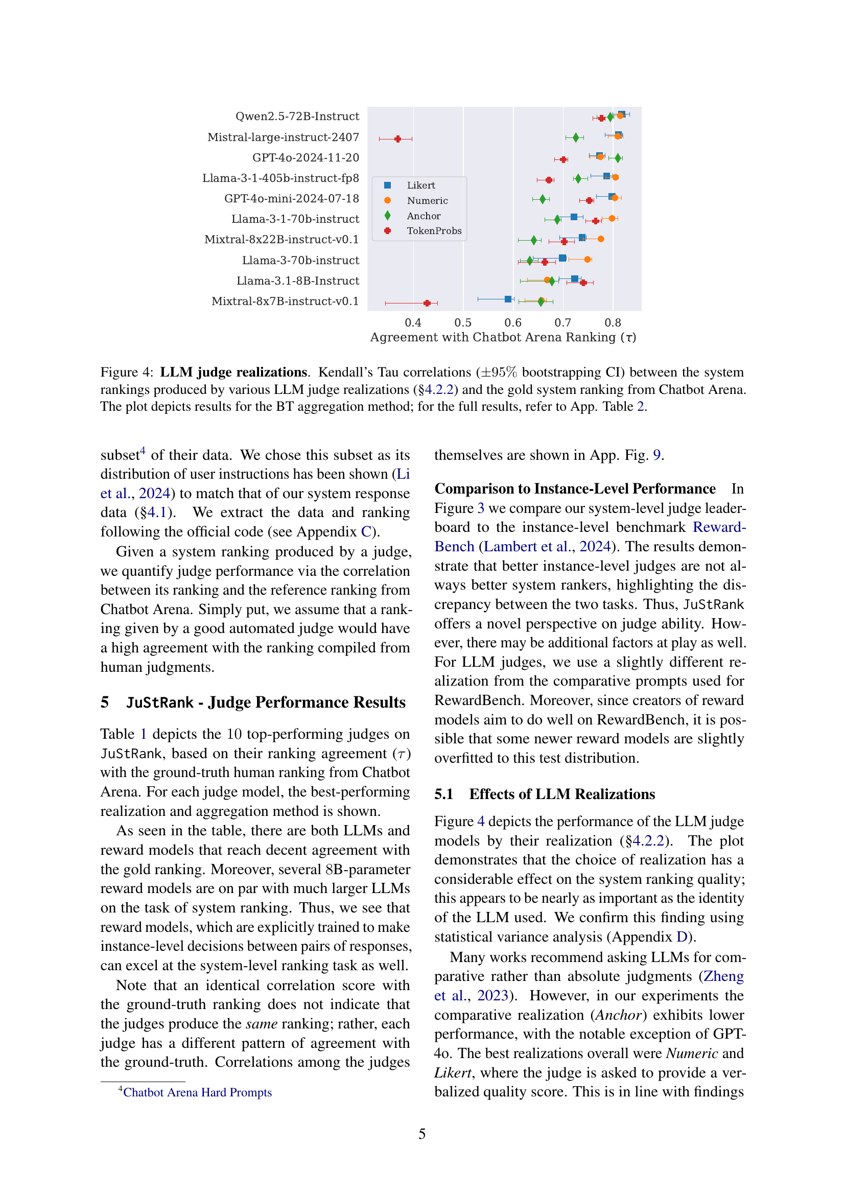
🔼 This figure shows the Kendall’s Tau correlation, with 95% confidence intervals, between system rankings generated by different Large Language Model (LLM) judge realizations and a gold standard ranking from Chatbot Arena. The LLM judges were evaluated using various prompts and scoring methods, as detailed in section 4.2.2 of the paper. The displayed correlations specifically utilize the Bradley-Terry (BT) aggregation method. A more comprehensive overview of the results, including other aggregation methods, is available in Appendix Table 2.
read the caption
Figure 4: LLM judge realizations. Kendall’s Tau correlations (±95%plus-or-minuspercent95\pm 95\%± 95 % bootstrapping CI) between the system rankings produced by various LLM judge realizations (§4.2.2) and the gold system ranking from Chatbot Arena. The plot depicts results for the BT aggregation method; for the full results, refer to App. Table LABEL:tab:leaderboard_full.

🔼 This figure shows the system-specific judge biases. The heat maps depict the win-rate biases of various judges towards specific systems, with respect to the ground-truth win-rates from Chatbot Arena. The raw ground-truth win-rates are shown in (a). The bias with respect to the fit value for the gold win-rate on the beta distribution fit is shown in (b).
read the caption
(a)

🔼 This figure shows the system-specific judge biases. The heatmaps depict the win-rate biases of various judges towards specific systems, comparing against ground-truth win-rates from Chatbot Arena. Panel (a) displays biases relative to the raw ground-truth win-rates; (b) shows biases relative to fit values for gold win-rates from the Beta distribution fit for each judge. The color scale represents the difference between predicted and gold win-rates.
read the caption
(b)

🔼 This figure shows the heatmap of system-specific judge biases. Each cell represents the win-rate bias of a specific judge towards a specific system, calculated as the difference between the judge’s predicted win rate and the ground-truth win rate from Chatbot Arena, considering the Beta CDF fit for each judge for a more accurate representation of judge behavior. The color intensity reflects the magnitude of the bias, with darker shades indicating stronger biases. The heatmap allows for the visualization of consistent biases across different judges towards specific systems, highlighting potential issues with fairness and reliability in judge performance.
read the caption
(c)

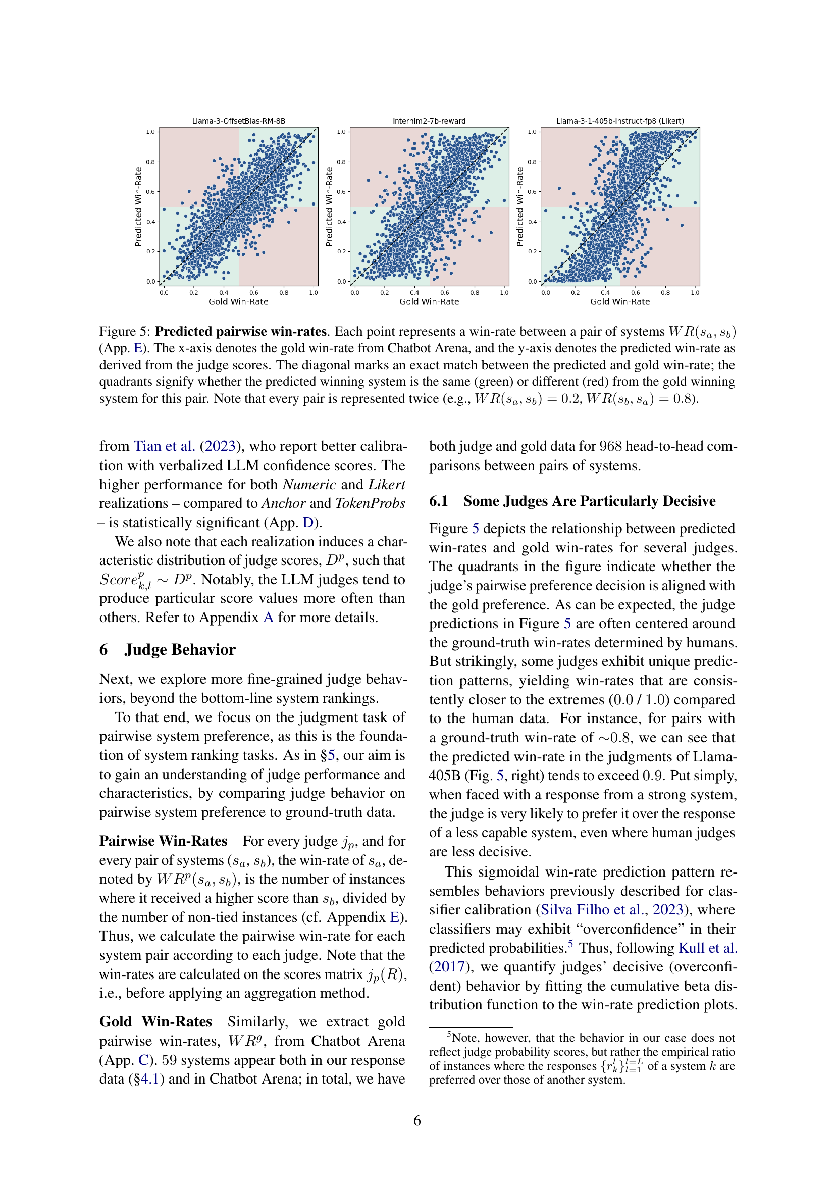
🔼 This figure displays the correlation between predicted and gold pairwise win-rates for different LLMs. Each point shows a system pair’s win rate, where the x-axis represents the gold win-rate from Chatbot Arena, and the y-axis represents the win-rate predicted by the LLM judge. The diagonal line indicates perfect agreement between predicted and actual win-rates. The colored quadrants highlight whether the predicted winner matches the gold standard winner (green) or not (red). Note that each pair is shown twice to illustrate the symmetrical nature of win rates (e.g., if system A beats system B at 80% rate, system B beats system A at 20% rate).
read the caption
Figure 5: Predicted pairwise win-rates. Each point represents a win-rate between a pair of systems WR(sa,sb)𝑊𝑅subscript𝑠𝑎subscript𝑠𝑏WR(s_{a},s_{b})italic_W italic_R ( italic_s start_POSTSUBSCRIPT italic_a end_POSTSUBSCRIPT , italic_s start_POSTSUBSCRIPT italic_b end_POSTSUBSCRIPT ) (App. E). The x-axis denotes the gold win-rate from Chatbot Arena, and the y-axis denotes the predicted win-rate as derived from the judge scores. The diagonal marks an exact match between the predicted and gold win-rate; the quadrants signify whether the predicted winning system is the same (green) or different (red) from the gold winning system for this pair. Note that every pair is represented twice (e.g., WR(sa,sb)=0.2𝑊𝑅subscript𝑠𝑎subscript𝑠𝑏0.2WR(s_{a},s_{b})=0.2italic_W italic_R ( italic_s start_POSTSUBSCRIPT italic_a end_POSTSUBSCRIPT , italic_s start_POSTSUBSCRIPT italic_b end_POSTSUBSCRIPT ) = 0.2, WR(sb,sa)=0.8𝑊𝑅subscript𝑠𝑏subscript𝑠𝑎0.8WR(s_{b},s_{a})=0.8italic_W italic_R ( italic_s start_POSTSUBSCRIPT italic_b end_POSTSUBSCRIPT , italic_s start_POSTSUBSCRIPT italic_a end_POSTSUBSCRIPT ) = 0.8).

🔼 This figure shows a heatmap visualizing system-specific judge biases. Each cell represents the win-rate bias of a specific judge (rows) towards a specific system (columns), calculated as the difference between the judge’s predicted win-rate and the gold standard win-rate from Chatbot Arena. The color intensity represents the magnitude of the bias, with darker colors indicating stronger biases. Subfigure (a) uses the raw win-rates, while (b) corrects the win-rates by fitting them to a beta distribution to account for judge overconfidence. This allows for a more nuanced understanding of judge behavior beyond simple win/loss counts.
read the caption
(a)

🔼 This heatmap visualizes system-specific biases of various judges. Each cell represents the win-rate bias of a specific judge towards a specific system, calculated as the difference between the judge’s predicted win-rate and the ground truth win-rate from Chatbot Arena. The color intensity reflects the magnitude of the bias, with darker colors indicating stronger biases (positive or negative). This figure helps to understand how different judges might exhibit preferential treatment towards certain systems.
read the caption
(b)

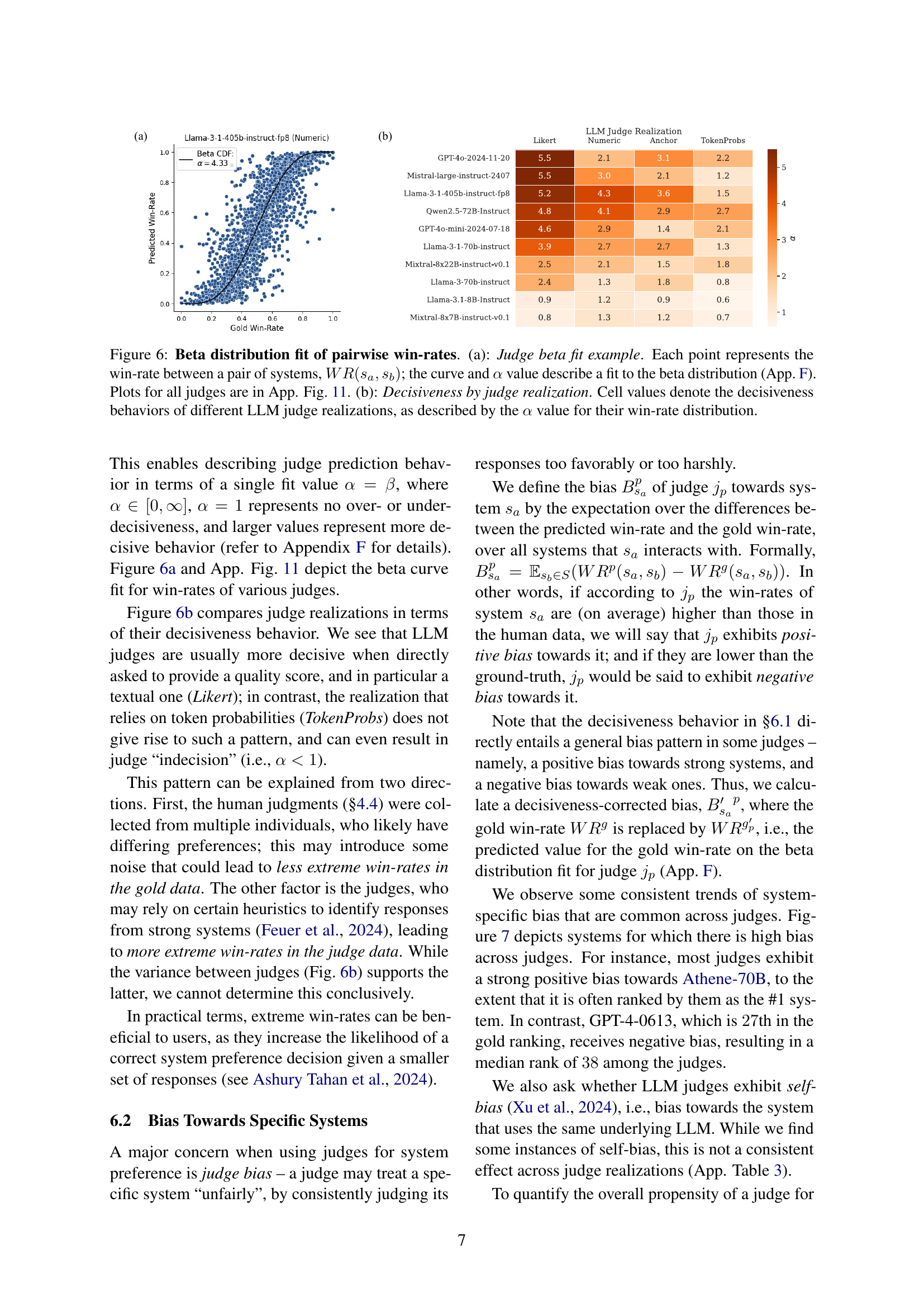
🔼 Figure 6 presents a detailed analysis of judge behavior in terms of pairwise win rates. Panel (a) shows a sample visualization of the Beta distribution fit for a single judge’s pairwise win-rate data. Each point represents a win-rate between a pair of systems, with the curve and alpha (α) value representing the fit to the Beta distribution. The supplementary material (Appendix F) provides further detail on this calculation, and Appendix Figure 11 contains similar visualizations for all judges. Panel (b) provides a tabular summary of decisiveness scores across different LLM judge realizations. The decisiveness is quantified by the alpha (α) value derived from the Beta distribution fit for each judge’s win-rate data, indicating the degree to which the judge consistently amplifies the gap between winning and losing systems.
read the caption
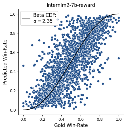
Figure 6: Beta distribution fit of pairwise win-rates. (a): Judge beta fit example. Each point represents the win-rate between a pair of systems, WR(sa,sb)𝑊𝑅subscript𝑠𝑎subscript𝑠𝑏WR(s_{a},s_{b})italic_W italic_R ( italic_s start_POSTSUBSCRIPT italic_a end_POSTSUBSCRIPT , italic_s start_POSTSUBSCRIPT italic_b end_POSTSUBSCRIPT ); the curve and α𝛼\alphaitalic_α value describe a fit to the beta distribution (App. F). Plots for all judges are in App. Fig. 11. (b): Decisiveness by judge realization. Cell values denote the decisiveness behaviors of different LLM judge realizations, as described by the α𝛼\alphaitalic_α value for their win-rate distribution.

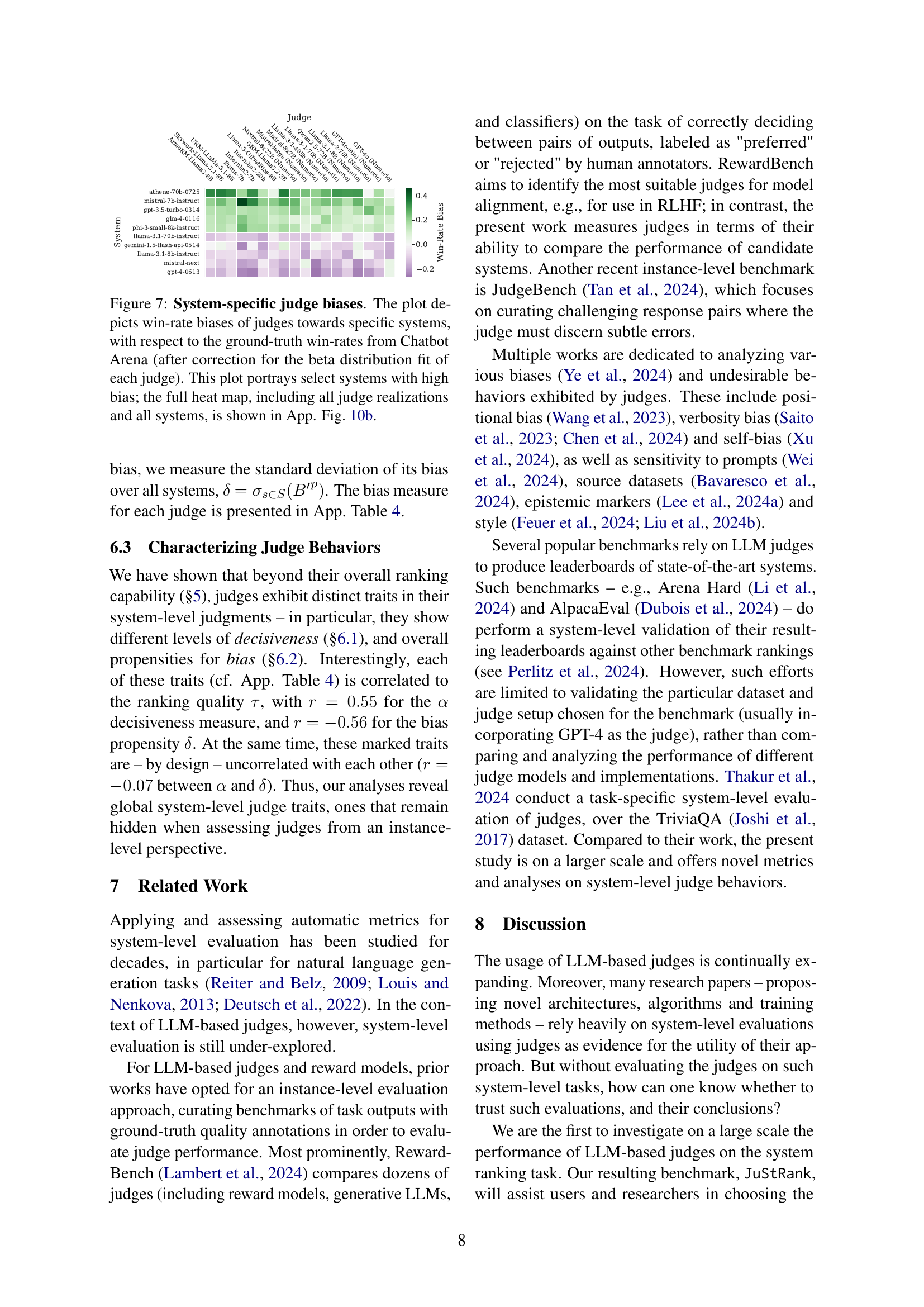
🔼 This figure visualizes system-specific biases exhibited by various judges when evaluating systems’ performance against a ground truth. Each cell in the heatmap represents the bias of a specific judge towards a specific system, calculated as the difference between the judge’s predicted win rate and the ground truth win rate from Chatbot Arena. The biases have been adjusted to account for the decisiveness of each judge using beta distribution fitting. The figure highlights several systems exhibiting extreme biases, both positive and negative. The full heatmap with complete data is presented in Appendix Figure 10b.
read the caption
Figure 7: System-specific judge biases. The plot depicts win-rate biases of judges towards specific systems, with respect to the ground-truth win-rates from Chatbot Arena (after correction for the beta distribution fit of each judge). This plot portrays select systems with high bias; the full heat map, including all judge realizations and all systems, is shown in App. Fig. 10b.

🔼 This figure shows system-specific judge biases. The heatmaps depict the win-rate biases of various judges towards specific systems, with respect to the ground-truth win-rates from Chatbot Arena. (a) shows the bias with respect to the raw ground-truth win-rates; (b) shows the bias with respect to the fit value for the gold win-rate on the beta distribution fit for each judge. The color scale represents the bias scores, and the colorbar shows the range of values.
read the caption
(a)
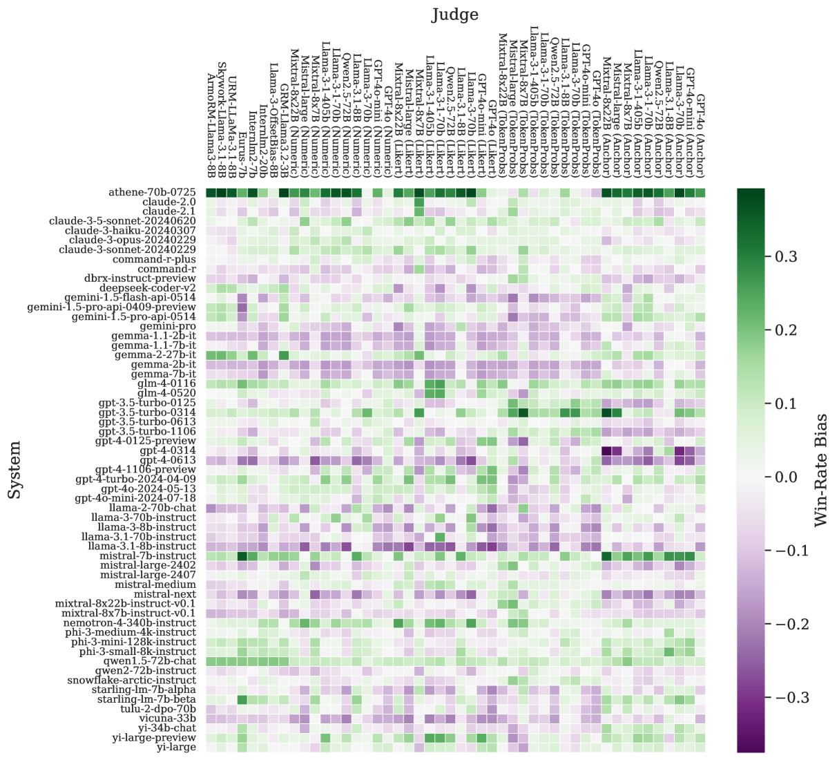
🔼 This figure is a heatmap showing system-specific judge biases. Each cell represents the win-rate bias of a judge towards a specific system, relative to the ground-truth win-rates from Chatbot Arena. The bias is corrected using a beta distribution fit to account for judge decisiveness. The color intensity represents the magnitude of bias, with lighter colors indicating less bias and darker colors indicating stronger bias, either positive or negative.
read the caption
(b)

🔼 This figure shows the system-specific judge biases. The heat maps depict the win-rate biases of various judges towards specific systems, with respect to the ground-truth win-rates from Chatbot Arena. Panel (a) shows bias with respect to the raw ground-truth win-rates. Panel (b) shows bias with respect to the fit value for the gold win-rate on the Beta distribution fit for each judge. The color scale represents the win-rate bias relative to the fitted Beta distribution; darker colors indicate stronger bias (positive or negative).
read the caption
(c)

🔼 This figure visualizes the results of applying different aggregation methods to the raw judgement scores from LLMs. Each point represents the win-rate between a pair of systems, calculated from the raw scores; the x-axis is the gold standard win-rate from Chatbot Arena; and the y-axis is the predicted win-rate generated by the LLM judges. The diagonal line indicates an exact match between gold and predicted win-rates. The quadrants show whether the predicted winning system is the same (green) or different (red) from the gold-standard. Different colors show the various judge realizations.
read the caption
(d)

🔼 This figure compares the performance of judges from JuStRank and RewardBench. RewardBench evaluates judges on an instance level (individual responses), while JuStRank assesses judges on a system level (ranking systems). To facilitate comparison, the plot shows the relative performance of judges that are in both benchmarks, using Min-Max normalization for consistent scaling (RewardBench’s accuracy and JuStRank’s Kendall’s Tau). The BT aggregation method is used for both, and the Anchor realization is used for LLM judges in JuStRank to match RewardBench’s conditions as closely as possible. Each subplot in the figure presents a different subset of the RewardBench dataset.
read the caption
Figure 8: Comparison to RewardBench. The plot depicts the relative performance of judges present in both JuStRank and RewardBench Lambert et al. (2024). For comparison, we perform Min-Max normalization over the judge performance scores (accuracy for RewardBench, Kendall’s Tau for our results). The results shown are for the BT aggregation method; the LLM judges use the Anchor realization, which is closest to the setting in RewardBench. Each panel portrays a different subset of RewardBench.

🔼 This figure displays a heatmap showing the Kendall’s Tau correlation coefficients between system rankings generated by various LLM judge configurations (different LLMs and prompting methods) using the Bradley-Terry aggregation method. Each cell represents the correlation between two system rankings; darker green indicates a stronger positive correlation, while darker purple indicates a stronger negative correlation. The first row and column show the correlation of each judge with the reference ranking from Chatbot Arena, allowing comparison of each judge’s ranking to a human-based ranking.
read the caption
Figure 9: Judge Correlations. Kendall’s Tau correlations between the system rankings produced by the different judge realizations, using the BT aggregation method. The first row/column denotes correlations with the reference ranking from Chatbot Arena.

🔼 This figure shows a heatmap visualizing system-specific judge biases. Each cell represents the win-rate bias of a specific judge towards a specific system, comparing the judge’s predicted win-rates to the ground-truth win-rates from Chatbot Arena. The color intensity reflects the magnitude of the bias, with warmer colors indicating stronger biases. The figure includes a legend illustrating the color-coding of biases. Part (a) shows biases relative to the raw ground-truth win-rates, while part (b) shows biases corrected for the decisiveness of each judge by fitting a beta distribution.
read the caption
(a)

🔼 This heatmap visualizes system-specific judge biases, showing how much each judge’s win-rate predictions deviate from the ground truth for each system. The bias is calculated considering the difference between the predicted win-rates and gold win-rates (from Chatbot Arena) for each system pair. Two versions of bias are presented: (a) raw bias computed directly against gold win-rates; (b) corrected bias that accounts for the tendency of judges to produce consistently extreme win-rate predictions, achieved by fitting a Beta distribution to the raw win-rate data.
read the caption
(b)

🔼 This figure visualizes system-specific biases exhibited by different judges when evaluating various systems. Two heatmaps are presented. The first (a) shows the bias of each judge towards specific systems relative to the raw ground-truth win-rates directly obtained from human evaluations on the Chatbot Arena platform. The second heatmap (b) presents the same bias, but this time calculated relative to adjusted ground-truth win-rates which are generated using a beta distribution fit to account for inherent noise and variations in the human judgment data. Darker colors in the heatmaps indicate stronger biases.
read the caption
Figure 10: System-specific judge biases. The heat maps depict the win-rate biases of various judges towards specific systems (§6.2), with respect to the ground-truth win-rates from Chatbot Arena. (a): Bias w.r.t. the raw ground-truth win-rates WRg𝑊superscript𝑅𝑔WR^{g}italic_W italic_R start_POSTSUPERSCRIPT italic_g end_POSTSUPERSCRIPT; (b): Bias w.r.t. the fit value for the gold win-rate WRg′𝑊superscript𝑅superscript𝑔′WR^{g^{\prime}}italic_W italic_R start_POSTSUPERSCRIPT italic_g start_POSTSUPERSCRIPT ′ end_POSTSUPERSCRIPT end_POSTSUPERSCRIPT on the beta distribution fit (App. F) for each judge.

🔼 This figure visualizes system-specific judge biases. It shows win-rate biases of various judges toward specific systems relative to ground-truth win-rates from Chatbot Arena. Panel (a) displays biases with respect to the raw ground-truth win-rates, while panel (b) shows biases relative to the fit value of the gold win-rate (based on Beta distribution fitting for each judge). The heat map’s color intensity represents the degree of bias, with warmer colors indicating stronger positive biases and cooler colors indicating stronger negative biases. Each row represents a judge, and each column represents a system.
read the caption
(a)

🔼 This heatmap visualizes system-specific biases exhibited by various judges. Each cell represents the bias of a specific judge towards a particular system, calculated as the difference between the judge’s predicted win rate and the ground truth win rate from Chatbot Arena, after correcting for the judge’s decisiveness using a beta distribution fit. The color intensity reflects the magnitude of the bias, with darker colors indicating stronger biases (positive or negative). This figure helps to understand how different judges may have inherent preferences or biases towards certain systems, which can impact their overall system ranking accuracy.
read the caption
(b)

🔼 This figure shows the heatmap of system-specific judge biases for various judges. The color depicts the bias of the win-rate of the system compared to the ground truth win-rate in the Chatbot Arena dataset. The raw win-rate bias is shown in (a), and the bias corrected for the beta distribution fit for each judge (Appendix F) is shown in (b).
read the caption
(c)

🔼 This figure shows the relationship between predicted win rates and gold win rates for several judges. The x-axis represents the gold win rate from Chatbot Arena, and the y-axis represents the predicted win rate from judge scores. Each point represents a win rate between a pair of systems. The diagonal line represents an exact match between predicted and gold win rates. The quadrants show whether the predicted winning system is the same (green) or different (red) from the gold winning system. Some judges show a sigmoidal prediction pattern, indicating that they are more decisive than human judges in their predictions.
read the caption
(d)

🔼 This figure shows the pairwise win-rates for several judges. The x-axis represents the gold win-rate from Chatbot Arena, and the y-axis shows the predicted win-rate from the judge scores. Each point represents a win-rate between a pair of systems, and the diagonal line marks the perfect match between predicted and gold win-rates. The quadrants show whether the predicted winning system is the same or different from the actual winning system in Chatbot Arena. Some judges are shown to be more decisive than others, meaning they consistently predict win-rates closer to 0 or 1, regardless of the gold win-rate.
read the caption
(e)
🔼 This figure visualizes the beta distribution fit of pairwise win-rates. Each point represents the win-rate between a pair of systems, and the curve shows the best-fit beta probability distribution. The figure helps to understand how well the judge’s pairwise win-rate predictions align with the ground truth. It shows fits for several different judges, allowing for a comparison of their prediction patterns.
read the caption
(f)

🔼 This figure shows the beta distribution fit for the pairwise win rates of various judges. Each point represents the win-rate between a pair of systems; the curve and α value describe the best beta probability distribution. The plot is useful for understanding the decisive behavior of different judges, which indicates their tendency to strongly favor a winning system.
read the caption
(g)

🔼 This figure shows the beta distribution fit of pairwise win-rates for several judges. Each point represents the win-rate between a pair of systems. The x-axis denotes the gold win-rate from Chatbot Arena, and the y-axis denotes the predicted win-rate as derived from the judge scores. The curve and a value describe a fit to the beta probability distribution. The diagonal marks an exact match between the predicted and gold win-rate; the quadrants signify whether the predicted winning system is the same (green) or different (red) from the gold winning system for this pair.
read the caption
(h)

🔼 This figure shows the correlation between predicted pairwise win rates and gold win rates for several judges. Each point represents a win rate between a pair of systems. The x-axis represents the gold win rate from Chatbot Arena, and the y-axis represents the predicted win rate derived from the judge scores. The diagonal represents an exact match between predicted and gold win rates. The quadrants show whether the predicted winning system matches the gold winning system. The plot reveals how decisive different judges are, with some judges exhibiting more extreme win-rate predictions (closer to 0 or 1) than others.
read the caption
(i)

🔼 This figure shows the Beta distribution fit of pairwise win-rates for various LLMs and reward models. Each point represents the win-rate between a pair of systems, where the x-axis is the gold win-rate and the y-axis is the predicted win-rate. The curve and α value show the best fit to the Beta distribution, and the color of the points indicates whether the predicted and gold winning systems are the same (green) or different (red). The figure provides a visual representation of how well each judge’s predictions align with human judgments of system quality in pairwise comparisons.
read the caption
(j)

🔼 This figure shows the Kendall’s Tau correlations between the system rankings produced by different judge realizations, using the BT aggregation method. The first row/column denotes correlations with the reference ranking from Chatbot Arena.
read the caption
(k)

🔼 This figure shows the predicted pairwise win-rates for several LLMs. Each point represents the win-rate between a pair of systems, calculated from the judge’s scores. The x-axis represents the gold win-rate from Chatbot Arena, and the y-axis shows the predicted win-rate. The diagonal represents an exact match between predicted and gold win-rates. The quadrants show whether the predicted winning system matches the gold winning system for each pair. This visualization helps to assess the accuracy and bias of the different LLMs in predicting system win-rates, revealing patterns of overconfidence or underconfidence in their judgements.
read the caption
(l)

🔼 This figure visualizes the correlation between predicted and gold pairwise win-rates for various LLM judges. Each point represents a pair of systems, and its position reflects the predicted win rate against the gold win rate from Chatbot Arena. The plots are categorized by judge model and realization (how the model was prompted to judge), illustrating how well each model’s predictions align with human judgments of system quality. The diagonal line represents a perfect match between predicted and gold win-rates.
read the caption
Figure 11: Beta distribution fit of pairwise win-rates (Part 1/4)

🔼 This figure shows the predicted pairwise win rates of different LLMs as judges. The x-axis represents the ground truth win rate from Chatbot Arena, and the y-axis shows the predicted win rate from the LLM judge scores. Each point represents a win rate between a pair of systems. The diagonal line represents a perfect match between predicted and actual win rates. Points above the diagonal indicate that the model overestimates the win rate, while points below the diagonal represent an underestimation. The color of each point indicates whether the LLM judge’s prediction agrees (green) or disagrees (red) with the gold standard winning system.
read the caption
(m)

🔼 This figure shows the beta distribution fit of pairwise win-rates for several LLMs. Each point represents the win-rate between a pair of systems. The x-axis represents the gold win-rate from Chatbot Arena, and the y-axis represents the predicted win-rate from the judge scores. The diagonal marks an exact match between the predicted and gold win-rate. The quadrants signify whether the predicted winning system is the same (green) or different (red) from the gold winning system for this pair. Each subplot shows the results for a different judge realization. The curves and α values describe the fits to the beta distribution for each judge.
read the caption
(n)

🔼 This figure shows the pairwise win-rates predicted by various judges compared to the gold standard win-rates obtained from Chatbot Arena. Each point on the graph represents a win-rate between a pair of systems. The x-axis represents the gold win-rate, while the y-axis represents the predicted win-rate. The diagonal line indicates a perfect match between the predicted and gold win-rates. The quadrants indicate whether the predicted winning system is the same (green) or different (red) as the gold winning system. The figure helps visualize the accuracy and decisiveness of different judges in predicting pairwise system preferences.
read the caption
(o)

🔼 This figure shows the predicted pairwise win-rates for several judges. Each point represents a win-rate between a pair of systems. The x-axis represents the gold win-rate from Chatbot Arena, and the y-axis represents the predicted win-rate from the judge scores. The diagonal line indicates an exact match between predicted and gold win-rates. The quadrants show whether the predicted winning system matches the gold winning system. The plot reveals that certain judges show a tendency towards more extreme win-rates (0 or 1) compared to the human-based ground truth, illustrating a decisiveness factor in judge behavior.
read the caption
(p)

🔼 This figure shows the pairwise win-rates for several judges. The x-axis represents the gold win-rate from Chatbot Arena, indicating the true win-rate between a pair of systems based on human judgments. The y-axis shows the predicted win-rate, calculated from the judge’s scores. Each point represents a single system pair comparison. The diagonal line represents perfect agreement between the judge and the gold standard. Points falling above the diagonal show the judge overestimating the winning system’s strength, while those below underestimate it. The color-coding distinguishes whether the predicted winning system matches the actual winning system (green) or differs (red). This visualization helps to assess the accuracy and potential biases in different judges’ evaluations of system performance.
read the caption
(q)

🔼 This figure shows the Kendall’s Tau correlations between system rankings produced by different LLM judge realizations, using the BT aggregation method. The first row and column represent the correlation with the reference ranking from Chatbot Arena. The color intensity represents the strength of the correlation, with darker colors indicating stronger correlations. The heatmap visually depicts the pairwise relationships between the different judge configurations and how their rankings agree or disagree with each other, along with their agreement with the human-generated ranking from Chatbot Arena.
read the caption
(r)

🔼 This figure shows the predicted pairwise win-rates for several LLMs. The x-axis represents the gold win-rate from Chatbot Arena, which is a human-based ranking of system quality. The y-axis represents the predicted win-rate calculated from the LLM judge scores. Each point represents a win-rate between a pair of systems. The diagonal line represents a perfect match between predicted and gold win-rates. Points above the diagonal indicate that the LLM judge overestimates the win-rate of a system, while points below the diagonal indicate an underestimation. The color of the points indicates whether the predicted winning system is the same (green) as the gold standard or different (red). The plot provides a visual representation of how well each LLM judge’s predictions align with human judgements on a pairwise level, revealing potential biases or overconfidence in the models’ predictions.
read the caption
(s)

🔼 This figure shows the Kendall’s Tau correlation between system rankings produced by different LLM judge realizations, using the BT aggregation method. The first row/column represents correlations with the reference ranking from Chatbot Arena. The heatmap visually represents the strength of correlation between different judges’ rankings, highlighting which judges tend to produce similar rankings and which produce dissimilar ones. Darker colors indicate stronger correlations (closer to +1 or -1), while lighter colors indicate weaker correlations (closer to 0). This visualization helps to understand the consistency and agreement among different judges in their system-level ranking performance.
read the caption
(t)

🔼 This figure shows the pairwise win-rates for several judges. The x-axis represents the gold win-rate from Chatbot Arena, indicating the true win rate between each pair of systems. The y-axis shows the predicted win-rate from the judge, illustrating how well the judge’s predictions align with the ground truth. Each point represents a system pair; the diagonal shows perfect agreement. Points in the upper-left and lower-right quadrants represent disagreements between the predicted and actual winning systems. The color coding helps to visualize the level of agreement (green for agreement, red for disagreement). The figure provides a granular view of the judge’s performance beyond overall system rankings, highlighting potential biases or tendencies toward particular systems.
read the caption
(u)

🔼 This figure shows the pairwise win rates predicted by various judges compared to the gold standard win rates obtained from human evaluations. The x-axis represents the gold win rate, while the y-axis shows the predicted win rate. Each point represents a pair of systems. The diagonal line represents perfect agreement between predicted and gold win rates. The quadrants show whether the predicted winning system matched the gold standard. Different colors indicate if the predicted and gold winning systems were the same (green) or different (red). This visualization helps to assess the accuracy and biases of different LLMs in their pairwise judgments.
read the caption
(v)

🔼 This figure shows the pairwise win rates for different judges. The x-axis represents the gold win-rate from Chatbot Arena, and the y-axis represents the predicted win-rate from the judge scores. Each point represents a win-rate between a pair of systems. The diagonal represents a perfect match between predicted and gold win-rates. The quadrants indicate whether the predicted winning system matches the gold winning system. The color coding distinguishes between pairs where the predicted winner is the same (green) or different (red) from the gold winner. This visualization helps assess the accuracy and calibration of different judges in predicting pairwise system performance.
read the caption
(w)

🔼 This figure shows the pairwise win-rates for various judges. Each point represents the win-rate between a pair of systems, where the x-axis is the gold win-rate from Chatbot Arena and the y-axis is the predicted win-rate from the judge’s scores. The diagonal represents a perfect match between predicted and gold win-rates. The quadrants show whether the predicted winning system matched the gold winning system. The color-coding helps to visualize agreement or disagreement. The figure helps to illustrate the accuracy and bias of different judges in predicting pairwise system performance.
read the caption
(x)

🔼 This figure shows the results of fitting a beta distribution to the pairwise win rates for several LLM judges. The x-axis represents the gold win-rate from human judgments in Chatbot Arena, while the y-axis represents the win-rate predicted by the judge. Each point represents a win-rate between a pair of systems. The diagonal line indicates perfect agreement between predicted and gold win rates. The curves represent the fitted beta cumulative distribution functions (CDFs), with the alpha parameter indicating the decisiveness of the judge. Deviations from the diagonal line and the shape of the curves illustrate the level of agreement and biases exhibited by each judge.
read the caption
Figure 11: Beta distribution fit of pairwise win-rates (Part 2/4)

🔼 This figure shows the Kendall’s Tau correlations between the system rankings produced by different LLM judge realizations, using the BT aggregation method. The first row/column denotes correlations with the reference ranking from Chatbot Arena. The color intensity represents the strength of the correlation, with darker shades indicating stronger positive correlations and lighter shades indicating weaker or negative correlations. This visualization helps to understand the relationships and agreement between different LLM judges and how they compare to a human-based ranking.
read the caption
(y)

🔼 This figure shows the correlation between the predicted pairwise win-rates and the gold win-rates from Chatbot Arena for several judges. The x-axis represents the gold win-rate, and the y-axis represents the predicted win-rate. Each point represents a win-rate between a pair of systems. The diagonal represents an exact match between the predicted and gold win-rates. The quadrants show whether the predicted winning system is the same (green) or different (red) from the gold winning system. The plot reveals how decisive (or overconfident) some judges are, as evidenced by their win-rate predictions tending towards extremes (0.0 or 1.0) more consistently than human judges.
read the caption
(z)

🔼 This figure shows the pairwise win rates predicted by different judges against the ground truth win rates from Chatbot Arena. Each point represents a win rate between a pair of systems. The x-axis is the gold win rate, while the y-axis is the predicted win rate. Points are colored green if the predicted winning system matches the gold standard, and red otherwise. This visualization helps to assess the accuracy and potential biases of various judges in predicting pairwise system performance.
read the caption
(aa)

🔼 This figure shows the pairwise win rates for several judges, comparing the predicted win rates to the gold standard win rates from Chatbot Arena. Each point represents a win rate between a pair of systems, and the quadrants signify whether the predicted winning system is the same (green) or different (red) from the gold winning system for that pair. The diagonal line represents an exact match between the predicted and gold win rates. The plot helps to visualize the consistency and accuracy of different judges in their system ranking abilities.
read the caption
(ab)

🔼 This figure visualizes the pairwise win-rates predicted by various judges against the gold standard win-rates from Chatbot Arena. Each point represents a pair of systems. The x-axis shows the gold win-rate, and the y-axis shows the predicted win-rate. The diagonal line represents perfect agreement between the predicted and gold win-rates. The quadrants show whether the winning system predicted by the judge matches the gold standard (green) or not (red). Each subplot presents the results for a different judge, illustrating varying degrees of accuracy and bias in their predictions.
read the caption
(ac)

🔼 This figure shows the predicted pairwise win-rates for several judges. The x-axis represents the gold win-rate from Chatbot Arena, and the y-axis represents the predicted win-rate derived from the judge scores. Each point represents a win-rate between a pair of systems. The diagonal represents an exact match between the predicted and gold win-rate. The quadrants signify whether the predicted winning system is the same (green) or different (red) from the gold winning system for this pair. The plot highlights how some judges exhibit unique prediction patterns, yielding win-rates consistently closer to the extremes (0.0/1.0) than the human data.
read the caption
(ad)

🔼 This figure visualizes the pairwise win-rates predicted by various judges against the ground truth win-rates obtained from Chatbot Arena. Each point represents a pair of systems (sa, sb) and their win-rates. The x-axis shows the gold win-rate from Chatbot Arena, while the y-axis displays the predicted win-rate. The diagonal line indicates perfect agreement between predicted and gold win-rates. The quadrants show whether the predicted winning system matches the gold winning system. This visualization helps assess the accuracy and biases of different judges in predicting pairwise system preferences.
read the caption
(ae)

🔼 The figure shows heatmaps visualizing system-specific judge biases. Panel (a) displays the raw win-rate biases, showing the difference between the predicted and actual win rates for each judge-system pair. Panel (b) shows the same biases, but after correction using a beta distribution fit to account for judge decisiveness, offering a refined view of inherent system bias. The color intensity reflects the bias magnitude: green indicates positive bias (judge favors the system), purple indicates negative bias (judge disfavors the system).
read the caption
(af)

🔼 This figure shows the pairwise win rates for several judges. The x-axis represents the gold win-rate from Chatbot Arena, and the y-axis represents the predicted win-rate from the judge scores. The diagonal line represents perfect agreement between predicted and actual win rates. Points above the diagonal indicate the judge overestimated the win rate, while points below indicate underestimation. Points in the green quadrants show correct predictions (same winning system), and red points indicate incorrect predictions.
read the caption
(ag)

🔼 This figure shows the pairwise win rates predicted by different judges compared to the gold standard win rates from Chatbot Arena. Each point represents a win rate between a pair of systems. The x-axis is the gold win rate, and the y-axis is the predicted win rate. The diagonal line represents perfect agreement between predicted and gold win rates. The quadrants show whether the predicted winning system matches the gold standard winning system. The plot helps to visually analyze the accuracy and decisiveness of the judges in predicting pairwise system preferences.
read the caption
(ah)

🔼 This figure shows the correlation between predicted pairwise win-rates and gold win-rates for several judges. Each point represents a win-rate between a pair of systems. The x-axis represents the gold win-rate from Chatbot Arena, and the y-axis represents the predicted win-rate derived from the judge scores. The diagonal line indicates perfect agreement between predicted and gold win-rates. The quadrants show whether the predicted winning system is the same (green) or different (red) from the gold winning system. This visualization helps to understand the decisiveness of different judges in making pairwise comparisons, and to identify potential biases.
read the caption
(ai)

🔼 This figure visualizes system-specific judge biases, showing how different judges’ win-rate predictions deviate from the ground truth (Chatbot Arena). Panel (a) uses raw win-rates, while panel (b) corrects for judges’ tendencies toward extreme win-rate predictions (decisiveness). The color intensity represents the magnitude of bias, with darker colors indicating stronger bias.
read the caption
(aj)

🔼 This figure shows the Beta distribution fit for pairwise win-rates. For each judge, it displays the win-rate between pairs of systems. The x-axis represents the gold win-rate from the Chatbot Arena, and the y-axis represents the predicted win-rate derived from the judge scores. A curve and a value (alpha) are provided for each judge, showing the best fit to the beta probability distribution. This visualization helps assess how well each judge’s pairwise win-rate predictions align with the ground truth.
read the caption
Figure 11: Beta distribution fit of pairwise win-rates (Part 3/4)

🔼 This figure shows the heatmaps depicting the win-rate biases of various judges towards specific systems. The top panel (a) shows the biases with respect to the raw ground-truth win-rates from Chatbot Arena, while the bottom panel (b) shows biases with respect to the fit value for the ground-truth win-rate using a beta distribution fit. The color scale represents the bias score, showing how much a judge’s win-rate deviates from the ground truth for each system.
read the caption
(ak)

🔼 This figure visualizes system-specific judge biases. It presents heatmaps showing the win-rate biases of various judges toward specific systems, relative to ground-truth win rates from Chatbot Arena. The top heatmap (a) displays bias based on the raw ground-truth win rates. The bottom heatmap (b) shows bias calculated after correcting for the beta distribution fit of each judge. This correction accounts for the judges’ tendency towards overconfidence or decisiveness, revealing a more nuanced picture of system-specific bias beyond simple win-rate differences.
read the caption
(al)

🔼 This figure shows the results of fitting a Beta distribution to the pairwise win-rates for several judges. The x-axis represents the gold win-rate (from human judgments in Chatbot Arena), and the y-axis represents the predicted win-rate from the LLM judge. Each point represents a win-rate between a pair of systems. The diagonal line indicates perfect agreement between predicted and gold win-rates. The quadrants show whether the predicted winning system matches the gold standard. Different judges display varying degrees of decisiveness, showing how consistently they predict extreme win rates (close to 0 or 1) even when the ground truth is less extreme. This provides a visual representation of judges’ biases and calibration.
read the caption
(am)

🔼 This figure shows the results of fitting a Beta distribution to the pairwise win rates for several judges. Each point represents the win rate between a pair of systems, with the x-axis showing the gold win rate from Chatbot Arena, and the y-axis showing the predicted win rate from the judge. The diagonal line represents perfect agreement, while the quadrants show whether the predicted and gold winning systems are the same (green) or different (red). The plots illustrate different levels of judge decisiveness; some judges’ predictions cluster more tightly around the diagonal, while others show a greater tendency to predict extreme win rates (closer to 0 or 1).
read the caption
(an)

🔼 This figure visualizes the relationship between predicted and gold pairwise win-rates for several judges. Each point represents the win-rate between a pair of systems. The x-axis represents the gold win-rate from Chatbot Arena, and the y-axis represents the predicted win-rate derived from the judge’s scores. The diagonal line indicates perfect agreement between predicted and gold win-rates. The quadrants show whether the predicted winning system matches the gold standard. The plot highlights how certain judges tend to produce win-rates that consistently favor either extreme (0 or 1), indicating a decisive or overconfident judgment.
read the caption
(ao)
🔼 This figure shows the pairwise win-rates for several judges. The x-axis represents the gold win-rate from Chatbot Arena, and the y-axis represents the predicted win-rate from the judge scores. Each point represents a win-rate between a pair of systems. The diagonal line indicates an exact match between predicted and gold win-rates. The quadrants show whether the predicted winning system is the same (green) or different (red) from the gold winning system for each pair. Note that each pair is represented twice (e.g., WR(sa, sb) = 0.2, WR(sb, sa) = 0.8).
read the caption
(ap)

🔼 This figure shows the results of the Beta distribution fit of pairwise win-rates for various judges. Each point represents a win-rate between a pair of systems. The x-axis shows the gold win-rate from Chatbot Arena, and the y-axis denotes the predicted win-rate. The diagonal marks an exact match between the predicted and gold win-rate; the quadrants signify whether the predicted winning system is the same (green) or different (red) from the gold winning system for this pair. The curve and a value describe a fit to the beta probability distribution. For details, see Appendix F.
read the caption
(aq)
🔼 This figure shows the comparison between the predicted pairwise win-rates and gold pairwise win-rates for several judges. The x-axis represents the gold win-rate from Chatbot Arena, and the y-axis represents the predicted win-rate derived from the judge scores. Each point represents a win-rate between a pair of systems. The diagonal line marks an exact match between the predicted and gold win-rate, while the quadrants indicate whether the predicted winning system is the same (green) or different (red) from the gold winning system for each pair. The plot helps visualize the consistency and potential biases of different judges in their pairwise comparisons.
read the caption
(ar)

🔼 This figure shows the predicted pairwise win-rates for several LLMs. Each point represents the win-rate between a pair of systems. The x-axis represents the gold win-rate from Chatbot Arena human evaluations, and the y-axis represents the predicted win-rate from the LLM judge scores. The diagonal line indicates perfect agreement between the predicted and gold win-rates. Points in the upper-left and lower-right quadrants indicate the LLM disagreed with the human evaluation, while points in the upper-right and lower-left quadrants show agreement. Different colors indicate whether the LLM predicted the same winning system as the human evaluators.
read the caption
(as)

🔼 This figure shows the predicted pairwise win rates for several judges. The x-axis represents the gold win rate from Chatbot Arena, and the y-axis represents the predicted win rate derived from the judge scores. Each point represents a win rate between a pair of systems. The diagonal marks an exact match between the predicted and gold win rate. The quadrants signify whether the predicted winning system is the same (green) or different (red) from the gold winning system for that pair. Each pair is represented twice (e.g., WR(sa, sb) = 0.2, WR(sb, sa) = 0.8).
read the caption
(at)

🔼 This figure shows the Kendall’s Tau correlations between system rankings generated by different LLM judge realizations using the BT aggregation method. The first row and column represent correlations with the reference ranking from Chatbot Arena. The color intensity of each cell represents the strength of the correlation, ranging from strongly positive (dark green) to strongly negative (dark purple), with lighter shades indicating weaker correlations.
read the caption
(au)

🔼 This figure shows the pairwise win rates predicted by various LLMs compared to the ground truth win rates from Chatbot Arena. Each point represents a win rate between a pair of systems. The x-axis shows the gold win rate from Chatbot Arena, and the y-axis shows the predicted win rate. The diagonal line represents perfect agreement between predicted and gold win rates. The quadrants show whether the predicted winning system is the same (green) or different (red) from the gold winning system. The plot helps visualize how well different LLMs’ predictions align with human judgments on the relative quality of different systems, indicating whether they exhibit overconfidence or other biases.
read the caption
(av)
🔼 This figure shows the Beta distribution fit for pairwise win-rates. For each judge, multiple scatter plots are presented, each point showing the win-rate of system sa over system sb (as calculated by the judge) on the y-axis versus the corresponding gold win-rate from the Chatbot Arena dataset on the x-axis. A Beta distribution curve is fitted to the data points for each judge, and the alpha value (α), which is a parameter of the Beta distribution and reflects the decisiveness of the judge, is displayed. The plots visualize how well the judge’s pairwise win-rate predictions match the gold standard and the judges’ tendency towards overconfidence in their predictions.
read the caption
Figure 11: Beta distribution fit of pairwise win-rates (Part 4/4). Each point represents the win-rate between a pair of systems, WR(sa,sb)𝑊𝑅subscript𝑠𝑎subscript𝑠𝑏WR(s_{a},s_{b})italic_W italic_R ( italic_s start_POSTSUBSCRIPT italic_a end_POSTSUBSCRIPT , italic_s start_POSTSUBSCRIPT italic_b end_POSTSUBSCRIPT ); the curve and α𝛼\alphaitalic_α value describe a fit to the beta probability distribution. Refer to Appendix F for details.

🔼 This figure shows the system-specific judge biases, where the heat maps depict the win-rate biases of various judges toward specific systems. Part (a) shows the biases with respect to the ground-truth win-rates from Chatbot Arena, while Part (b) displays the biases with respect to the fit value for the gold win-rate from the beta distribution fit for each judge.
read the caption
(a)

🔼 This figure shows the heatmap of system-specific judge biases. Each cell in the heatmap represents the bias of a specific judge towards a specific system. The x-axis represents different judges, and the y-axis represents different systems. The color of each cell represents the magnitude and direction of the bias. A positive bias (darker green) indicates that the judge tends to overestimate the quality of a system, while a negative bias (darker purple) indicates that the judge tends to underestimate the quality of a system. The figure also shows the win-rate bias relative to the Beta CDF fit, correcting for judge decisiveness.
read the caption
(b)

🔼 This figure shows the heatmap of system-specific judge biases. Each cell represents the win-rate bias of a specific judge towards a specific system, compared to the ground-truth win-rates from Chatbot Arena. The figure is divided into two subfigures: (a) shows the bias with respect to the raw ground-truth win-rates, while (b) shows the bias with respect to the fit value for the gold win-rate, obtained from fitting a beta distribution to the observed data. The color intensity of each cell represents the magnitude of the bias (higher intensity means stronger bias).
read the caption
(c)
🔼 This figure shows the correlation between the predicted pairwise win-rates and the gold win-rates for several judges. The x-axis represents the gold win-rate from Chatbot Arena, and the y-axis represents the predicted win-rate derived from the judge scores. The diagonal line represents a perfect match between predicted and gold win-rates. Points above the diagonal indicate that the judge overestimates the win-rate for the corresponding system pair, while points below indicate an underestimation. The color of the points indicates whether the predicted and actual winning system match (green) or differ (red). This visualization helps to assess the calibration and accuracy of different judges in predicting pairwise win-rates.
read the caption
(d)

🔼 This figure visualizes the pairwise win rates predicted by various judges against the ground truth win rates obtained from Chatbot Arena. Each point represents a win rate between a pair of systems. The x-axis shows the ground truth win rate, while the y-axis displays the predicted win rate. The diagonal line represents perfect agreement between prediction and ground truth. Points falling above the diagonal indicate that the judge overestimates the winning system, while points below indicate underestimation. The color-coding helps to distinguish between cases where the predicted winning system aligns with the ground truth and when it differs.
read the caption
(e)

🔼 This figure shows the Beta distribution fit of pairwise win-rates for several judges. Each point represents a win-rate between a pair of systems. The x-axis shows the gold win-rate from Chatbot Arena, and the y-axis shows the predicted win-rate from the judge scores. The diagonal marks an exact match. The quadrants show whether the predicted winning system is the same (green) or different (red) from the gold winning system. Each subfigure represents a different judge, illustrating their individual tendencies towards decisiveness and bias in pairwise comparisons.
read the caption
(f)

🔼 This figure shows the relationship between predicted win-rates and gold win-rates for several judges. The x-axis represents the gold win-rate (from human judgments in Chatbot Arena), and the y-axis represents the win-rate predicted by the judge. Each point shows a single system pair comparison. Points near the diagonal represent accurate predictions, while points far from the diagonal indicate inaccurate predictions. The different colored quadrants represent whether the predicted winning system is the same as the actual winning system. The pattern of points reveals the tendencies of different judges: some are highly decisive (their predictions tend to be close to 0 or 1), while others are less decisive (their predictions are closer to 0.5).
read the caption
(g)
🔼 This figure shows the Beta distribution fit of pairwise win-rates for several LLMs and reward models. Each point represents the win-rate between a pair of systems; the curve and a value describe a fit to the beta probability distribution. The x-axis shows the gold win-rate (from Chatbot Arena), and the y-axis shows the predicted win-rate as derived from the judge scores. The diagonal marks an exact match between predicted and gold win-rate; the quadrants signify whether the predicted winning system is the same (green) or different (red) from the gold winning system for this pair. Note that every pair is represented twice (e.g., WR(sa, sb) = 0.2, WR(sb, sa) = 0.8). The plot helps visualize and quantify the degree of overconfidence or decisiveness exhibited by different judges, showing how well their predicted win rates align with the actual win rates from human evaluations.
read the caption
(h)

🔼 This figure shows the correlation between the predicted win-rates and gold win-rates for several judges. The x-axis represents the gold win-rate from Chatbot Arena, and the y-axis represents the predicted win-rate derived from the judge scores. Each point represents a win-rate between a pair of systems. The diagonal line marks an exact match between predicted and gold win-rates. The quadrants show whether the predicted winning system is the same (green) or different (red) from the gold winning system. The plot reveals that some judges exhibit unique prediction patterns, with win-rates consistently closer to the extremes (0 or 1) than the human data, indicating a tendency towards decisive judgments.
read the caption
(i)

🔼 This figure shows the beta distribution fit of pairwise win-rates for several judges. Each point represents the win-rate between a pair of systems, with the x-axis denoting the gold win-rate from Chatbot Arena and the y-axis denoting the predicted win-rate from the judge scores. The diagonal line represents an exact match between the predicted and gold win-rates. The quadrants show whether the predicted winning system is the same (green) or different (red) from the gold winning system. The curves and alpha values show the best-fit beta probability distribution for each judge.
read the caption
(j)

🔼 This figure shows the correlation between the system rankings produced by different LLM judge realizations and the gold standard ranking from Chatbot Arena. The plot displays the Kendall’s Tau correlations, with 95% bootstrapping confidence intervals, illustrating the agreement between each LLM judge’s ranking and the human-generated ranking. This provides a visual representation of the relative performance of different LLM judge realizations in system ranking tasks. The full results are available in Appendix Table 2.
read the caption
(k)

🔼 This figure visualizes the pairwise win rates predicted by various judges against the gold standard win rates obtained from Chatbot Arena. Each point represents a win rate between a system pair. The x-axis shows the gold win rate, while the y-axis displays the predicted win rate. The diagonal line indicates perfect agreement between predicted and gold win rates. Points above the diagonal show overestimation of win rates by the judges, while those below indicate underestimation. The color-coding further distinguishes whether the predicted and gold winning systems are the same (green) or different (red). This visualization helps assess the accuracy and bias of different LLMs as judges in predicting system rankings.
read the caption
(l)

🔼 This figure shows the predicted pairwise win-rates of different LLMs. The x-axis represents the gold win-rate from Chatbot Arena, indicating the actual win-rate between pairs of systems in human judgments. The y-axis displays the predicted win-rate, calculated from the LLM judge’s scores. Each point represents a win-rate pair (sa, sb), plotted twice (sa, sb) and (sb, sa) to fully represent each comparison. The diagonal line represents perfect agreement between the predicted and gold win-rates. The different quadrants represent four scenarios: (1) the predicted winning system matches the gold standard; (2) the predicted loser matches the gold standard; (3) the predicted winner does not match the gold standard; and (4) the predicted loser does not match the gold standard. The plot highlights how different LLMs show various degrees of decisiveness, indicated by how closely their points cluster around the diagonal line and the extremes of 0 and 1.
read the caption
(m)

🔼 This figure shows the pairwise win rates predicted by various judges against the gold standard win rates from Chatbot Arena. The x-axis represents the gold win rate, and the y-axis represents the predicted win rate. Each point represents a win rate between a pair of systems. The diagonal line represents a perfect match between predicted and gold win rates. The quadrants show whether the predicted winning system matches the gold winning system. The figure helps to visualize the judges’ decisiveness and accuracy in predicting pairwise system preferences.
read the caption
(n)

🔼 This figure shows the pairwise win rates for several judges. The x-axis represents the gold win rate from Chatbot Arena, indicating the actual win rate between pairs of systems based on human evaluation. The y-axis shows the predicted win rate as calculated from the judge’s scores. Points in the top-left and bottom-right quadrants show agreement between the judge’s prediction and the gold standard, while points in the top-right and bottom-left quadrants indicate disagreement. The diagonal line represents perfect agreement between the predicted and actual win rates. The plot illustrates the decisiveness of various judges, with some judges consistently making predictions closer to 0 or 1 (indicating decisiveness), and others exhibiting predictions closer to 0.5 (less decisive).
read the caption
(o)

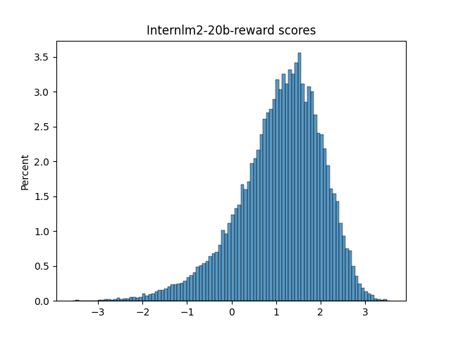
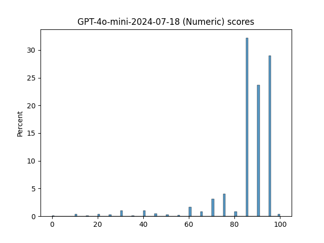
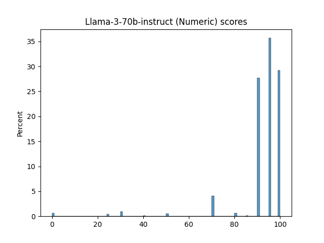
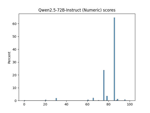
🔼 This figure displays the distributions of scores generated by different LLM judges for evaluating the quality of system responses. It shows histograms of scores from various reward models and LLM judges using different prompt realizations (Numeric, Likert, TokenProbs, and Anchor). The distributions vary significantly across judges, showcasing the diversity in their scoring behavior and potential biases. This part (1/3) shows histograms for reward models and some numeric realizations of LLMs.
read the caption
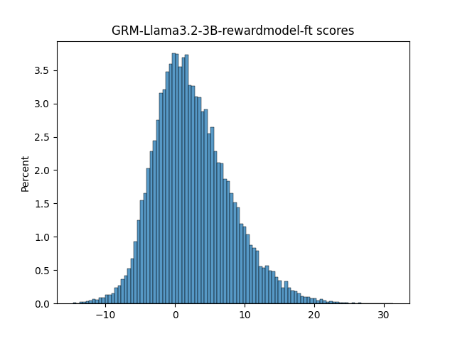
Figure 12: Judge score distributions (Part 1/3)

🔼 This figure visualizes the results of pairwise system comparisons, showing the predicted win-rates against the gold standard win-rates from Chatbot Arena. Each point represents a win-rate between a system pair. The diagonal signifies perfect agreement, while deviations show discrepancies between predicted and gold-standard results. The quadrants indicate whether the predicted winning system matches the actual winner. The figure also shows the distribution of data points and the degree of agreement between the predicted and gold-standard results.
read the caption
(p)

🔼 This figure shows the correlation between predicted pairwise win-rates and gold win-rates for several judges. Each point represents the win-rate between a pair of systems. The x-axis shows the gold win-rate from Chatbot Arena, and the y-axis shows the predicted win-rate derived from the judge scores. The diagonal represents an exact match between the predicted and gold win-rate. The quadrants show whether the predicted winning system is the same (green) or different (red) from the gold winning system. This helps visualize the consistency of a judge’s pairwise preferences in relation to human judgements, and illustrates the degree of overconfidence in its predictions.
read the caption
(q)

🔼 This figure shows the Kendall’s Tau correlation between system rankings produced by different LLM judge realizations. The first row and column represent correlations with the reference ranking from Chatbot Arena. The color intensity represents the strength of the correlation, with darker colors indicating stronger correlations. This visualization helps assess the agreement between different judges and their alignment with human judgment.
read the caption
(r)

🔼 This figure shows the predicted pairwise win-rates, comparing the predicted win-rates from different judges against the gold standard win-rates from Chatbot Arena. Each point on the plot represents a win-rate between a pair of systems. The x-axis represents the gold win-rate, and the y-axis represents the predicted win-rate. The diagonal line indicates an exact match between the predicted and gold win-rates. The different quadrants show whether the predicted winning system is the same or different from the gold winning system.
read the caption
(s)

🔼 This figure shows the correlation between the system rankings produced by different LLM judge realizations and the gold standard ranking from Chatbot Arena. The x-axis represents the gold standard ranking, and the y-axis represents the predicted ranking from each judge. Each point represents a system, and the color indicates whether the system’s predicted rank matches the ground truth (green) or differs (red). The diagonal line shows where predicted and gold rankings are identical. The plot helps assess the ability of different LLM judges to accurately rank systems compared to human judgments.
read the caption
(t)

🔼 This figure shows the pairwise win rates predicted by various judges compared to the gold standard win rates from Chatbot Arena. Each point represents a win rate between a pair of systems. The x-axis represents the gold win rate, while the y-axis represents the predicted win rate. The diagonal line indicates perfect agreement between predicted and gold win rates. Points above the line indicate that the judge overestimates the win rate of the system, while points below indicate an underestimation. The color of the points indicates whether the winning system predicted by the judge is the same as the winning system in the gold standard (green) or not (red). This visualization helps to assess the accuracy and bias of different judges in predicting pairwise system win rates.
read the caption
(u)

🔼 This figure shows the pairwise win rates for several judges. The x-axis represents the gold win rate from Chatbot Arena, and the y-axis represents the predicted win rate from the judge scores. Each point represents a win rate between a pair of systems. The diagonal represents an exact match between the predicted and gold win rate. The quadrants show whether the predicted winning system is the same as (green) or different from (red) the gold winning system. This figure is used to visualize the relationship between predicted win-rates and gold win-rates and to reveal potential judge behaviors such as overconfidence or bias. It helps to understand the accuracy and consistency of the LLM judges in predicting pairwise win rates and the overall quality of a system.
read the caption
(v)

🔼 This figure shows the pairwise win-rates for several judges. Each point represents the win-rate between a pair of systems. The x-axis shows the gold win-rate (from Chatbot Arena), and the y-axis shows the predicted win-rate from the judge scores. The diagonal line indicates an exact match. The quadrants indicate whether the predicted winning system is the same (green) or different (red) from the gold winning system for that pair. Each pair is represented twice (e.g., WR(sa, sb) = 0.2, WR(sb, sa) = 0.8).
read the caption
(w)

🔼 This figure compares the system-level performance of different LLMs and reward models used as judges. The x-axis represents the gold standard ranking from human evaluation (Chatbot Arena), while the y-axis shows the predicted win-rates for each pair of systems from the judges’ scores. Each point corresponds to a specific system pair, and the color indicates whether the judge’s predicted winning system matches the gold standard (green) or not (red). The diagonal line represents perfect agreement between the predicted and gold rankings. The plot allows us to assess the accuracy of different judges in ranking systems and observe any biases or trends in their judgment behavior.
read the caption
(x)

🔼 This figure shows the Kendall’s Tau correlation between system rankings produced by different LLM judge realizations, using the BT aggregation method. The first row/column denotes correlations with the reference ranking from Chatbot Arena.
read the caption
(y)

🔼 This figure shows the Kendall’s Tau correlations between the system rankings produced by different judge realizations, using the BT aggregation method. The first row/column denotes correlations with the reference ranking from Chatbot Arena.
read the caption
(z)

🔼 This figure shows the pairwise win-rates for several judges. Each point represents a win-rate between a pair of systems. The x-axis represents the gold win-rate from Chatbot Arena, and the y-axis represents the predicted win-rate derived from the judge scores. The diagonal marks an exact match between the predicted and gold win-rates. The quadrants signify whether the predicted winning system is the same (green) or different (red) from the gold winning system. The plot reveals different prediction patterns for different judges, particularly how some judges’ predictions consistently lean toward extreme values (0.0 or 1.0) as compared to the human data.
read the caption
(aa)

🔼 This figure visualizes the results of the pairwise win-rate analysis, comparing the predicted win-rates from various judges against the gold standard win-rates. Each point represents the win-rate between a pair of systems (sa, sb), where the x-axis is the gold win-rate from Chatbot Arena and the y-axis is the predicted win-rate from the judge’s scores. The plot is divided into quadrants to show whether the predicted winning system is the same (green) or different (red) from the gold winning system. The diagonal line represents perfect agreement between the gold and predicted win-rates.
read the caption
(ab)

🔼 This figure visualizes the pairwise win rates predicted by various judges against the gold standard win rates from Chatbot Arena. Each point represents a win rate between a pair of systems. The x-axis shows the gold win rate, and the y-axis shows the predicted win rate. Points are colored green if the predicted and gold winning systems are the same and red if they differ. The plots reveal the decisiveness of different judges, with some showing a stronger tendency to predict extreme win rates (closer to 0 or 1) than others. This indicates that some judges are more decisive in their judgments than others, amplifying differences between systems’ performance.
read the caption
(ac)

🔼 This figure shows the predicted pairwise win-rates, comparing the judge’s predictions to the ground truth from Chatbot Arena. Each point represents a win-rate between a system pair. The x-axis represents the gold win-rate from Chatbot Arena, while the y-axis shows the predicted win-rate from the judge’s scores. The diagonal represents a perfect match between predicted and gold win-rates. The quadrants visually represent whether the predicted winning system matched the gold winning system (green) or not (red). This visualization helps assess judge accuracy and identify potential biases or overconfidence in the judge’s predictions.
read the caption
(ad)

🔼 This figure displays the distributions of scores produced by various LLMs and reward models used as judges in the paper. It visually represents the frequency of different scores assigned by each judge to the responses it evaluated, showing how the scores are distributed across their range for each judge model. The distributions are helpful in understanding the nature and potential biases of each judging model, showing, for example, whether a judge tends towards more extreme or moderate scores. This helps to explain the different behaviors of judges in system ranking observed later in the paper.
read the caption
Figure 12: Judge score distributions (Part 2/3)

🔼 This figure visualizes the pairwise win rates predicted by various judges against the ground truth win rates obtained from Chatbot Arena. Each point represents a win rate between a pair of systems. The x-axis represents the ground truth win rate from Chatbot Arena, and the y-axis represents the predicted win rate from the judge scores. The diagonal line represents perfect agreement between predicted and ground truth win rates. The quadrants show whether the predicted winning system matches the ground truth winner (green) or not (red). The figure shows the performance of various judges in predicting pairwise win rates accurately.
read the caption
(ae)

🔼 This figure visualizes the win-rate biases of various judges towards specific systems. The heatmaps depict the win-rate biases of various judges with respect to the ground-truth win-rates from Chatbot Arena. The raw win-rate biases are shown in (a). In (b), the biases are shown after correcting for each judge’s tendency to make predictions that are closer to the extremes (0.0, 1.0) than the human gold-standard.
read the caption
(af)

🔼 This figure shows the pairwise win-rates for several judges. Each point represents a win-rate between a pair of systems. The x-axis denotes the gold win-rate from Chatbot Arena, and the y-axis denotes the predicted win-rate as derived from the judge scores. The diagonal marks an exact match between the predicted and gold win-rate; the quadrants signify whether the predicted winning system is the same (green) or different (red) from the gold winning system for this pair. Note that every pair is represented twice (e.g., WR(sa, sb) = 0.2, WR(sb, sa) = 0.8). The figure reveals how decisive different judges are, with some judges exhibiting more extreme win-rates consistently closer to 0 or 1 than human judges, indicating an overconfidence in their predictions.
read the caption
(ag)
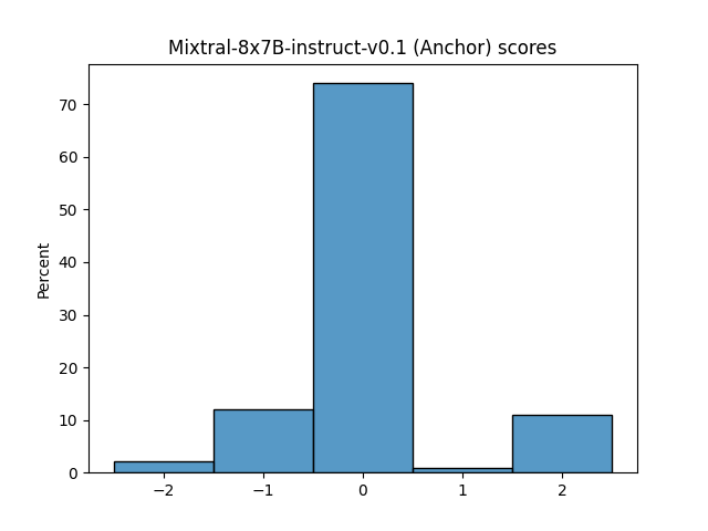
🔼 This figure visualizes the relationship between predicted and gold pairwise win-rates for several judges. Each point represents the win-rate between a pair of systems. The x-axis represents the gold win-rate from Chatbot Arena, and the y-axis represents the predicted win-rate derived from judge scores. The diagonal represents perfect agreement. The quadrants show whether the predicted winning system matches the gold winning system. Some judges exhibit a more decisive pattern, consistently predicting win-rates closer to 0 or 1, compared to the more nuanced human-based gold data. This visualization is crucial for understanding judges’ decisiveness and potential biases in system ranking.
read the caption
(ah)

🔼 This figure shows the results of the pairwise win-rate analysis, where each point represents the win-rate of one system against another (from the Chatbot Arena dataset). The x-axis displays the gold win-rate (ground truth from human evaluations), while the y-axis shows the win-rate predicted by the judge. The diagonal line represents perfect agreement between predicted and gold win-rates. Each quadrant shows the cases where the predicted and gold winning system were the same (green) or different (red). The plot gives a visual indication of judges’ accuracy and bias in pairwise comparisons.
read the caption
(ai)

🔼 This figure is a heatmap visualizing system-specific judge biases. Each cell represents the bias of a specific judge towards a specific system, calculated as the difference between the judge’s win rate for that system pair and the ground truth win rate from Chatbot Arena, after correction for beta distribution fit to account for judge decisiveness. The color scale indicates the magnitude of the bias, with green representing positive bias (the judge favors the system more than the ground truth) and purple representing negative bias. The figure shows both raw and corrected biases.
read the caption
(aj)
More on tables
| Judge Model | Realization | Aggregation | Agreement (τ) |
|---|---|---|---|
| w/ Gold Ranking | |||
| Qwen2.5-72B-Instruct | Likert | Win-Rate | .827 |
| URM-LLaMa-3.1-8B | Reward | Mean | .823 |
| GPT-4o-2024-11-20 | Anchor | Mean | .822 |
| URM-LLaMa-3.1-8B | Reward | BT | .819 |
| Qwen2.5-72B-Instruct | Likert | BT | .817 |
| URM-LLaMa-3.1-8B | Reward | Win-Rate | .816 |
| Qwen2.5-72B-Instruct | Numeric | BT | .814 |
| GPT-4o-2024-11-20 | Anchor | Win-Rate | .814 |
| Qwen2.5-72B-Instruct | Numeric | Win-Rate | .813 |
| Llama-3-1-405b-instruct-fp8 | Numeric | Mean | .812 |
| Llama-3-1-405b-instruct-fp8 | Numeric | Win-Rate | .812 |
| Mistral-large-instruct-2407 | Likert | BT | .811 |
| GPT-4o-2024-11-20 | Anchor | BT | .809 |
| Mistral-large-instruct-2407 | Numeric | BT | .809 |
| URM-LLaMa-3.1-8B | Reward | Median | .809 |
| GPT-4o-mini-2024-07-18 | Numeric | Win-Rate | .807 |
| Llama-3-1-405b-instruct-fp8 | Numeric | BT | .805 |
| GPT-4o-mini-2024-07-18 | Numeric | BT | .804 |
| Mistral-large-instruct-2407 | Numeric | Win-Rate | .802 |
| Qwen2.5-72B-Instruct | Likert | Mean | .801 |
| ArmoRM-Llama3-8B-v0.1 | Reward | Mean | .800 |
| Qwen2.5-72B-Instruct | Anchor | Mean | .799 |
| GPT-4o-mini-2024-07-18 | Likert | BT | .798 |
| Llama-3-1-70b-instruct | Numeric | Win-Rate | .798 |
| Llama-3-1-70b-instruct | Numeric | BT | .798 |
| Mistral-large-instruct-2407 | Likert | Win-Rate | .798 |
| Qwen2.5-72B-Instruct | Anchor | BT | .794 |
| Llama-3-1-405b-instruct-fp8 | Likert | Win-Rate | .793 |
| Llama-3-1-70b-instruct | TokenProbs | Win-Rate | .793 |
| GPT-4o-mini-2024-07-18 | Likert | Win-Rate | .793 |
| ArmoRM-Llama3-8B-v0.1 | Reward | Median | .793 |
| Llama-3-1-405b-instruct-fp8 | Likert | BT | .787 |
| Mistral-large-instruct-2407 | Anchor | Win-Rate | .786 |
| Skywork-Llama-3.1-8B-v0.2 | Reward | Mean | .786 |
| Qwen2.5-72B-Instruct | Anchor | Win-Rate | .786 |
| Mistral-large-instruct-2407 | Likert | Mean | .782 |
| GPT-4o-mini-2024-07-18 | Numeric | Mean | .781 |
| Skywork-Llama-3.1-8B-v0.2 | Reward | Win-Rate | .780 |
| Llama-3-1-405b-instruct-fp8 | Likert | Mean | .780 |
| Skywork-Llama-3.1-8B-v0.2 | Reward | BT | .778 |
| Llama-3.1-8B-Instruct | TokenProbs | Mean | .778 |
| Qwen2.5-72B-Instruct | TokenProbs | BT | .777 |
| Llama-3.1-8B-Instruct | TokenProbs | Median | .776 |
| Mixtral-8x22B-instruct-v0.1 | Numeric | BT | .776 |
| Llama-3-1-70b-instruct | TokenProbs | Median | .776 |
| GPT-4o-2024-11-20 | Numeric | BT | .774 |
| GPT-4o-mini-2024-07-18 | Likert | Mean | .773 |
| Qwen2.5-72B-Instruct | Numeric | Mean | .773 |
| GPT-4o-2024-11-20 | Likert | BT | .773 |
| GPT-4o-2024-11-20 | Numeric | Win-Rate | .771 |
| Llama-3-OffsetBias-RM-8B | Reward | Win-Rate | .765 |
| Llama-3-1-70b-instruct | TokenProbs | BT | .765 |
| Llama-3-OffsetBias-RM-8B | Reward | BT | .765 |
| Skywork-Llama-3.1-8B-v0.2 | Reward | Median | .764 |
| Llama-3-1-70b-instruct | TokenProbs | Mean | .764 |
| Mistral-large-instruct-2407 | Anchor | Mean | .764 |
| Llama-3-1-70b-instruct | Numeric | Mean | .764 |
| ArmoRM-Llama3-8B-v0.1 | Reward | BT | .763 |
| ArmoRM-Llama3-8B-v0.1 | Reward | Win-Rate | .762 |
| Llama-3-OffsetBias-RM-8B | Reward | Median | .759 |
| GPT-4o-mini-2024-07-18 | TokenProbs | Win-Rate | .759 |
| GPT-4o-2024-11-20 | Likert | Win-Rate | .758 |
| Llama-3-OffsetBias-RM-8B | Reward | Mean | .757 |
| Mixtral-8x22B-instruct-v0.1 | Numeric | Win-Rate | .756 |
| GPT-4o-mini-2024-07-18 | TokenProbs | BT | .752 |
| Qwen2.5-72B-Instruct | TokenProbs | Median | .752 |
| Mistral-large-instruct-2407 | Numeric | Mean | .750 |
| Llama-3-70b-instruct | Numeric | BT | .749 |
| Qwen2.5-72B-Instruct | TokenProbs | Win-Rate | .748 |
| Llama-3-1-405b-instruct-fp8 | Anchor | Win-Rate | .748 |
| Llama-3-1-70b-instruct | Likert | Mean | .746 |
| GPT-4o-2024-11-20 | Likert | Mean | .744 |
| Llama-3.1-8B-Instruct | TokenProbs | Win-Rate | .744 |
| Llama-3-1-405b-instruct-fp8 | Anchor | Mean | .744 |
| Llama-3.1-8B-Instruct | TokenProbs | BT | .741 |
| Llama-3-1-405b-instruct-fp8 | TokenProbs | Win-Rate | .741 |
| GPT-4o-mini-2024-07-18 | TokenProbs | Mean | .741 |
| Mixtral-8x22B-instruct-v0.1 | Likert | BT | .738 |
| GPT-4o-2024-11-20 | Numeric | Mean | .738 |
| Llama-3-1-405b-instruct-fp8 | TokenProbs | Median | .737 |
| Llama-3.1-8B-Instruct | Likert | Mean | .736 |
| Llama-3-70b-instruct | Numeric | Win-Rate | .733 |
| Llama-3-1-405b-instruct-fp8 | TokenProbs | Mean | .733 |
| Llama-3-1-70b-instruct | Likert | Win-Rate | .732 |
| Mistral-large-instruct-2407 | TokenProbs | Mean | .730 |
| Internlm2-7b-reward | Reward | Mean | .731 |
| Llama-3-1-405b-instruct-fp8 | Anchor | BT | .730 |
| Internlm2-20b-reward | Reward | Mean | .728 |
| Mistral-large-instruct-2407 | Anchor | BT | .725 |
| Internlm2-20b-reward | Reward | Median | .724 |
| GPT-4o-mini-2024-07-18 | TokenProbs | Median | .723 |
| Llama-3.1-8B-Instruct | Likert | BT | .723 |
| Llama-3-1-70b-instruct | Likert | BT | .722 |
| Internlm2-7b-reward | Reward | Median | .721 |
| Mixtral-8x22B-instruct-v0.1 | Likert | Mean | .719 |
| Internlm2-7b-reward | Reward | Win-Rate | .717 |
| Internlm2-20b-reward | Reward | BT | .717 |
| Mixtral-8x22B-instruct-v0.1 | TokenProbs | Win-Rate | .717 |
| Llama-3-1-70b-instruct | Anchor | Win-Rate | .716 |
| GRM-Llama3.2-3B | Reward | Mean | .716 |
| Internlm2-20b-reward | Reward | Win-Rate | .716 |
| Mixtral-8x22B-instruct-v0.1 | Numeric | Mean | .715 |
| Llama-3-1-70b-instruct | Anchor | Mean | .714 |
| GRM-Llama3.2-3B | Reward | Win-Rate | .712 |
| Internlm2-7b-reward | Reward | BT | .712 |
| GRM-Llama3.2-3B | Reward | BT | .711 |
| GRM-Llama3.2-3B | Reward | Median | .706 |
| GPT-4o-2024-11-20 | TokenProbs | Median | .704 |
| Llama-3-70b-instruct | Numeric | Mean | .704 |
| Mixtral-8x22B-instruct-v0.1 | TokenProbs | BT | .702 |
| GPT-4o-2024-11-20 | TokenProbs | Mean | .701 |
| GPT-4o-2024-11-20 | TokenProbs | BT | .700 |
| Llama-3-70b-instruct | Likert | BT | .698 |
| Llama-3-70b-instruct | TokenProbs | Win-Rate | .696 |
| GPT-4o-2024-11-20 | TokenProbs | Win-Rate | .696 |
| Llama-3.1-8B-Instruct | Anchor | Mean | .695 |
| Llama-3.1-8B-Instruct | Likert | Win-Rate | .694 |
| Llama-3-1-70b-instruct | Anchor | BT | .688 |
| Llama-3-70b-instruct | Likert | Win-Rate | .681 |
| Llama-3.1-8B-Instruct | Numeric | Mean | .680 |
| Llama-3-70b-instruct | Likert | Mean | .678 |
| Llama-3.1-8B-Instruct | Anchor | BT | .677 |
| GPT-4o-mini-2024-07-18 | Anchor | Mean | .675 |
| Llama-3-1-405b-instruct-fp8 | TokenProbs | BT | .672 |
| Llama-3.1-8B-Instruct | Numeric | BT | .668 |
| GPT-4o-mini-2024-07-18 | Anchor | Win-Rate | .668 |
| Llama-3-70b-instruct | Anchor | Mean | .667 |
| Llama-3-70b-instruct | TokenProbs | Mean | .666 |
| Mixtral-8x22B-instruct-v0.1 | Anchor | Mean | .665 |
| Llama-3-70b-instruct | TokenProbs | BT | .663 |
| GPT-4o-mini-2024-07-18 | Anchor | BT | .659 |
| Mixtral-8x7B-instruct-v0.1 | Numeric | BT | .656 |
| Mixtral-8x7B-instruct-v0.1 | Anchor | BT | .655 |
| Mixtral-8x22B-instruct-v0.1 | TokenProbs | Mean | .650 |
| Eurus-RM-7b | Reward | Median | .643 |
| Eurus-RM-7b | Reward | Mean | .641 |
| Mixtral-8x22B-instruct-v0.1 | Anchor | BT | .641 |
| Llama-3.1-8B-Instruct | Anchor | Win-Rate | .639 |
| Llama-3-70b-instruct | Anchor | Win-Rate | .638 |
| Llama-3-70b-instruct | Anchor | BT | .633 |
| Llama-3.1-8B-Instruct | Numeric | Win-Rate | .632 |
| Eurus-RM-7b | Reward | Win-Rate | .629 |
| Eurus-RM-7b | Reward | BT | .628 |
| Mixtral-8x7B-instruct-v0.1 | Numeric | Win-Rate | .626 |
| Mixtral-8x7B-instruct-v0.1 | Numeric | Mean | .626 |
| Mixtral-8x7B-instruct-v0.1 | Anchor | Win-Rate | .622 |
| Mixtral-8x22B-instruct-v0.1 | Anchor | Win-Rate | .612 |
| Mixtral-8x7B-instruct-v0.1 | Anchor | Mean | .610 |
| Mixtral-8x7B-instruct-v0.1 | Likert | BT | .590 |
| Mixtral-8x7B-instruct-v0.1 | Likert | Mean | .585 |
| Mixtral-8x7B-instruct-v0.1 | Likert | Win-Rate | .543 |
| Mixtral-8x7B-instruct-v0.1 | TokenProbs | BT | .427 |
| Mistral-large-instruct-2407 | TokenProbs | Win-Rate | .417 |
| Mixtral-8x7B-instruct-v0.1 | TokenProbs | Mean | .411 |
| Mixtral-8x7B-instruct-v0.1 | TokenProbs | Win-Rate | .371 |
| Mistral-large-instruct-2407 | TokenProbs | BT | .369 |
| Mistral-large-instruct-2407 | TokenProbs | Median | .363 |
🔼 This table presents the top-performing large language models (LLMs) and reward models, ranked by their ability to accurately rank different systems based on their overall quality. The ranking is determined by calculating the Kendall’s Tau correlation between each model’s system ranking and a human-generated gold standard ranking from Chatbot Arena. Higher Kendall’s Tau correlation indicates better agreement with the human ranking, signifying a more accurate system-level evaluation by the model.
read the caption
Table 2: Judges by ranking performance. The judges are sorted by the Kendall’s Tau correlation between their overall system ranking and the gold ranking from Chatbot Arena (§4.4).
| Judge | Self-bias | Significance p-value |
|---|---|---|
| GPT-4o-mini-2024-07-18 (Anchor) | -0.05 | – |
| GPT-4o-mini-2024-07-18 (Likert) | -0.04 | – |
| GPT-4o-mini-2024-07-18 (Numeric) | +0.03 | >0.5 (N.S.) |
| GPT-4o-mini-2024-07-18 (TokenProbs) | +0.06 | 0.13 (N.S.) |
| Llama-3-1-70b-instruct (Anchor) | -0.05 | – |
| Llama-3-1-70b-instruct (Likert) | +0.16 | 7.1e-03 |
| Llama-3-1-70b-instruct (Numeric) | -0.00 | – |
| Llama-3-1-70b-instruct (TokenProbs) | -0.03 | – |
| Llama-3-70b-instruct (Anchor) | +0.09 | 4.7e-04 |
| Llama-3-70b-instruct (Likert) | +0.15 | 8.4e-08 |
| Llama-3-70b-instruct (Numeric) | +0.14 | 1.8e-13 |
| Llama-3-70b-instruct (TokenProbs) | -0.01 | – |
| Llama-3.1-8B-Instruct (Anchor) | -0.07 | – |
| Llama-3.1-8B-Instruct (Likert) | -0.04 | – |
| Llama-3.1-8B-Instruct (Numeric) | +0.02 | >0.5 (N.S.) |
| Llama-3.1-8B-Instruct (TokenProbs) | -0.04 | – |
| Mistral-large-instruct-2407 (Anchor) | -0.07 | – |
| Mistral-large-instruct-2407 (Likert) | +0.02 | >0.5 (N.S.) |
| Mistral-large-instruct-2407 (Numeric) | +0.06 | 0.33 (N.S.) |
| Mistral-large-instruct-2407 (TokenProbs) | +0.01 | >0.5 (N.S.) |
🔼 This table presents the results of a statistical analysis assessing whether Large Language Models (LLMs) exhibit bias towards systems using the same underlying LLM (self-bias). Each row represents a specific LLM judge realization, showing the calculated self-bias value, whether it was significantly positive or negative, and the p-value of a statistical test for significance. A positive bias indicates the LLM judge favors systems built on its own underlying model, while a negative bias suggests otherwise. Non-significant results are noted as N.S. The statistical test employed is a paired t-test with a Bonferroni correction to account for multiple comparisons.
read the caption
Table 3: Judge self-bias. The table shows the self-bias values for LLM judge realizations, i.e., the value of the corrected bias Bsa′psuperscriptsubscriptsuperscript𝐵′subscript𝑠𝑎𝑝{B^{\prime}_{s_{a}}}^{p}italic_B start_POSTSUPERSCRIPT ′ end_POSTSUPERSCRIPT start_POSTSUBSCRIPT italic_s start_POSTSUBSCRIPT italic_a end_POSTSUBSCRIPT end_POSTSUBSCRIPT start_POSTSUPERSCRIPT italic_p end_POSTSUPERSCRIPT (§6.2) where the LLM judge p𝑝pitalic_p and system sasubscript𝑠𝑎s_{a}italic_s start_POSTSUBSCRIPT italic_a end_POSTSUBSCRIPT correspond to the same underlying LLM. For positive self-bias values we test the statistical significance using paired t-tests (one-sided, with Bonferroni correction). N.S.: non-significant (p>0.05𝑝0.05p>0.05italic_p > 0.05).
| Judge Model | Realization | Agreement | Decisiveness | Bias |
|---|---|---|---|---|
| with Gold τ↑ | α↑ | δ↓ | ||
| URM-LLaMa-3.1-8B | Reward | .819 | 1.84 | .085 |
| Qwen2.5-72B-Instruct | Likert | .817 | 4.76 | .079 |
| Qwen2.5-72B-Instruct | Numeric | .814 | 4.09 | .079 |
| Mistral-large-instruct-2407 | Likert | .811 | 5.47 | .086 |
| GPT-4o-2024-11-20 | Anchor | .809 | 3.07 | .085 |
| Mistral-large-instruct-2407 | Numeric | .809 | 3.01 | .082 |
| Llama-3-1-405b-instruct-fp8 | Numeric | .805 | 4.33 | .087 |
| GPT-4o-mini-2024-07-18 | Numeric | .804 | 2.91 | .077 |
| GPT-4o-mini-2024-07-18 | Likert | .798 | 4.61 | .087 |
| Llama-3-1-70b-instruct | Numeric | .798 | 2.69 | .087 |
| Qwen2.5-72B-Instruct | Anchor | .794 | 2.93 | .090 |
| Llama-3-1-405b-instruct-fp8 | Likert | .787 | 5.22 | .097 |
| Skywork-Llama-3.1-8B-v0.2 | Reward | .778 | 2.46 | .100 |
| Qwen2.5-72B-Instruct | TokenProbs | .777 | 2.69 | .082 |
| Mixtral-8x22B-instruct-v0.1 | Numeric | .776 | 2.12 | .089 |
| GPT-4o-2024-11-20 | Numeric | .774 | 2.15 | .077 |
| GPT-4o-2024-11-20 | Likert | .773 | 5.49 | .089 |
| Llama-3-1-70b-instruct | TokenProbs | .765 | 1.26 | .070 |
| Llama-3-OffsetBias-RM-8B | Reward | .765 | 1.39 | .076 |
| ArmoRM-Llama3-8B-v0.1 | Reward | .763 | 1.84 | .092 |
| GPT-4o-mini-2024-07-18 | TokenProbs | .752 | 2.10 | .084 |
| Llama-3-70b-instruct | Numeric | .749 | 1.27 | .084 |
| Llama-3.1-8B-Instruct | TokenProbs | .741 | .598 | .061 |
| Mixtral-8x22B-instruct-v0.1 | Likert | .738 | 2.53 | .108 |
| Llama-3-1-405b-instruct-fp8 | Anchor | .730 | 3.58 | .112 |
| Mistral-large-instruct-2407 | Anchor | .725 | 2.13 | .111 |
| Llama-3.1-8B-Instruct | Likert | .723 | .935 | .090 |
| Llama-3-1-70b-instruct | Likert | .722 | 3.90 | .120 |
| Internlm2-20b-reward | Reward | .717 | 1.90 | .098 |
| Internlm2-7b-reward | Reward | .712 | 2.35 | .113 |
| GRM-Llama3.2-3B | Reward | .711 | 2.30 | .114 |
| Mixtral-8x22B-instruct-v0.1 | TokenProbs | .702 | 1.85 | .088 |
| GPT-4o-2024-11-20 | TokenProbs | .700 | 2.22 | .093 |
| Llama-3-70b-instruct | Likert | .698 | 2.40 | .122 |
| Llama-3-1-70b-instruct | Anchor | .688 | 2.71 | .126 |
| Llama-3.1-8B-Instruct | Anchor | .677 | .868 | .085 |
| Llama-3-1-405b-instruct-fp8 | TokenProbs | .672 | 1.55 | .092 |
| Llama-3.1-8B-Instruct | Numeric | .668 | 1.20 | .104 |
| Llama-3-70b-instruct | TokenProbs | .663 | .775 | .071 |
| GPT-4o-mini-2024-07-18 | Anchor | .659 | 1.41 | .111 |
| Mixtral-8x7B-instruct-v0.1 | Numeric | .656 | 1.27 | .102 |
| Mixtral-8x7B-instruct-v0.1 | Anchor | .655 | 1.17 | .102 |
| Mixtral-8x22B-instruct-v0.1 | Anchor | .641 | 1.50 | .140 |
| Llama-3-70b-instruct | Anchor | .633 | 1.82 | .132 |
| Eurus-RM-7b | Reward | .628 | 2.49 | .138 |
| Mixtral-8x7B-instruct-v0.1 | Likert | .590 | .838 | .110 |
| Mixtral-8x7B-instruct-v0.1 | TokenProbs | .427 | .739 | .107 |
| Mistral-large-instruct-2407 | TokenProbs | .369 | 1.17 | .123 |
🔼 This table presents a comprehensive evaluation of different Large Language Models (LLMs) and reward models used as judges for ranking systems. For each judge (and its different configurations/realizations), three key metrics are provided: 1. Overall Ranking Quality (τ): Measures the correlation (Kendall’s Tau) between the judge’s ranking of systems and a human-generated gold standard ranking from Chatbot Arena. Higher values indicate better agreement with human judgment. 2. Decisiveness (α): Quantifies the tendency of a judge to produce extreme win-rate predictions (i.e., closer to 0 or 1). Higher α values represent more decisive judges, amplifying the difference between strong and weak systems. 3. Bias (δ): Measures the propensity of a judge to exhibit system-specific bias (i.e., consistently favoring or disfavoring particular systems). Lower values indicate less bias. The analysis is performed using the Bradley-Terry (BT) aggregation method for ranking quality (τ) while decisiveness (α) and bias (δ) are calculated using raw judge scores before aggregation.
read the caption
Table 4: Judge characteristics. The table presents three measures for each judge realization: an overall ranking quality τ𝜏\tauitalic_τ (§5, Kendall’s Tau correlation with the Chatbot Arena gold ranking), a decisiveness score α𝛼\alphaitalic_α (§6.1, App. F), and its propensity for system-specific biases δ𝛿\deltaitalic_δ (§6.2). Correlations τ𝜏\tauitalic_τ shown are for the BT aggregation method; α𝛼\alphaitalic_α and δ𝛿\deltaitalic_δ are calculated on the judge scores before aggregation. ↓↓\downarrow↓: Lower is better.
Full paper#
