↗ arXiv ↗ Hugging Face ↗ Papers with Code
TL;DR#
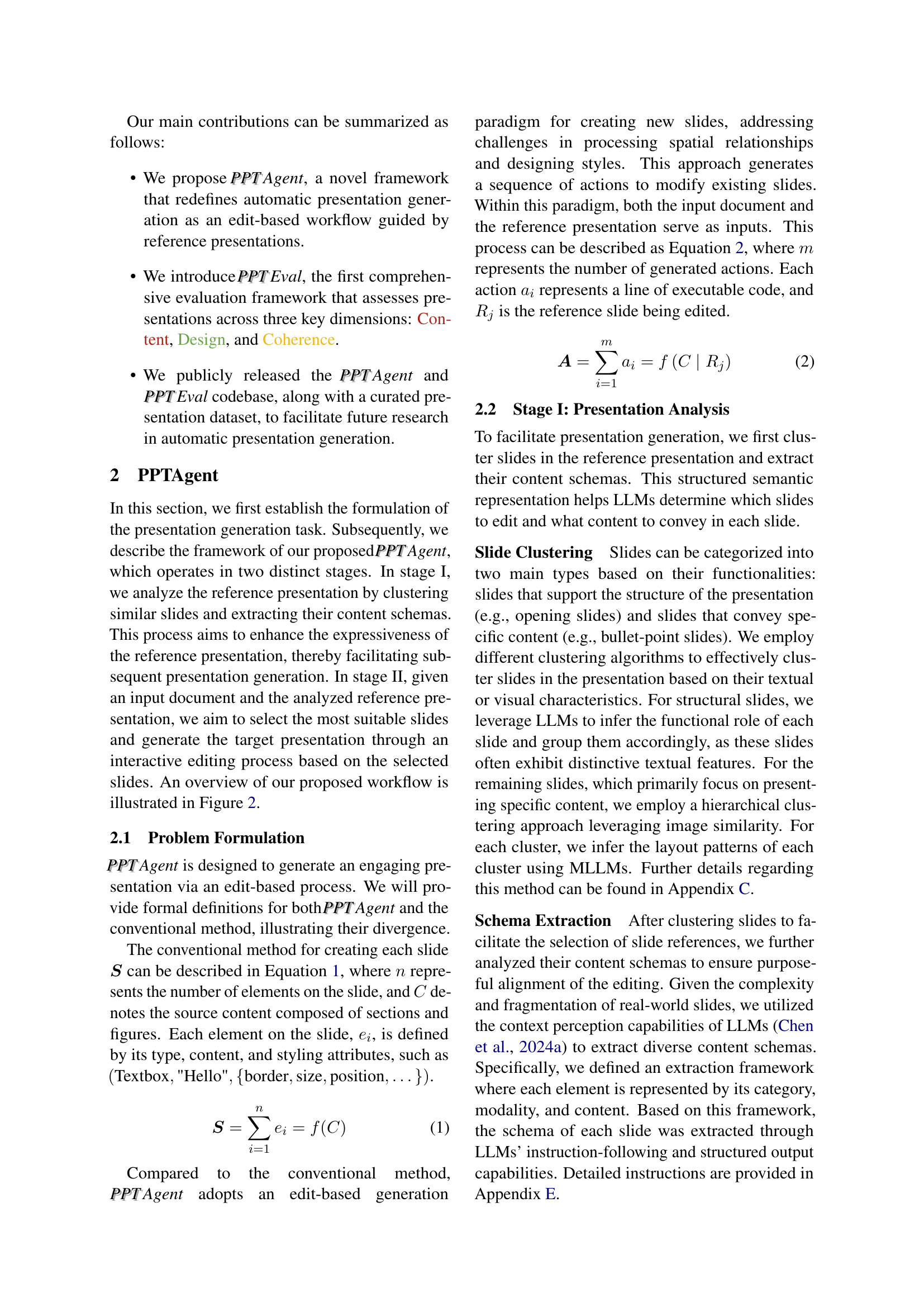
Generating high-quality presentations automatically is challenging because existing methods often neglect visual design and structural coherence. This limits their practical use and effective evaluation is difficult due to complex data formats and the absence of comprehensive evaluation frameworks.
To address these issues, the paper introduces PPTAgent, a two-stage edit-based approach mimicking human workflows. PPTAgent first analyzes reference presentations to understand structural patterns, then drafts outlines and generates slides through code actions. The paper also introduces PPT Eval, a multidimensional evaluation framework assessing content, design, and coherence. Experiments demonstrate that PPTAgent significantly outperforms existing methods across all three dimensions.
Key Takeaways#
Why does it matter?#
This paper is crucial for researchers in AI and presentation generation due to its introduction of PPTAgent, a novel framework that significantly improves automatic presentation generation, and PPT Eval, the first comprehensive evaluation framework that assesses presentations across content, design, and coherence. It also provides open-source code and data, facilitating future research and development in the field.
Visual Insights#

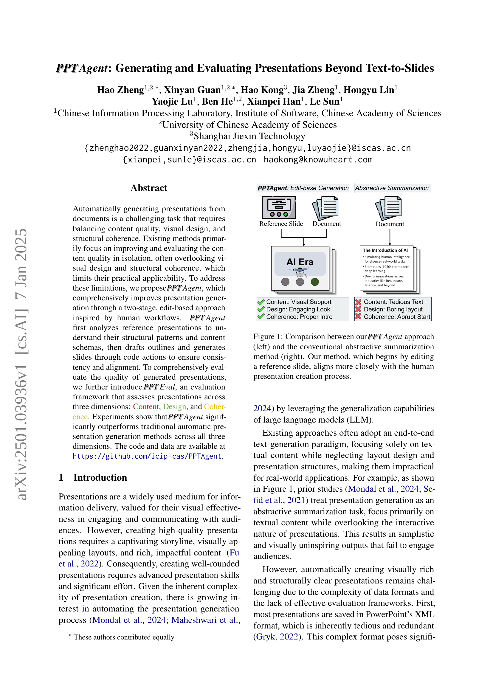
🔼 Figure 1 illustrates the difference between the proposed PPTAgent method and traditional abstractive summarization techniques in presentation generation. The left side shows PPTAgent’s approach, which starts by using an existing presentation slide as a template and making edits. This approach is closer to how humans create presentations, involving iterative refinement. The right side depicts the conventional method, which generates a presentation directly from text, often leading to less engaging visual results and a poor structural coherence. The figure highlights that PPTAgent’s edit-based approach better accounts for visual design and structural coherence.
read the caption
Figure 1: Comparison between our PPTPPTAgent approach (left) and the conventional abstractive summarization method (right). Our method, which begins by editing a reference slide, aligns more closely with the human presentation creation process.
| Domain | Document #Chars | Document #Figs | Presentation #Chars | Presentation #Figs | Presentation #Pages |
|---|---|---|---|---|---|
| Culture | 12,708 | 2.9 | 6,585 | 12.8 | 14.3 |
| Education | 12,305 | 5.5 | 3,993 | 12.9 | 13.9 |
| Science | 16,661 | 4.8 | 5,334 | 24.0 | 18.4 |
| Society | 13,019 | 7.3 | 3,723 | 9.8 | 12.9 |
| Tech | 18,315 | 11.4 | 5,325 | 12.9 | 16.8 |
🔼 This table presents a statistical overview of the Zenodo10K dataset used in the paper’s experiments. It provides details on the number of characters, figures, and pages in the presentations and documents included in the dataset, categorized by domain (Culture, Education, Science, Society, Tech). This information is crucial for understanding the scale and characteristics of the data used to train and evaluate the proposed PPTAgent model.
read the caption
Table 1: Statistics of the dataset used in our experiments, detailing the number of characters (‘#Chars’) and figures (‘#Figs’), as well as the number of pages (‘#Pages’).
In-depth insights#
Edit-Based Gen#
The concept of “Edit-Based Gen” in the context of automated presentation generation offers a compelling alternative to traditional end-to-end methods. Instead of generating slides from scratch, an edit-based approach leverages existing reference presentations as templates. This is significant because it addresses the inherent complexity of PowerPoint’s XML format, which is often cumbersome for direct generation. By focusing on iterative edits, the model can progressively refine a slide, mimicking human workflows. This method is likely to result in more visually appealing and structurally coherent presentations. The reliance on reference slides allows the model to leverage existing successful design choices, reducing the risk of generating slides with poor visual layouts or illogical flow. However, the effectiveness of this approach hinges on having a sufficient and diverse dataset of high-quality reference presentations for the model to learn from. Furthermore, the evaluation process needs careful consideration, potentially requiring metrics that go beyond traditional measures of content similarity and account for visual design and structural coherence. Therefore, future research should explore the scalability and robustness of this approach with diverse datasets and evaluate using comprehensive metrics tailored to presentation quality.
LLM-driven PPT#
The concept of “LLM-driven PPT” evokes a powerful image of AI-powered presentation generation. It suggests a paradigm shift from laborious manual creation to an automated process where large language models (LLMs) take center stage. An LLM could analyze a research paper or other input document, extract key information, and generate slides, incorporating visuals and narrative flow. Key challenges include ensuring accurate information extraction, maintaining coherent structure, and designing visually appealing slides that align with presentation best practices. Successful implementation would require sophisticated algorithms to handle complex layouts and visual elements. The output quality would depend on the LLM’s capabilities and training data. Ethical considerations arise regarding potential biases in generated content and the impact on human creativity and presentation skills. However, the potential for enhanced productivity and accessibility is immense, particularly for researchers and professionals who need to create presentations frequently.
PPT Eval Metrics#
The effectiveness of automatically generated presentations hinges on a robust evaluation framework. A hypothetical ‘PPT Eval Metrics’ section would delve into the specifics of such a framework, likely encompassing several key dimensions to holistically assess presentation quality. Content would measure accuracy, clarity, and completeness of information. Design would evaluate visual aesthetics, including layout, color schemes, and use of imagery. Coherence would assess the logical flow, narrative structure, and overall consistency of the presentation. These metrics would likely be operationalized through a combination of automated techniques (e.g., analyzing text clarity and image quality) and human evaluation (e.g., assessing engagement and overall impact). The choice of metrics would reflect the priorities of the research, potentially weighting specific criteria more heavily based on relevance to the generated content. Furthermore, the framework would ideally offer detailed, granular feedback on each dimension, allowing for iterative improvements in presentation generation. Establishing inter-rater reliability among human evaluators would also be crucial to ensure the consistency and validity of the results. The final output would likely include numerical scores for each dimension, along with qualitative insights to provide a comprehensive understanding of the presentation’s strengths and weaknesses.
Future Enhancements#
The research paper’s “Future Enhancements” section would ideally delve into several crucial areas. Improving the handling of complex slide layouts is paramount; the current method struggles with intricate nested shapes, impacting overall consistency. Enhancing visual harmony and stylistic consistency is another key area; while the system shows improvement, issues like overlapping elements remain. A potential solution is to integrate visual information more deeply into the generation process, perhaps by leveraging advanced image processing techniques to analyze and interpret visual cues more effectively. Expanding the evaluation framework is also vital; the current PPTEval, while innovative, could benefit from incorporating more nuanced metrics and perhaps exploring inter-annotator agreement analysis to gauge reliability. Finally, the study should address the scalability and efficiency of the system by exploring optimizations for processing large documents and handling more diverse presentation styles and formats. Addressing these issues would pave the way for more robust and versatile automatic presentation generation tools.
Ethical Dataset#
Creating an ethical dataset is paramount for research integrity. Data sourcing must be transparent, with clear attribution and acknowledgment of sources. Consent is crucial; if the dataset involves personal information, explicit informed consent from individuals must be obtained. Anonymization techniques should be employed to protect privacy and prevent re-identification. Data biases must be carefully addressed, documented, and mitigated to prevent perpetuating societal inequalities. Data security is also crucial; the dataset should be protected from unauthorized access and use. Finally, responsible data governance ensures that usage adheres to ethical guidelines and the dataset’s intended purpose, preventing misuse and promoting equitable access. A well-documented ethical framework is necessary for transparency and accountability.
More visual insights#
More on figures

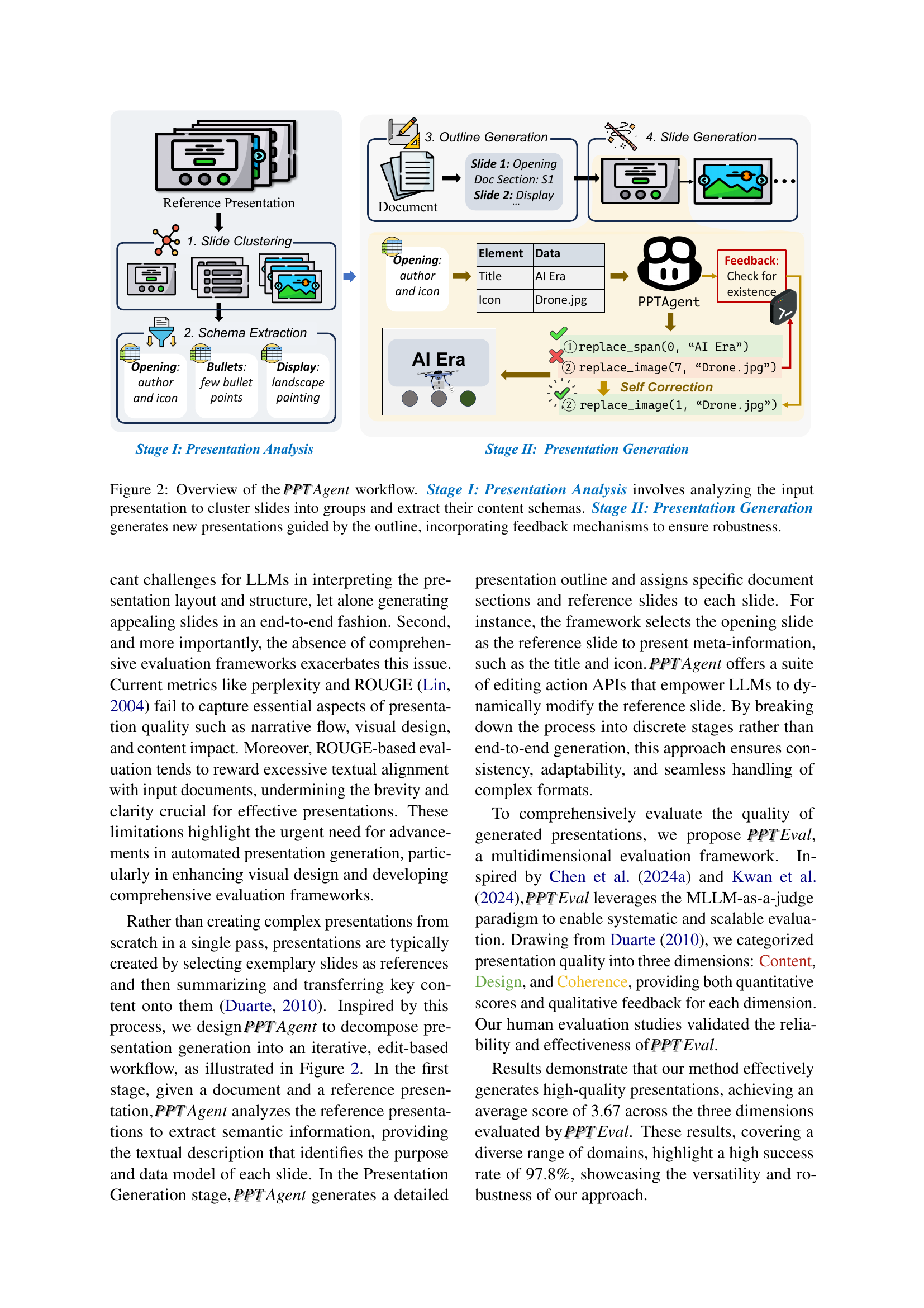
🔼 PPTAgent is a two-stage process. Stage I, Presentation Analysis, takes an input presentation and analyzes its slides. It groups similar slides together and extracts the content schema from each group. Stage II, Presentation Generation, uses this information to generate a new presentation. It does this by first creating an outline, then generating slides based on this outline and the content schemas. A feedback mechanism is incorporated to enhance robustness.
read the caption
Figure 2: Overview of the PPTPPTAgent workflow. Stage I: Presentation Analysis involves analyzing the input presentation to cluster slides into groups and extract their content schemas. Stage II: Presentation Generation generates new presentations guided by the outline, incorporating feedback mechanisms to ensure robustness.

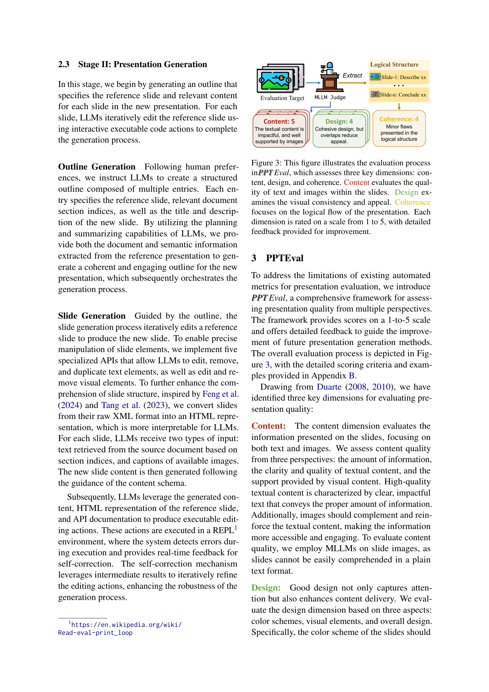
🔼 The figure illustrates the three-dimensional evaluation framework, PPT PPTEval, used to assess the quality of automatically generated presentations. It evaluates presentations across Content (quality of text and images), Design (visual consistency and appeal), and Coherence (logical flow). Each dimension is scored on a scale of 1 to 5, with detailed feedback provided to support improvement. The diagram shows the evaluation process, including an MLLM judge providing scores and feedback based on the three dimensions.
read the caption
Figure 3: This figure illustrates the evaluation process in PPTPPTEval, which assesses three key dimensions: content, design, and coherence. Content evaluates the quality of text and images within the slides. Design examines the visual consistency and appeal. Coherence focuses on the logical flow of the presentation. Each dimension is rated on a scale from 1 to 5, with detailed feedback provided for improvement.

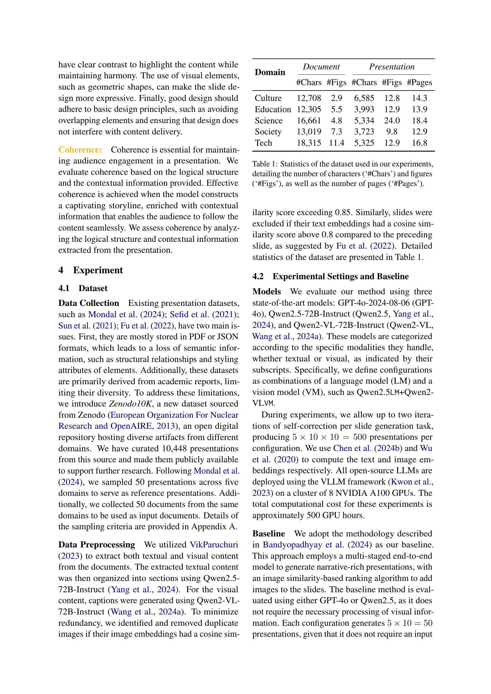
🔼 This figure displays the number of iterative self-correction steps needed to generate a single slide using three different large language models (LLMs): GPT-40, Qwen2.5, and Qwen2-VL. The x-axis represents the iteration number (0, 1, or 2), indicating the number of times the model’s output was refined through a self-correction mechanism. The y-axis shows the number of slides requiring a given number of iterations. Each bar represents a different model, showing how often each model successfully generated a slide within a specified number of iterations and how many times it failed (requiring more than two iterations). This visual comparison helps to assess the robustness and efficiency of each model’s self-correction process during slide generation.
read the caption
Figure 4: The number of iterative self-corrections required to generate a single slide under different models.

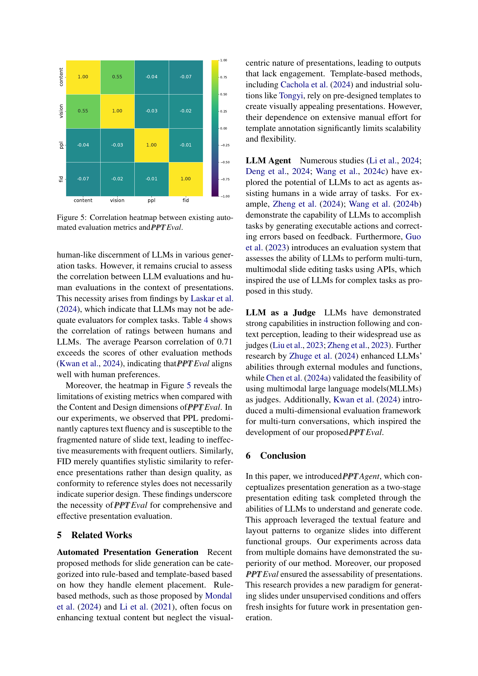
🔼 This heatmap visualizes the correlation coefficients between the scores of existing automated metrics (perplexity, Fréchet Inception Distance (FID), and human-like evaluation scores) and the three dimensions of the newly proposed PPT Eval metric (Content, Design, and Coherence) for evaluating presentation quality. Each cell’s color intensity represents the strength and direction of the correlation; darker shades of red indicate strong positive correlations, while darker shades of blue indicate strong negative correlations. The figure helps to assess how well established automated metrics align with the more nuanced human judgment captured by the PPT Eval framework.
read the caption
Figure 5: Correlation heatmap between existing automated evaluation metrics and PPTPPTEval.

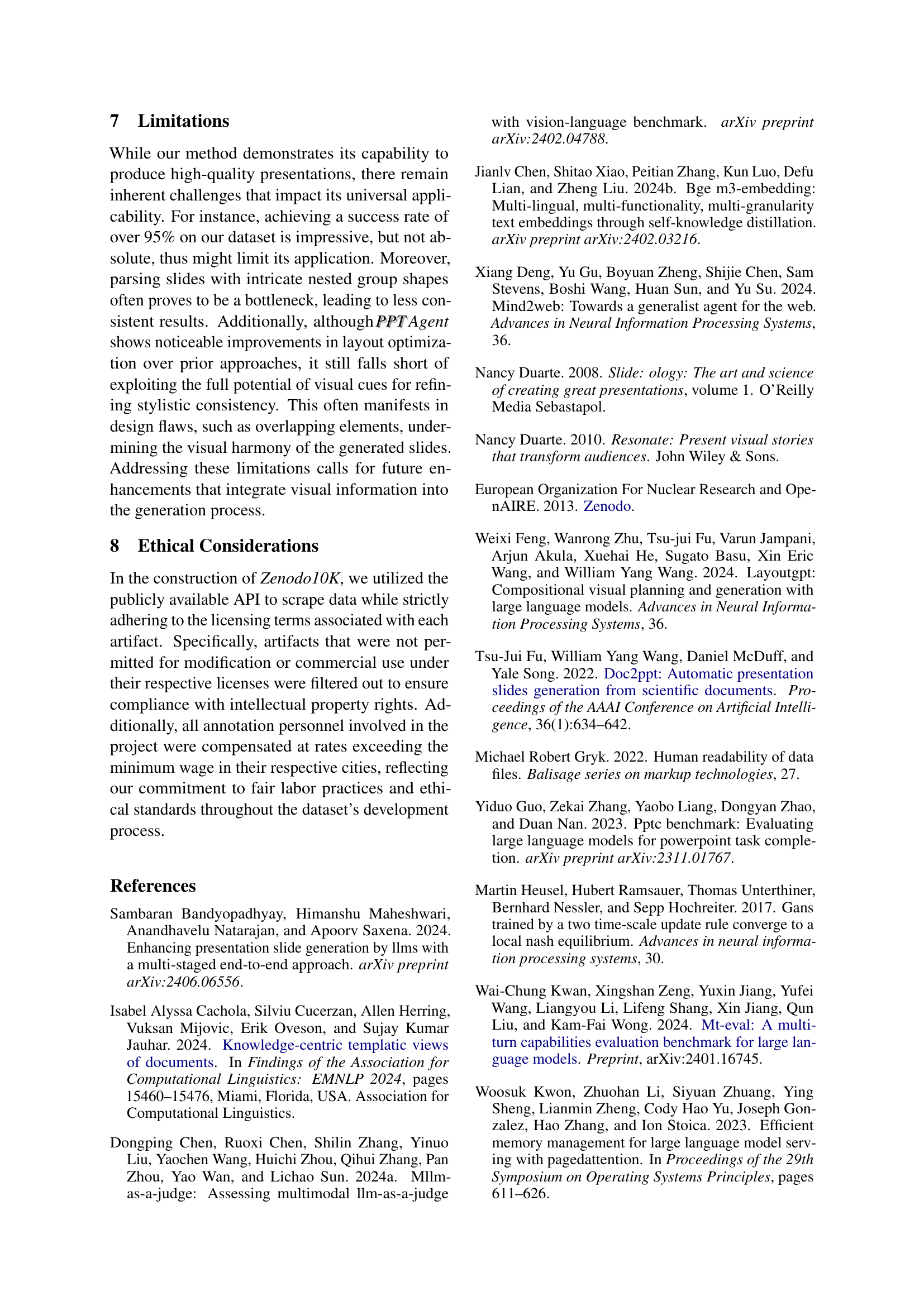
🔼 Figure 6 shows example scores and justifications from human evaluators using the PPTEval framework. Each example demonstrates how different aspects of a presentation (content, design) are assessed and scored on a 1-5 scale. The examples highlight the criteria used in judging content quality (impact, clarity, image support), visual design (color harmony, visual elements), and overall coherence (logical flow, contextual information). The variety of scores and justifications illustrate the nuanced evaluation capabilities of PPTEval.
read the caption
Figure 6: Scoring Examples of PPTPPTEval.

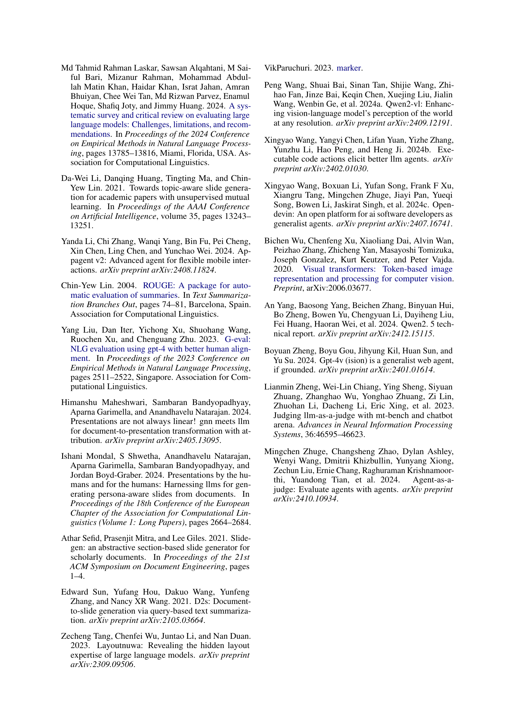
🔼 This figure shows examples of different slide clusters generated by the PPTAgent’s slide clustering algorithm. Each cluster represents a group of slides with similar functionalities or visual characteristics. The clustering helps the PPTAgent to understand the structure and content patterns of the reference presentation, facilitating the generation of a new presentation that is more coherent and visually consistent.
read the caption
Figure 7: Example of slide clusters.

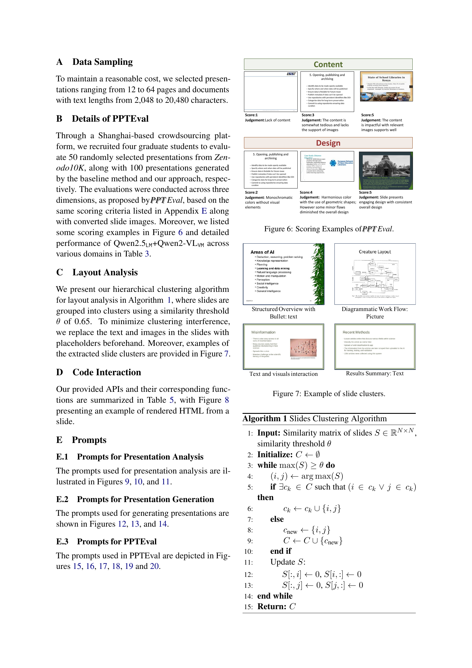
🔼 This figure shows an example of how a PowerPoint slide is converted into an HTML format. This conversion is a crucial step in the PPTAgent workflow, as it allows Large Language Models (LLMs) to more easily process and interpret the slide’s structure and content for editing and generation purposes. The HTML representation provides a structured, text-based view of the slide’s elements, making it easier for the LLMs to understand and manipulate the content using their coding abilities. This is in contrast to directly working with the complex XML format of PowerPoint files.
read the caption
Figure 8: Example of rendering a slide into HTML format.

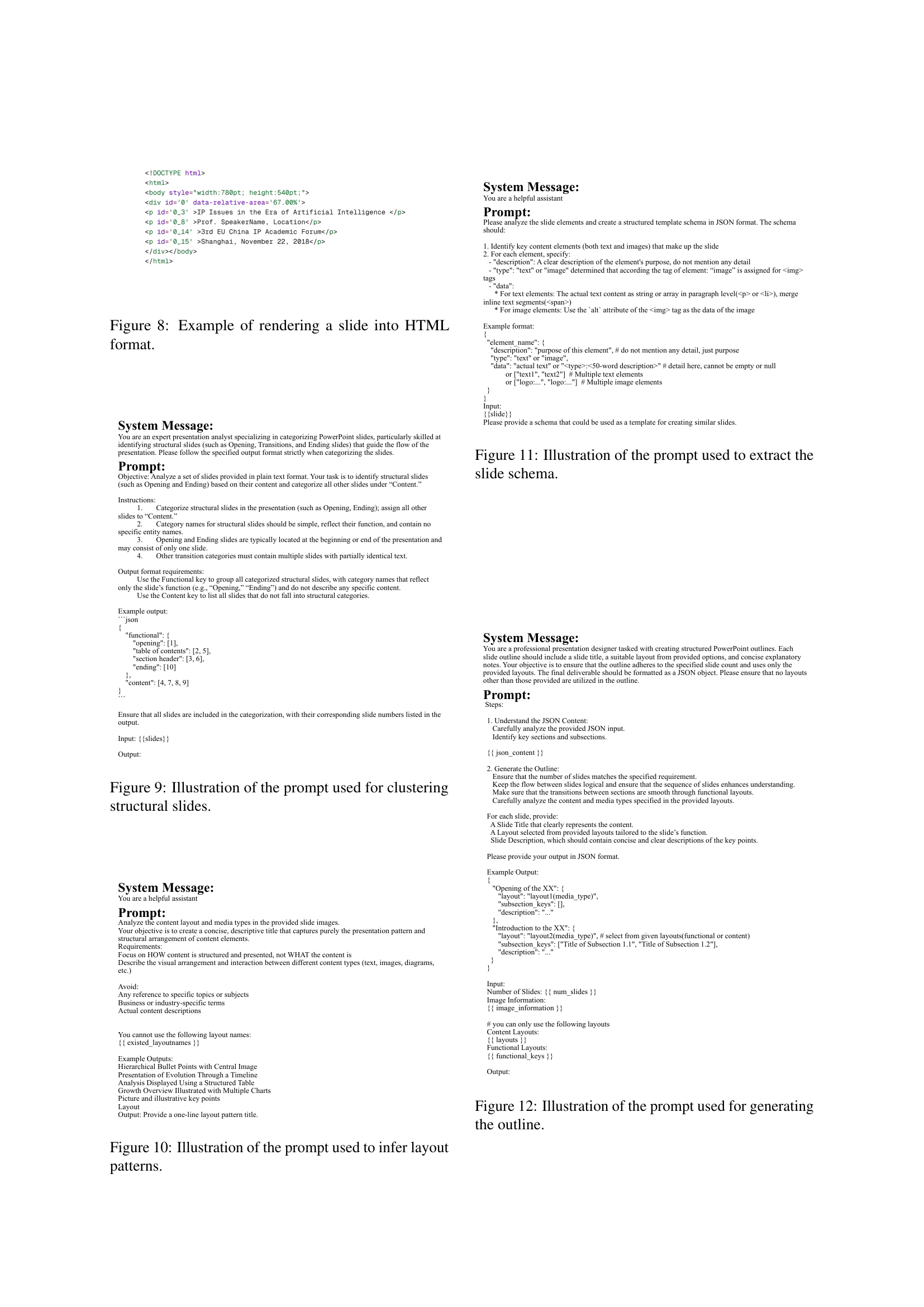
🔼 This figure shows the prompt used in the PPTAgent framework to instruct a Large Language Model (LLM) to identify and categorize structural slides within a presentation. Structural slides are those which define the overall presentation structure, such as opening slides, table of contents, section headers, and closing slides. The prompt guides the LLM to differentiate these structural slides from content slides based on their function and to provide a JSON output categorizing each slide appropriately. This step is crucial in the first stage of PPTAgent, where the LLM analyzes the reference presentation to understand its structure before generating a new presentation.
read the caption
Figure 9: Illustration of the prompt used for clustering structural slides.

🔼 This figure shows the prompt used in the PPTAgent framework for layout analysis. The prompt instructs a language model to analyze the content layout and media types within provided slide images. The goal is to generate a concise title that describes the presentation pattern and structural arrangement of content elements without referencing specific topics or content. The prompt emphasizes focusing on how content is structured and presented, not what the content is, and provides examples of appropriate output.
read the caption
Figure 10: Illustration of the prompt used to infer layout patterns.
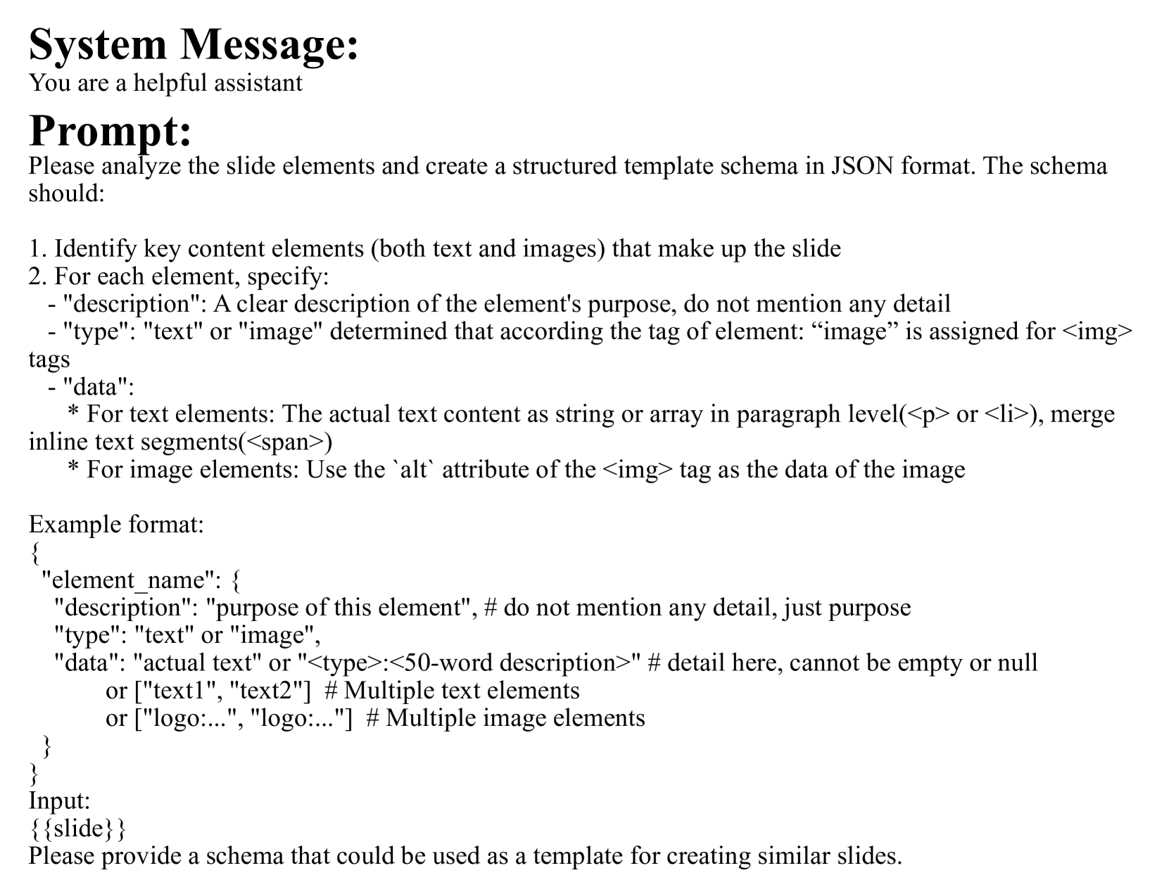
🔼 This figure shows the prompt used in the PPTAgent framework to extract the slide schema. The prompt instructs the model to analyze the slide elements and generate a structured JSON schema that identifies key content elements (text and images), their purpose, and the actual text or image data. This schema is crucial for the next stage of presentation generation where the model will use this information to create new slides.
read the caption
Figure 11: Illustration of the prompt used to extract the slide schema.

🔼 This figure shows the prompt used in the PPTAgent framework to generate the presentation outline. The prompt instructs the LLM to create a structured outline containing multiple entries, each specifying a reference slide, relevant document sections, a slide title, and a description. The LLM uses planning and summarizing capabilities, along with input from both the document and semantic information extracted from the reference presentation, to ensure a coherent and engaging outline for the new presentation. This outline then guides the subsequent slide generation process.
read the caption
Figure 12: Illustration of the prompt used for generating the outline.

🔼 This figure shows the prompt used to instruct a large language model (LLM) to generate slide content. The prompt details the requirements and rules the LLM must follow. These include using concise and impactful presentation styles, deriving content only from provided reference text and image information, following default quantities for elements, and ensuring that generated text meets character limits. The LLM is also instructed on extracting key content from reference text, including supporting images. Additionally, the prompt specifies how to handle generating supporting elements (e.g., presenter and logo information) and outputting the final content in a structured JSON format.
read the caption
Figure 13: Illustration of the prompt used for generating slide content.

🔼 This figure shows the prompt used to instruct a large language model (LLM) on how to generate a sequence of API calls to edit slides. The prompt details the rules for quantity adjustment (adding or removing content using cloning or deletion), content replacement (modifying text or images), and output formatting (including comments explaining actions and handling of specific elements like paragraphs and images). The LLM uses these rules to transform a set of commands into executable code for slide editing.
read the caption
Figure 14: Illustration of the prompt used for generating editing actions.

🔼 This figure shows the prompt used in the PPTEval framework to evaluate the content quality of a presentation slide. The prompt instructs the evaluator to assess the slide based on three criteria: (1) amount of information (whether the slide provides too little or too much information); (2) content clarity and language quality (checking for grammatical errors, unclear expressions, and overall organization); and (3) image relevance (evaluating the presence and appropriateness of images in relation to the slide’s content). The evaluator is asked to provide an objective, concise description and a score (on a five-point scale) for each criterion.
read the caption
Figure 15: Illustration of the prompt used to describe content in PPTEval.

🔼 This figure shows the prompt used in the PPTEval framework to evaluate the style of a presentation slide. The prompt instructs the evaluator to assess three aspects of the slide’s style: visual consistency (checking for readability issues like overlapping elements or low contrast), color scheme (determining if it’s monochromatic or colorful), and the use of visual elements (such as icons, images, or geometric shapes). A five-point scoring rubric is provided to guide the evaluation, ensuring objective and consistent assessment of the slide’s visual appeal.
read the caption
Figure 16: Illustration of the prompt used to describe style in PPTEval.

🔼 This figure shows the detailed instructions given to the large language model (LLM) for extracting content information from a presentation during the evaluation phase of PPT-Eval. The prompt instructs the LLM to summarize the content of each slide and extract presentation metadata (such as the speaker, date, etc.) from the opening and closing slides. The expected output is a JSON object containing the summarized content for each slide and a ‘background’ field for the extracted metadata.
read the caption
Figure 17: Illustration of the prompt used to extract content in PPTEval.

🔼 This figure shows the prompt used in the PPTEval framework to evaluate the content quality of a presentation slide. The prompt provides detailed scoring criteria on a five-point scale, with specific descriptions for each level (1-point to 5-points). It guides the evaluator to assess aspects like grammatical errors, clarity of text, structure of content, and the relevance of any images to the overall message. The goal is to obtain an objective and concise evaluation focusing exclusively on the specified dimensions.
read the caption
Figure 18: Illustration of the prompt used to evaluate content in PPTEval.

🔼 This figure shows the prompt used in the PPTEval framework to assess the style of a presentation slide. The prompt instructs the evaluator to judge the slide’s visual appeal based on three aspects: visual consistency (absence of readability issues like border overflow or low contrast), color scheme (monochromatic or colorful), and use of visual elements (icons, backgrounds, images, or geometric shapes). A five-point scoring system is provided, with detailed descriptions of what constitutes each score level. The goal is to provide a structured and consistent evaluation of the presentation’s visual design.
read the caption
Figure 19: Illustration of the prompt used to evaluate style in PPTEval.

🔼 This figure displays the prompt used within the PPTEval framework to assess the coherence of a presentation. The prompt instructs the evaluator to consider the logical flow and contextual information of the presentation, assigning a score based on five levels of quality: Poor, Fair, Average, Good, and Excellent. Each score level has specific criteria that must be met for that rating to be assigned. The prompt aims to ensure a consistent and fair evaluation of the presentation’s narrative structure and organization.
read the caption
Figure 20: Illustration of the prompt used to evaluate coherence in PPTEval.
More on tables
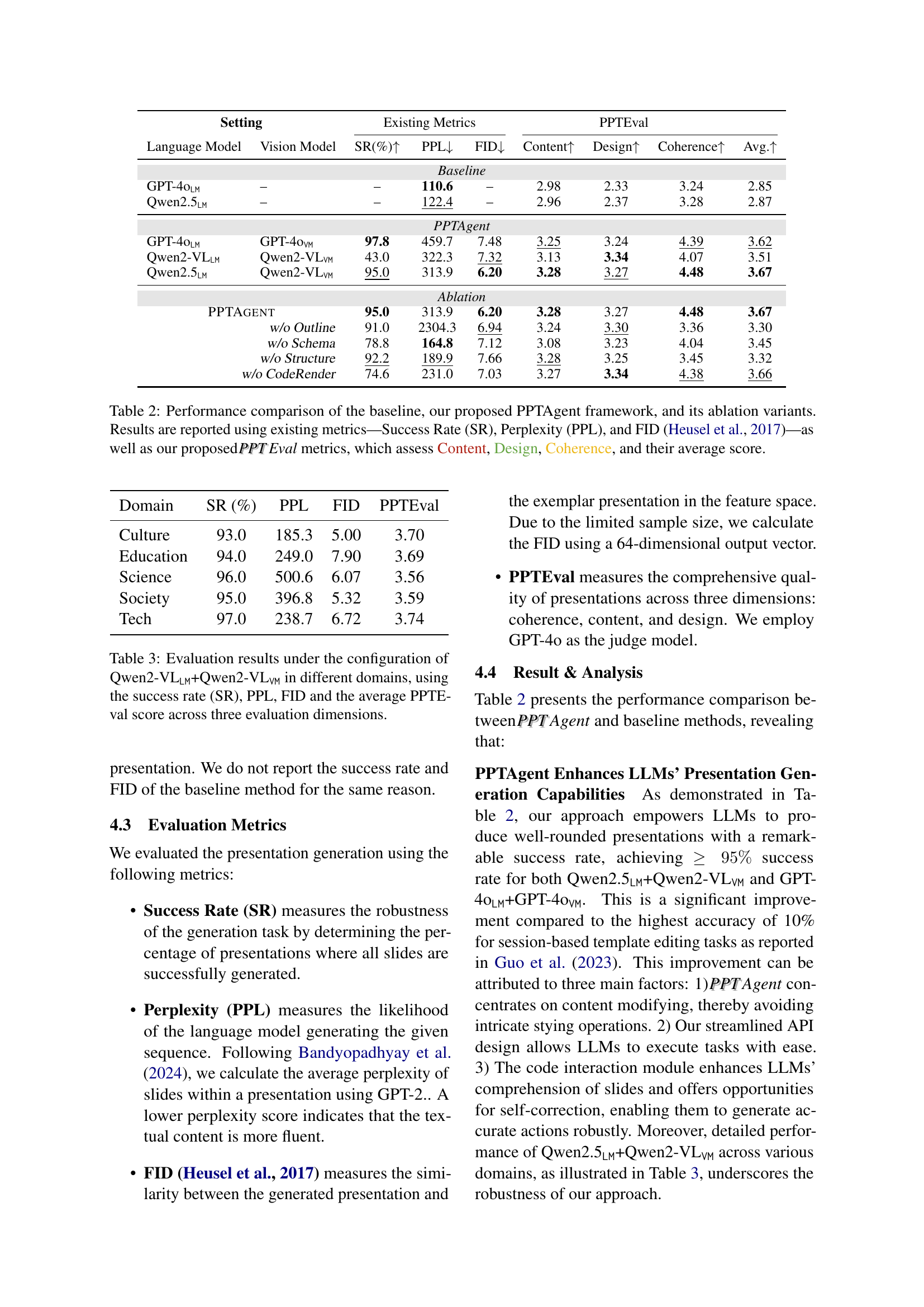
| Setting | Existing Metrics | PPTEval | ||||
|---|---|---|---|---|---|---|
| Language Model | Vision Model | SR(%) ↑ | PPL ↓ | FID ↓ | Content ↑ | Design ↑ |
| — | — | — | — | — | — | — |
| Baseline | ||||||
| GPT-4oLM | – | – | 110.6 | – | 2.98 | 2.33 |
| Qwen2.5LM | – | – | 122.4 | – | 2.96 | 2.37 |
| PPTAgent | ||||||
| GPT-4oLM | GPT-4oVM | 97.8 | 459.7 | 7.48 | 3.25 | 3.24 |
| Qwen2-VLLM | Qwen2-VLVM | 43.0 | 322.3 | 7.32 | 3.13 | 3.34 |
| Qwen2.5LM | Qwen2-VLVM | 95.0 | 313.9 | 6.20 | 3.28 | 3.27 |
| Ablation | ||||||
| PPTAgent | 95.0 | 313.9 | 6.20 | 3.28 | 3.27 | |
| w/o Outline | 91.0 | 2304.3 | 6.94 | 3.24 | 3.30 | |
| w/o Schema | 78.8 | 164.8 | 7.12 | 3.08 | 3.23 | |
| w/o Structure | 92.2 | 189.9 | 7.66 | 3.28 | 3.25 | |
| w/o CodeRender | 74.6 | 231.0 | 7.03 | 3.27 | 3.34 |
🔼 This table presents a comprehensive comparison of different presentation generation methods. It contrasts a baseline approach with the proposed PPTAgent framework and several ablation variants of PPTAgent. Performance is evaluated using established metrics like Success Rate (SR), Perplexity (PPL), and Fréchet Inception Distance (FID), alongside the newly introduced PPT Eval metrics which assess presentation quality across Content, Design, and Coherence. The average score across all metrics is also included, providing a holistic view of each method’s effectiveness.
read the caption
Table 2: Performance comparison of the baseline, our proposed PPTAgent framework, and its ablation variants. Results are reported using existing metrics—Success Rate (SR), Perplexity (PPL), and FID (Heusel et al., 2017)—as well as our proposed PPTPPTEval metrics, which assess Content, Design, Coherence, and their average score.
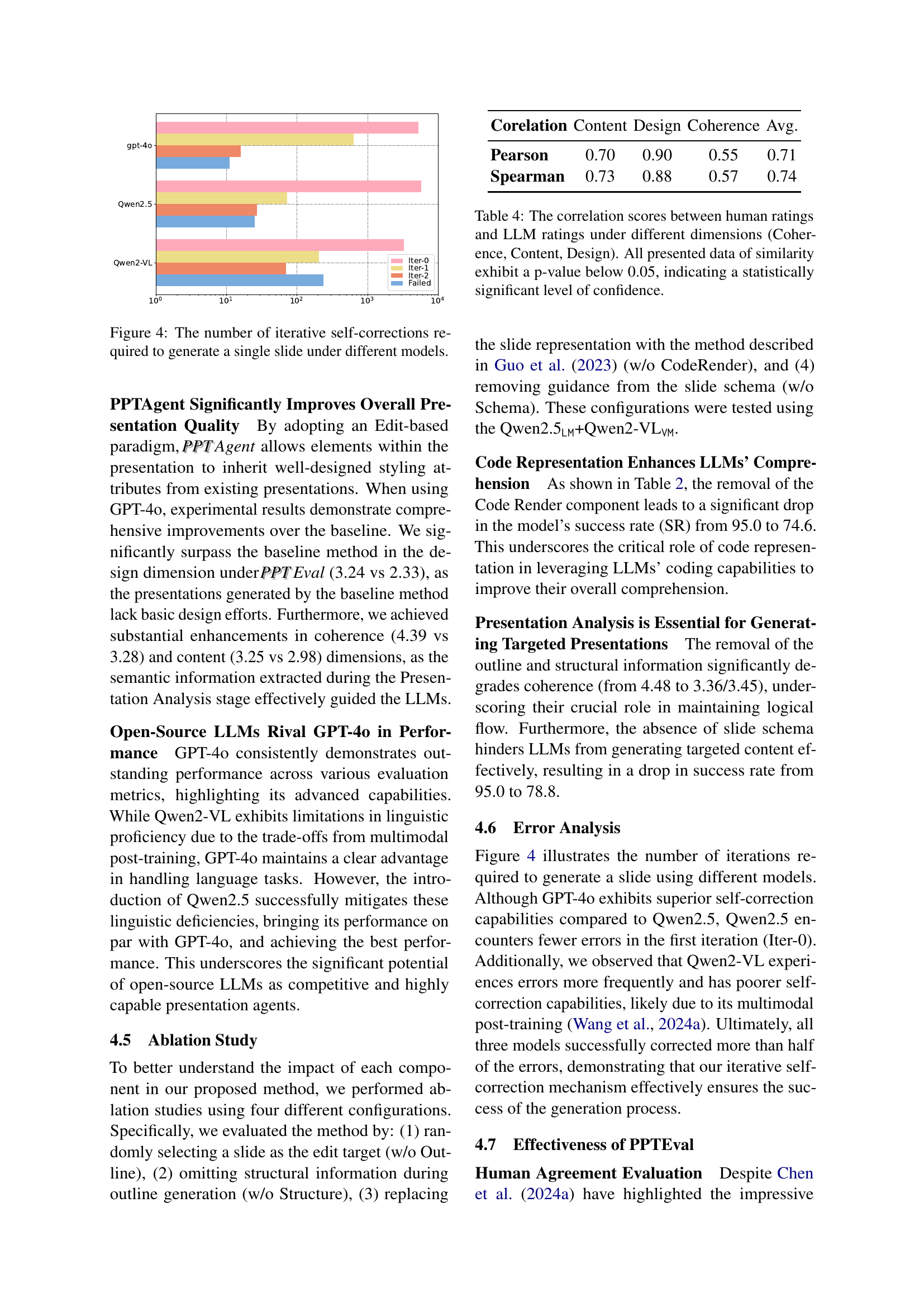
| Corelation | Content | Design | Coherence | Avg. |
|---|---|---|---|---|
| Pearson | 0.70 | 0.90 | 0.55 | 0.71 |
| Spearman | 0.73 | 0.88 | 0.57 | 0.74 |
🔼 Table 3 presents a performance evaluation of the PPTAgent model using the Qwen2-VLLM and Qwen2-VL configurations. It shows the success rate (SR), perplexity (PPL), Fréchet Inception Distance (FID), and average PPTEval score across content, design, and coherence dimensions for various domains (Culture, Education, Science, Society, Tech). This helps assess the model’s effectiveness in different contexts.
read the caption
Table 3: Evaluation results under the configuration of Qwen2-VLLMLM{}_{\texttt{LM}}start_FLOATSUBSCRIPT LM end_FLOATSUBSCRIPT+Qwen2-VLVMVM{}_{\texttt{VM}}start_FLOATSUBSCRIPT VM end_FLOATSUBSCRIPT in different domains, using the success rate (SR), PPL, FID and the average PPTEval score across three evaluation dimensions.
| Function Name | Description |
|---|---|
del_span | Deletes a specific span. |
del_image | Deletes an image element. |
clone_paragraph | Creates a duplicate of an existing paragraph. |
replace_span | Replaces the content of a specific span. |
replace_image | Replaces an image with a new image. |
🔼 This table presents the correlation analysis results between human evaluation scores and Large Language Model (LLM) scores across three dimensions: Content, Design, and Coherence. The correlation is measured using both Pearson and Spearman correlation coefficients. A p-value below 0.05 for all correlations indicates that the relationships between human and LLM judgments are statistically significant, suggesting a high degree of agreement between human raters and the LLM’s assessment of presentation quality.
read the caption
Table 4: The correlation scores between human ratings and LLM ratings under different dimensions (Coherence, Content, Design). All presented data of similarity exhibit a p-value below 0.05, indicating a statistically significant level of confidence.
Full paper#
