TL;DR#
The UCR and UEA archives have been instrumental in time series classification, yet their datasets are notably small. This favors models optimized for variance minimization, potentially hindering the discovery of solutions applicable to large-scale, real-world data. Current benchmarks may not fully represent the theoretical or practical challenges inherent in larger, more complex datasets.
To address this, MONSTER(Monash Scalable Time Series Evaluation Repository)—a collection of large univariate and multivariate datasets was created. The goal is to diversify the research landscape, encouraging methods suited for larger datasets and inspiring the exploration of learning from extensive data quantities. Preliminary baseline results for selected methods are also provided.
Key Takeaways#
Why does it matter?#
The study introduces MONSTER, a large time-series dataset, to push for scalability & broader model relevance. This tackles current benchmarks’ limitations and inspires impactful, real-world research.
Visual Insights#

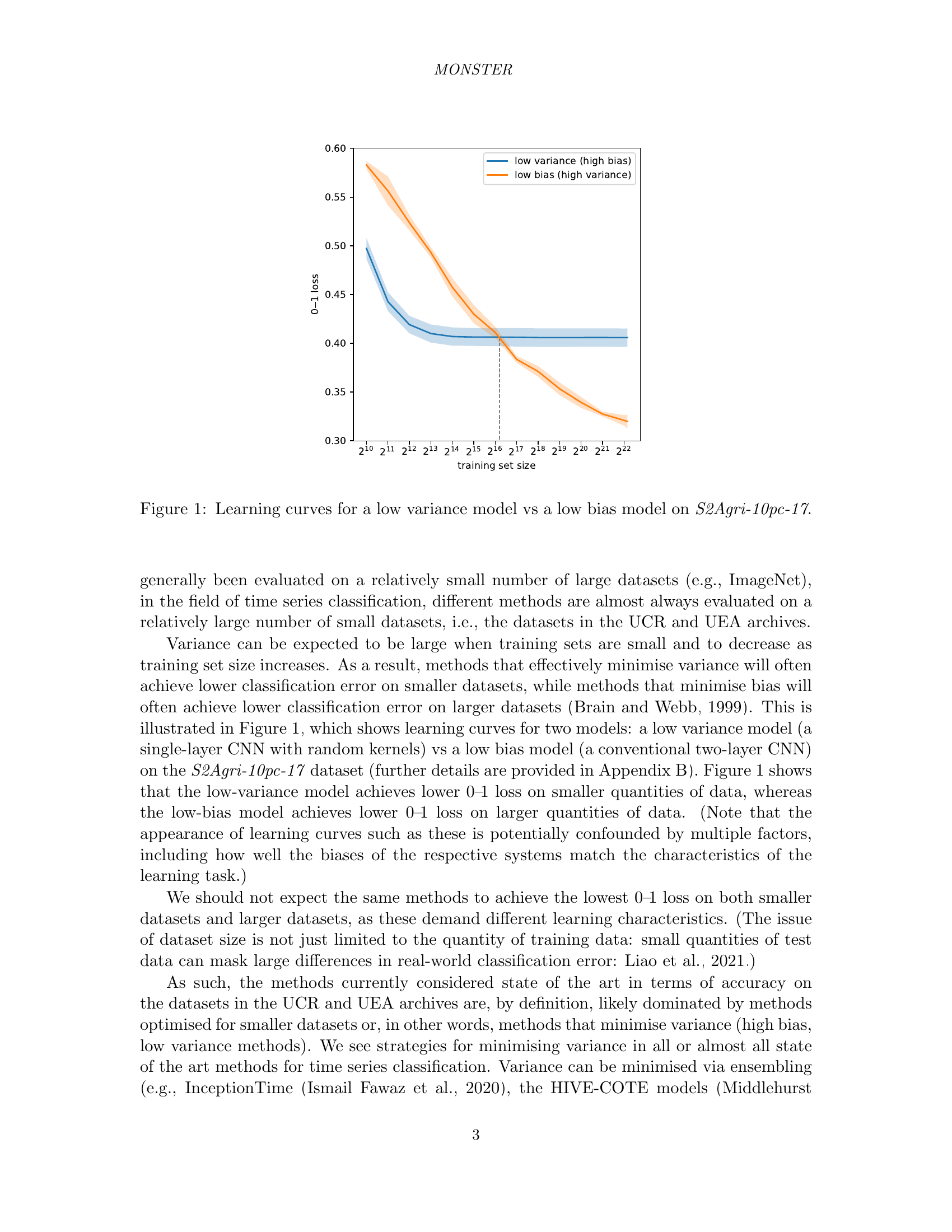
🔼 This figure compares the learning curves of two time series classification models trained on the S2Agri-10pc-17 dataset. The x-axis represents the size of the training dataset, and the y-axis represents the 0-1 loss (classification error rate). One model is a low-variance, high-bias model that minimizes variance and thus performs well on small datasets but generalizes poorly. The other model is a low-bias, high-variance model that prioritizes minimizing bias, performing better with larger datasets but having higher variance and thus lower performance with smaller datasets. The plot visually demonstrates the bias-variance tradeoff in machine learning, showing how model performance changes with increasing amounts of training data and the differing behaviors of high bias vs high variance models.
read the caption
Figure 1: Learning curves for a low variance model vs a low bias model on S2Agri-10pc-17.
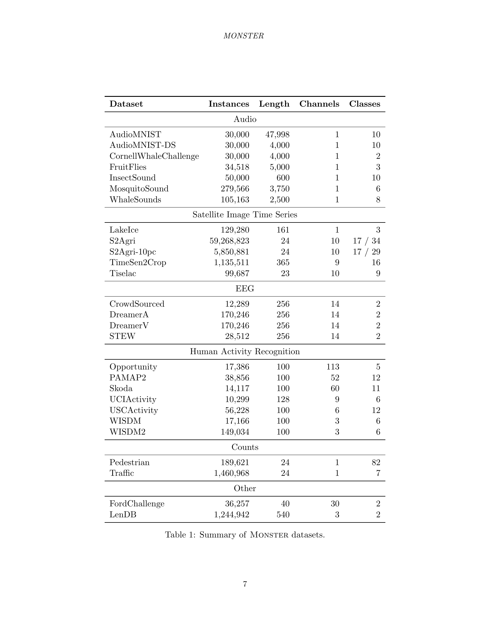
| Dataset | Instances | Length | Channels | Classes |
|---|---|---|---|---|
| Audio | ||||
| AudioMNIST | 30,000 | 47,998 | 1 | 10 |
| AudioMNIST-DS | 30,000 | 4,000 | 1 | 10 |
| CornellWhaleChallenge | 30,000 | 4,000 | 1 | 2 |
| FruitFlies | 34,518 | 5,000 | 1 | 3 |
| InsectSound | 50,000 | 600 | 1 | 10 |
| MosquitoSound | 279,566 | 3,750 | 1 | 6 |
| WhaleSounds | 105,163 | 2,500 | 1 | 8 |
| Satellite Image Time Series | ||||
| LakeIce | 129,280 | 161 | 1 | 3 |
| S2Agri | 59,268,823 | 24 | 10 | 17 / 34 |
| S2Agri-10pc | 5,850,881 | 24 | 10 | 17 / 29 |
| TimeSen2Crop | 1,135,511 | 365 | 9 | 16 |
| Tiselac | 99,687 | 23 | 10 | 9 |
| EEG | ||||
| CrowdSourced | 12,289 | 256 | 14 | 2 |
| DreamerA | 170,246 | 256 | 14 | 2 |
| DreamerV | 170,246 | 256 | 14 | 2 |
| STEW | 28,512 | 256 | 14 | 2 |
| Human Activity Recognition | ||||
| Opportunity | 17,386 | 100 | 113 | 5 |
| PAMAP2 | 38,856 | 100 | 52 | 12 |
| Skoda | 14,117 | 100 | 60 | 11 |
| UCIActivity | 10,299 | 128 | 9 | 6 |
| USCActivity | 56,228 | 100 | 6 | 12 |
| WISDM | 17,166 | 100 | 3 | 6 |
| WISDM2 | 149,034 | 100 | 3 | 6 |
| Counts | ||||
| Pedestrian | 189,621 | 24 | 1 | 82 |
| Traffic | 1,460,968 | 24 | 1 | 7 |
| Other | ||||
| FordChallenge | 36,257 | 40 | 30 | 2 |
| LenDB | 1,244,942 | 540 | 3 | 2 |
🔼 This table provides a comprehensive overview of the datasets included in the MONSTER benchmark. For each dataset, it lists the number of instances (time series), the length of each time series, the number of channels (univariate or multivariate), and the number of classes in the dataset. The datasets are categorized into groups such as Audio, Satellite Image Time Series, EEG, Human Activity Recognition, Counts, and Other, indicating the source or type of data.
read the caption
Table 1: Summary of Monster datasets.
In-depth insights#
Dataset Lottery#
The ‘dataset lottery’ concept highlights how the choice of datasets significantly shapes machine learning research directions. Certain benchmarks become foundational, influencing which models and algorithms are favored. This can lead to a narrow focus, where methods optimized for popular datasets may not generalize well to broader, real-world problems. The risk is that progress becomes ‘benchmark-driven’ rather than ‘problem-driven, potentially limiting exploration of alternative approaches better suited for diverse data characteristics. Recognizing this ’lottery’ effect is crucial for fostering a more robust and versatile field.
Bias Tradeoff#
The bias-variance tradeoff is a fundamental concept in machine learning. It states that models with high bias tend to underfit the data, while models with high variance tend to overfit the data. A good model strikes a balance, generalizing well to unseen data. High-bias models are simpler, making strong assumptions. Consequently, they might miss important patterns. High-variance models are complex, fitting noise in the training data. Finding the optimal point involves managing model complexity and data quantity. More data reduces variance, allowing for more complex models. Regularization reduces variance by penalizing complexity. The bias-variance tradeoff is crucial for benchmark design, as datasets should reflect real-world challenges, ensuring that models generalize well beyond the training data.
Scalable Data#
Scalable Data refers to datasets that can be expanded without compromising performance. This is crucial in time series analysis as real-world data often grows exponentially. A key challenge is developing models that remain accurate and efficient as data volume increases. This involves algorithms with low computational complexity and architectures that can leverage parallel processing. Furthermore, effective data management strategies, such as data summarization and feature selection, become essential for handling large-scale time series data. Addressing the scalability issue is not just about processing speed; it also encompasses memory management, storage requirements, and the ability to handle streaming data in real-time or near real-time. Scalable data drives innovation and is more useful than a small set of data.
Training time#
The paper dedicates a section to training time, a crucial aspect of evaluating machine learning models, especially with the new MONSTER dataset. It emphasizes the computational cost associated with various models across the 29 datasets. The analysis is separated for GPU and CPU methods, highlighting the efficiency differences. HYDRA demonstrates exceptional speed on GPUs, significantly faster than other GPU-based models. QUANT, while CPU-bound, offers a reasonable training time. The details provide insights into the trade-offs between accuracy and computational cost, especially for the MONSTER benchmark.
Hardware Bottleneck#
The ‘hardware lottery’ significantly impacts time series classification. Larger datasets favor methods computationally suited to current hardware. Methods with high computational or memory demands become impractical. This creates a selection pressure for efficiency, potentially overlooking theoretically superior but resource-intensive approaches. The field must balance algorithmic innovation with practical hardware limitations to achieve real-world scalability.
More visual insights#
More on figures

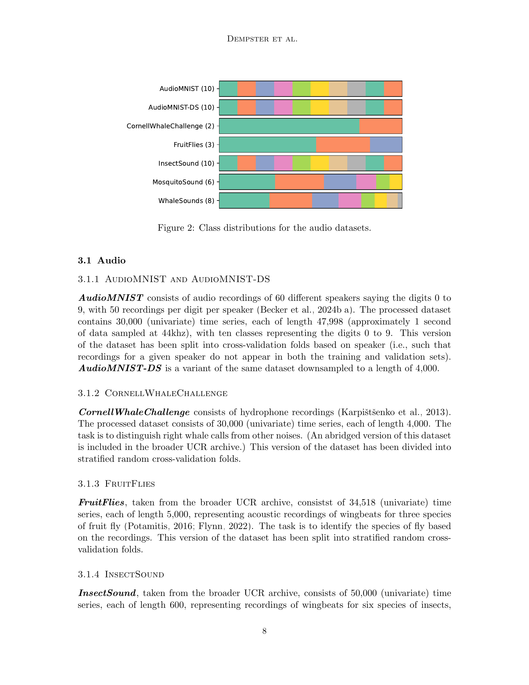
🔼 This figure shows the distribution of classes within each of the audio datasets used in the MONSTER benchmark. Each dataset is represented as a bar chart, with each bar corresponding to one of the classes in that dataset. The height of each bar is proportional to the number of instances belonging to that class. This visualization helps to understand the class imbalance in each of the datasets, showing whether certain classes are more heavily represented than others.
read the caption
Figure 2: Class distributions for the audio datasets.

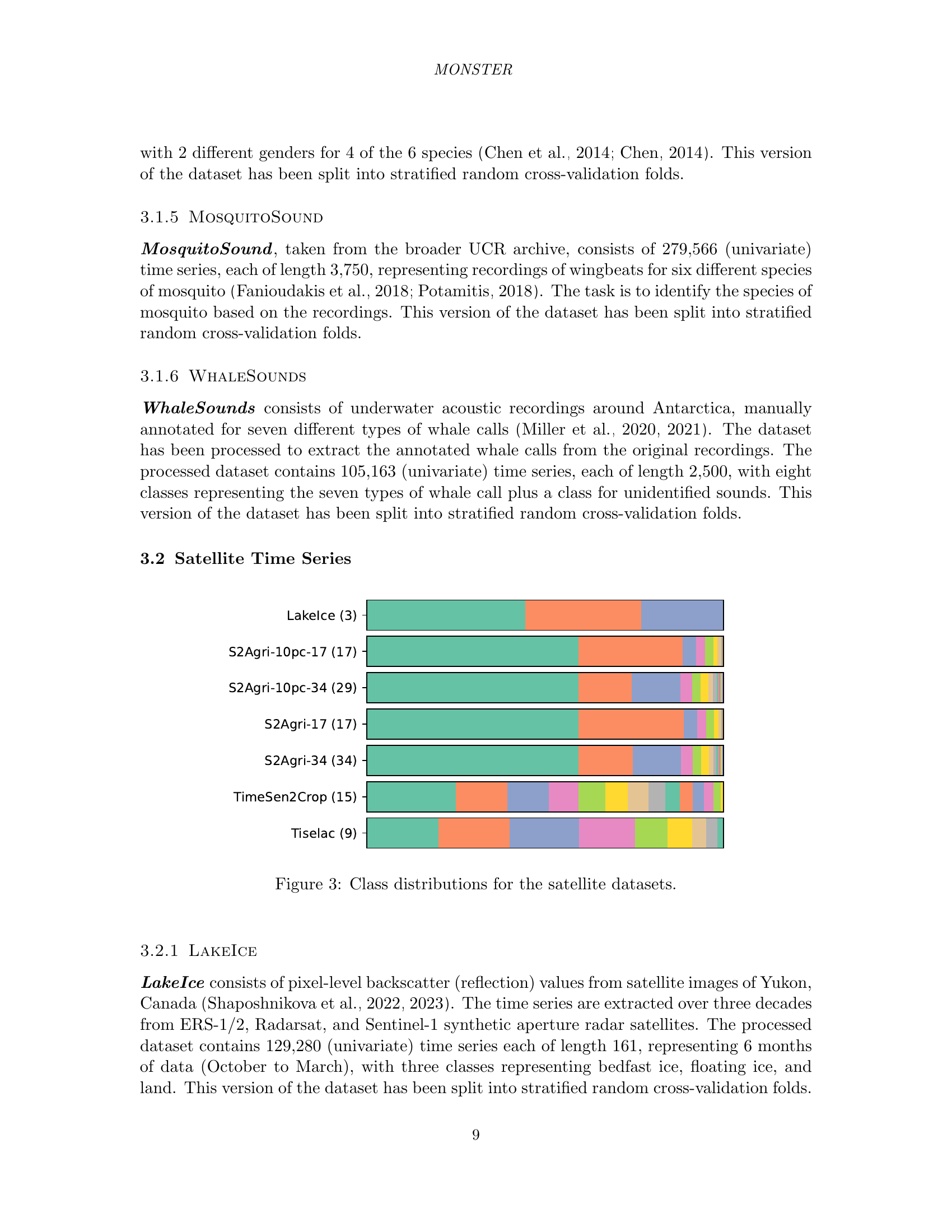
🔼 This figure shows the distribution of classes for each of the satellite-based datasets included in the MONSTER benchmark. Each bar represents a different dataset, and the segments within each bar represent the proportions of samples belonging to each class within that dataset. The class distributions vary significantly across datasets, highlighting the diversity of the benchmark.
read the caption
Figure 3: Class distributions for the satellite datasets.

🔼 This figure shows a map of France highlighting the specific Sentinel-2 tile used to create the S2Agri dataset. The S2Agri dataset is a land cover classification dataset, and the selection of this particular tile is important because it contains a diverse range of crop types and terrain conditions within its 12,100 square kilometer area, which allows for a robust and representative dataset for machine learning.
read the caption
Figure 4: Map of France showing the location of the Sentinel-2 tile used in the S2Agri dataset.

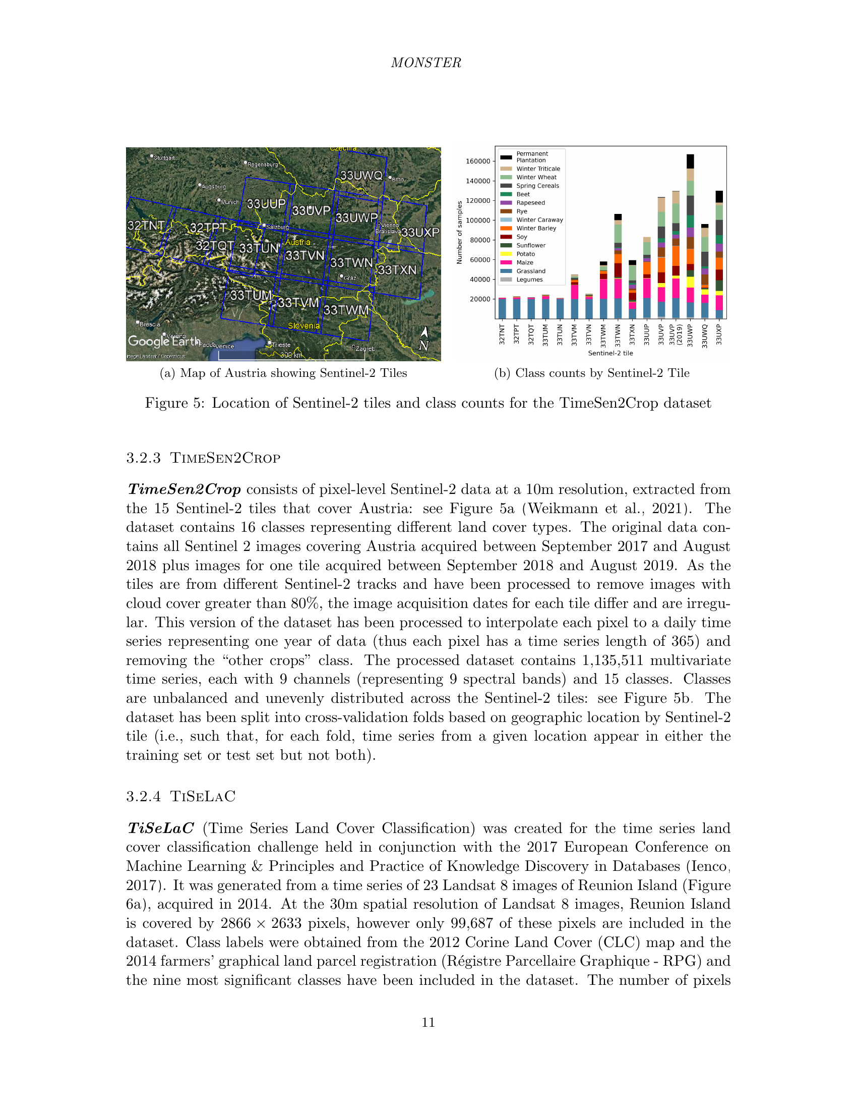
🔼 This figure shows a map of Austria highlighting the locations of the 15 Sentinel-2 tiles used in the TimeSen2Crop dataset. The map provides geographical context for the dataset, illustrating the spatial coverage and distribution of the data.
read the caption
(a) Map of Austria showing Sentinel-2 Tiles

🔼 This figure shows the distribution of land cover classes for each of the 15 Sentinel-2 tiles used in the TimeSen2Crop dataset. Each bar represents a different class, and the height of each bar indicates the number of pixels belonging to that class in a given tile. The figure helps visualize the class imbalance and spatial distribution of land cover across the tiles, providing insights into the characteristics of the dataset.
read the caption
(b) Class counts by Sentinel-2 Tile
🔼 This figure visualizes the spatial distribution of Sentinel-2 tiles across Austria and the class counts within each tile for the TimeSen2Crop dataset. Subfigure (a) shows a map of Austria highlighting the location of the 15 Sentinel-2 tiles used in the dataset. Subfigure (b) provides a bar chart illustrating the number of samples belonging to each of the 15 land cover classes present in each of those 15 tiles.
read the caption
Figure 5: Location of Sentinel-2 tiles and class counts for the TimeSen2Crop dataset
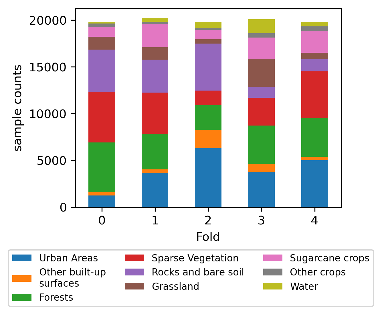
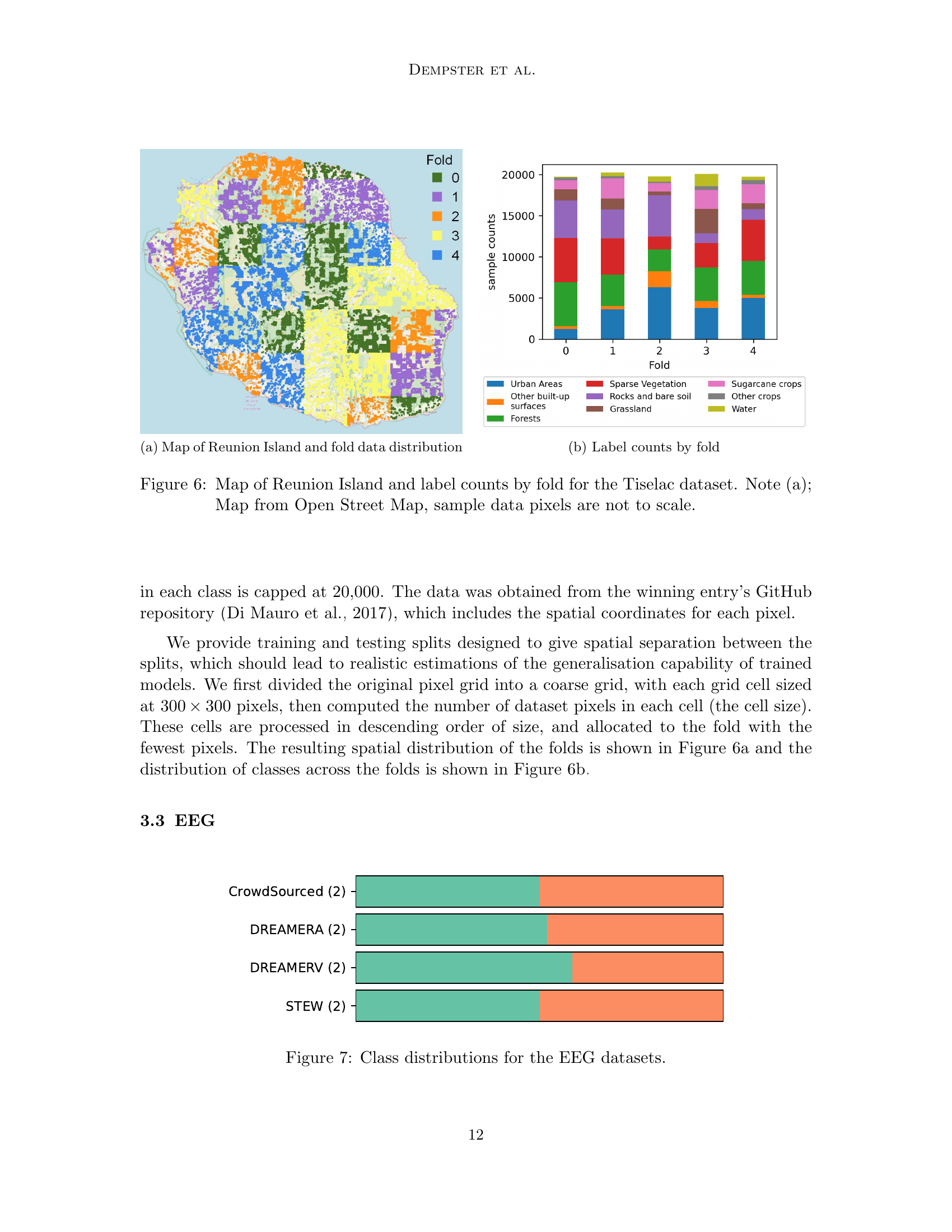
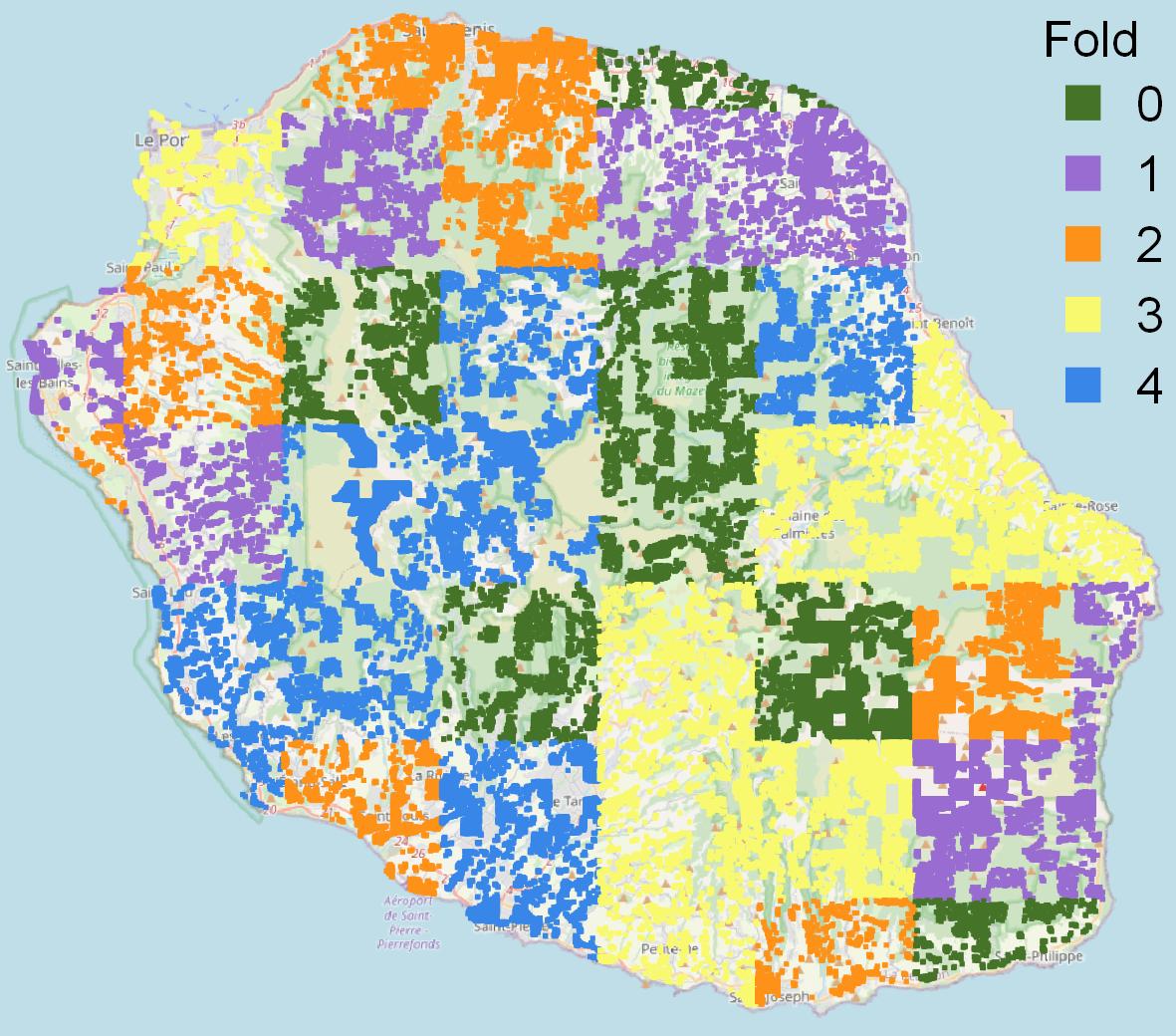
🔼 This figure shows a map of Reunion Island overlaid with colors representing the different cross-validation folds used in the TiSeLaC dataset. It visually demonstrates how the data is split geographically for evaluation purposes. This split ensures that the training and testing sets are spatially distinct, leading to more realistic estimations of the models’ generalisation capabilities.
read the caption
(a) Map of Reunion Island and fold data distribution

🔼 This figure shows the distribution of class labels across the five cross-validation folds created for the TiSeLaC dataset. The y-axis represents the number of samples, while the x-axis shows the fold number. Each color represents a different class label, allowing for a visual comparison of class balance across the folds. This is important for assessing the robustness and generalizability of machine learning models trained on this dataset.
read the caption
(b) Label counts by fold

🔼 Figure 6 is a visualization showing the spatial distribution of data points across different folds of the Tiselac dataset on Reunion Island. Subfigure (a) displays a map of Reunion Island from OpenStreetMap, where different colors represent different folds. Note that the sizes of the colored areas are not representative of the actual number of data points within those regions. Subfigure (b) shows a bar chart illustrating the class distribution for each fold, providing insights into the class balance within each fold of the dataset.
read the caption
Figure 6: Map of Reunion Island and label counts by fold for the Tiselac dataset. Note (a); Map from Open Street Map, sample data pixels are not to scale.

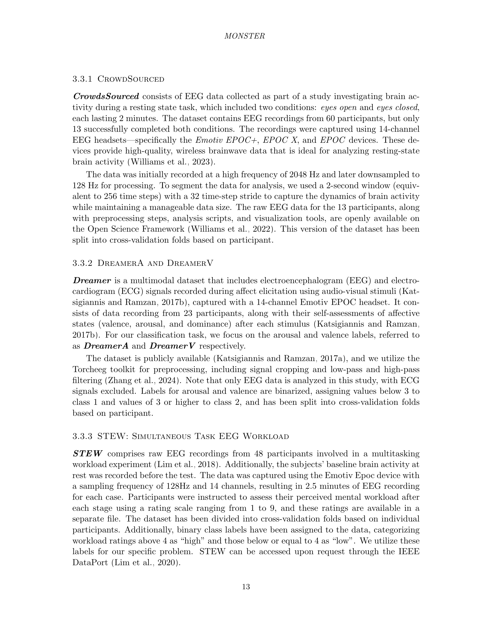
🔼 Figure 7 presents a visual representation of the class distributions for the four EEG datasets included in the MONSTER benchmark. Each dataset is depicted as a stacked bar chart, where the height of each segment corresponds to the number of instances belonging to a specific class. This visualization allows for easy comparison of class frequencies across the datasets and helps to understand the class imbalance present in each dataset. The four datasets are: CrowdSourced, DreamerA, DreamerV, and STEW.
read the caption
Figure 7: Class distributions for the EEG datasets.

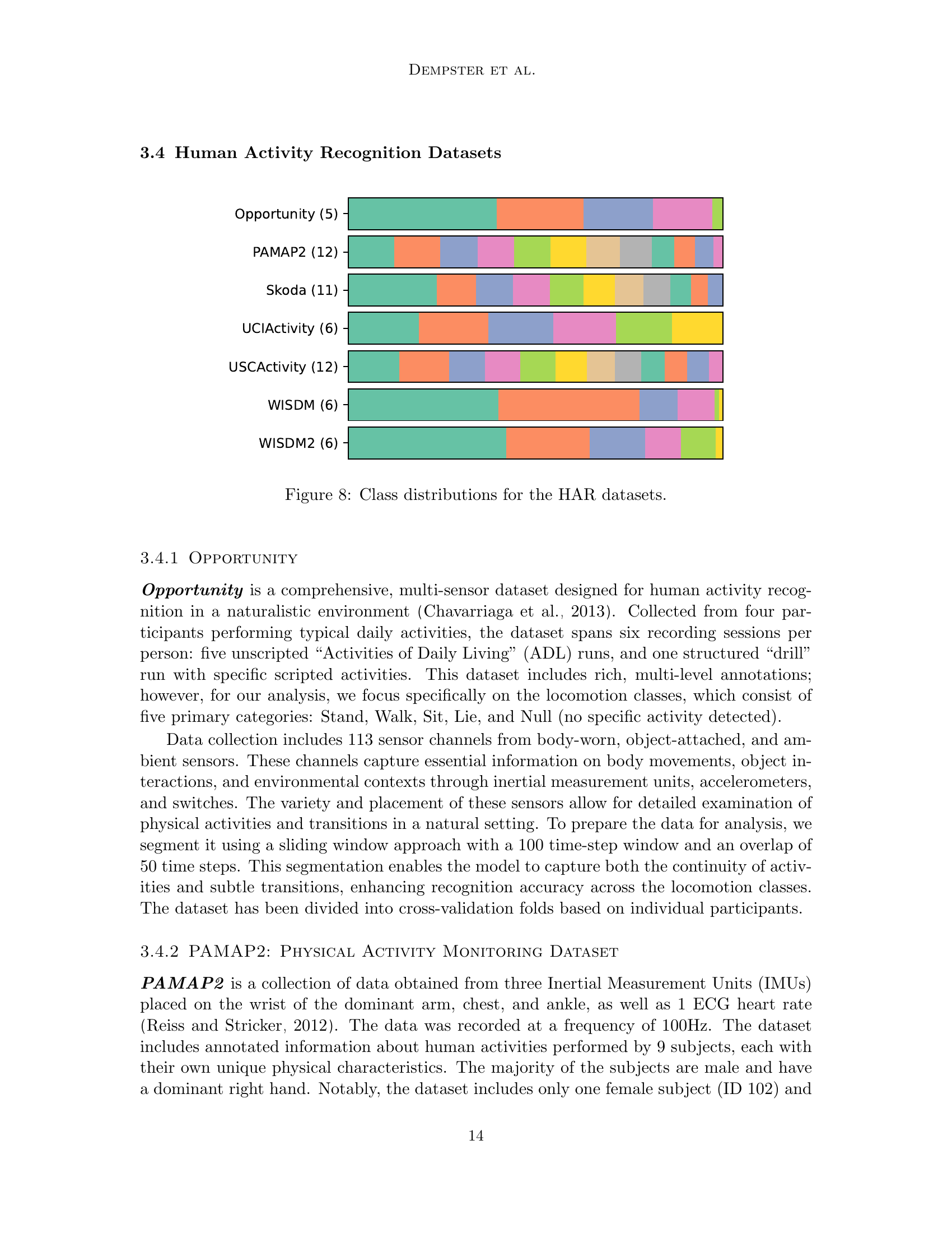
🔼 This figure visualizes the class distribution within each of the Human Activity Recognition (HAR) datasets included in the MONSTER benchmark. It provides a quick overview of the class imbalance or balance in each dataset, allowing for a visual comparison of the datasets’ characteristics before performing any analysis.
read the caption
Figure 8: Class distributions for the HAR datasets.

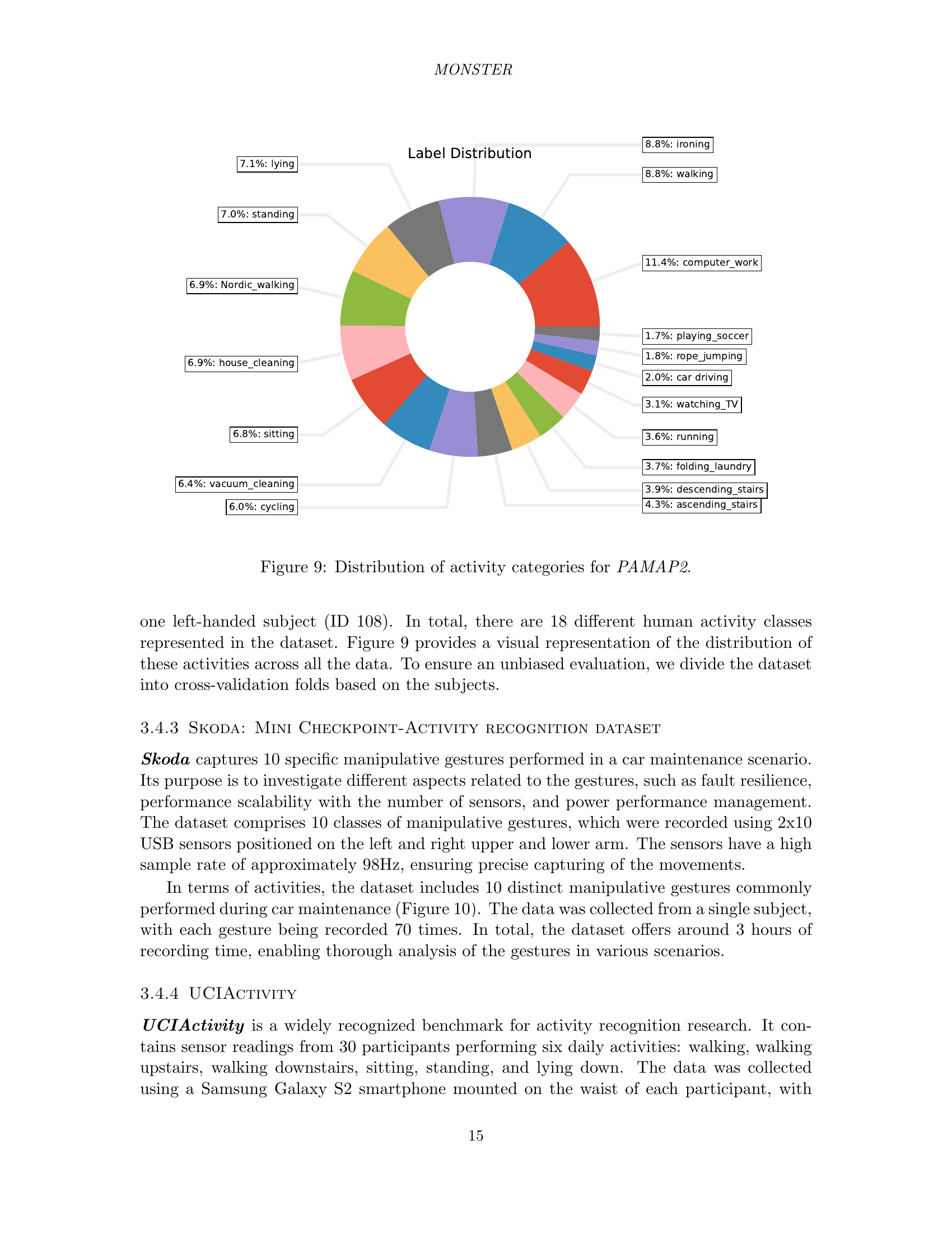
🔼 This figure shows a pie chart that visualizes the distribution of 18 different activity categories within the PAMAP2 dataset. Each slice of the pie chart represents a specific activity, and the size of the slice is proportional to the number of instances of that activity in the dataset. This provides a clear overview of the class distribution, highlighting the prevalence of certain activities over others. The dataset includes a variety of activities of daily life.
read the caption
Figure 9: Distribution of activity categories for PAMAP2.

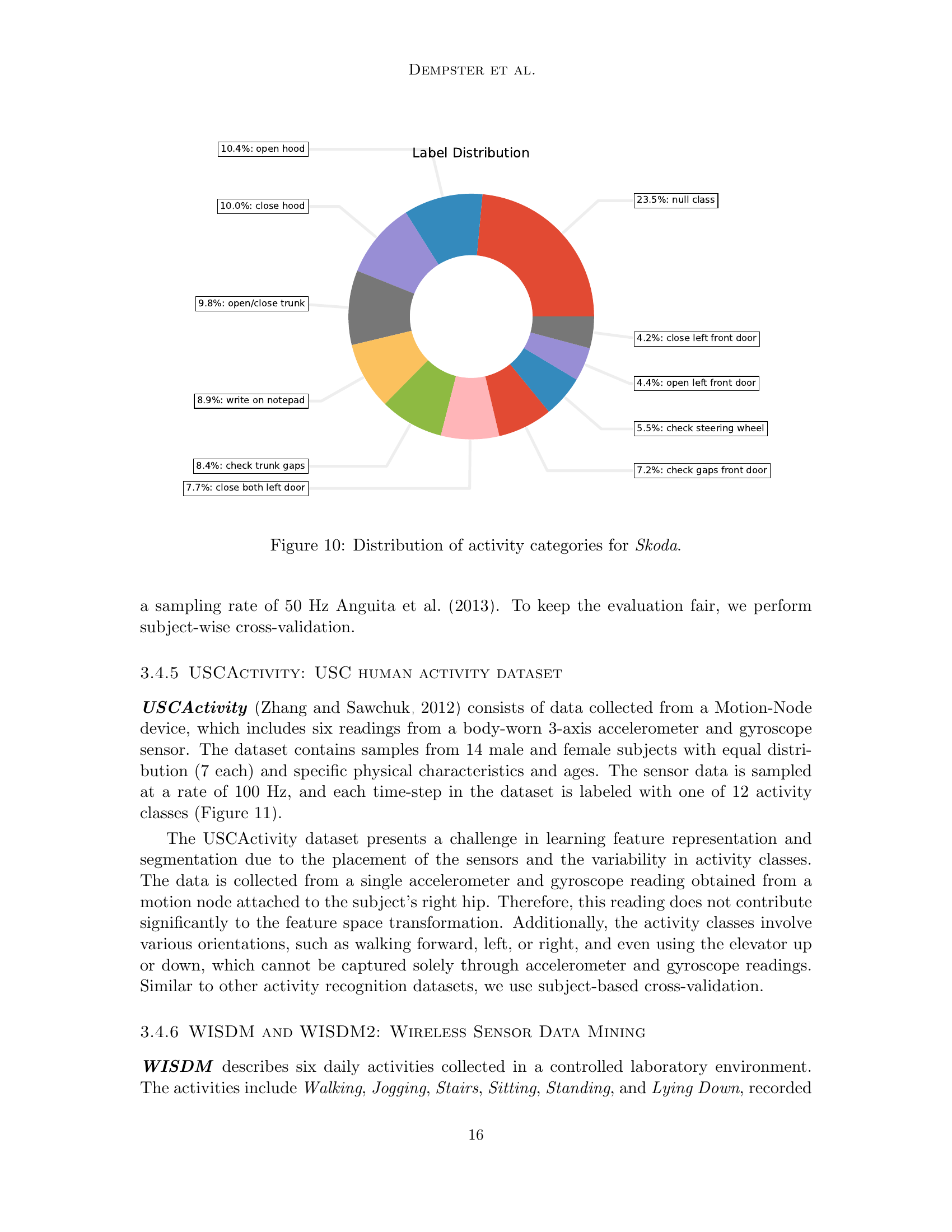
🔼 This figure shows a pie chart illustrating the distribution of activity categories in the Skoda dataset. The Skoda dataset captures 10 specific manipulative gestures performed in a car maintenance scenario. Each slice of the pie chart represents a different activity category, with the size of the slice proportional to the number of samples belonging to that category. The chart provides a visual representation of the class distribution in the dataset, highlighting the relative frequency of each activity.
read the caption
Figure 10: Distribution of activity categories for Skoda.

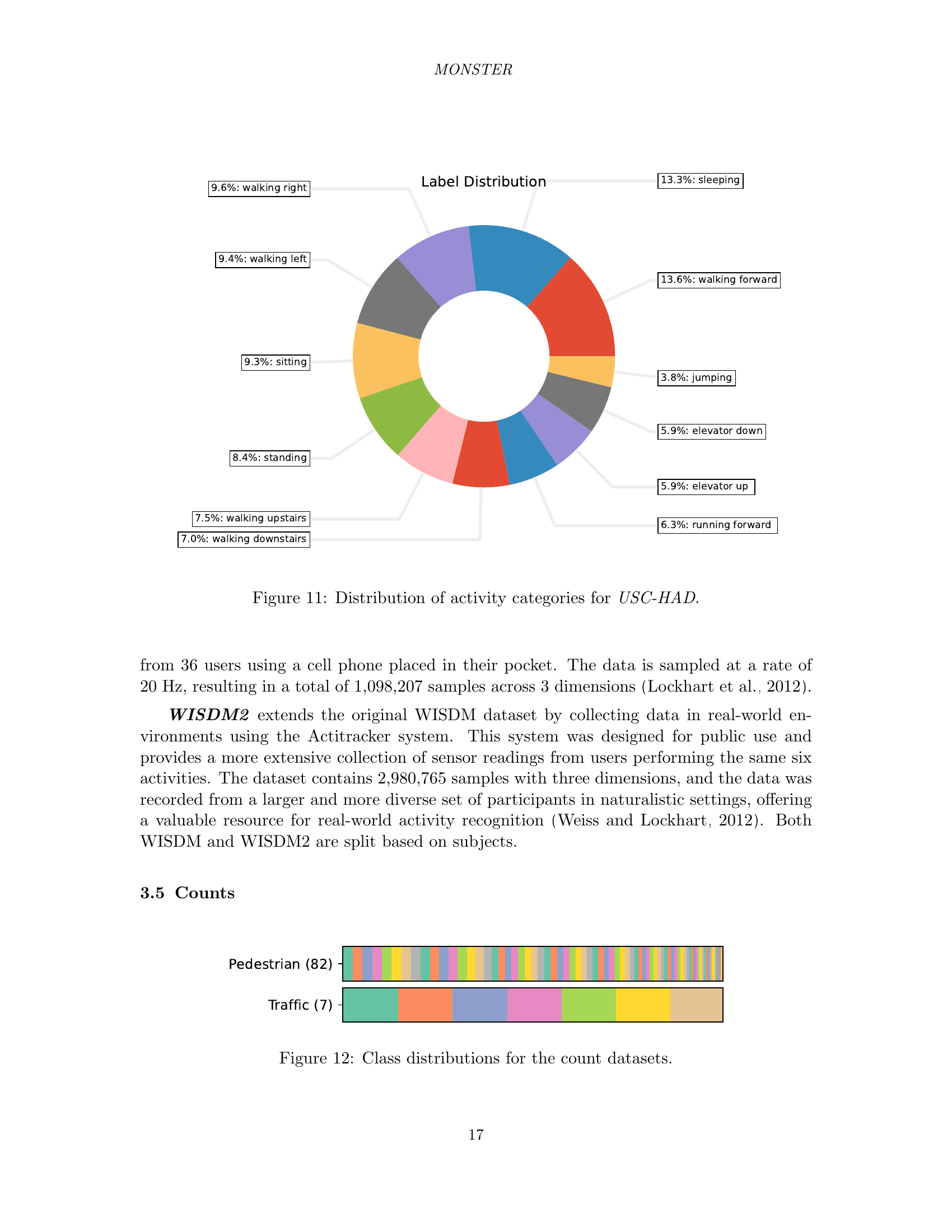
🔼 This figure shows a pie chart illustrating the distribution of different activity categories within the USC-HAD dataset. Each slice of the pie chart represents a specific activity, and its size corresponds to the proportion of the dataset dedicated to that activity. This visualization helps understand the class balance (or imbalance) of the dataset, highlighting the activities with more or fewer samples.
read the caption
Figure 11: Distribution of activity categories for USC-HAD.
🔼 This figure visualizes the class distribution within the count datasets of the MONSTER benchmark. It likely displays bar charts showing the number of instances (data points) belonging to each class for each dataset. This helps readers understand the class imbalance, if any, present in each count dataset, providing context for evaluating model performance on these datasets, as class imbalance can impact model training and evaluation.
read the caption
Figure 12: Class distributions for the count datasets.

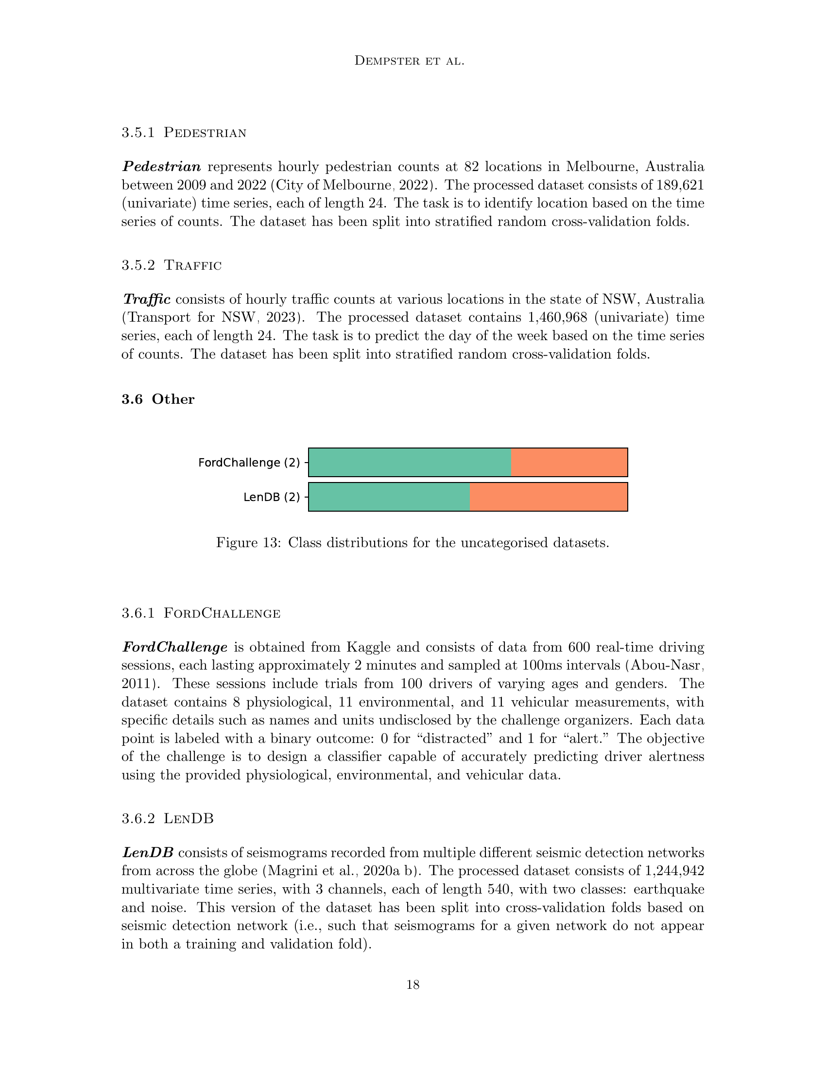
🔼 This figure shows the distribution of classes within the datasets that do not fall into any specific category (audio, satellite, EEG, HAR, count). It provides a visual representation of the class imbalance or balance within each of these datasets. Understanding class distribution is important for assessing the difficulty of classification tasks and for selecting appropriate machine learning methods.
read the caption
Figure 13: Class distributions for the uncategorised datasets.

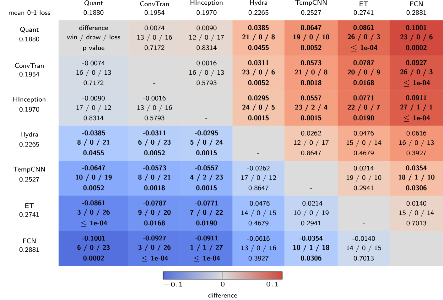
🔼 This figure presents a multi-comparison matrix (MCM) that summarizes the performance of several time series classification methods across 29 datasets. The MCM displays the average 0-1 loss (classification error rate) for each method, providing a comparative view of their overall accuracy. Furthermore, it visually represents pairwise comparisons, indicating whether one method outperforms another, resulting in a win/draw/loss count for each pairwise comparison. This allows for a comprehensive understanding of the relative strengths and weaknesses of each method across the diverse set of datasets.
read the caption
Figure 14: Multi-comparison matrix showing mean 0–1 loss and pairwise differences.

🔼 This figure displays a comparative analysis of the 0-1 loss achieved by six different time series classification methods across six categories of datasets: Audio, Count, ECG/EEG, HAR, Satellite, and Other. Each point on the plot represents a single dataset within a given category, with the horizontal bars indicating the average 0-1 loss for each method within that category. This visual allows for easy comparison of method performance across various types of data and provides insights into the relative strengths and weaknesses of each approach.
read the caption
Figure 15: 0–1 loss by category.

🔼 This figure visualizes pairwise comparisons of the 0-1 loss (misclassification rate) between the ConvTran model and other benchmark models (ET, FCN, HInceptionTime, Hydra, QUANT, and TempCNN) across multiple datasets. Each point represents a single dataset and its corresponding 0-1 loss for the two methods being compared. The color-coding differentiates whether ConvTran performs better (blue) or worse (red) than the comparison model. This allows for an easy visual assessment of ConvTran’s performance relative to others, highlighting its strengths and weaknesses across diverse datasets.
read the caption
Figure 16: Pairwise 0–1 loss for ConvTran.

🔼 This figure shows a pairwise comparison of ConvTran’s log-loss against other methods across various datasets. For each comparison, it plots the log-loss values for ConvTran against the log-loss of another method on the same dataset. The points’ color indicates which method performed better (ConvTran in blue, other methods in red). The plot helps to visually assess ConvTran’s relative performance against each of the other methods considered in the paper.
read the caption
Figure 17: Pairwise log-loss for ConvTran.
🔼 This figure shows a pairwise comparison of ConvTran’s training time against other methods used in the paper. For each comparison, it plots ConvTran’s training time against the training time of a second method across multiple datasets. The plot uses a scatterplot, where each point represents a dataset. The plot is colored to indicate which method had a shorter training time for that specific dataset, enabling easy visual identification of datasets where ConvTran was faster or slower than the other method. This provides a comprehensive analysis of ConvTran’s relative efficiency compared to the other techniques.
read the caption
Figure 18: Pairwise training time for ConvTran.

🔼 This figure displays a pairwise comparison of the 0-1 loss achieved by the Extremely Randomized Trees (ET) classifier against other methods across various datasets. Each subplot represents a comparison with a different model, illustrating which model performs better (lower 0-1 loss) for each dataset. This visualization allows for a detailed assessment of the relative performance of ET compared to other time series classification techniques in different dataset contexts.
read the caption
Figure 19: Pairwise results (0–1 loss) for ET.

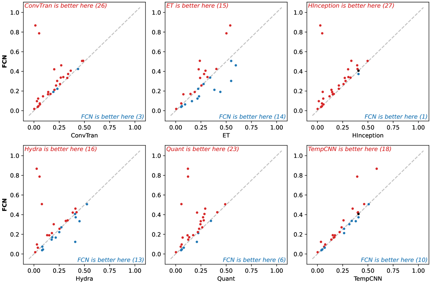
🔼 This figure visualizes pairwise comparisons of the 0-1 loss for the FCN model against other baseline models (ConvTran, ET, HInceptionTime, HYDRA, QUANT, and TempCNN). Each subplot represents a comparison between FCN and one other model, with the x-axis showing the 0-1 loss for FCN and the y-axis showing the 0-1 loss for the other model. Each point on the plot corresponds to one of the datasets used in the study. The points above the diagonal indicate datasets on which the alternative model outperformed FCN, while points below the diagonal show datasets where FCN performed better. The diagonal line represents equal performance.
read the caption
Figure 20: Pairwise results (0–1 loss) for FCN.

🔼 This figure shows a pairwise comparison of the HInceptionTime model’s 0-1 loss against other benchmark models. For each pairwise comparison, a scatter plot is generated, showing the 0-1 loss of HInceptionTime on the x-axis and the 0-1 loss of the other model on the y-axis. Each point represents a single dataset, and the color indicates which model performed better for that dataset. A diagonal line represents equal performance for both models. Deviations from this line indicate superior or inferior performance of one model over the other for a given dataset. The plots visualize the relative performance differences of HInceptionTime compared to other methods on a per-dataset basis.
read the caption
Figure 21: Pairwise results (0–1 loss) for HInceptionTime.

🔼 This figure visualizes pairwise comparisons of Hydra’s 0-1 loss against other methods (ConvTran, ET, FCN, HInceptionTime, Quant, TempCNN) across various datasets. Each subplot represents a pairwise comparison, showing the 0-1 loss achieved by Hydra plotted against the 0-1 loss of another method for each dataset. The plots reveal the relative performance of Hydra compared to each alternative method and highlight datasets where Hydra significantly outperforms or underperforms other methods.
read the caption
Figure 22: Pairwise results (0–1 loss) for Hydra.

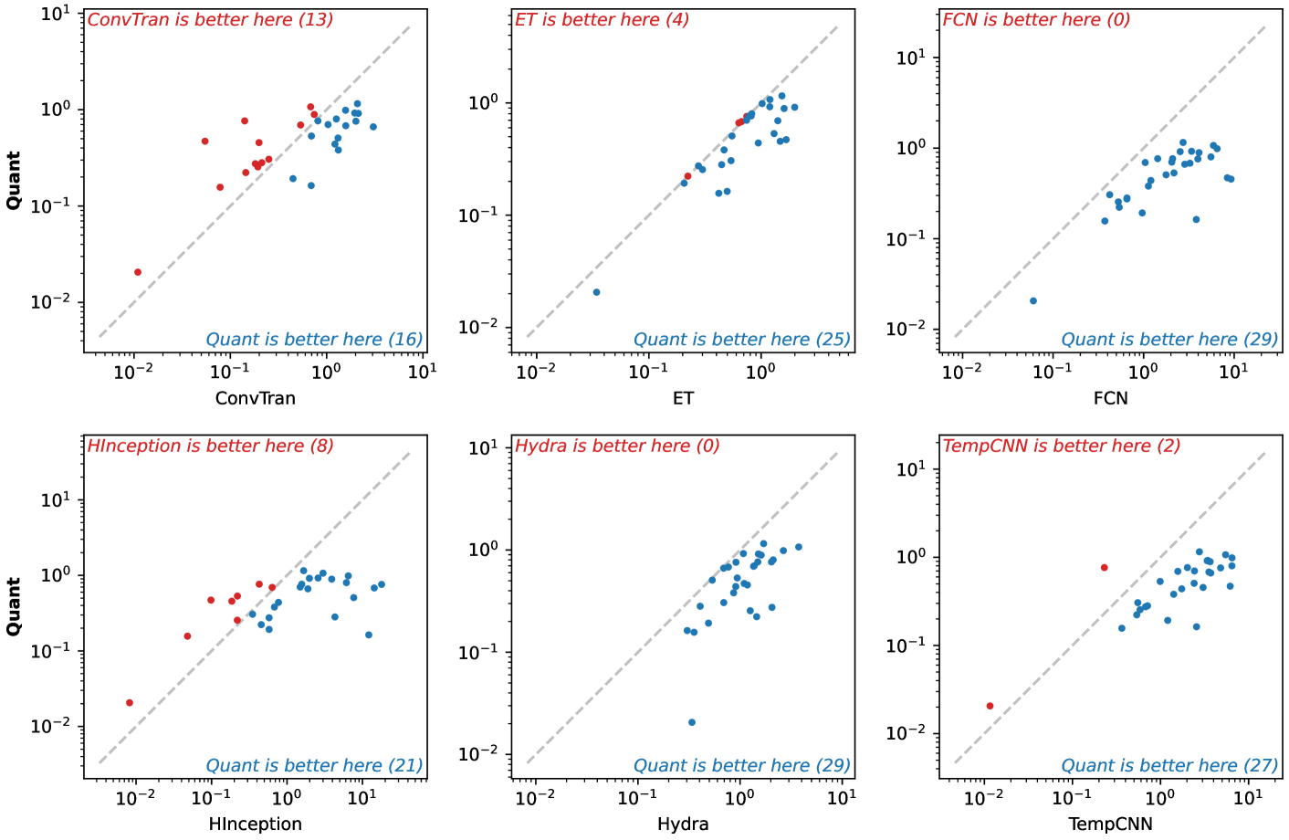
🔼 This figure displays pairwise comparisons of the 0-1 loss for the QUANT model against other baseline models (ConvTran, ET, FCN, HInceptionTime, HYDRA, TempCNN). Each subplot represents a comparison between QUANT and one other model, showing the 0-1 loss on each dataset for both models. This allows for visual evaluation of the relative performance of QUANT compared to each other model across various datasets. Datasets are grouped to facilitate easier comparison.
read the caption
Figure 23: Pairwise results (0–1 loss) for Quant.

🔼 This figure displays a pairwise comparison of the TempCNN model’s 0-1 loss against other baseline methods (ConvTran, ET, FCN, HInceptionTime, HYDRA, QUANT). Each subplot represents a comparison with a specific method, showing the 0-1 loss achieved by TempCNN plotted against the 0-1 loss of the other method across various datasets. The number of datasets where TempCNN outperforms the other method is indicated in the title of each subplot. This visualization helps to understand the relative performance of TempCNN compared to other models in terms of classification error.
read the caption
Figure 24: Pairwise results (0–1 loss) for TempCNN.

🔼 This figure displays a pairwise comparison of the Extremely Randomized Trees (ET) model’s log-loss performance against other baseline models (ConvTran, FCN, HInceptionTime, Hydra, Quant, and TempCNN). Each subplot represents a comparison against a different model. The x-axis represents the log-loss of the ET model, while the y-axis represents the log-loss of the compared model. Points above the diagonal indicate datasets where the compared model outperforms ET in terms of log-loss. The number of datasets where each model outperforms ET is noted in the caption. This visualization helps assess the relative performance of ET against other methods across a range of datasets.
read the caption
Figure 25: Pairwise results (log-loss) for ET.

🔼 This figure visualizes pairwise comparisons of the FCN model’s log-loss against other models (ConvTran, ET, HInceptionTime, Hydra, Quant, and TempCNN). For each comparison, it shows a scatter plot where each point represents a dataset from MONSTER. The x-axis shows the log-loss of FCN, and the y-axis shows the log-loss of the other model for the corresponding dataset. The plots are annotated to indicate which model performed better (lower log-loss) for each dataset, giving a visual representation of the relative performance of FCN compared to the other models across diverse datasets in terms of log-loss.
read the caption
Figure 26: Pairwise results (log-loss) for FCN.
🔼 This figure presents a pairwise comparison of the log-loss results for the HInceptionTime model against other baseline models. Each subplot displays the 0-1 loss for each dataset. The x-axis represents the 0-1 loss of HInceptionTime, while the y-axis represents the 0-1 loss of another baseline model. The number of data points where each model performs better than the other is indicated within the plot. This visualization allows readers to quickly assess the relative performance of HInceptionTime compared to other methods on the specific datasets used in the MONSTER benchmark.
read the caption
Figure 27: Pairwise results (log-loss) for HInceptionTime.

🔼 This figure visualizes pairwise comparisons of Hydra’s log-loss performance against other benchmark methods (ConvTran, ET, FCN, HInceptionTime, Quant, and TempCNN). Each subplot shows the relationship between Hydra’s log-loss and the log-loss of a different method across the various datasets. The plots help understand where Hydra performs better or worse compared to other methods and to what degree.
read the caption
Figure 28: Pairwise results (log-loss) for Hydra.

🔼 This figure displays a pairwise comparison of the log-loss values obtained from the Quant model against other benchmark models. Each subplot represents a comparison with a different model, visualizing the log-loss achieved by Quant versus the model on the x-axis, and the log-loss by that specific model on the y-axis. Points above the diagonal indicate that Quant performed better, while points below the diagonal show where the benchmark model outperformed Quant. The plots provide a detailed comparison, showing how Quant’s performance varies relative to each of the other methods.
read the caption
Figure 29: Pairwise results (log-loss) for Quant.

🔼 This figure displays a pairwise comparison of TempCNN’s log-loss performance against other methods across various datasets. For each comparison (TempCNN vs. another method), the plot shows the log-loss of TempCNN on the y-axis and the log-loss of the other method on the x-axis. Each point represents a dataset. If a point lies above the diagonal, TempCNN performed better on that dataset; below, the other method was better. The number of datasets where each method outperformed TempCNN is indicated.
read the caption
Figure 30: Pairwise results (log-loss) for TempCNN.

🔼 This figure shows a pairwise comparison of the training times for the Extremely Randomized Trees (ET) model against other models evaluated in the MONSTER benchmark. For each pair of models (ET vs. another model), it displays a scatter plot where each point represents a dataset from the MONSTER benchmark. The x-axis shows the training time of one model, and the y-axis shows the training time of the other model in the pair. The plot helps to visualize which model is faster (or slower) for training on various datasets.
read the caption
Figure 31: Pairwise results (training time) for ET.

🔼 This figure displays a pairwise comparison of training times for the FCN model against other models in the study. Each subplot shows the training time of the FCN model plotted against the training time of another model across multiple datasets. The x-axis represents the training time of the model being compared, and the y-axis represents the training time of the FCN model. Points above the diagonal indicate datasets where FCN was faster, while points below show where the other model was faster. The number of datasets where each model outperforms FCN is indicated in the caption. This visualization aids in understanding the relative computational efficiency of FCN compared to other methods used in the paper.
read the caption
Figure 32: Pairwise results (training time) for FCN.

🔼 This figure shows a pairwise comparison of the training times for the HInceptionTime model against other models used in the paper. For each comparison, it displays a scatter plot where the x-axis represents the training time of one model and the y-axis represents the training time of another, showing how the training times of different models relate to each other. Each point on the plot corresponds to a single dataset. The plot also highlights which model had a shorter training time for each dataset comparison.
read the caption
Figure 33: Pairwise results (training time) for HInceptionTime.

🔼 This figure shows a pairwise comparison of Hydra’s training time against other methods used in the paper. For each pair of methods, it plots the training time of Hydra against the other method across various datasets. Points above the diagonal indicate that Hydra trains faster, while points below indicate slower training times. The number of datasets where each method is faster or slower is also indicated in the plot.
read the caption
Figure 34: Pairwise results (training time) for Hydra.

🔼 This figure displays a pairwise comparison of Quant’s training time against other methods. Each subplot represents a comparison against a different method. The x-axis shows Quant’s training time, and the y-axis shows the training time for the other method. Each point represents a dataset, with its position indicating the relative training times for the two methods on that dataset. The color of the point indicates which method performed faster for that dataset. This visualization helps understand Quant’s computational efficiency compared to the other benchmark methods.
read the caption
Figure 35: Pairwise results (training time) for Quant.

🔼 This figure displays a pairwise comparison of the training times for TempCNN against other methods. For each comparison (e.g., TempCNN vs. ConvTran), it shows a scatter plot where each point represents a dataset. The x-axis shows the training time for one method, and the y-axis shows the training time for the other method. The color of the points indicates which method was faster for that specific dataset. This visual representation helps understand the relative training efficiency of TempCNN compared to other methods on the various datasets.
read the caption
Figure 36: Pairwise results (training time) for TempCNN.
More on tables
| GPU | CPU | |||||
|---|---|---|---|---|---|---|
| Hydra | ConvTran | TempCNN | FCN | HInception | ET | Quant |
| 47m 44s | 5d 6h | 2d 9h | 2d 12h | 6d 6h | 5h 10m | 20h 10m |
🔼 This table presents the total training time required for each of the eight time series classification models (Hydra, ConvTran, TempCNN, FCN, HInceptionTime, ET, Quant) across the 29 datasets in the MONSTER benchmark. Training times are broken down by whether training was performed using GPU or CPU. The times shown represent the average training time across the five cross-validation folds.
read the caption
Table 2: Total Training Time
| ConvTran | FCN | HInception | TempCNN | Hydra† | Quant‡ | |
|---|---|---|---|---|---|---|
| min | 27,039 Traffic | 264,962 CornellWhale | 869,570 CornellWhale | 424,649 Tiselac | 6,144 FordChallenge | 275 CrowdSourced |
| max | 486,941 Opportunity | 380,037 Opportunity | 1,420,145 Opportunity | 786,444,426 AudioMNIST | 167,936 Pedestrian | 379,112 Traffic |
🔼 This table presents the number of parameters used for each of the models used in the MONSTER benchmark study. It breaks down the number of parameters into minimum and maximum values across all datasets, with specific examples provided to illustrate the range of parameter counts. The table also notes the architecture-specific parameter count for the ridge classifier in HYDRA and the median number of leaves per tree for QUANT, which differ from the trainable parameters in the deep learning models.
read the caption
Table 3: Number of Parameters
Full paper#