TL;DR#
Generating business-related infographics and slides is tough because it demands lengthy context and high precision and suffers from the lack of datasets. Existing methods fail to adhere to ultra-dense layouts in business content due to the limited scope to only limited sub-regions and sentence-level prompts. The models also struggle with article-level visual text rendering, leading to spelling errors and disorganized layouts.
To address these challenges, BIZGEN is introduced. The new data engine creates high-quality INFOGRAPHICS-650K and offers tens or hundreds of sub-regions from ultra-dense layouts by layer-wise retrieval and augmentation. A layout-guided cross-attention scheme injects region-wise prompts into cropped region latent space with conditional CFG and leads to more flexible inference and refinement. The system shows strong results in comparison to FLUX and SD3.
Key Takeaways#
Why does it matter?#
BIZGEN enables high-quality infographics & slides generation from article-level text. It mitigates data scarcity and context length challenges. The new dataset and benchmarks open new avenues for business content generation research.
Visual Insights#

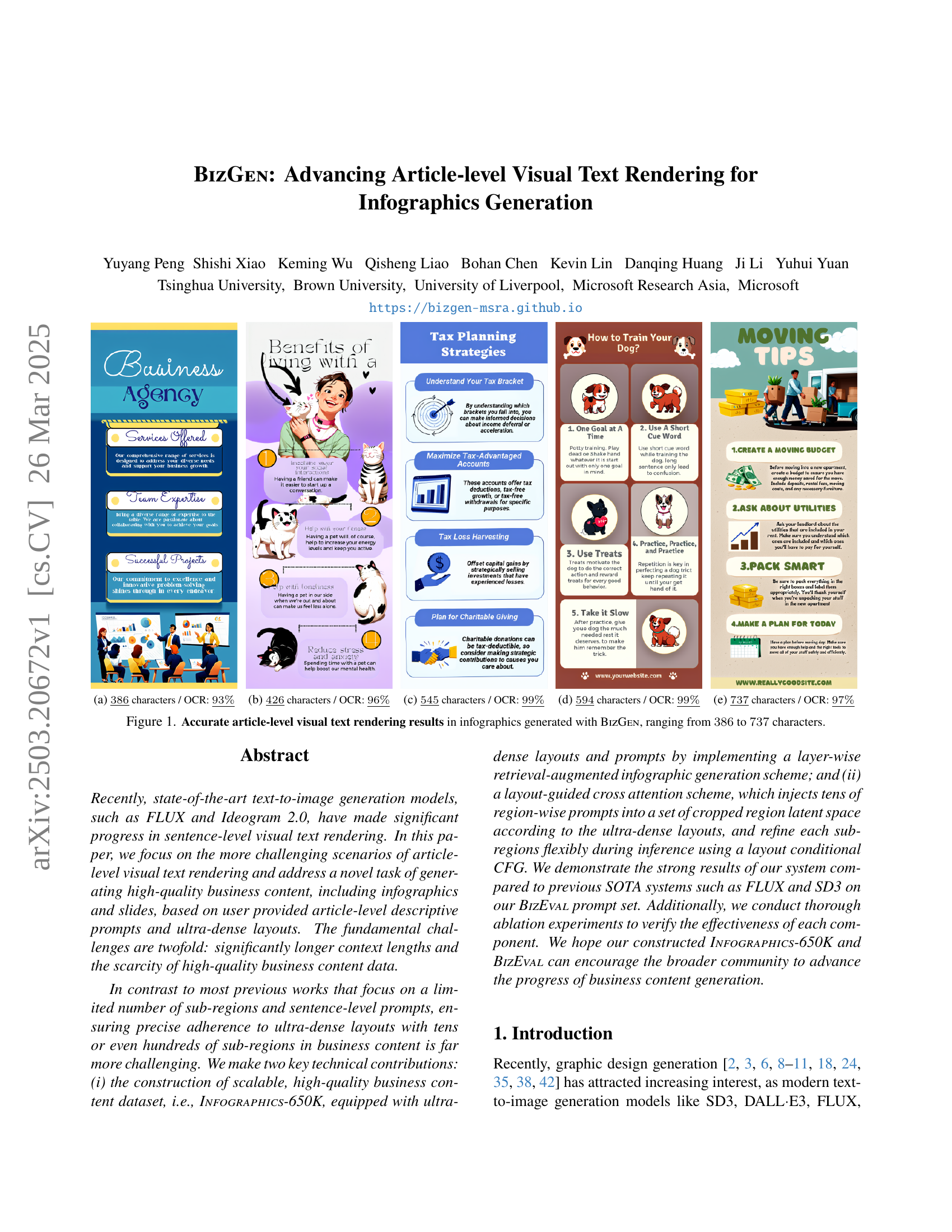
🔼 The figure shows an infographic with 386 characters generated by the BizGEN model. The Optical Character Recognition (OCR) accuracy for this infographic is 93%. This demonstrates the model’s ability to generate visually accurate text within the context of an infographic, which is a challenging task for AI models.
read the caption
(a) 386¯¯386\underline{386}under¯ start_ARG 386 end_ARG characters / OCR: 93%¯¯percent93\underline{93\%}under¯ start_ARG 93 % end_ARG
| Method | Infographics Visual Text Spelling Precision () | Slides Visual Text Spelling Precision () | ||||||
| 10 layers | 10-15 layers | 15-20 layers | 20 layers | 10 layers | 10-20 layers | 20-30 layers | 30 layers | |
| DALLE3 | ||||||||
| SD3 Large | ||||||||
| FLUX | ||||||||
| Glyph-SDXL-v2 | ||||||||
| BizGen | ||||||||
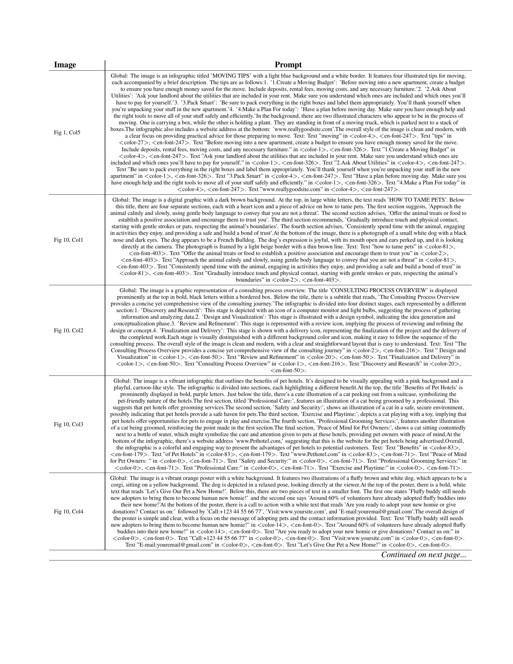
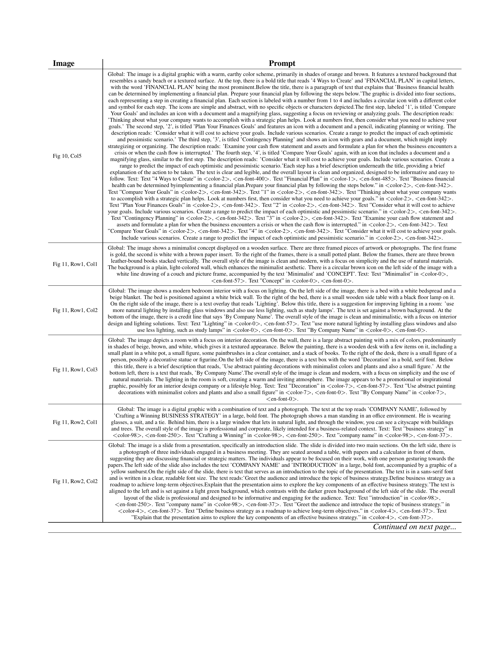
🔼 This table provides the detailed prompts used to generate the infographics and slides shown in Figures 1, 10, and 11 of the paper. For each figure, the global prompt (describing the overall image content) and individual prompts for each layer (specifying text and non-text elements) are listed. This detailed breakdown allows for a comprehensive understanding of how the model’s inputs shaped the final outputs.
read the caption
Table 9: Detailed prompt for generated infographics and slides in Figure 1, Figure 10 and Figure 11.
In-depth insights#
Article-Level Gen#
The research paper extensively explores visual text rendering for infographics generation at an article level, moving beyond the sentence-level focus typical in current models like FLUX and Ideogram 2.0. It specifically deals with the task of generating high-quality business content. The work introduces INFOGRAPHICS-650K, a scalable dataset of ultra-dense layouts and corresponding prompts constructed using a layer-wise retrieval-augmented scheme. It is complemented with a layout-guided cross-attention mechanism, that injects region-specific prompts into cropped region latent spaces, and uses a layout conditional CFG to refine sub-regions. Comparative results against SOTA systems such as FLUX and SD3, along with ablation studies, are presented to validate the BIZGEN system’s effectiveness. Overall, the work makes a meaningful contribution by creating resources (dataset and benchmark) and methods that aim to spur further progress in business content generation.
INFOGRAPHICS-650K#
The INFOGRAPHICS-650K dataset is a key contribution, addressing the data scarcity challenge in business content generation. It comprises a large number of high-quality, multilingual infographic samples. Each sample includes not only images and detailed global captions but also ultra-dense layouts and region-specific captions, facilitating detailed and nuanced learning. The dataset construction employs a retrieval-augmented infographic generation scheme. The scale and richness of INFOGRAPHICS-650K enable the study of complex layout structures and visual text rendering, areas that are critical for creating effective business communications. The multi-layered data benefits the research community, specifically within the context of creating high-quality infographics. The meticulous curation of INFOGRAPHICS-650K is a significant advancement that fosters innovation in content creation tasks by its sheer scale and the diversity and depth of the included data.
Layout Guided Gen#
From the provided context, it seems the research paper focuses on generating infographics with accurate visual text. While prior works enhance image generation with text, this paper specifically tackles article-level visual text rendering. A key challenge is representing spatial layouts effectively in prompts. Previous methods have limitations, inspiring the authors to introduce new ways with fine-grained spatial controls. They also explore the possibilities in plug-and-play modules that inject visual guidance, aiming to achieve more precise and visually coherent infographic generation. The authors aim to solve existing problems by careful control over visual text and image generation.
BizEVAL Benchmark#
The BizEVAL benchmark is a crucial component for assessing the quality of generated business content, particularly infographics and slides. It provides a standardized evaluation framework, allowing for objective comparison of different generation models. The benchmark includes detailed article-level prompts and ultra-dense layouts, representing a significant leap in complexity compared to traditional image generation tasks. It serves as a challenging testbed for evaluating visual text rendering accuracy, layout adherence, and overall aesthetic quality, pushing the boundaries of current text-to-image generation capabilities and highlighting areas for future research and improvement in business content creation. The benchmark uses metrics such as visual aesthetics, prompt following, and OCR.
Glyph-SDXL-v2 Base#
While ‘Glyph-SDXL-v2 Base’ is not explicitly discussed as a dedicated heading in the provided research paper snippets, it likely refers to the foundational model upon which the authors build their proposed system, BIZGEN. Based on the context, understanding the base model is crucial as it directly impacts several aspects of the research. Firstly, the choice of Glyph-SDXL-v2 provides an existing architecture for image generation and visual text rendering capabilities. This impacts the design choices for BIZGEN. The authors would have considered the existing strengths and weaknesses of Glyph-SDXL-v2 while designing BIZGEN. Secondly, initialization using pre-trained weights from Glyph-SDXL-v2 is crucial for faster training and better convergence. Fine-tuning pre-trained weights is generally more efficient than training from scratch. It would lead to improved performance, especially given the limited amount of high-quality business content data. Thirdly, the limitations in areas such as visual text spelling accuracy or adherence to complex layouts in infographics led to the innovations introduced in BIZGEN.
Iterative Refine#
While ‘Iterative Refine’ wasn’t a specific heading, the concept was inherent in the layout conditional CFG to reduce artifacts layer-wise during inference. The model starts with noise and progressively denoises. I found that joint generation is crucial, where all elements are generated together in a unified way. By applying a dense guidance scale map the layer-wise quality was improved, eliminating certain regional flaws during the fine-tuning process, therefore refining the overall result. It made visual element adhere more closely to the overall prompts as well as improve accuracy during the model iteration, so BIZGEN can output more impressive infographic results.
Scaling is Key#
When it comes to machine learning and AI, scaling is a fundamental aspect that goes beyond simply increasing the size of datasets or models. It encompasses optimizing the entire pipeline, from data acquisition and preprocessing to model training, evaluation, and deployment. A well-designed scaling strategy considers computational resources, algorithmic efficiency, and infrastructure limitations. Furthermore, scaling is not just about handling larger volumes of data, but also about improving the model’s ability to generalize to unseen data. This can be achieved through various techniques such as distributed training, model parallelism, and data augmentation. To unlock greater gains in model performance and applicability, we need a strategic plan for scaling to provide improvements across many metrics.
More visual insights#
More on figures

🔼 This figure shows an infographic generated by the BizGEN model. The infographic contains 426 characters, and the Optical Character Recognition (OCR) accuracy is 96%. The image demonstrates the model’s ability to generate high-quality visual text within an infographic context.
read the caption
(b) 426¯¯426\underline{426}under¯ start_ARG 426 end_ARG characters / OCR: 96%¯¯percent96\underline{96\%}under¯ start_ARG 96 % end_ARG

🔼 The figure shows an infographic generated by the BizGEN model. The infographic contains 545 characters, and the Optical Character Recognition (OCR) accuracy is 99%. This demonstrates the model’s ability to generate high-quality infographics with accurate text rendering. This particular infographic is one of several examples used to showcase the model’s performance on varying lengths of text.
read the caption
(c) 545¯¯545\underline{545}under¯ start_ARG 545 end_ARG characters / OCR: 99%¯¯percent99\underline{99\%}under¯ start_ARG 99 % end_ARG

🔼 This infographic contains 594 characters, and the Optical Character Recognition (OCR) accuracy is 99%. The figure shows one of the infographics generated by the BizGEN model, demonstrating its ability to render accurate visual text within an infographic.
read the caption
(d) 594¯¯594\underline{594}under¯ start_ARG 594 end_ARG characters / OCR: 99%¯¯percent99\underline{99\%}under¯ start_ARG 99 % end_ARG

🔼 This figure shows one of the infographics generated by the BizGEN model. The infographic contains 737 characters, and the Optical Character Recognition (OCR) accuracy is 97%. This demonstrates the model’s ability to generate infographics with high accuracy and a relatively large amount of text.
read the caption
(e) 737¯¯737\underline{737}under¯ start_ARG 737 end_ARG characters / OCR: 97%¯¯percent97\underline{97\%}under¯ start_ARG 97 % end_ARG

🔼 This figure showcases the quality of visual text rendering achieved by the BizGen model in generating infographics. Five examples of infographics are displayed, each with varying lengths of text (ranging from 386 to 737 characters). The purpose is to demonstrate BizGen’s capability to accurately render article-level amounts of text within the visual design of an infographic, which is a challenging task for text-to-image models.
read the caption
Figure 1: Accurate article-level visual text rendering results in infographics generated with BizGen, ranging from 386386386386 to 737737737737 characters.

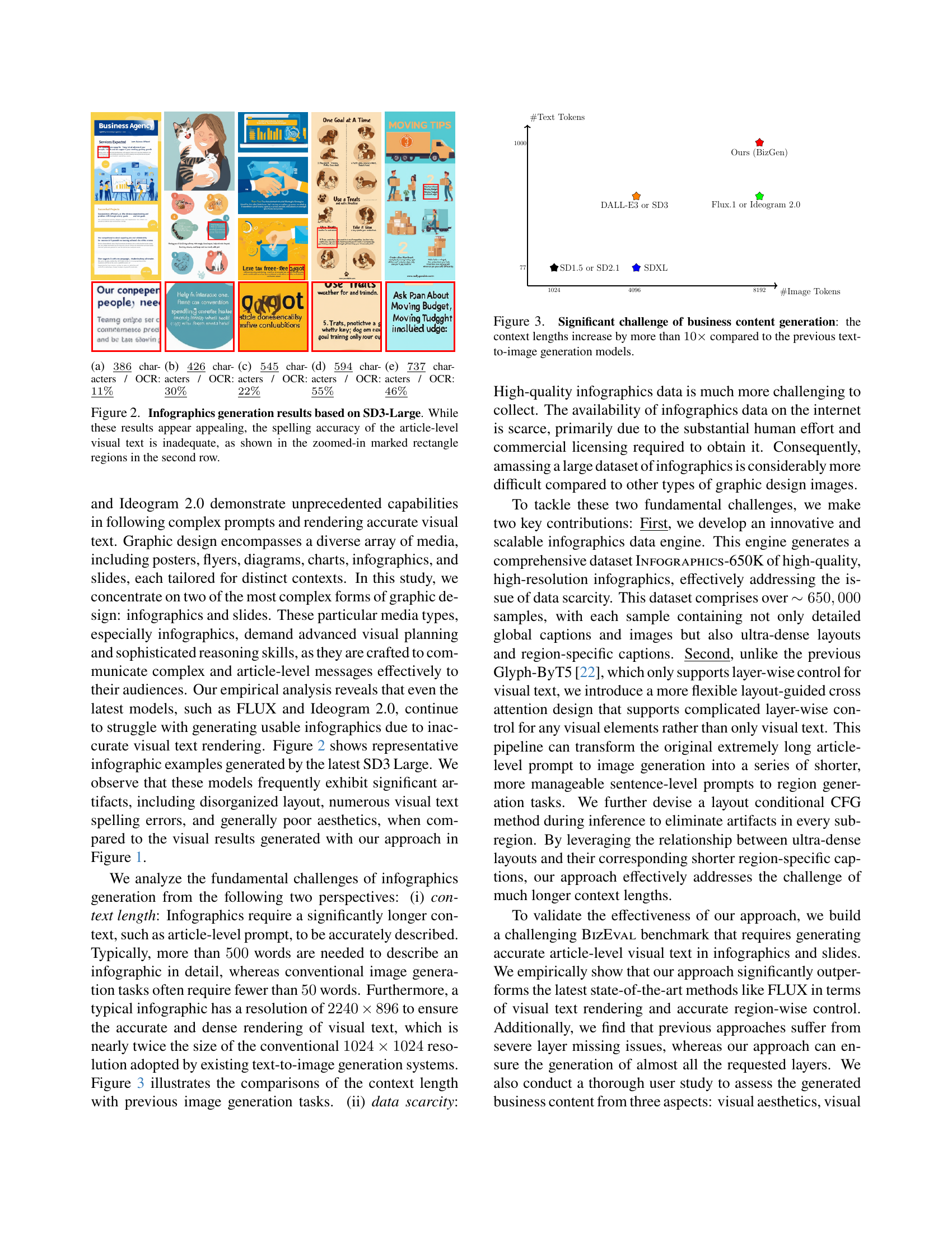
🔼 This figure shows the results of infographic generation using different methods. The first row displays sample infographics with various numbers of characters, and the second row indicates their corresponding Optical Character Recognition (OCR) accuracy. Infographics (a) through (e) show increased complexity and length, corresponding to the increasing OCR accuracy. This demonstrates the relationship between character count and OCR performance in infographic generation.
read the caption
(a) 386¯¯386\underline{386}under¯ start_ARG 386 end_ARG characters / OCR: 11%¯¯percent11\underline{11\%}under¯ start_ARG 11 % end_ARG

🔼 The figure shows an infographic generated by a model other than BizGen. The infographic contains 426 characters, but only 30% of them were correctly recognized by the OCR system. This highlights a limitation of existing text-to-image generation models in terms of generating accurate visual text, particularly in complex layouts.
read the caption
(b) 426¯¯426\underline{426}under¯ start_ARG 426 end_ARG characters / OCR: 30%¯¯percent30\underline{30\%}under¯ start_ARG 30 % end_ARG

🔼 This infographic contains 545 characters. The Optical Character Recognition (OCR) process, which converts images of text into machine-readable text, achieved only 22% accuracy for this specific infographic. This low accuracy suggests that a significant portion of the text in the image was either not correctly recognized or completely missed by the OCR software. This could be due to factors such as image quality, font style, or the presence of visual elements interfering with text recognition.
read the caption
(c) 545¯¯545\underline{545}under¯ start_ARG 545 end_ARG characters / OCR: 22%¯¯percent22\underline{22\%}under¯ start_ARG 22 % end_ARG

🔼 The figure shows an infographic with 594 characters. The Optical Character Recognition (OCR) accuracy for this infographic is 55%. This means that 55% of the characters in the infographic were correctly identified by the OCR software.
read the caption
(d) 594¯¯594\underline{594}under¯ start_ARG 594 end_ARG characters / OCR: 55%¯¯percent55\underline{55\%}under¯ start_ARG 55 % end_ARG

🔼 This infographic contains 737 characters, and the Optical Character Recognition (OCR) accuracy is 46%. The low OCR accuracy suggests that a significant portion of the text in the infographic was not correctly recognized by the OCR system.
read the caption
(e) 737¯¯737\underline{737}under¯ start_ARG 737 end_ARG characters / OCR: 46%¯¯percent46\underline{46\%}under¯ start_ARG 46 % end_ARG

🔼 This figure showcases infographics generated using the SD3-Large model. While visually appealing at first glance, a closer inspection (specifically, the zoomed-in rectangular areas in the second row) reveals significant inaccuracies in the spelling of the article-level text. This highlights a key challenge addressed by the BizGEN model: achieving accurate article-level visual text rendering in infographics.
read the caption
Figure 2: Infographics generation results based on SD3-Large. While these results appear appealing, the spelling accuracy of the article-level visual text is inadequate, as shown in the zoomed-in marked rectangle regions in the second row.

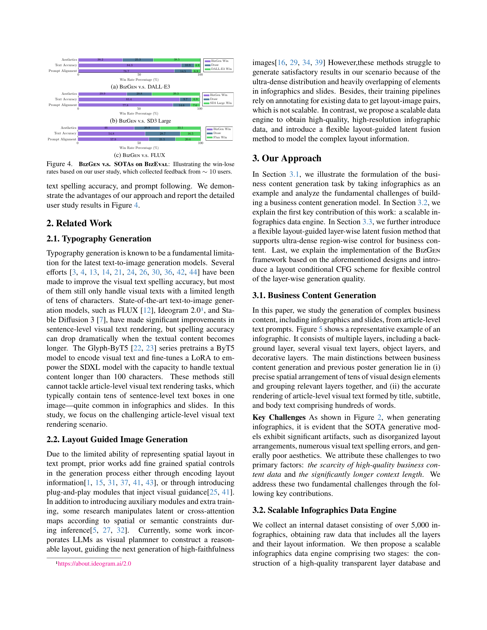
🔼 This figure illustrates the significant increase in context length required for business content generation, specifically infographics, compared to previous text-to-image models. The context length for infographics is more than 10 times longer than what is typical for other text-to-image tasks. This highlights a key challenge in generating high-quality business infographics due to the significantly greater amount of textual information needed to describe the complex visual elements and layouts. This large context length places higher demands on the model’s capacity to process and understand the provided text.
read the caption
Figure 3: Significant challenge of business content generation: the context lengths increase by more than 10×10\times10 × compared to the previous text-to-image generation models.

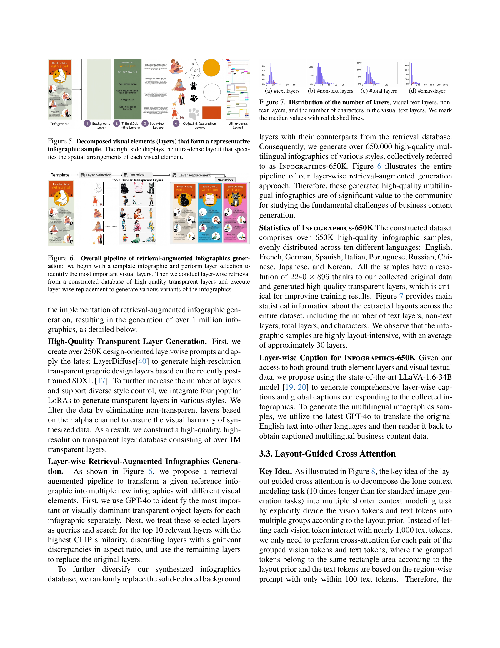
🔼 The figure shows a comparison of the performance of BizGen against DALL-E3 using a win-rate percentage. Three metrics were compared: Aesthetics, Text Accuracy, and Prompt Alignment. For each metric, the win rate percentage is shown for BizGen and the comparison model. A higher percentage indicates better performance for BizGen. The win-rate is derived from a user study, with details of the study population and methodology provided in the paper.
read the caption
(a) BizGen v.s. DALL⋅⋅\cdot⋅E3

🔼 The figure showcases a comparison between BizGen and SD3 Large models in terms of three aspects: aesthetics, text accuracy, and prompt alignment. It presents the win rate percentages for each model across these three criteria. The win rate is calculated based on a user study where participants compared the output of both models and judged which one performed better on each aspect. This comparison aims to demonstrate the relative advantages of BizGen over SD3 Large in generating high-quality business content, including infographics and slides.
read the caption
(b) BizGen v.s. SD3 Large

🔼 This figure presents a comparison of the performance of BizGen and FLUX using the BizEVAL benchmark. Specifically, it shows the win-lose rates based on a user study involving approximately 10 participants. The study evaluates three aspects: visual aesthetics, text accuracy, and prompt alignment. Each aspect’s win rate percentage is presented in a bar chart format, allowing for easy comparison between BizGen and FLUX for each evaluation criterion.
read the caption
(c) BizGen v.s. FLUX

🔼 This figure displays the results of a user study comparing the performance of BizGen against other state-of-the-art (SOTA) models on the BizEval benchmark. The study involved approximately 10 users who provided feedback on three key aspects: visual aesthetics, text accuracy, and prompt alignment. The bar chart visually represents the win-loss rates for BizGen compared to each SOTA method for each of the three criteria. A higher win rate indicates superior performance of BizGen in that specific area.
read the caption
Figure 4: BizGen v.s. SOTAs on BizEval: Illustrating the win-lose rates based on our user study, which collected feedback from ∼10similar-toabsent10\sim 10∼ 10 users.

🔼 This figure shows the layered structure of an infographic. The left side displays a sample infographic, while the right side shows a detailed layout diagram. The layout diagram illustrates how each visual element (text, images, icons, etc.) is positioned and organized within the infographic. This illustrates the complexity of creating infographics and the ultra-dense nature of the layout, which is a key challenge addressed in the paper.
read the caption
Figure 5: Decomposed visual elements (layers) that form a representative infographic sample. The right side displays the ultra-dense layout that specifies the spatial arrangements of each visual element.

🔼 This figure illustrates the process of creating variations of infographics using a retrieval-augmentation method. The process starts by selecting a template infographic and identifying its key visual layers. These key layers are then used as queries to search a database of high-quality, transparent layers. The most visually similar layers from the database are retrieved and replace the original layers in the template. This layer-wise replacement generates several new variations of the original infographic.
read the caption
Figure 6: Overall pipeline of retrieval-augmented infographics generation: we begin with a template infographic and perform layer selection to identify the most important visual layers. Then we conduct layer-wise retrieval from a constructed database of high-quality transparent layers and execute layer-wise replacement to generate various variants of the infographics.

🔼 This figure shows the distribution of the number of text layers across the infographics dataset. It visualizes the frequency of different counts of text layers within each infographic, providing insights into the complexity and variability of the infographics in the dataset. A higher frequency at lower layer counts could indicate that many infographics have a relatively simple structure, while a broader distribution or higher values could suggest greater visual complexity or more detailed designs.
read the caption
(a) #text layers

🔼 This figure shows the distribution of the number of non-text layers across the infographics in the INFOGRAPHICS-650K dataset. The x-axis represents the number of non-text layers, and the y-axis represents the frequency or count of infographics with that number of layers. The graph visually illustrates the distribution of non-textual elements such as background, object, and decorative layers within the dataset’s infographics.
read the caption
(b) #non-text layers

🔼 This figure shows the distribution of the total number of layers in the infographics dataset INFOGRAPHICS-650K. The distribution is visualized as a histogram, showing the frequency of different layer counts across the entire dataset. This helps to understand the complexity and variability of the infographics included in the dataset, revealing the prevalence of infographics with varying numbers of layers.
read the caption
(c) #total layers

🔼 The figure shows the distribution of the number of characters per layer in the INFOGRAPHICS-650K dataset. It visualizes the typical character count within each layer of the infographics, providing insights into the text density and length variations across different layers. This helps in understanding the complexity of text rendering required for generating high-quality infographics.
read the caption
(d) #chars/layer

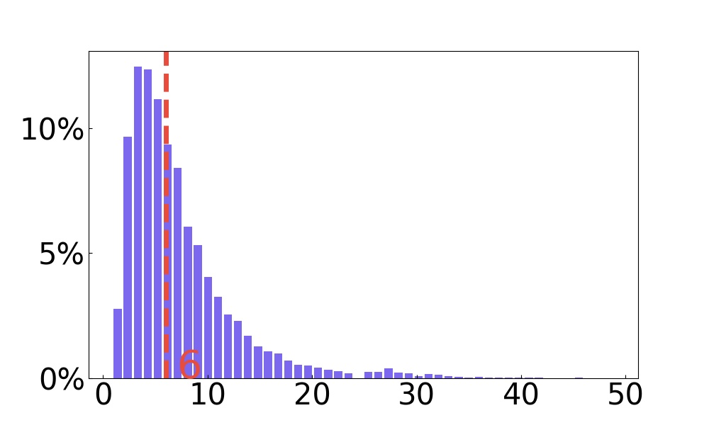
🔼 This figure presents four histograms visualizing the distribution of different aspects related to the layers found in infographics from the INFOGRAPHICS-650K dataset. The first histogram shows the distribution of the total number of layers per infographic. The second displays the distribution of the number of layers containing visual text. The third shows the distribution of the number of non-text layers. Finally, the fourth histogram illustrates the distribution of the number of characters present within the visual text layers of each infographic. Median values are indicated by dashed red lines across the histograms.
read the caption
Figure 7: Distribution of the number of layers, visual text layers, non-text layers, and the number of characters in the visual text layers. We mark the median values with red dashed lines.

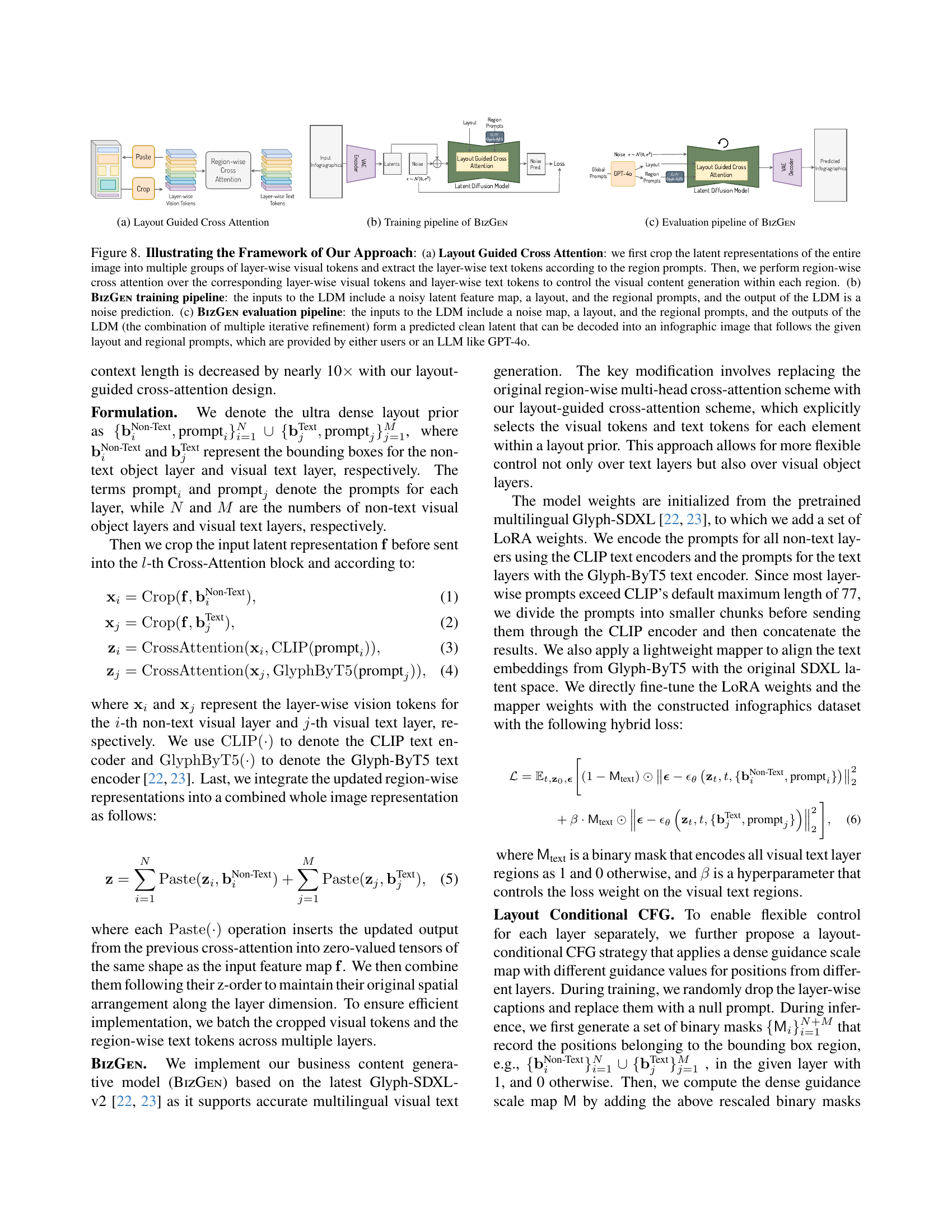
🔼 This figure illustrates the architecture of the Layout Guided Cross Attention mechanism used in BizGen. It shows how the model processes the long context of an article-level prompt by dividing it into multiple shorter, region-wise prompts corresponding to the layout. The process begins with cropping the latent representation of the input image into multiple groups of layer-wise visual tokens. Then, layer-wise text tokens are extracted according to the region-wise prompts. Finally, region-wise cross-attention is performed between the corresponding layer-wise visual tokens and layer-wise text tokens to control visual content generation within each region.
read the caption
(a) Layout Guided Cross Attention
🔼 The figure illustrates the training process of the BizGen model. It shows the input components: noisy latent features, a layout, and regional prompts. These inputs are fed into a latent diffusion model which outputs a noise prediction. The predicted noise is then used to refine the latent features, ultimately leading to the generation of an infographic.
read the caption
(b) Training pipeline of BizGen

🔼 The figure illustrates the evaluation pipeline of the BizGEN model. It begins with a noise map, a layout, and region-wise prompts as inputs to a latent diffusion model. The model then undergoes multiple iterative refinement steps, generating a predicted clean latent representation. Finally, a VAE decoder transforms this clean latent into the predicted infographic image.
read the caption
(c) Evaluation pipeline of BizGen

🔼 Figure 8 illustrates the BizGen framework. (a) shows the Layout Guided Cross Attention mechanism: the model crops the latent representation of an image into groups of layer-wise visual tokens and extracts layer-wise text tokens based on region prompts. Region-wise cross-attention is then performed to control visual content generation within each region. (b) details the BizGen training pipeline: a noisy latent feature map, layout, and regional prompts are fed into a Latent Diffusion Model (LDM), which outputs a noise prediction. (c) outlines the BizGen evaluation pipeline: a noise map, layout, and regional prompts are inputted into the LDM. Iterative refinement generates a predicted clean latent, decodable into an infographic matching the provided layout and prompts (from users or an LLM such as GPT-4).
read the caption
Figure 8: Illustrating the Framework of Our Approach: (a) Layout Guided Cross Attention: we first crop the latent representations of the entire image into multiple groups of layer-wise visual tokens and extract the layer-wise text tokens according to the region prompts. Then, we perform region-wise cross attention over the corresponding layer-wise visual tokens and layer-wise text tokens to control the visual content generation within each region. (b) BizGen training pipeline: the inputs to the LDM include a noisy latent feature map, a layout, and the regional prompts, and the output of the LDM is a noise prediction. (c) BizGen evaluation pipeline: the inputs to the LDM include a noise map, a layout, and the regional prompts, and the outputs of the LDM (the combination of multiple iterative refinement) form a predicted clean latent that can be decoded into an infographic image that follows the given layout and regional prompts, which are provided by either users or an LLM like GPT-4o.

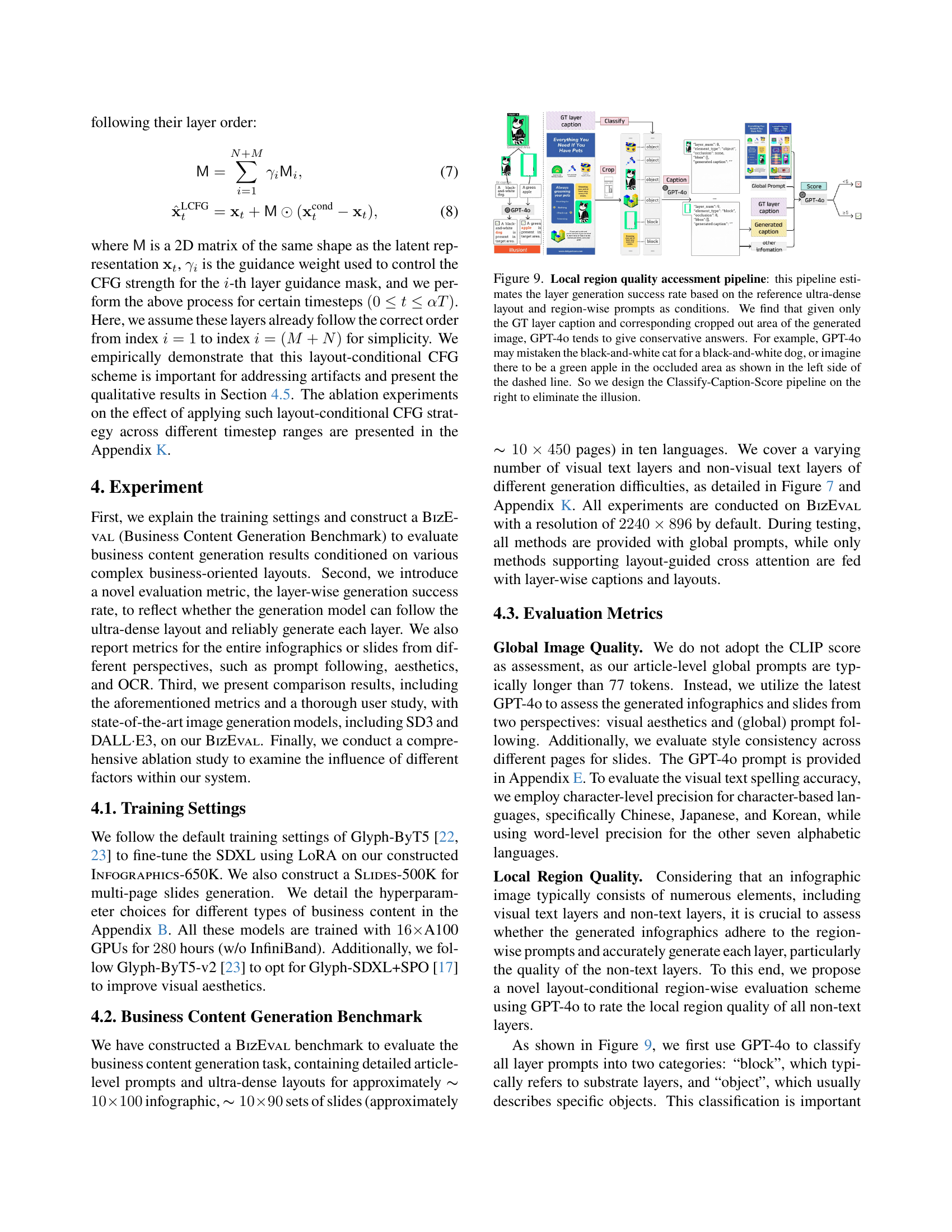
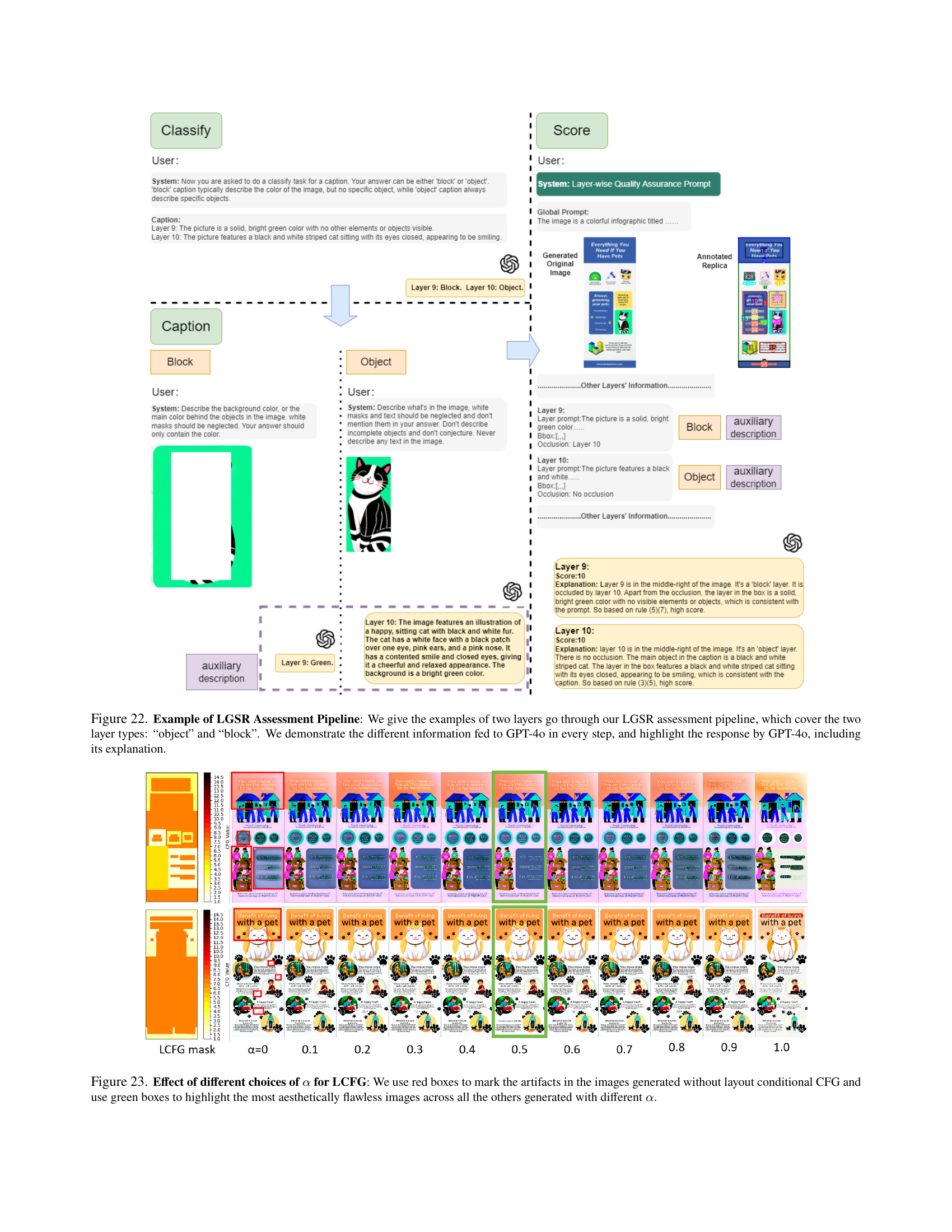
🔼 This figure illustrates a two-stage pipeline for assessing the quality of locally generated image regions within an infographic. The first stage uses only the ground truth (GT) layer caption and the corresponding cropped region from the generated image. However, it’s shown that GPT-40, used in this stage, sometimes provides overly cautious assessments (e.g., mistaking a black-and-white cat for a black-and-white dog). The second stage, the Classify-Caption-Score pipeline, addresses this issue by adding a layer classification step (‘block’ or ‘object’) before generating a score. This helps to reduce inaccurate assessments resulting from ambiguity in the image.
read the caption
Figure 9: Local region quality accessment pipeline: this pipeline estimates the layer generation success rate based on the reference ultra-dense layout and region-wise prompts as conditions. We find that given only the GT layer caption and corresponding cropped out area of the generated image, GPT-4o tends to give conservative answers. For example, GPT-4o may mistaken the black-and-white cat for a black-and-white dog, or imagine there to be a green apple in the occluded area as shown in the left side of the dashed line. So we design the Classify-Caption-Score pipeline on the right to eliminate the illusion.

🔼 The figure shows an infographic generated by the BizGEN model. The infographic is about moving tips and contains several sections with text and illustrations. The OCR accuracy for this specific infographic is 97%. The image demonstrates the model’s ability to generate high-quality visual text rendering within the context of a complex infographic layout.
read the caption
OCR: 97%¯¯percent97\underline{97\%}under¯ start_ARG 97 % end_ARG

🔼 The figure shows the result of infographics generation using the BizGen model. The image displays high accuracy in Optical Character Recognition (OCR), achieving a 100% score. This indicates that the model successfully rendered the text within the infographic, making it highly legible and easily understandable.
read the caption
OCR: 100%¯¯percent100\underline{100\%}under¯ start_ARG 100 % end_ARG

🔼 The figure shows the qualitative results of the infographics generated by the model. Each infographic is shown, and under each is a percentage representing the accuracy of the optical character recognition (OCR) of the text within that infographic. In every case, the accuracy is 100%, demonstrating that the model’s text rendering is highly accurate.
read the caption
OCR: 100%¯¯percent100\underline{100\%}under¯ start_ARG 100 % end_ARG

🔼 The figure shows an infographic generated by the BizGen model. The infographic is about the benefits of pet ownership and contains several points describing the positive effects of having a pet, including increased social interaction, improved fitness, reduced loneliness, and stress reduction. The infographic features a visually appealing design with a cartoon illustration and several small icons that reinforce the main points. The text is clear and easy to read, and the overall tone is friendly and informative.
read the caption
OCR: 98%¯¯percent98\underline{98\%}under¯ start_ARG 98 % end_ARG

🔼 The figure shows an infographic generated by the BizGEN model. The infographic is about the benefits of pet ownership. It includes illustrations of a person with a pet and bullet points that list the benefits, including stress reduction, increased social interaction, fitness improvements, and relief from loneliness. The accuracy of the Optical Character Recognition (OCR) on the text within the infographic is 98%.
read the caption
OCR: 98%¯¯percent98\underline{98\%}under¯ start_ARG 98 % end_ARG

🔼 The figure shows an infographic generated by a model (likely SD3-Large) from the paper, where the optical character recognition (OCR) accuracy is only 37%. This low accuracy indicates significant issues with the model’s ability to correctly render the text within the infographic. The image likely shows visual artifacts, misspellings, and possibly other inaccuracies in the generated text, highlighting a key challenge the paper addresses: the difficulty of generating high-quality visual text within complex layouts at the article level.
read the caption
OCR: 37%¯¯percent37\underline{37\%}under¯ start_ARG 37 % end_ARG

🔼 The figure shows infographic generation results using SD3-Large. While visually appealing, the results have significant issues with visual text spelling accuracy, as highlighted in a zoomed rectangle region in the image. This demonstrates a challenge for state-of-the-art models in rendering accurate visual text at the article level. This inaccuracy is a key focus of the paper, which proposes improvements to address this challenge.
read the caption
OCR: 52%¯¯percent52\underline{52\%}under¯ start_ARG 52 % end_ARG

🔼 The figure shows a low-quality infographic generated by a state-of-the-art model. Only 15% of the text is correctly recognized by optical character recognition (OCR). This highlights the challenge of generating high-quality infographics with accurate text rendering.
read the caption
OCR: 15%¯¯percent15\underline{15\%}under¯ start_ARG 15 % end_ARG

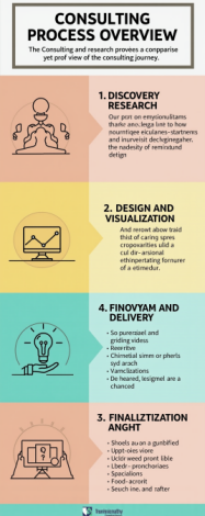
🔼 The figure shows an infographic generated by the model. The infographic displays information about consulting process overview. The OCR (Optical Character Recognition) accuracy for this specific infographic is 65%. This indicates that 65% of the text in the generated infographic was correctly recognized by the OCR system.
read the caption
OCR: 65%¯¯percent65\underline{65\%}under¯ start_ARG 65 % end_ARG

🔼 The figure shows an infographic generated by a system other than BizGEN. The infographic has text with poor OCR accuracy, specifically only 19% accuracy.
read the caption
OCR: 19%¯¯percent19\underline{19\%}under¯ start_ARG 19 % end_ARG

🔼 The figure shows the result of infographic generation using SD3-Large. The result shows significant visual artifacts such as spelling errors in the visual text, as indicated by the low OCR accuracy of 21%. This highlights a limitation of existing text-to-image generation models when dealing with longer, article-level text input.
read the caption
OCR: 21%¯¯percent21\underline{21\%}under¯ start_ARG 21 % end_ARG

🔼 The figure shows an example of an infographic generated by a previous state-of-the-art model. Only 14% of the text was correctly recognized by optical character recognition (OCR). This highlights the challenge of accurately rendering text within complex infographic layouts, a problem that the authors’ model aims to address.
read the caption
OCR: 14%¯¯percent14\underline{14\%}under¯ start_ARG 14 % end_ARG

🔼 The figure shows the results of infographic generation using SD3-Large. The zoomed-in rectangle highlights the poor spelling accuracy of the article-level visual text, despite the visually appealing nature of the generated infographics. This demonstrates the challenges of achieving accurate visual text rendering in complex, article-level infographics.
read the caption
OCR: 10%¯¯percent10\underline{10\%}under¯ start_ARG 10 % end_ARG

🔼 The figure shows an infographic generated by a previous state-of-the-art model, SD3-Large. The infographic attempts to depict business content, but the visual text is marred by significant inaccuracies in spelling (OCR accuracy of only 38%). This highlights the challenges faced by earlier methods in accurately rendering article-level text into infographics.
read the caption
OCR: 38%¯¯percent38\underline{38\%}under¯ start_ARG 38 % end_ARG

🔼 The figure shows an example of an infographic generated by a previous state-of-the-art model. The text within the infographic has a low OCR accuracy of only 43%, indicating significant issues with the quality of the text rendering. This highlights the challenge the authors of the paper are addressing in generating high-quality visual text within infographics.
read the caption
OCR: 43%¯¯percent43\underline{43\%}under¯ start_ARG 43 % end_ARG

🔼 The figure shows a sample infographic generated using a state-of-the-art text-to-image generation model. The infographic is about pet hotels, but the text quality is quite low, with only 16% accuracy in Optical Character Recognition (OCR). This low accuracy highlights one of the key challenges addressed in the paper: generating high-quality visual text within infographics.
read the caption
OCR: 16%¯¯percent16\underline{16\%}under¯ start_ARG 16 % end_ARG

🔼 The figure shows examples of infographics generated by a model with poor OCR accuracy. The caption indicates that the Optical Character Recognition (OCR) performance on these images is 0%, meaning no text could be accurately extracted from the images. This highlights a challenge in generating infographics where accurately rendering text is crucial.
read the caption
OCR: 0%¯¯percent0\underline{0\%}under¯ start_ARG 0 % end_ARG

🔼 The figure shows the results of infographics generation using a model trained on a dataset with low OCR accuracy (40%). The low accuracy likely results in visual artifacts and inaccuracies in the generated infographics compared to models trained on higher-quality data. The image demonstrates the challenge of generating high-quality infographics from low-accuracy data.
read the caption
OCR: 40%¯¯percent40\underline{40\%}under¯ start_ARG 40 % end_ARG

🔼 This figure shows an example of an infographic generated using a previous state-of-the-art model. The text in this infographic has very low accuracy (only 14% accuracy according to Optical Character Recognition or OCR). This highlights one of the key challenges the authors are addressing in their paper: generating high-quality, accurate visual text within infographics.
read the caption
OCR: 14%¯¯percent14\underline{14\%}under¯ start_ARG 14 % end_ARG

🔼 The figure shows an example of infographic generation result using SD3-Large model. The OCR accuracy is only 27%, indicating significant issues in visual text rendering, such as misspellings and inaccuracies. This highlights the challenges faced by existing models in handling article-level visual text rendering and the need for improvements in this area.
read the caption
OCR: 27%¯¯percent27\underline{27\%}under¯ start_ARG 27 % end_ARG

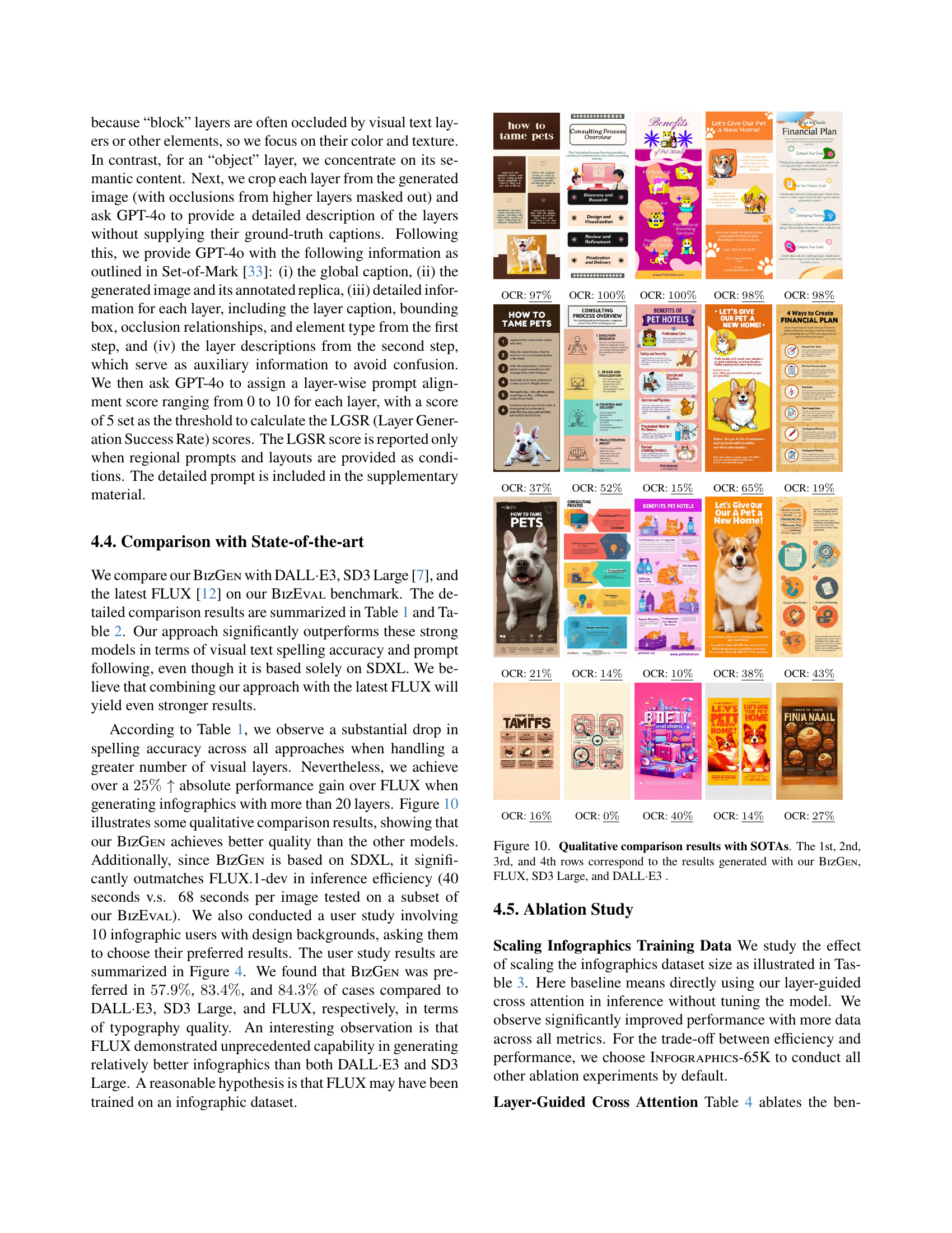
🔼 This figure presents a qualitative comparison of infographics generated by BizGen and three state-of-the-art (SOTA) models: FLUX, SD3 Large, and DALL-E 3. Each row displays examples generated by a different model, allowing for a direct visual comparison of the models’ capabilities in terms of accuracy, aesthetics, and overall quality. The figure visually demonstrates BizGen’s superior performance compared to the SOTAs.
read the caption
Figure 10: Qualitative comparison results with SOTAs. The 1st, 2nd, 3rd, and 4th rows correspond to the results generated with our BizGen, FLUX, SD3 Large, and DALL⋅⋅\cdot⋅E3 .

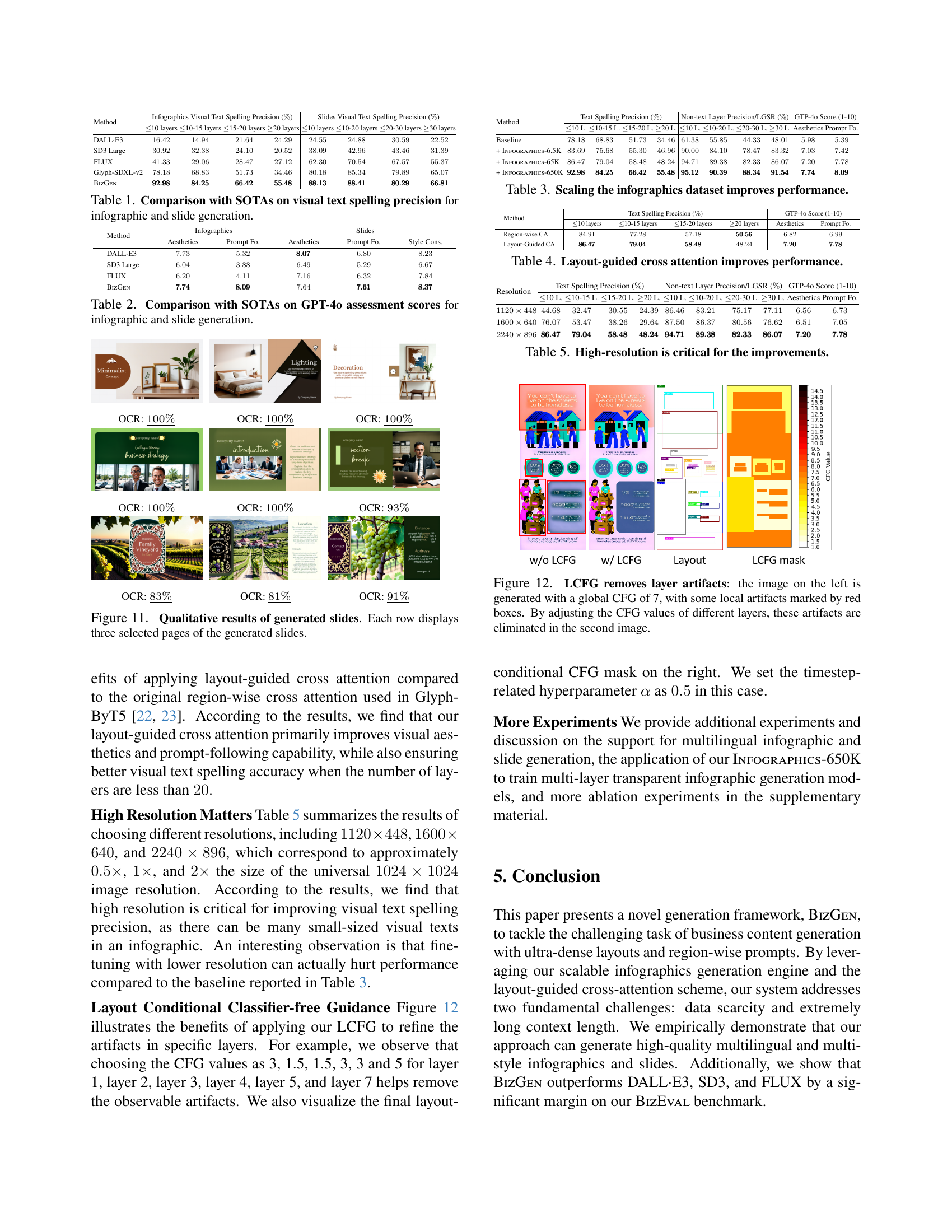
🔼 This table compares the visual text spelling precision of BizGEN against state-of-the-art (SOTA) models, including DALL-E3, SD3 Large, and FLUX, for both infographic and slide generation. It showcases the performance difference across various scenarios categorized by the number of layers in the generated images. This allows for evaluating how each model handles different levels of visual text complexity.
read the caption
Table 1: Comparison with SOTAs on visual text spelling precision for infographic and slide generation.

🔼 This table presents a comparison of the performance of different state-of-the-art (SOTA) models and the BIZGEN model on the task of generating infographics and slides. The evaluation is based on scores from GPT-40, a large language model, assessing aesthetics and prompt following. Higher scores indicate better performance. The table allows for comparison across various model types on the specified generation task.
read the caption
Table 2: Comparison with SOTAs on GPT-4o assessment scores for infographic and slide generation.

🔼 The figure shows a set of infographics generated by the BizGen model. Each infographic contains accurately rendered visual text, demonstrating the model’s ability to handle long, article-level prompts and ultra-dense layouts. The caption highlights the high accuracy (100%) of the optical character recognition (OCR) process applied to the generated text.
read the caption
OCR: 100%¯¯percent100\underline{100\%}under¯ start_ARG 100 % end_ARG

🔼 The figure displays a series of infographics generated by the BizGEN model. Each infographic contains text and images, demonstrating the model’s ability to render visuals accurately from article-level prompts. The OCR accuracy for each infographic is noted as 100%, indicating perfect recognition of the text within the generated images. The figures illustrate the high quality and accuracy achieved by BizGEN in generating complex, article-level infographics.
read the caption
OCR: 100%¯¯percent100\underline{100\%}under¯ start_ARG 100 % end_ARG

🔼 The figure shows the result of an infographic generated by the proposed BizGEN model. The infographic contains multiple layers of visual elements including visual texts and non-visual objects. The caption indicates that the Optical Character Recognition (OCR) accuracy for this infographic is 100%, meaning all text within the image was correctly recognized by OCR software.
read the caption
OCR: 100%¯¯percent100\underline{100\%}under¯ start_ARG 100 % end_ARG

🔼 The figure shows the results of optical character recognition (OCR) on a generated infographic. The OCR accuracy is 100%, indicating that all text in the generated infographic was correctly recognized.
read the caption
OCR: 100%¯¯percent100\underline{100\%}under¯ start_ARG 100 % end_ARG

🔼 The figure shows the results of optical character recognition (OCR) on a generated image. The OCR process successfully recognized 100% of the characters in the image, indicating perfect accuracy. This highlights the quality of the image generation model’s visual text rendering capabilities.
read the caption
OCR: 100%¯¯percent100\underline{100\%}under¯ start_ARG 100 % end_ARG

🔼 The figure shows the results of infographics generation using different text-to-image generation models. Each infographic was generated from a relatively short text prompt (386-737 characters). The image displays five infographics with varying levels of detail and complexity. The caption indicates that the optical character recognition (OCR) accuracy is 93% or greater for each image. This suggests that the generated text within the images is largely accurate and legible, although minor errors might be present.
read the caption
OCR: 93%¯¯percent93\underline{93\%}under¯ start_ARG 93 % end_ARG

🔼 The figure shows an infographic generated by the BizGEN model. The infographic includes text and images, and the OCR accuracy is 83%. The image shows a variety of elements, including text, illustrations, and photographs, suggesting a complex design.
read the caption
OCR: 83%¯¯percent83\underline{83\%}under¯ start_ARG 83 % end_ARG

🔼 The figure shows the result of an infographic generated by the model. The model achieved an Optical Character Recognition (OCR) accuracy of 81%. This indicates the model’s ability to accurately render text within the generated image. While the original caption is short, this explanation provides more context and clarifies the meaning of the OCR metric.
read the caption
OCR: 81%¯¯percent81\underline{81\%}under¯ start_ARG 81 % end_ARG

🔼 The figure shows an infographic generated by the BizGEN model. The infographic contains text and visuals, and the caption indicates that the Optical Character Recognition (OCR) accuracy of the text within the image is 91%. This suggests that 91% of the text in the generated infographic was correctly identified by the OCR software.
read the caption
OCR: 91%¯¯percent91\underline{91\%}under¯ start_ARG 91 % end_ARG

🔼 This figure showcases the quality of slides generated by the BizGEN model. Each row presents three sample pages from different generated slide decks, offering a visual representation of the model’s ability to produce coherent and aesthetically pleasing multi-page presentations. The slides demonstrate the model’s capacity to handle diverse layouts, text content, and visual elements in a cohesive manner.
read the caption
Figure 11: Qualitative results of generated slides. Each row displays three selected pages of the generated slides.

🔼 This table presents the results of an experiment evaluating the effect of scaling the size of the infographics dataset on the performance of the model. Increasing the dataset size from 6.5K to 65K and finally to 650K infographics led to significant improvements in the model’s ability to generate high-quality infographics. The table likely shows metrics such as visual text spelling precision, non-text layer precision, and a GPT-40 score (a measure of overall quality), demonstrating how these metrics improve as the dataset increases in size. This illustrates the importance of large, high-quality training data for effective model performance in the task of infographic generation.
read the caption
Table 3: Scaling the infographics dataset improves performance.

🔼 This table presents the ablation study results focusing on the impact of the layout-guided cross attention mechanism on the overall performance of the model. It compares the model’s performance with and without the layout-guided cross attention, demonstrating its effectiveness in improving key metrics such as text spelling precision and non-text layer precision (LGSR). The results are presented for different numbers of layers in both infographics and slides, showing the impact of the layout-guided approach across various complexity levels.
read the caption
Table 4: Layout-guided cross attention improves performance.

🔼 This table presents ablation study results that demonstrate the impact of image resolution on the performance of the BizGEN model. It shows that using higher resolutions (2240x896) significantly improves the model’s ability to accurately render visual text, especially when dealing with a large number of layers. Lower resolutions lead to a substantial drop in performance, highlighting the importance of high-resolution input for effective article-level visual text rendering in infographics and slides.
read the caption
Table 5: High-resolution is critical for the improvements.

🔼 This figure demonstrates the effectiveness of Layout Conditional Classifier-free Guidance (LCFG) in removing artifacts during image generation. The image on the left shows an infographic generated using a global CFG scale of 7. Noticeable artifacts are highlighted with red boxes. The image on the right displays the same infographic after applying LCFG with adjusted CFG values for different layers. These adjustments successfully eliminate the previously identified artifacts, resulting in a cleaner and more refined image.
read the caption
Figure 12: LCFG removes layer artifacts: the image on the left is generated with a global CFG of 7, with some local artifacts marked by red boxes. By adjusting the CFG values of different layers, these artifacts are eliminated in the second image.

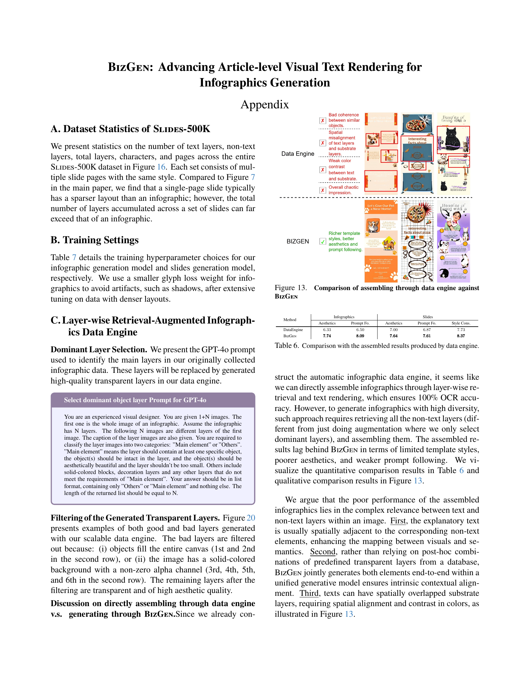
🔼 Figure 13 compares the performance of directly assembling infographics using a data engine versus generating them with the BizGen model. The data engine method involves retrieving pre-generated layers and combining them, while BizGen generates the infographics directly. The figure visually demonstrates that BizGen produces significantly better results in terms of aesthetics and prompt following due to its superior control over layer coherence, color contrast, and spatial arrangement, resulting in a more polished, cohesive final product. The data engine approach, while achieving 100% OCR accuracy, falls short in these qualitative aspects.
read the caption
Figure 13: Comparison of assembling through data engine against BizGen

🔼 This table compares the performance of the BizGEN model with a method that directly assembles infographics from a database of pre-generated layers. The BizGEN approach uses a layer-wise retrieval-augmented generation process, while the assembly method directly combines pre-existing components. The comparison is based on several metrics that evaluate the aesthetics and accuracy of the generated infographics. The results demonstrate BizGEN’s superior performance in these aspects, suggesting the benefits of its generative approach over simply assembling existing layers.
read the caption
Table 6: Comparison with the assembled results produced by data engine.

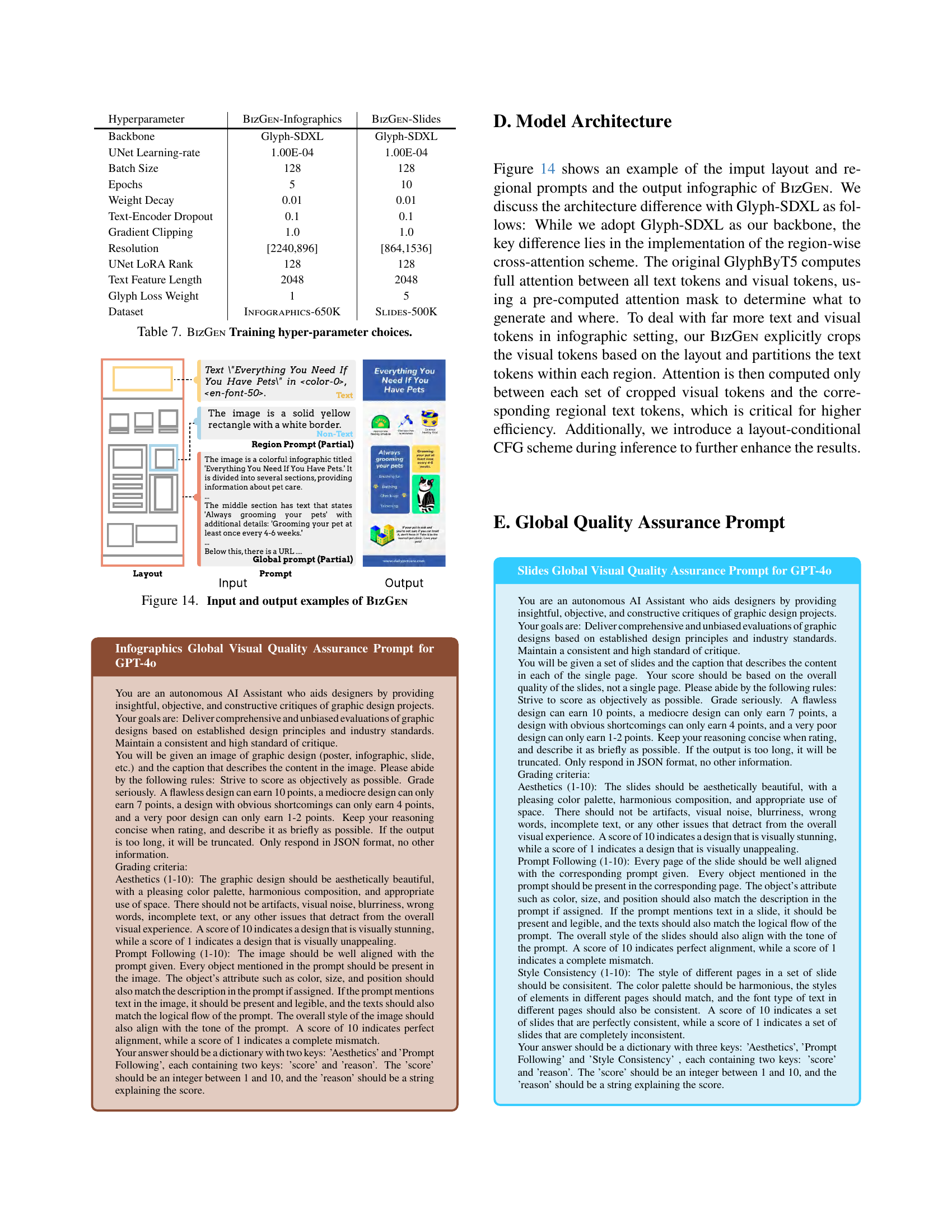
🔼 This table details the hyperparameter settings used during the training of the BizGen model for both infographic and slide generation. It lists values for various parameters, including the backbone model used (Glyph-SDXL), learning rate, batch size, number of epochs, weight decay, dropout rate, gradient clipping, image resolution, LoRA rank, text feature length, glyph loss weight, and the datasets used for training (INFOGRAPHICS-650K and SLIDES-500K). The specific values chosen for each parameter reflect the choices made by the authors for optimal model performance.
read the caption
Table 7: BizGen Training hyper-parameter choices.

🔼 This figure showcases the BizGen framework’s functionality by presenting example inputs and their corresponding outputs. The input consists of a combination of a global prompt (overall description of the desired infographic), a layout specifying the spatial arrangement of elements, and region-wise prompts (detailed descriptions for specific regions of the infographic). The output displays the generated infographic that BizGen produced based on these inputs, demonstrating its capability to render complex, multi-layered infographics accurately.
read the caption
Figure 14: Input and output examples of BizGen

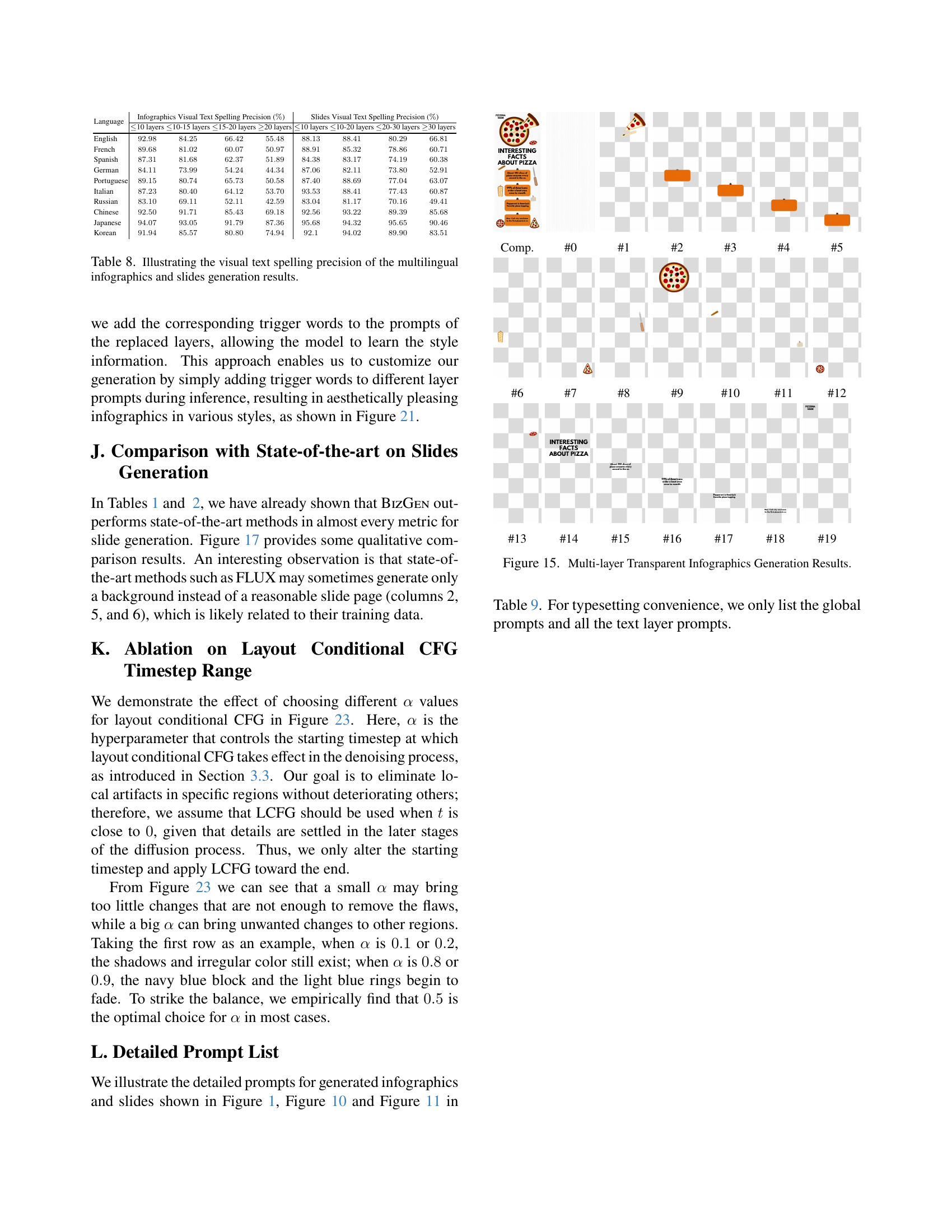
🔼 This table presents a comprehensive evaluation of the multilingual capabilities of the BizGEN model in generating infographics and slides. It shows the visual text spelling precision, a key indicator of the model’s accuracy in rendering text across multiple languages. The precision is broken down by the number of layers in each infographic and slide, giving insights into how the model’s performance scales with complexity. This allows for a nuanced understanding of BizGEN’s strengths and weaknesses across different linguistic and visual design challenges.
read the caption
Table 8: Illustrating the visual text spelling precision of the multilingual infographics and slides generation results.

🔼 This figure shows the results of multi-layer transparent infographic generation. It demonstrates the ability of the model to generate complex infographics with numerous layers, showcasing the ability to control individual elements within the ultra-dense layout. Each row represents a different infographic, illustrating the model’s ability to render a range of designs and layouts.
read the caption
Comp.

🔼 This figure showcases the results of infographics generated using the BizGEN model. Each sub-figure shows an infographic example generated by BizGEN, demonstrating the model’s capacity to accurately render visual text within ultra-dense layouts. The variations in character count and OCR accuracy across the sub-figures illustrate the model’s robustness across different infographic complexities.
read the caption
#0

🔼 The figure showcases five examples of infographics generated by the BizGEN model. Each infographic demonstrates the model’s ability to render accurate visual text within complex layouts. The examples vary in character count (386-737 characters), showcasing the scalability of the model for different lengths of article-level prompts. The caption in the paper indicates the Optical Character Recognition (OCR) accuracy for each infographic, ranging from 93% to 99%, suggesting a high degree of text rendering accuracy.
read the caption
#1

🔼 This figure showcases the strong performance of BizGen compared to other state-of-the-art models on the BizEVAL benchmark. The win rates, based on a user study, demonstrate BizGen’s superiority in terms of aesthetics, text accuracy, and prompt alignment. The specific win rates are presented for BizGen against three other models, DALL-E3, SD3 Large, and FLUX, respectively.
read the caption
#2

🔼 This figure shows an infographic about tax planning strategies. It’s divided into four sections: ‘Understand Your Tax Bracket,’ ‘Maximize Tax-Advantaged Accounts,’ ‘Tax Loss Harvesting,’ and ‘Plan for Charitable Giving.’ Each section includes a concise description and a small illustrative graphic related to the topic. The overall style is informative and aimed at providing brief advice on tax planning.
read the caption
#3

🔼 This figure displays infographics generated by the BIZGEN model, showcasing its ability to render accurate visual text within ultra-dense layouts. Each infographic contains a substantial amount of text, ranging from 386 to 737 characters, demonstrating the model’s capability in handling article-level visual text rendering tasks. The high accuracy of the OCR (93%-99%) further validates the efficacy of the BIZGEN model’s text rendering.
read the caption
#4
🔼 Figure 5 demonstrates the decomposition of an infographic into its constituent visual elements (layers). It displays a sample infographic and highlights the different visual layers, such as background, title and subtitle, body text, objects, and decorative elements. The figure also illustrates the ‘ultra-dense layout’, which is a crucial element in the paper, specifying the precise spatial arrangement of each visual element within the infographic.
read the caption
#5

🔼 Figure 6 illustrates the overall pipeline of the retrieval-augmented infographics generation process. Starting with a template infographic, the system first selects dominant visual layers. Next, it retrieves the top K most similar transparent layers from a database of high-quality layers. Finally, it replaces layers in the template with retrieved layers to create varied infographic designs.
read the caption
#6
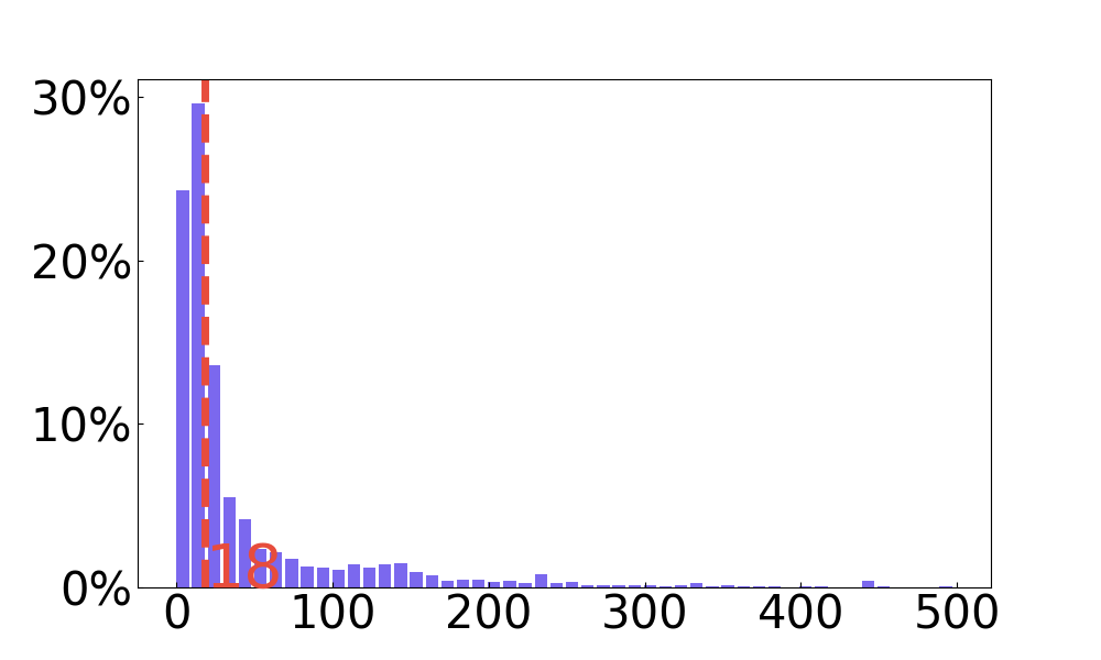
🔼 Figure 7 presents a statistical overview of the INFOGRAPHICS-650K dataset, visualizing the distribution of several key features related to the infographic layers. Specifically, it shows the distribution of the number of text layers, the number of non-text layers, the total number of layers per infographic, and the average number of characters per text layer. These distributions provide insights into the complexity and density of the infographics within the dataset. The median values for each distribution are highlighted using red dashed lines, facilitating a comparison of central tendencies across these different features.
read the caption
#7

🔼 Figure 18 presents qualitative results demonstrating multilingual infographics generation capabilities. The figure showcases examples of infographics generated in ten different languages: Chinese, Japanese, Korean, German, Spanish, French, Italian, Portuguese, and Russian. Each language has multiple infographic examples, showcasing variety in style and content. The purpose is to demonstrate the system’s ability to handle diverse languages effectively and to achieve high quality outputs in various linguistic contexts.
read the caption
#8

🔼 Figure 9 demonstrates the process of evaluating the quality of locally generated infographic regions. It uses GPT-4 to assess how well the generated regions match the intended content based on provided captions and layout information. The process involves classifying each region as either a ‘block’ or ‘object’, and then scoring the quality of the generated content within the region’s bounding box. The scoring considers factors like accuracy of the visual elements and their alignment with the caption. An example of the process is also provided to illustrate how captions are used, and how the model evaluates consistency between generated images and intended content.
read the caption
#9

🔼 This figure shows qualitative comparison results of slides generation with state-of-the-art methods (SOTA). The first, second, third and fourth rows correspond to the results generated with BizGEN, FLUX, SD3 Large and DALL-E 3, respectively. The left three columns are in the same set, while the right three columns are in another set. The results highlight BizGEN’s ability to generate slides with better aesthetics and adherence to the prompt compared to other SOTAs.
read the caption
#10

🔼 Figure 11 shows qualitative results of multilingual slides generation. Each row displays three selected pages from generated slides in a specific language. The languages represented are Chinese, Japanese, Korean, German, Spanish, French, Italian, Portuguese, and Russian, respectively. The figure visually demonstrates the model’s ability to generate slides in multiple languages while maintaining high visual quality and accurate text rendering.
read the caption
#11

🔼 Figure 12 shows the effectiveness of the layout conditional classifier-free guidance (LCFG) in removing artifacts from generated images. The left image shows artifacts in the generated image, which are marked by red boxes. By applying LCFG, these artifacts are successfully removed, as shown in the image on the right.
read the caption
#12

🔼 Figure 13 presents a comparison between generating infographics through the data engine and using the BIZGEN model. The data engine approach, while ensuring 100% OCR accuracy, results in less diverse styles, poorer aesthetics, and weaker prompt following compared to BIZGEN. The limitations of directly assembling infographics through the data engine are highlighted, particularly the lack of coherent relationships between text and non-text layers, impacting visual quality.
read the caption
#13

🔼 Figure 14 shows an example of the input layout and regional prompts, and the output infographic generated by BizGEN. The input includes a layout specifying the spatial arrangement of visual elements (like text boxes and images), and regional prompts, which provide specific instructions for what should appear in each region. The output demonstrates the infographic generated according to these instructions. This figure illustrates the workflow and capabilities of the BizGEN framework in handling complex layout and region-specific requirements.
read the caption
#14

🔼 Figure 15 presents qualitative results for multi-layer transparent infographic generation. It showcases the generation of infographics with more than 20 transparent layers, including various visual elements and visual text layers. This figure demonstrates the capability of the model to produce complex, layered graphics, highlighting the intricate detail and design achievable with the approach.
read the caption
#15

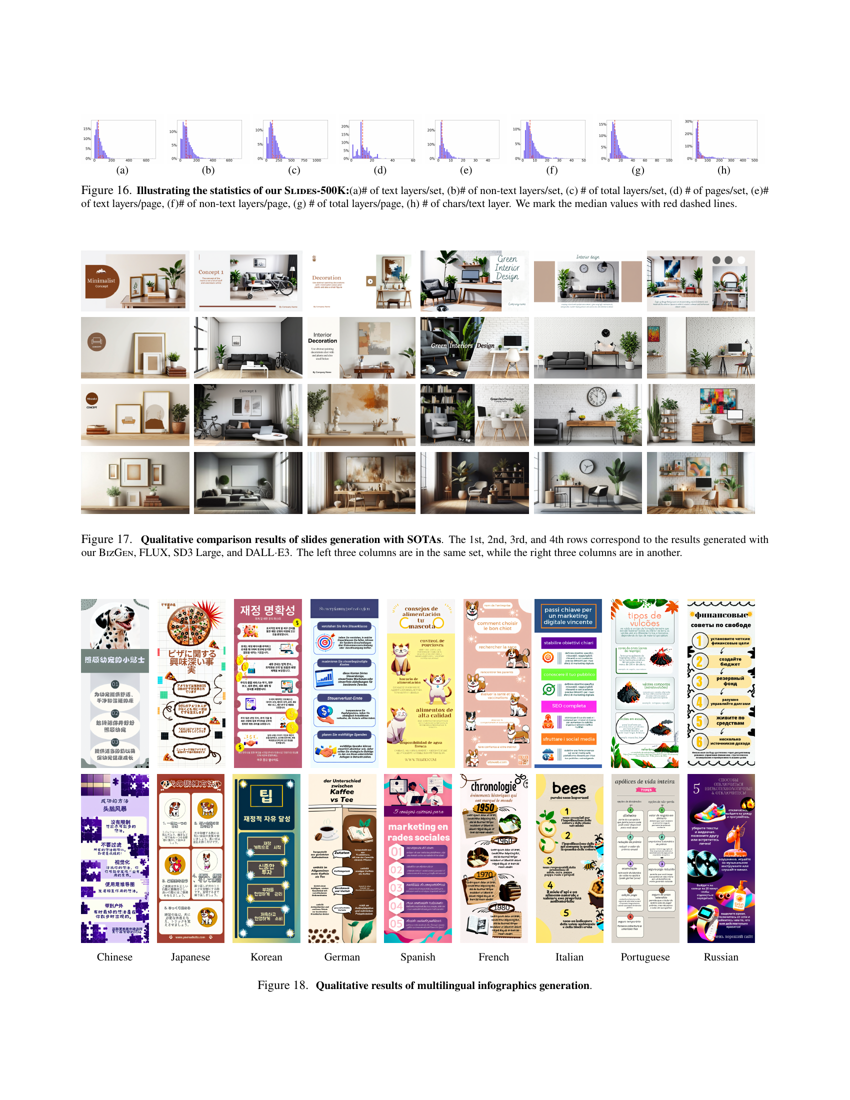
🔼 Figure 16 presents a statistical overview of the SLIDES-500K dataset, which contains over 500,000 sets of slides. The figure shows the distributions of several key metrics across the dataset, including the number of text layers per set, the number of non-text layers per set, the total number of layers per set, the total number of pages per set, the number of text layers per page, the number of non-text layers per page, the total number of layers per page, and the number of characters per text layer. Each metric’s distribution is illustrated with a histogram, visually representing the frequency of different values within the dataset. The median values are highlighted with red dashed lines for each metric. This figure provides insights into the size and structural properties of the SLIDES-500K dataset, which is important for understanding the scope of the data used for training and evaluation in the context of the paper.
read the caption
#16

🔼 Figure 17 shows qualitative comparison results of slides generated by BizGen and other state-of-the-art models. The figure consists of multiple slide sets, each containing several pages. Each row represents a comparison between BizGen and other methods such as FLUX, SD3 large, and DALL-E3. For each slide set, BizGen generally produces more visually appealing and coherent results, outperforming the other methods in terms of visual aesthetics and alignment with prompts.
read the caption
#17

🔼 Figure 18 presents qualitative results from generating multilingual infographics across ten different languages. Each row showcases examples generated in a specific language, demonstrating the model’s ability to adapt to various writing systems and cultural contexts while maintaining visual fidelity and thematic consistency.
read the caption
#18

🔼 Figure 19 presents qualitative results of multilingual slide generation. The figure showcases examples of slides generated in ten different languages: Chinese, Japanese, Korean, German, Spanish, French, Italian, Portuguese, and Russian. Each row displays slides in a particular language, illustrating the model’s ability to generate accurate visual text and appropriate aesthetics across multiple linguistic contexts.
read the caption
#19

🔼 This figure showcases the results of generating multi-layer transparent infographics using the BizGen framework. It visually demonstrates the model’s ability to render complex infographics with numerous layers, each containing distinct visual elements and text. The high-quality, detailed rendering highlights the effectiveness of the approach in managing intricate layouts and accurately representing diverse visual components. The figure visually demonstrates BizGen’s advanced capabilities in generating business content, showcasing the high-quality results achieved.
read the caption
Figure 15: Multi-layer Transparent Infographics Generation Results.

🔼 The figure shows an infographic generated by the BIZGEN model. It depicts a business agency, showcasing its services offered, team expertise, and successful projects. The visual style is clean and modern, employing a combination of text and illustrative elements to effectively communicate the agency’s capabilities and values.
read the caption
(a)

🔼 This figure shows infographics generated by using SD3-Large. Although visually appealing, the generated text within the infographics suffers from notable spelling inaccuracies. A zoomed-in portion of the figure highlights examples of these errors.
read the caption
(b)

🔼 This infographic uses a light blue background with a white border. It shows four key tips for moving, each with an illustration and concise description. Tips include creating a moving budget, inquiring about utilities, packing efficiently, and planning for moving day. Two cartoon characters are also depicted in the process of moving.
read the caption
(c)

🔼 The figure shows an infographic generated by BizGEN. It contains 594 characters and has an OCR accuracy of 99%. The infographic is about tips for moving, with sections on creating a moving budget, asking about utilities, packing smart, and making a plan for moving day. Each tip includes a short description and a small illustration.
read the caption
(d)

🔼 This infographic uses a light blue background with white text and icons, divided into four sections, each detailing a tip for a smooth move. The tips, presented with numbers 1-4, cover budgeting, utility inquiries, smart packing strategies, and the importance of pre-move planning. Illustrative elements depict people moving boxes and plants.
read the caption
(e)

🔼 This figure shows the distribution of the number of non-text layers per page in the SLIDES-500K dataset. The x-axis represents the number of non-text layers, and the y-axis represents the percentage of pages with that number of non-text layers. The distribution is heavily skewed towards smaller numbers of non-text layers, indicating that most slides in this dataset have a relatively simple layout with few non-text elements. The median number of non-text layers per page is shown as a red dashed line, giving a visual reference for the central tendency of the distribution.
read the caption
(f)

🔼 The figure shows the distribution of the number of total layers per page in the SLIDES-500K dataset. The x-axis represents the number of total layers, and the y-axis shows the percentage of pages with that many layers. The distribution is heavily skewed towards a smaller number of layers, indicating that most slides in this dataset have a relatively simple layout. The median number of layers is marked by a red dashed line. This distribution helps characterize the complexity of slide layouts in the dataset and provides context for the model’s ability to handle varying levels of complexity.
read the caption
(g)

🔼 This histogram shows the distribution of the number of characters per text layer in the SLIDES-500K dataset. The x-axis represents the number of characters, and the y-axis represents the frequency of layers with that many characters. The graph shows that the majority of text layers have a relatively small number of characters, with the distribution tailing off as the number of characters increases.
read the caption
(h)

🔼 This figure presents a statistical analysis of the Slides-500K dataset, which consists of various slide presentations. Each sub-figure (a-h) shows the distribution of a specific characteristic across all the slide sets. Specifically, the sub-figures illustrate the distributions of: (a) Number of text layers per slide set (b) Number of non-text layers per slide set (c) Total number of layers per slide set (d) Number of pages per slide set (e) Number of text layers per page (f) Number of non-text layers per page (g) Total number of layers per page (h) Number of characters per text layer The median values for each distribution are marked with red dashed lines, providing a visual representation of the central tendency of the data.
read the caption
Figure 16: Illustrating the statistics of our Slides-500K:(a)# of text layers/set, (b)# of non-text layers/set, (c) # of total layers/set, (d) # of pages/set, (e)# of text layers/page, (f)# of non-text layers/page, (g) # of total layers/page, (h) # of chars/text layer. We mark the median values with red dashed lines.

🔼 This figure presents a qualitative comparison of slide generation results from four different models: BizGen (the authors’ model), FLUX, SD3 Large, and DALL-E 3. Each row displays the results of one model, showcasing several slides within a set. The left three columns represent slides from one set, while the right three show slides from a different set, allowing for comparison of both the model’s ability to generate cohesive sets and the overall quality of the generated slides.
read the caption
Figure 17: Qualitative comparison results of slides generation with SOTAs. The 1st, 2nd, 3rd, and 4th rows correspond to the results generated with our BizGen, FLUX, SD3 Large, and DALL⋅⋅\cdot⋅E3. The left three columns are in the same set, while the right three columns are in another.

🔼 This figure showcases qualitative results of multilingual infographics generation. Each row presents infographics generated for a specific language, illustrating the model’s capability in handling diverse linguistic contexts and producing visually appealing outputs.
read the caption
Chinese

🔼 This figure showcases qualitative results of multilingual infographics generation. Each row presents examples generated in a different language, namely Chinese, Japanese, Korean, German, Spanish, French, Italian, Portuguese, and Russian. The variations demonstrate the model’s ability to adapt visual text rendering and overall style across multiple languages.
read the caption
Japanese

🔼 This figure showcases qualitative results of multilingual infographic generation, demonstrating the model’s ability to generate high-quality infographics in various languages. Each column represents a different language (Chinese, Japanese, Korean, German, Spanish, French, Italian, Portuguese, Russian), with multiple examples of generated infographics displayed within each column. The visual diversity across languages highlights the model’s adaptability and capacity to handle diverse textual and visual styles.
read the caption
Korean

🔼 Figure 10 presents a qualitative comparison of infographics generated by BizGEN and other state-of-the-art models (DALL-E3, SD3 Large, and FLUX). Each row displays samples generated by the different models, showing BizGEN’s superior ability to produce high-quality, visually appealing results with accurate text compared to the other models.
read the caption
German

🔼 Figure 18 showcases a series of infographics generated by the BizGen model, each in a different language. The infographics demonstrate the model’s ability to accurately render visual text in multiple languages, including Chinese, Japanese, Korean, German, Spanish, French, Italian, Portuguese, and Russian. The variety of styles and layouts in each infographic illustrates the model’s versatility and robustness.
read the caption
Spanish

🔼 This figure showcases the results of multilingual infographics generation using the BizGEN model. It displays a series of infographics, each created in a different language (Chinese, Japanese, Korean, German, Spanish, French, Italian, Portuguese, Russian), demonstrating the model’s ability to render accurate visual text and adhere to prompts across various languages. The figure highlights the model’s capacity for high-quality multilingual infographic generation, supporting the study’s claim of robust performance across multiple language settings.
read the caption
French

🔼 This figure showcases qualitative results from multilingual infographics generation. Each column represents a different language (Chinese, Japanese, Korean, German, Spanish, French, Italian, Portuguese, Russian), demonstrating the model’s ability to generate infographics with accurate text in various languages.
read the caption
Italian

🔼 This figure displays qualitative results of multilingual infographics generation. Each column represents a different language (Chinese, Japanese, Korean, German, Spanish, French, Italian, Portuguese, Russian), showcasing the effectiveness of the model in generating diverse infographics across multiple languages. The results demonstrate the model’s ability to accurately render textual elements and adapt to various writing systems.
read the caption
Portuguese

🔼 Figure 18 presents qualitative results of multilingual infographics generation. The figure showcases examples of infographics generated in ten different languages: Chinese, Japanese, Korean, German, Spanish, French, Italian, Portuguese, and Russian. Each language is represented by a row, visually demonstrating the accuracy and diversity of the model’s output across various linguistic contexts. This highlights the model’s capability to generate high-quality infographics adapted for different languages while maintaining visual coherence and accuracy.
read the caption
Russian

🔼 This figure showcases the qualitative results of the BizGEN model’s multilingual infographic generation capabilities. It presents a diverse collection of infographics created in various languages (including English, French, German, Spanish, Italian, Portuguese, Russian, Chinese, Japanese, and Korean), demonstrating BizGEN’s ability to handle different languages and generate visually appealing and relevant content based on the language provided.
read the caption
Figure 18: Qualitative results of multilingual infographics generation.

🔼 This figure showcases the qualitative results of multilingual slide generation using the BizGen model. Each row displays slides generated using the model with the text in a different language: Chinese, Japanese, Korean, German, Spanish, French, Italian, Portuguese, and Russian. The figure demonstrates the model’s ability to accurately render visual text in various languages and scripts, highlighting its cross-lingual capabilities.
read the caption
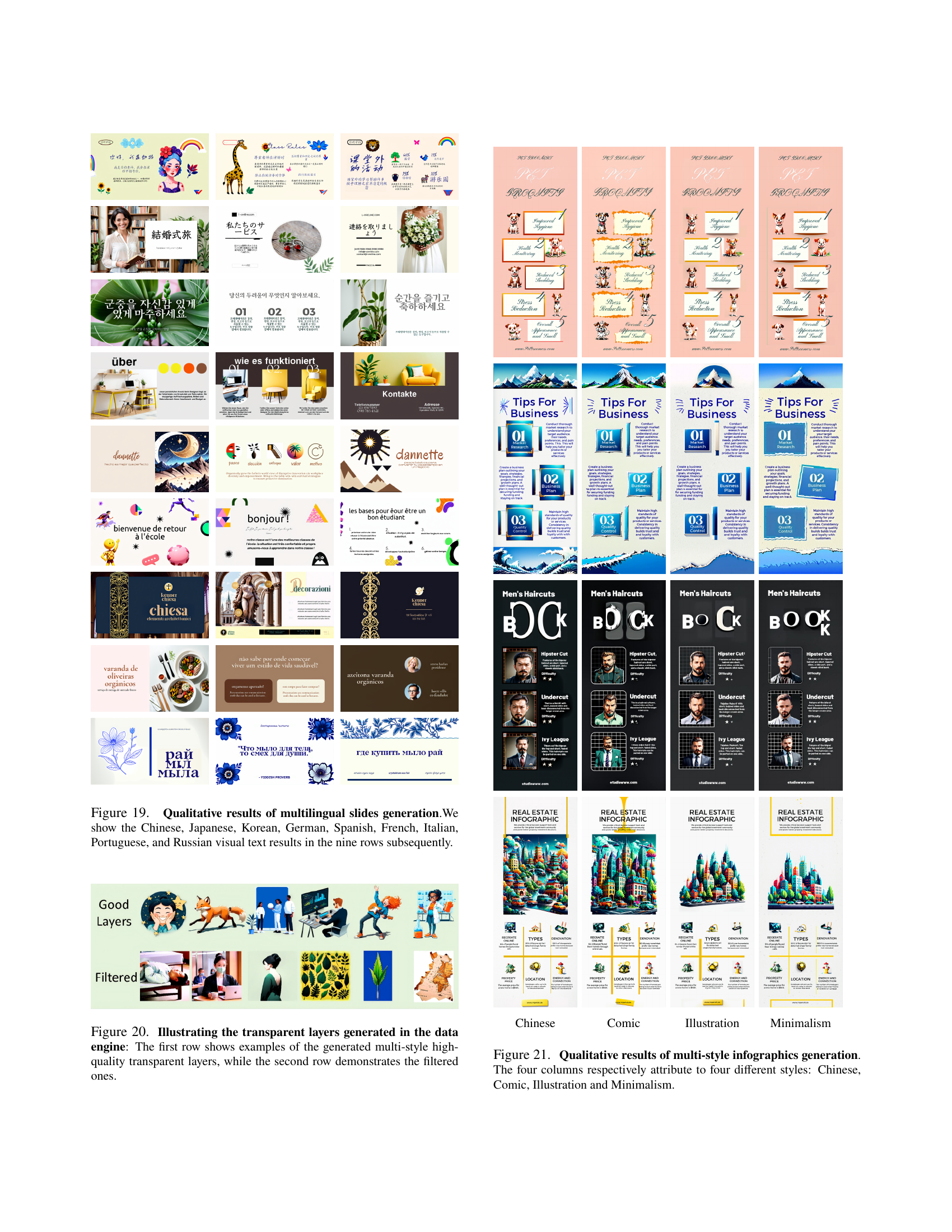
Figure 19: Qualitative results of multilingual slides generation.We show the Chinese, Japanese, Korean, German, Spanish, French, Italian, Portuguese, and Russian visual text results in the nine rows subsequently.

🔼 This figure showcases the transparent layers generated by the data engine. The top row displays examples of the diverse styles and high quality achieved in the generated layers. These layers are used in the construction of infographics. The bottom row presents layers that were filtered out, illustrating the quality control process and the criteria used for layer selection. This filtering ensures only high-quality, usable layers are included in the infographic dataset.
read the caption
Figure 20: Illustrating the transparent layers generated in the data engine: The first row shows examples of the generated multi-style high-quality transparent layers, while the second row demonstrates the filtered ones.

🔼 This figure showcases qualitative results of multilingual infographics generation. It presents a diverse range of infographic designs, each generated using the BizGEN model and reflecting different languages (Chinese, Japanese, Korean, German, Spanish, French, Italian, Portuguese, and Russian). The visual diversity demonstrates BizGEN’s ability to adapt to various linguistic and cultural styles while maintaining high-quality visual text rendering.
read the caption
Chinese
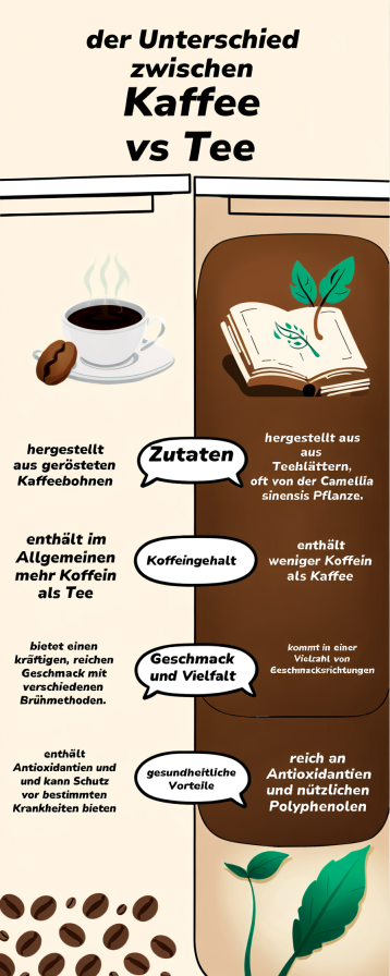
🔼 The figure showcases a variety of infographics generated using the BizGEN model, each demonstrating a distinct artistic style categorized as ‘Comic’. The ‘Comic’ style is characterized by its playful, cartoonish aesthetic, bright colors, and simplified imagery. These infographics illustrate BizGEN’s ability to produce diverse visual outputs while adhering to the user-specified article-level prompts. The visual elements in the comic style are designed to be easily understood and engaging for a broad audience.
read the caption
Comic

🔼 This figure showcases examples of infographics and slides generated by the BizGEN model. The images demonstrate the model’s ability to render accurate visual text, adhere to ultra-dense layouts, and produce high-quality business content. Each example has a caption indicating the number of characters and the accuracy of Optical Character Recognition (OCR).
read the caption
Illustration

🔼 The image showcases a minimalist design concept. It features three framed pieces of artwork or photographs with a simple, clean aesthetic. The frames are gold, white with a brown paper insert, and gold. To the right of the frames, a small potted plant is placed. Three brown leather-bound books are stacked vertically under the artwork. The backdrop is a light-colored wall, enhancing the minimalistic feel. A circular brown icon on the left shows a white line drawing of a couch and picture frame, along with the text ‘Minimalist’ and ‘CONCEPT’. The overall style emphasizes simplicity, natural elements, and a clean, uncluttered look.
read the caption
Minimalism

🔼 This figure showcases the versatility of the BizGEN model in generating infographics across various artistic styles. Four distinct styles are presented: Chinese, Comic, Illustration, and Minimalism. Each column displays multiple examples of infographics produced in the corresponding style, demonstrating the model’s ability to adapt to different visual aesthetics and thematic approaches while maintaining high-quality visual text rendering. This highlights BizGEN’s capability to satisfy diverse user preferences and creative needs.
read the caption
Figure 21: Qualitative results of multi-style infographics generation. The four columns respectively attribute to four different styles: Chinese, Comic, Illustration and Minimalism.
🔼 This figure details the process of evaluating layer generation success rates (LGSR). It visually depicts how the LGSR assessment pipeline evaluates two example layers (one ‘object’ and one ‘block’) from a generated infographic. For each layer, the process illustrates the information provided to GPT-40: the global caption, layer caption, bounding box, occlusion details, element type (object or block), and auxiliary description. The figure shows GPT-40’s assessment (a score from 0-10) and justification for each layer.
read the caption
Figure 22: Example of LGSR Assessment Pipeline: We give the examples of two layers go through our LGSR assessment pipeline, which cover the two layer types: “object” and “block”. We demonstrate the different information fed to GPT-4o in every step, and highlight the response by GPT-4o, including its explanation.

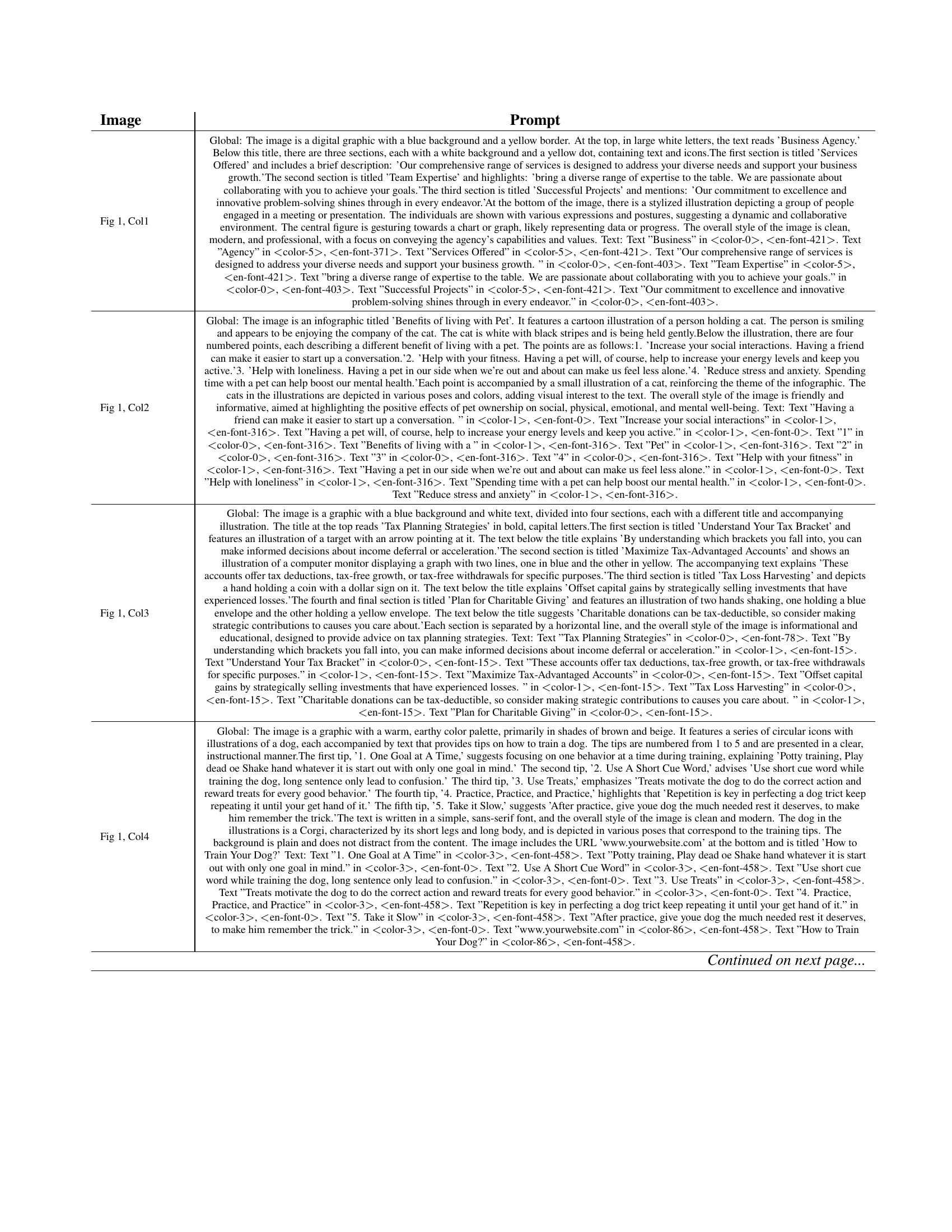
🔼 This figure demonstrates the impact of the hyperparameter α (alpha) on the Layout Conditional Classifier-Free Guidance (LCFG) method used in the BizGEN model. Different values of α control the starting timestep at which the LCFG takes effect during the image generation process. The images shown illustrate the results obtained for various α values. Red boxes highlight artifacts present in images generated without LCFG, while green boxes indicate the most aesthetically pleasing images among those generated using LCFG with different α values. This visualization helps to determine the optimal α value for balancing artifact removal and maintaining image quality.
read the caption
Figure 23: Effect of different choices of α𝛼\alphaitalic_α for LCFG: We use red boxes to mark the artifacts in the images generated without layout conditional CFG and use green boxes to highlight the most aesthetically flawless images across all the others generated with different α𝛼\alphaitalic_α.
Full paper#
