TL;DR#
Many existing methods struggle to analyze irregularly sampled medical time series (ISMTS) data effectively, failing to fully consider the unique temporal patterns and correlations among different medical variables. This is problematic because it limits the ability to extract detailed features at the variable level, thus hindering accurate predictions. The varying sampling rates and time-dependent correlations further complicate the analysis.
To overcome this, the authors propose Knowledge-Empowered Dynamic Graph Network (KEDGN). KEDGN uses a pre-trained language model to integrate medical knowledge, allowing it to capture variable-specific temporal patterns. A density-aware mechanism dynamically adjusts the variable graph, reflecting the time-varying correlations among variables. This dynamic graph, combined with variable-specific parameter spaces, is integrated into a graph convolutional recurrent network to model intra and inter-variable dependencies. Experiments show KEDGN significantly outperforms existing methods on four healthcare datasets.
Key Takeaways#
Why does it matter?#
This paper is crucial for researchers working with irregularly sampled medical time series. It offers a novel approach that significantly improves the accuracy of predictions by integrating medical knowledge and dynamic graph networks. This advances the field and opens new avenues for research into more sophisticated methods for handling complex medical data.
Visual Insights#

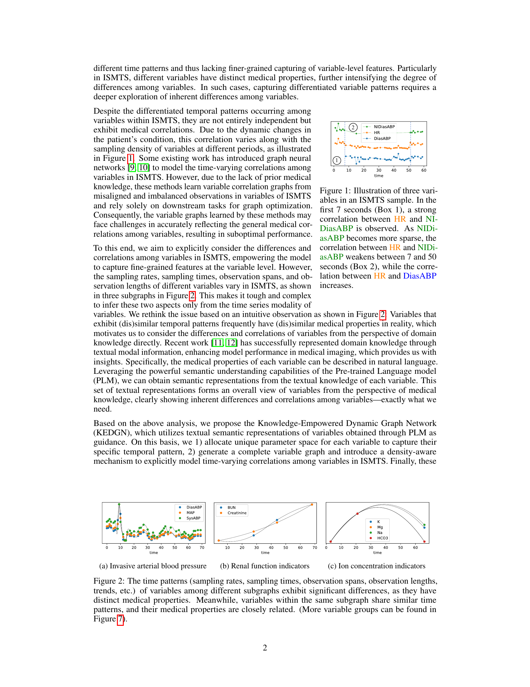
🔼 This figure shows three example variables (HR, NIDiasABP, DiasABP) from an irregularly sampled medical time series (ISMTS) dataset. It highlights how correlations between variables can change over time, even within a short observation period. In the initial phase, HR and NIDiasABP are strongly correlated. As the sampling frequency of NIDiasABP decreases, its correlation with HR weakens while the correlation between HR and DiasABP strengthens. This illustrates the dynamic and time-varying nature of correlations in ISMTS data that the proposed method (KEDGN) aims to address.
read the caption
Figure 1: Illustration of three variables in an ISMTS sample. In the first 7 seconds (Box 1), a strong correlation between HR and NIDiasABP is observed. As NIDiasABP becomes more sparse, the correlation between HR and NIDiasABP weakens between 7 and 50 seconds (Box 2), while the correlation between HR and DiasABP increases.

🔼 This table presents the performance comparison of different methods on four irregularly sampled medical time series datasets (P19, Physionet, MIMIC-III, and P12) for the task of time series classification. The performance is evaluated using AUROC and AUPRC metrics. The best and second-best results for each dataset and metric are highlighted.
read the caption
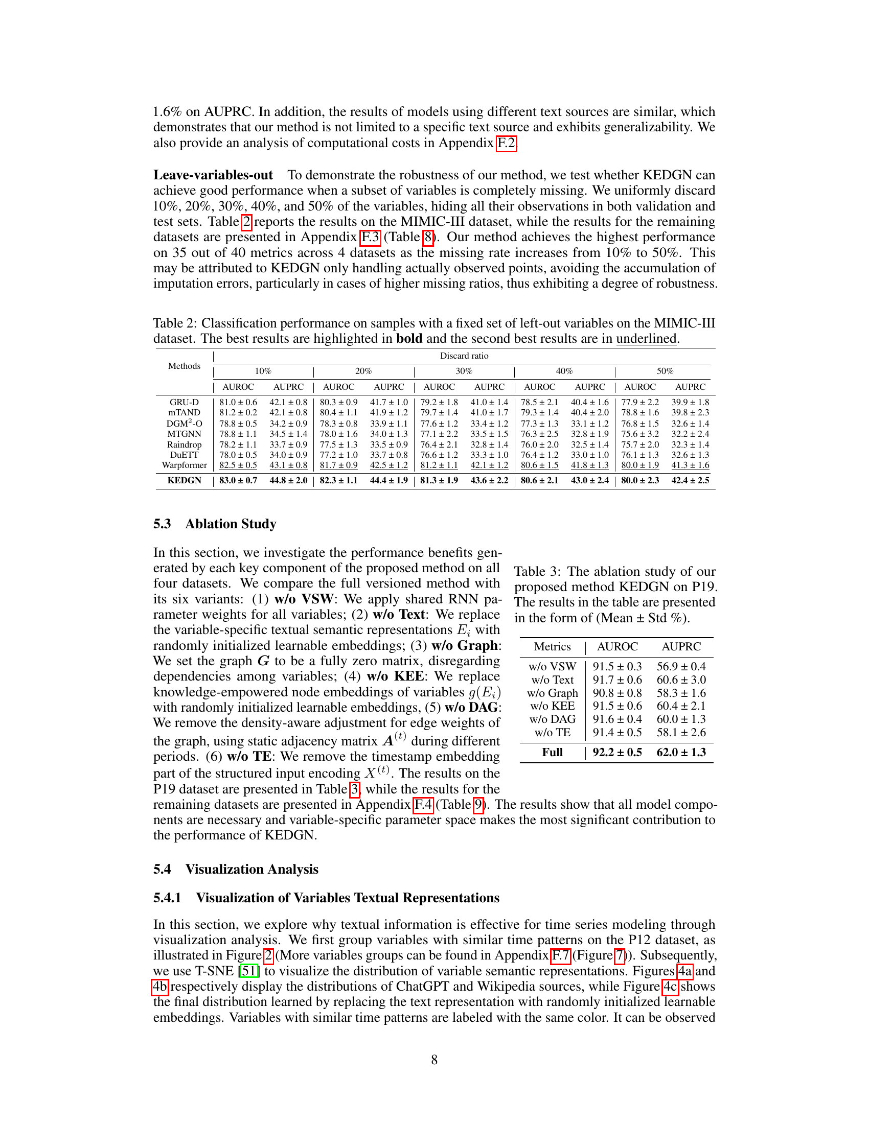
Table 1: Method benchmarking on irregularly sampled medical time series classification. The best results are highlighted in bold, and the second-best results are in underlined. The results in the table are presented in the form of (Mean ± Std %)
In-depth insights#
ISMTS Challenges#
Analyzing irregularly sampled medical time series (ISMTS) presents unique challenges due to the inherent variability in sampling frequencies across different variables and time points. This irregularity makes it difficult to apply standard time series analysis techniques directly. Furthermore, missing data is common, often non-randomly distributed, requiring sophisticated imputation methods. The presence of noise and outliers further complicates the analysis, demanding robust feature extraction and modeling approaches. Another key challenge is effectively capturing the complex inter-dependencies between multiple medical variables, as their correlations may change dynamically over time. Finally, interpretability remains a crucial concern, given the need to understand the underlying clinical dynamics from the model’s predictions. Successfully addressing these interconnected challenges is vital for developing accurate and reliable ISMTS analysis methods that can improve healthcare decision-making.
KEDGN Framework#
The KEDGN framework innovatively integrates medical knowledge with dynamic graph neural networks to analyze irregularly sampled medical time series. Knowledge-empowered variable representations, derived from textual descriptions of medical properties using a pre-trained language model, are central to KEDGN’s approach. These representations enable the model to capture variable-specific temporal patterns and allocate unique parameter spaces for each variable, addressing the challenge of uneven sampling in medical data. Furthermore, the framework employs a dynamic variable graph mechanism, which adjusts based on data density and reflects time-varying correlations between variables. This dynamic graph, combined with a graph convolutional recurrent network, allows KEDGN to effectively capture both intra-variable and inter-variable dependencies. By leveraging medical knowledge and adapting to the inherent irregularities of the data, KEDGN aims to improve the accuracy and interpretability of analyses compared to existing methods that use shared parameter spaces or ignore variable-specific characteristics.
Dynamic Graph#
Dynamic graphs, in the context of analyzing time-series data, offer a powerful way to model the ever-changing relationships between variables. Unlike static graphs that represent a fixed structure, dynamic graphs adapt over time, reflecting the evolving correlations and dependencies within the data. This adaptability is crucial when dealing with complex systems, such as those found in healthcare, where the interactions between various physiological signals are not constant but rather vary depending on the patient’s condition and treatment. The use of dynamic graphs allows for a more nuanced and realistic representation of the underlying processes. Furthermore, the ability to adjust the graph structure according to the available data (e.g., accounting for missing or irregularly sampled data) is particularly beneficial for real-world applications. This density-aware approach addresses the challenges posed by the inherent sparsity and noise often present in medical time-series data, leading to more robust and accurate analysis. By capturing temporal dynamics, dynamic graphs move beyond simple static correlation measurements, providing a richer understanding of the intricate relationships and causal interactions driving the observed phenomena. This is particularly vital in fields such as healthcare, where the ability to predict future outcomes and identify patterns accurately is critical for effective interventions and improved patient care. Therefore, dynamic graphs provide a valuable tool for the analysis of complex temporal data, offering a more sophisticated and accurate perspective than traditional static approaches.
Ablation Study#
An ablation study systematically removes components of a model to assess their individual contributions. In the context of a paper on irregularly sampled medical time series, an ablation study might investigate the impact of removing the knowledge-empowered variable graphs, variable-specific parameter spaces, or the density-aware mechanism. By isolating each component’s effect, researchers can quantify its contribution to the overall model performance and demonstrate the necessity of each element. A well-designed ablation study is crucial for validating design choices and highlighting the model’s key innovations. It’s particularly important in this field to understand what aspects of the model are essential for handling the unique challenges of irregularly sampled data. The results should provide insights into whether the model’s performance relies heavily on specific features or if it exhibits robustness across various configurations. The detailed results of such a study would lend strong support to the model’s effectiveness and potentially reveal opportunities for further optimization or simplified model variations. Analyzing the ablation study’s findings can reveal whether individual components are equally crucial or whether certain aspects are more dominant than others, providing a deeper understanding of the model’s strengths and limitations.
Future Works#
The paper’s ‘Future Works’ section could explore several promising avenues. Extending KEDGN’s capabilities to handle various medical tasks beyond mortality prediction, such as diagnosis, prognosis, or treatment response prediction, is crucial. Investigating the model’s performance with different data modalities such as images or genetics combined with time series data would provide a more holistic patient profile. A deeper dive into the density-aware mechanism is warranted, examining its robustness and potential for improvement through alternative graph learning or dynamic graph construction methods. Finally, thorough comparative analysis across diverse healthcare settings and populations should validate KEDGN’s generalizability and reveal any limitations. Addressing these points would significantly advance the application of knowledge-empowered dynamic graph networks in personalized medicine.
More visual insights#
More on figures

🔼 This figure shows three subgraphs representing different groups of medical variables from a dataset of irregularly sampled medical time series. Each subgraph visually represents the different temporal patterns (sampling rates, sampling times, observation spans, and observation lengths) exhibited by each group. The key takeaway is that variables within the same subgraph share similar patterns because they have closely related medical properties, whereas variables across subgraphs have significantly different temporal patterns due to their diverse medical properties.
read the caption
Figure 2: The time patterns (sampling rates, sampling times, observation spans, observation lengths, trends, etc.) of variables among different subgraphs exhibit significant differences, as they have distinct medical properties. Meanwhile, variables within the same subgraph share similar time patterns, and their medical properties are closely related. (More variable groups can be found in Figure 7).

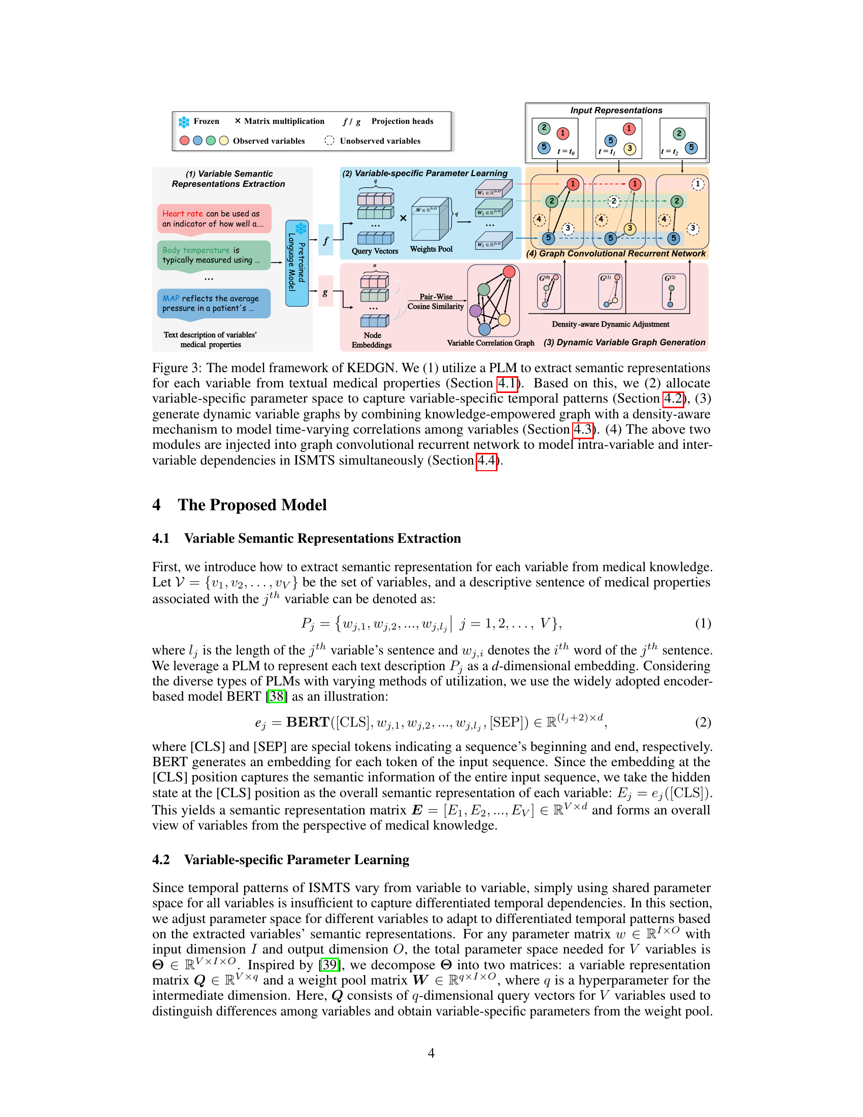
🔼 This figure shows the overall architecture of the Knowledge-Empowered Dynamic Graph Network (KEDGN) model. It details the four main stages: 1) extracting variable semantic representations using a pre-trained language model (PLM); 2) learning variable-specific parameters; 3) generating dynamic variable graphs using a density-aware mechanism; and 4) utilizing a graph convolutional recurrent network to capture both intra- and inter-variable dependencies. Each stage is visually represented and linked to the relevant sections of the paper for more detailed information.
read the caption
Figure 3: The model framework of KEDGN. We (1) utilize a PLM to extract semantic representations for each variable from textual medical properties (Section 4.1). Based on this, we (2) allocate variable-specific parameter space to capture variable-specific temporal patterns (Section 4.2), (3) generate dynamic variable graphs by combining knowledge-empowered graph with a density-aware mechanism to model time-varying correlations among variables (Section 4.3). (4) The above two modules are injected into graph convolutional recurrent network to model intra-variable and inter-variable dependencies in ISMTS simultaneously (Section 4.4).

🔼 This figure visualizes the distribution of variable semantic representations learned by the model using three different text sources: ChatGPT, Wikipedia, and randomly initialized embeddings. The visualization uses t-SNE to reduce the dimensionality of the data and project it into a 2D space. Each point represents a variable, and points with similar colors represent variables with similar time patterns. The figure aims to show that using textual medical knowledge (ChatGPT and Wikipedia) leads to distinct clustering of variables based on their inherent medical properties and temporal patterns. This contrasts with randomly initialized embeddings, where variables are distributed more uniformly without clear grouping.
read the caption
Figure 4: T-SNE visualization of partial variable representations on the P12 dataset.

🔼 This figure visualizes the learned correlation graphs for variables in the MIMIC-III dataset, comparing two approaches. (a) shows the graph learned using node embeddings derived from textual representations of variables’ medical properties; (b) shows the graph learned using randomly initialized node embeddings. The heatmaps illustrate the correlations between variables; darker colors indicate stronger correlations. The authors highlight the strong correlations observed in (a) between pairs of variables (HR & RR, GCS-MR, GCS-T & GCS-VR) as consistent with domain knowledge, while the random embeddings in (b) do not show such clear patterns.
read the caption
Figure 5: Visualization of the learned correlation graph of variables on the MIMIC-III dataset.
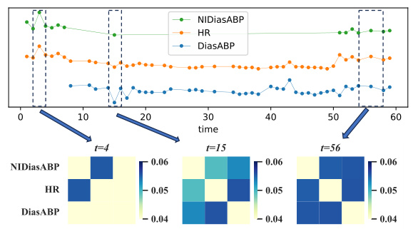
🔼 This figure visualizes how the correlation between three medical variables changes over time. The top panel shows the time series data for Heart Rate (HR), Non-invasive Diastolic Blood Pressure (NIDiasABP), and Invasive Diastolic Blood Pressure (DiasABP). The bottom panel displays heatmaps representing the correlation matrix between these three variables at three different time points (t=4, t=15, and t=56). The color intensity in each heatmap cell indicates the strength of the correlation, with darker colors representing stronger correlations. The figure demonstrates the dynamic, time-varying nature of the correlations between these variables, as observed in the paper.
read the caption
Figure 6: Visualization of the dynamic graph of three variables over time for the sample in Figure 1. To enhance the contrast ratio, we set the diagonal elements to 0.
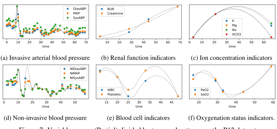
🔼 This figure shows six subfigures, each illustrating a group of variables from the P12 dataset that share similar temporal patterns. The subfigures are: (a) Invasive arterial blood pressure (b) Renal function indicators (c) Ion concentration indicators (d) Non-invasive blood pressure (e) Blood cell indicators (f) Oxygenation status indicators. Each subfigure displays multiple time series, with each time series representing a different variable. The x-axis represents time, and the y-axis represents the value of each variable. The grouping of variables based on their temporal patterns highlights the importance of considering variable-specific temporal dynamics in irregularly sampled medical time series analysis. These groupings are used in the paper to demonstrate the differences in temporal patterns among various variables.
read the caption
Figure 7: Variable groups (Partial) divided by temporal patterns on the P12 dataset.

🔼 This figure shows the architecture of the Knowledge-Empowered Dynamic Graph Network (KEDGN) model proposed in the paper. It illustrates the four main stages of the model: (1) extracting semantic representations of medical variables from their textual descriptions using a pre-trained language model (PLM); (2) learning variable-specific parameters to capture their individual temporal patterns; (3) generating a dynamic variable graph that adapts to the time-varying correlations among variables using a density-aware mechanism; and (4) using a graph convolutional recurrent network to integrate the variable-specific parameters and dynamic graph to capture intra- and inter-variable dependencies in irregularly sampled medical time series.
read the caption
Figure 3: The model framework of KEDGN. We (1) utilize a PLM to extract semantic representations for each variable from textual medical properties (Section 4.1). Based on this, we (2) allocate variable-specific parameter space to capture variable-specific temporal patterns (Section 4.2), (3) generate dynamic variable graphs by combining knowledge-empowered graph with a density-aware mechanism to model time-varying correlations among variables (Section 4.3). (4) The above two modules are injected into graph convolutional recurrent network to model intra-variable and inter-variable dependencies in ISMTS simultaneously (Section 4.4).

🔼 This figure visualizes the distribution of variable semantic representations learned using three different methods: ChatGPT, Wikipedia, and randomly initialized embeddings. The visualization uses t-SNE to reduce the dimensionality of the data and reveals clusters of variables. The ChatGPT and Wikipedia methods show distinct clustering patterns, indicating that variables with similar time patterns are grouped together. In contrast, the randomly initialized embeddings show a more uniform distribution, lacking the clear separation of clusters observed in the other methods. This suggests that leveraging textual medical knowledge helps capture the inherent differences and correlations among variables in irregularly sampled medical time series.
read the caption
Figure 4: T-SNE visualization of partial variable representations on the P12 dataset.

🔼 This figure visualizes how the correlation between three variables (HR, NIDiasABP, DiasABP) changes over time. The heatmaps show the dynamic correlation graph at three different timestamps (t=4, t=15, t=56). The color intensity represents the strength of the correlation; darker colors indicate stronger correlations. The figure demonstrates how the density-aware mechanism dynamically adjusts the correlation graph based on the sampling density of the variables at different time points.
read the caption
Figure 6: Visualization of the dynamic graph of three variables over time for the sample in Figure 1. To enhance the contrast ratio, we set the diagonal elements to 0.

🔼 This figure visualizes the distribution of variable semantic representations generated by three different methods: ChatGPT, Wikipedia, and randomly initialized embeddings. It uses t-SNE to reduce the dimensionality of the data for visualization. The goal is to show how the textual representations of variables cluster based on their medical properties and temporal patterns. The figure demonstrates that the textual representations capture relationships between variables more accurately than randomly initialized embeddings, highlighting the value of knowledge-empowered graph generation in the proposed KEDGN model.
read the caption
Figure 4: T-SNE visualization of partial variable representations on the P12 dataset.

🔼 This figure visualizes the distribution of variable semantic representations using t-SNE for the P12 dataset. Three subfigures show the results obtained using ChatGPT, Wikipedia, and randomly initialized embeddings. Variables with similar time patterns are marked with the same color. The visualization aims to demonstrate that textual representation space exhibits distinct clustering which is consistent with groups divided based on time series patterns. In contrast, randomly initialized embeddings lack such distinct clustering.
read the caption
Figure 4: T-SNE visualization of partial variable representations on the P12 dataset.

🔼 This figure visualizes the distribution of variable semantic representations using t-SNE. It shows three subplots: (a) ChatGPT, (b) Wikipedia, and (c) Random Initialized. Each subplot displays the t-SNE visualization of variable representations extracted from different text sources. The variables with similar time patterns are marked with the same color. The figure aims to demonstrate the effectiveness of using textual information to capture the differences among variables by showing that textual representations capture distinct clusters, while random initialization does not.
read the caption
Figure 4: T-SNE visualization of partial variable representations on the P12 dataset.
More on tables

🔼 This table presents the performance comparison of different methods on four irregularly sampled medical time series datasets for a classification task. The methods are evaluated using AUROC and AUPRC metrics and the results are presented as mean ± standard deviation. The best and second-best results for each metric and dataset are highlighted for easy comparison.
read the caption
Table 1: Method benchmarking on irregularly sampled medical time series classification. The best results are highlighted in bold, and the second-best results are in underlined. The results in the table are presented in the form of (Mean ± Std %)
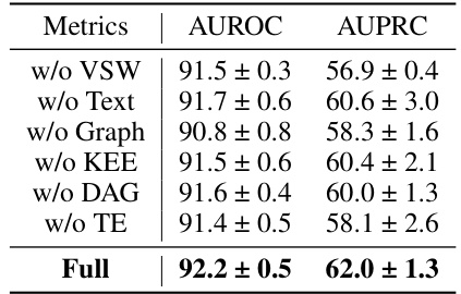
🔼 This table presents the results of an ablation study conducted on the P19 dataset to evaluate the impact of each component of the proposed Knowledge-Empowered Dynamic Graph Network (KEDGN) model. The study involves removing one component at a time to assess its contribution to the overall performance. The metrics used are AUROC (Area Under the Receiver Operating Characteristic Curve) and AUPRC (Area Under the Precision-Recall Curve). The results are presented as mean ± standard deviation percentages.
read the caption
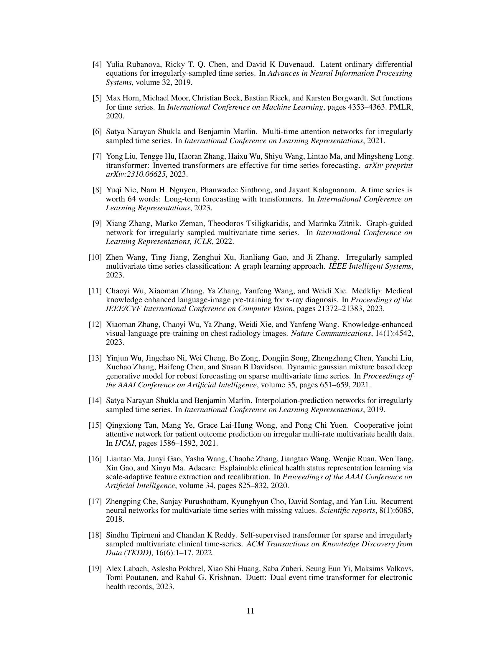
Table 3: The ablation study of our proposed method KEDGN on P19. The results in the table are presented in the form of (Mean ± Std %)

🔼 This table presents the benchmarking results of various methods on four irregularly sampled medical time series datasets for a time series classification task. The performance metrics used are AUROC (Area Under the Receiver Operating Characteristic Curve) and AUPRC (Area Under the Precision-Recall Curve). The best and second-best results for each method across all datasets are highlighted.
read the caption
Table 1: Method benchmarking on irregularly sampled medical time series classification. The best results are highlighted in bold, and the second-best results are in underlined. The results in the table are presented in the form of (Mean ± Std %).

🔼 This table presents the results of various methods on four different medical time series datasets. The performance of each method is evaluated using AUROC and AUPRC metrics. The best and second-best results are highlighted for each dataset and metric.
read the caption
Table 1: Method benchmarking on irregularly sampled medical time series classification. The best results are highlighted in bold, and the second-best results are in underlined. The results in the table are presented in the form of (Mean ± Std %)
🔼 This table compares the performance of KEDGN against other state-of-the-art methods for irregularly sampled medical time series classification. The performance is measured using AUROC and AUPRC metrics across four different datasets (P19, Physionet, MIMIC-III, and P12). The best and second-best results for each metric and dataset are highlighted for easy comparison.
read the caption
Table 1: Method benchmarking on irregularly sampled medical time series classification. The best results are highlighted in bold, and the second-best results are in underlined. The results in the table are presented in the form of (Mean ± Std %)

🔼 This table presents a comparison of the performance of various methods for classifying irregularly sampled medical time series data across four different datasets (P19, Physionet, MIMIC-III, and P12). The performance is evaluated using AUROC (Area Under the Receiver Operating Characteristic curve) and AUPRC (Area Under the Precision-Recall curve). The best and second-best results for each metric and dataset are highlighted.
read the caption
Table 1: Method benchmarking on irregularly sampled medical time series classification. The best results are highlighted in bold, and the second-best results are in underlined. The results in the table are presented in the form of (Mean ± Std %)

🔼 This table presents a comparison of the performance of various methods on four different irregularly sampled medical time series datasets. The performance is measured using AUROC and AUPRC, and the best and second-best results for each metric and dataset are highlighted. The results are presented as mean ± standard deviation.
read the caption
Table 1: Method benchmarking on irregularly sampled medical time series classification. The best results are highlighted in bold, and the second-best results are in underlined. The results in the table are presented in the form of (Mean ± Std %)
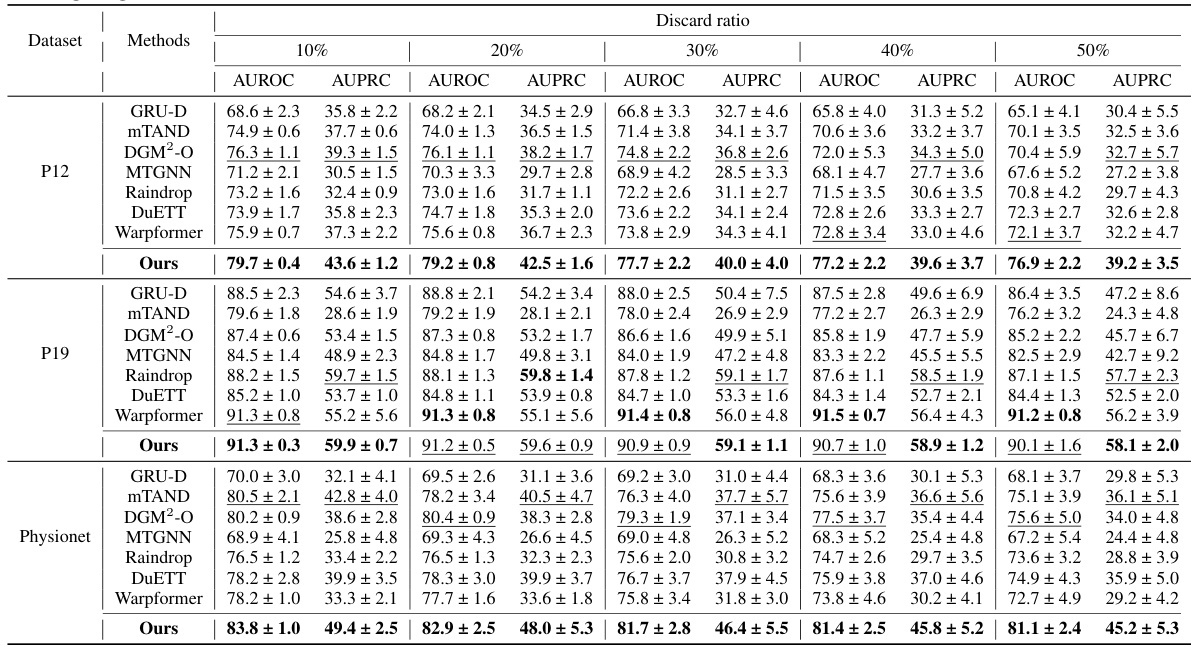
🔼 This table presents the results of a benchmarking study comparing various methods for classifying irregularly sampled medical time series data. The methods are evaluated on four different datasets (P19, Physionet, MIMIC-III, and P12), and the performance is measured using two metrics: AUROC (Area Under the Receiver Operating Characteristic Curve) and AUPRC (Area Under the Precision-Recall Curve). The table shows the mean and standard deviation of the AUROC and AUPRC scores for each method on each dataset. The best and second-best results for each metric and dataset are highlighted.
read the caption
Table 1: Method benchmarking on irregularly sampled medical time series classification. The best results are highlighted in bold, and the second-best results are in underlined. The results in the table are presented in the form of (Mean ± Std %)
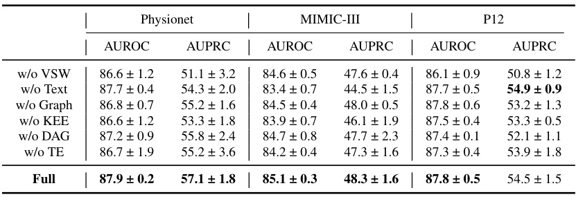
🔼 This table presents a comparison of the performance of various methods for irregularly sampled medical time series classification across four different datasets (P19, Physionet, MIMIC-III, and P12). For each method and dataset, it shows the AUROC (Area Under the Receiver Operating Characteristic curve) and AUPRC (Area Under the Precision-Recall curve), both presented as mean ± standard deviation. The best and second-best results for each metric and dataset are highlighted.
read the caption
Table 1: Method benchmarking on irregularly sampled medical time series classification. The best results are highlighted in bold, and the second-best results are in underlined. The results in the table are presented in the form of (Mean ± Std %)

🔼 This table presents the results of an ablation study that compares the performance of the proposed KEDGN model using three different activation functions (σ, Sigmoid, Tanh) in Equation 7. The study aims to determine the optimal activation function for modeling the time-varying correlations among variables in irregularly sampled medical time series (ISMTS). The table shows the AUROC and AUPRC scores for each activation function on four different datasets: P19, Physionet, MIMIC-III, and P12. The results indicate that the Tanh activation function performs best across all datasets, achieving the highest AUROC and AUPRC scores.
read the caption
Table 10: Comparison of the results of different activation functions in Eq.(7).

🔼 This table presents a comparison of the performance of different methods on four datasets in terms of AUROC and AUPRC. The methods include various RNNs, ODE-based methods, graph neural networks, and the proposed KEDGN. The results are shown as mean ± standard deviation, indicating the average performance across multiple trials and the variability.
read the caption
Table 1: Method benchmarking on irregularly sampled medical time series classification. The best results are highlighted in bold, and the second-best results are in underlined. The results in the table are presented in the form of (Mean ± Std %)
Full paper#

