↗ OpenReview ↗ NeurIPS Homepage ↗ Chat
TL;DR#
Graph Neural Networks (GNNs) are powerful but their decision-making processes in regression tasks often lack transparency. Existing explanation methods primarily focus on classification tasks, leaving a significant gap for understanding GNN behaviors in regression. This research highlights the challenges posed by distribution shifts, which occur when applying models trained on the full graph to explain sub-graphs, and continuously ordered decision boundaries in regression. These issues hinder the application of existing explanation methods designed for classification to the regression setting.
To address these challenges, the authors propose RegExplainer, a novel explanation method based on the Graph Information Bottleneck theory (GIB) and a mix-up framework. RegExplainer maximizes the mutual information between the explanation and the label, while minimizing the size of the explanation. Crucially, a self-supervised learning strategy is introduced to handle the distribution shift problem. Evaluated on three benchmark datasets and a new real-world dataset, RegExplainer demonstrates significantly improved effectiveness in interpreting GNN models in regression, showcasing its ability to generate accurate and concise explanations.
Key Takeaways#
Why does it matter?#
This paper is crucial for researchers working on explainable AI and graph neural networks. It directly addresses the significant challenge of interpreting GNNs in regression tasks, a gap that limits their applicability in various sensitive domains. By providing a novel method and comprehensive evaluation, the research opens up new avenues for improving model transparency and trust in GNN predictions, ultimately enhancing the reliability of GNN-based applications.
Visual Insights#
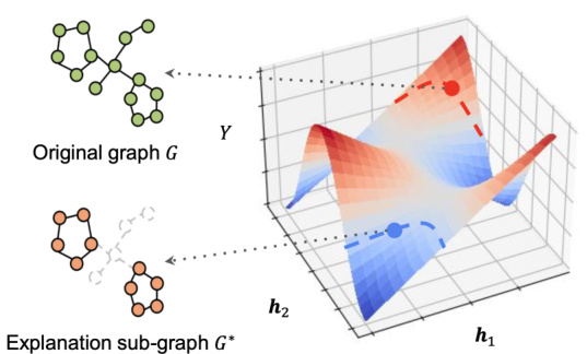
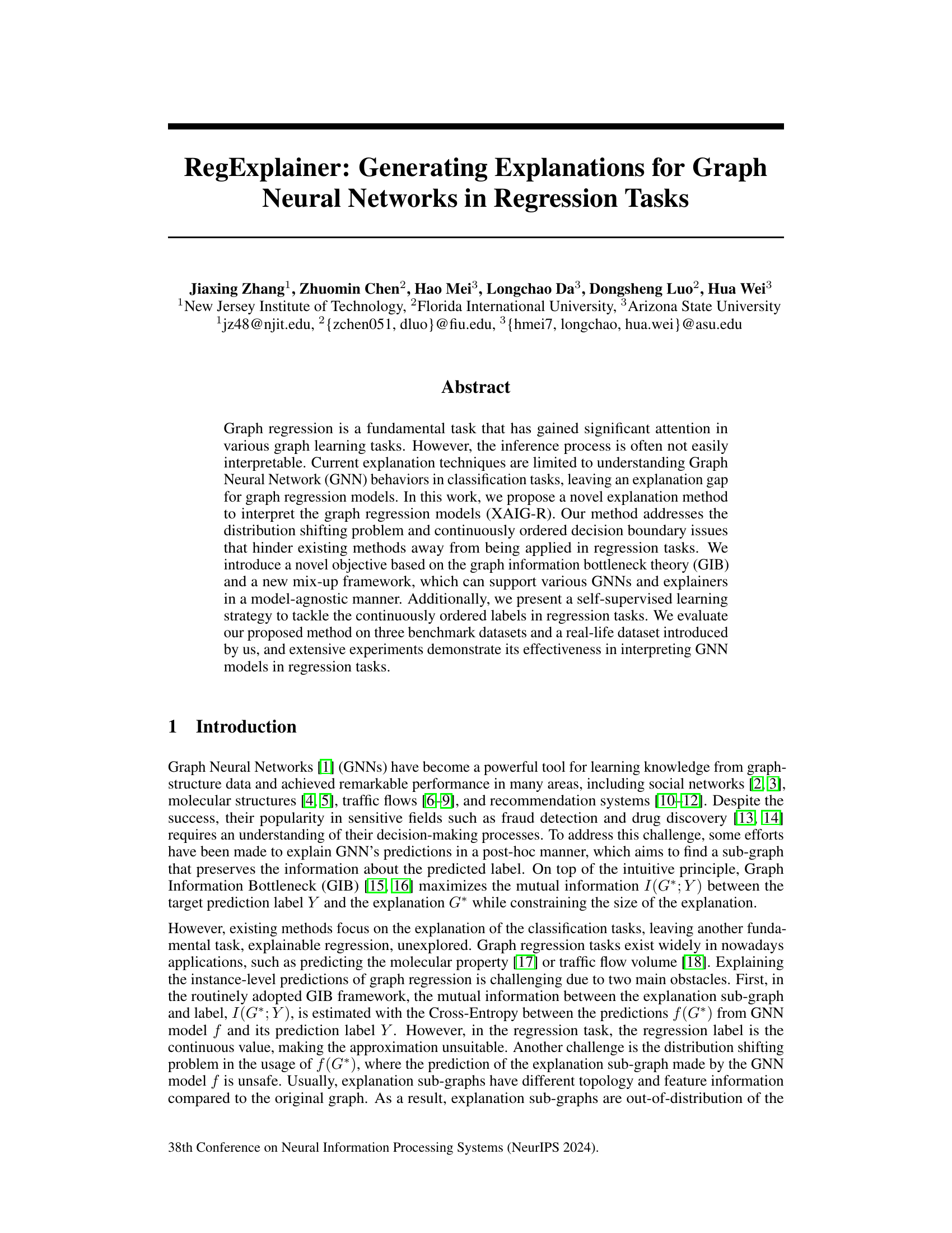
This figure illustrates the distribution shift problem encountered when using a GNN model trained on a set of original graphs to predict the labels of explanation subgraphs. The 3D plot shows the model’s predictions (Y-axis) as a function of the graph embeddings (h1 and h2 axes). The red points represent the original graph data, while the blue points represent the distribution of the explanation sub-graphs. The key observation is that the distribution of the subgraphs (blue) is shifted considerably compared to the distribution of the original graphs (red), which can lead to inaccurate predictions when using the trained GNN model on the subgraphs.

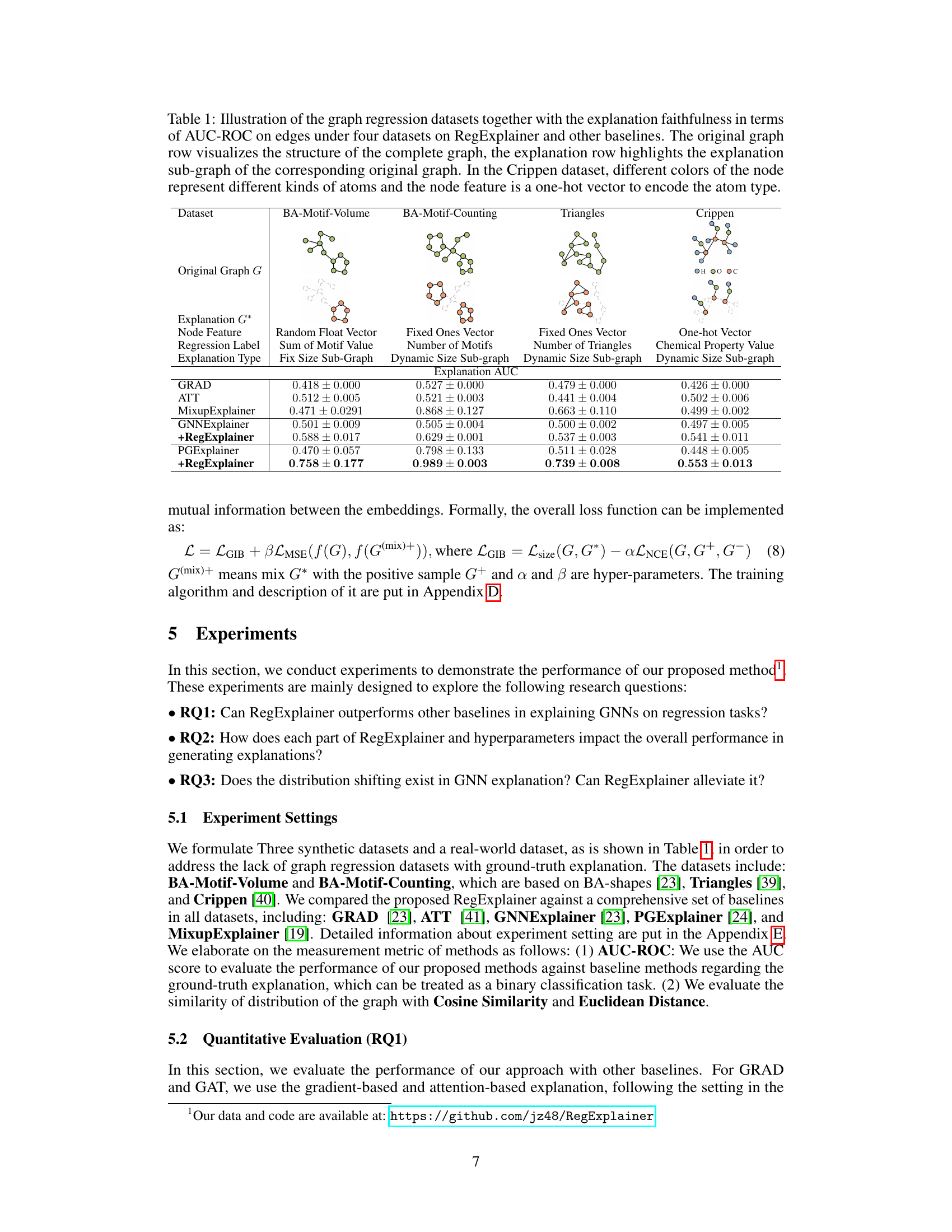
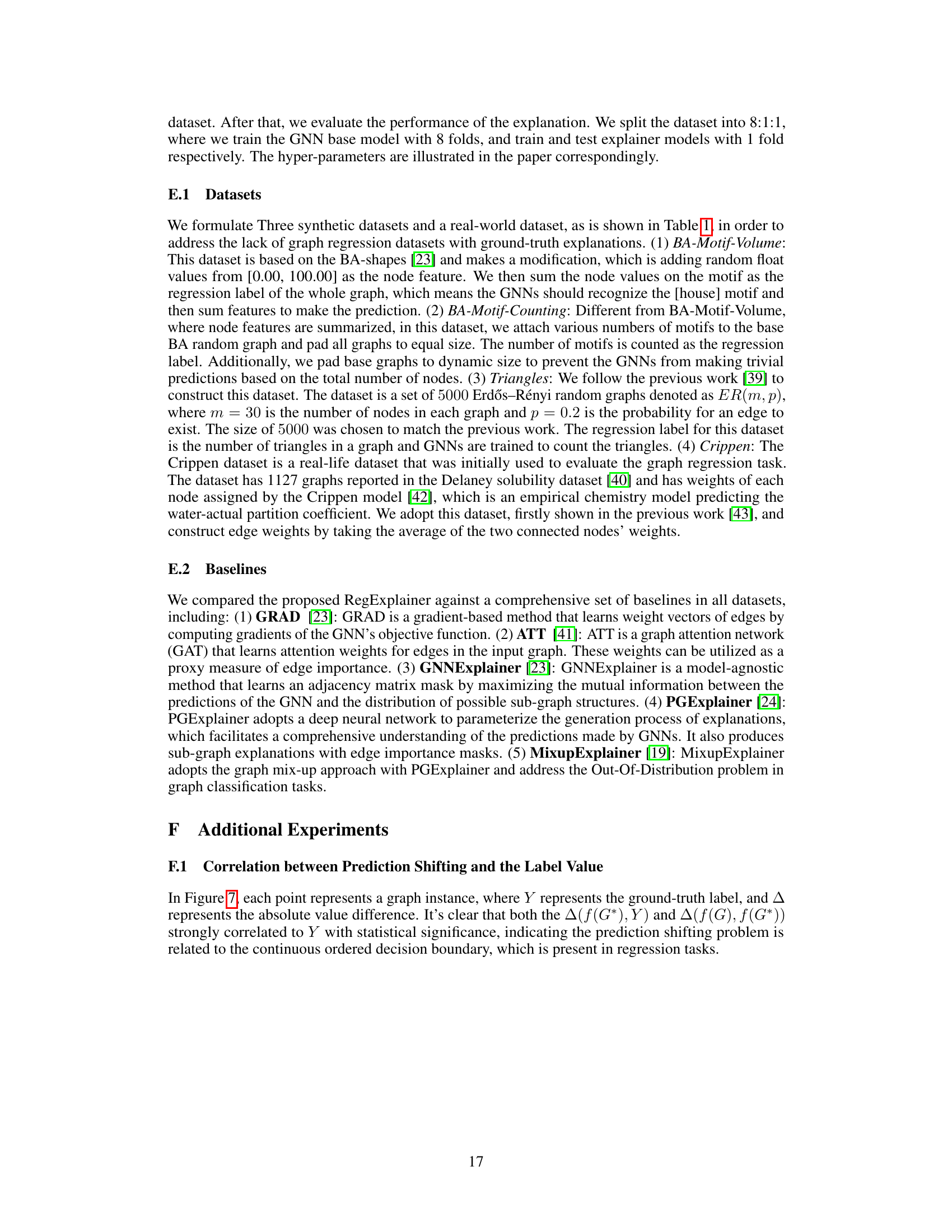
This table presents four graph regression datasets used to evaluate the proposed RegExplainer and other baseline methods. For each dataset, it shows the structure of the original graph and the corresponding explanation subgraph generated by different methods. It includes the node features, regression labels, and the type of explanation generated (e.g., fixed-size subgraph, dynamic-size subgraph). Finally, it presents the AUC-ROC scores for each method on each dataset, which measures the faithfulness of the explanations.
In-depth insights#
GNN Explanation#
The field of Graph Neural Network (GNN) explanation is rapidly evolving, driven by the need for transparency and interpretability in GNN models’ predictions, especially in sensitive applications like fraud detection and medical diagnosis. Current techniques largely focus on classification tasks, using methods like subgraph identification to pinpoint features most influential in a given decision. However, the landscape for GNN explanation in regression tasks remains comparatively less explored, presenting unique challenges due to the continuous nature of the output and the difficulty in defining meaningful explanations. Addressing this gap is crucial for fostering trust and understanding in GNN regression models and enabling their wider adoption in various real-world applications. Key future directions involve developing novel explanation methods that effectively handle the complexities of regression outputs, and also improving the generalizability and scalability of existing techniques for broader application to diverse GNN architectures and datasets. The development of benchmark datasets and evaluation metrics tailored to regression explanations will be vital for driving progress in this area.
Regression Tasks#
The concept of ‘Regression Tasks’ within the context of graph neural networks (GNNs) involves predicting continuous values associated with graph-structured data. Unlike classification tasks focusing on discrete labels, regression tasks in GNNs aim to model relationships where the output is a real number, rather than a class. This presents unique challenges, including the need for suitable loss functions (e.g., mean squared error) that handle continuous outputs, and the potential for distribution shifts when creating explanations, as continuous values are sensitive to even small shifts in model predictions. Successfully tackling regression tasks requires careful consideration of the decision boundaries and the distribution of the data and predictions. Existing explanation methods often struggle with regression due to the inherently ordered nature of the output space and the difficulty of approximating mutual information. Therefore, developing effective and reliable explanation methods for GNNs specifically designed for regression problems is a crucial area of research, requiring innovative approaches like those explored in the paper to address distribution shifts, define appropriate loss functions, and ensure the generated explanations are faithful to the model’s predictions.
Mixup Approach#
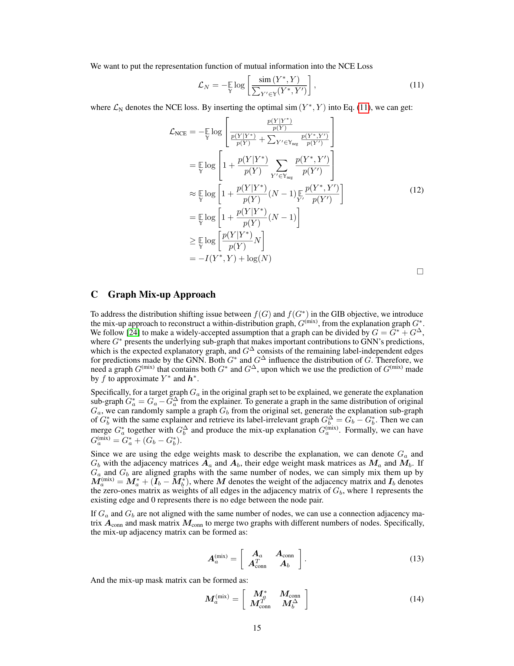
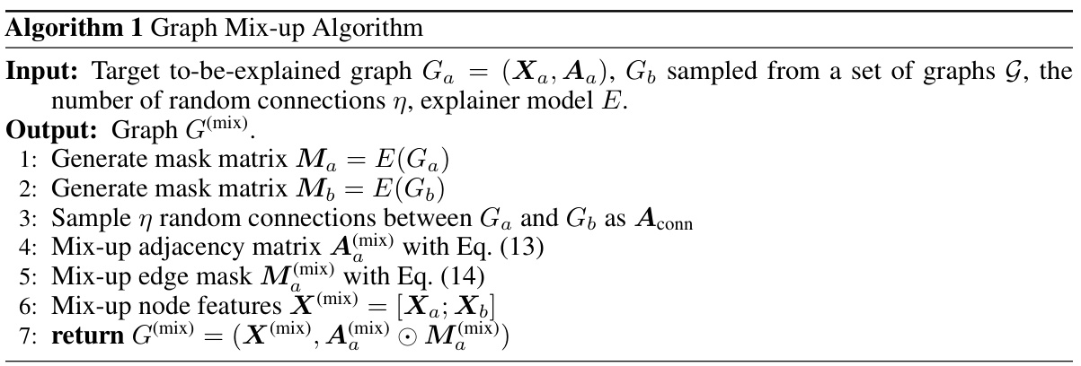
The Mixup approach, as described in the context of graph neural network (GNN) explanation, is a novel method to address the problem of distribution shift. This shift occurs because the explanation sub-graphs generated often have significantly different characteristics than the graphs in the original training data, leading to unreliable predictions by the GNN when evaluating the explanations. The core idea is to synthesize training samples that bridge the gap between the distribution of the original graph and its explanation subgraph. This is achieved by cleverly mixing the explanation sub-graph with a randomly sampled graph from the training set, using a technique that preserves the essential information contained in the explanation while reducing the out-of-distribution problem. Self-supervised learning further enhances the effectiveness of this method by incorporating label-relevant and irrelevant graphs to enhance model learning and prevent overfitting. This Mixup approach is a key element in improving the robustness and reliability of GNN explanation in regression tasks, resulting in more faithful and accurate interpretations of GNN predictions.
Distribution Shift#
The concept of ‘Distribution Shift’ in the context of graph neural network (GNN) explainability highlights a critical challenge: the discrepancy between the distribution of the original training data and the distribution of the explanation sub-graphs generated during the post-hoc explanation process. Existing GNN explanation methods often assume that the sub-graphs are drawn from the same distribution as the original training data. This is not true in practice, as the sub-graphs often have unique structural and feature properties. This discrepancy can lead to unreliable explanations because the GNN model is not trained to generalize well to this out-of-distribution data and can produce predictions that are not in the same distribution as the original data. The problem is particularly acute in regression tasks due to the continuous nature of the target variable. Addressing this distribution shift is crucial for improving the accuracy and reliability of GNN explanations. Methods employing techniques like mix-up and self-supervised learning attempt to bridge this distribution gap, thereby generating explanations more consistent with model predictions and improving the overall trustworthiness of the interpretation.
Future Works#
Future research directions stemming from this work could explore extensions to other graph neural network architectures beyond those tested. A thorough investigation into the impact of different mix-up strategies and self-supervised learning methods on explanation quality and robustness is warranted. Further analysis of the distribution shifting problem in various regression tasks, perhaps focusing on developing more sophisticated methods for mitigating this, would be highly valuable. Finally, applying RegExplainer to real-world problems beyond those presented would strengthen its applicability and unveil potential limitations, guiding future enhancements and improvements. Benchmarking against a wider range of explanation methods, particularly those specifically designed for regression, would offer a more comprehensive evaluation. Investigating the scalability of RegExplainer for larger graphs and datasets remains crucial for wider adoption. Exploring the explainability of higher-order relationships within graphs and incorporating temporal information into the framework present opportunities to enhance the depth and scope of the explanations.
More visual insights#
More on figures

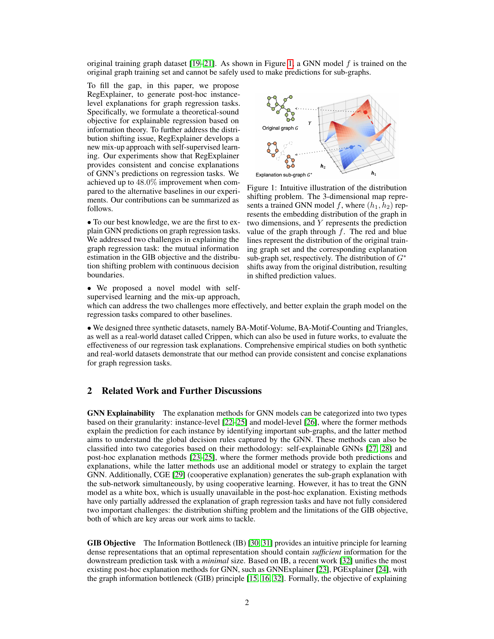
This figure provides a visual explanation for why the mutual information between the explanation subgraph G* and the label Y is greater than the mutual information between the prediction label Y* and Y. It uses Venn diagrams to represent the information shared by these variables. The larger overlapping area between G* and Y illustrates that G* contains more information about Y than Y* does.

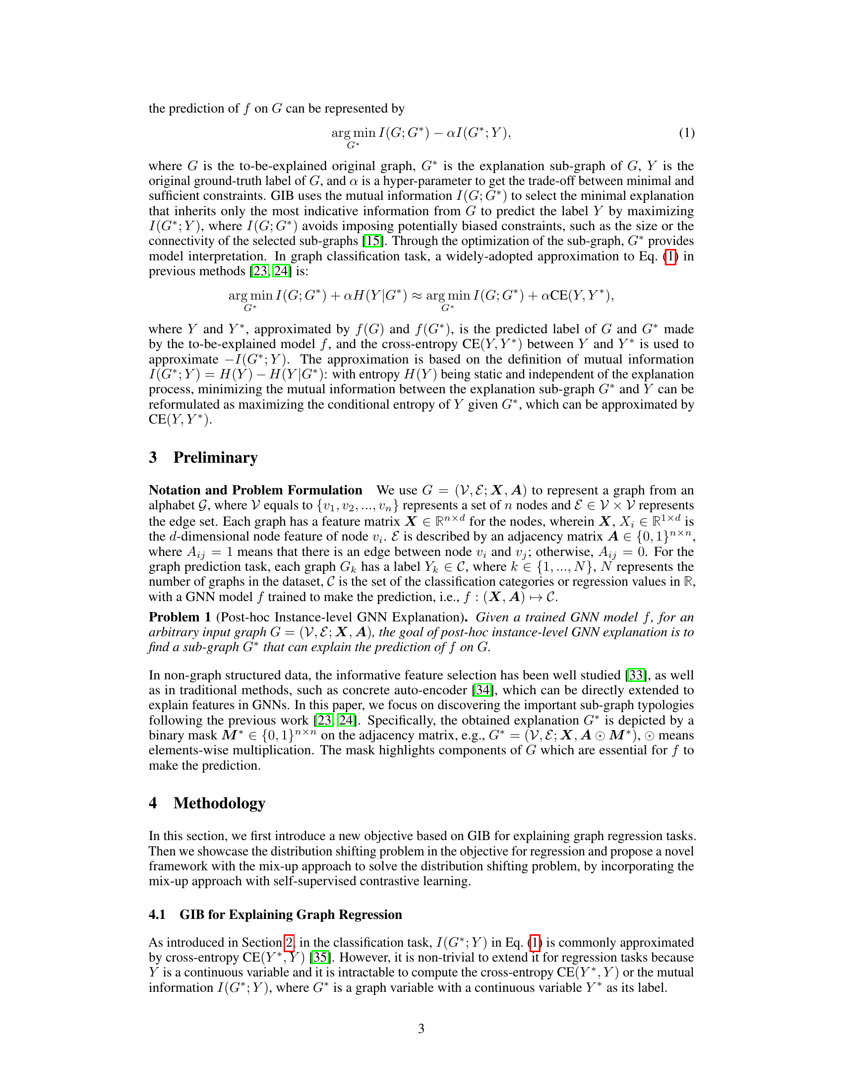
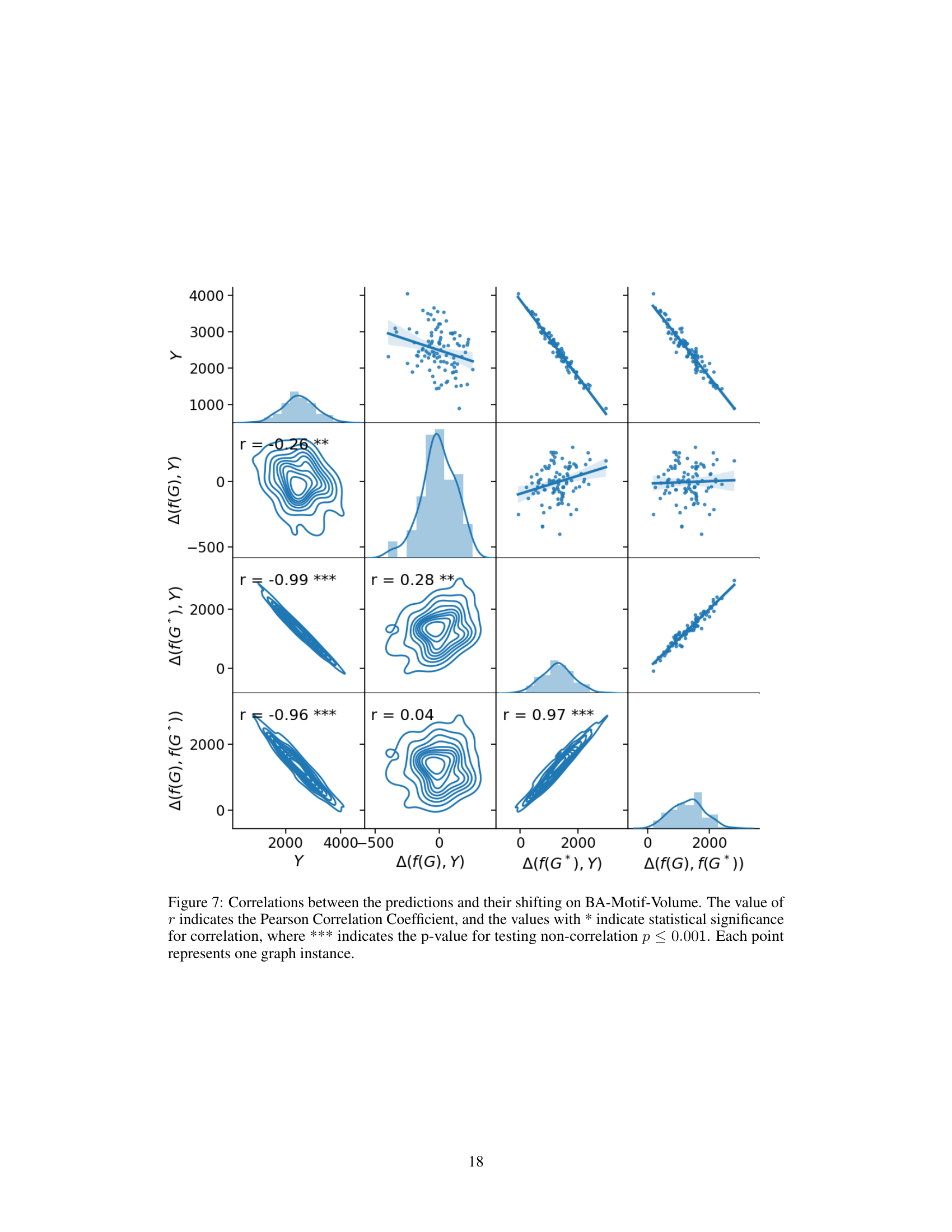
This figure shows the distribution shift problem in graph regression. Four graphs, one for each dataset (BA-Motif-Volume, BA-Motif-Counting, Triangles, Crippen), illustrate the distribution of ground truth labels (blue), predictions from the original graph (red), and predictions from the explanation subgraph (green). The x-axis represents the graph index sorted by the label value. The significant shift between the red and green points across all datasets demonstrates the distribution shift problem, where the model’s performance on the original graph differs substantially from its performance on the explanation subgraph.

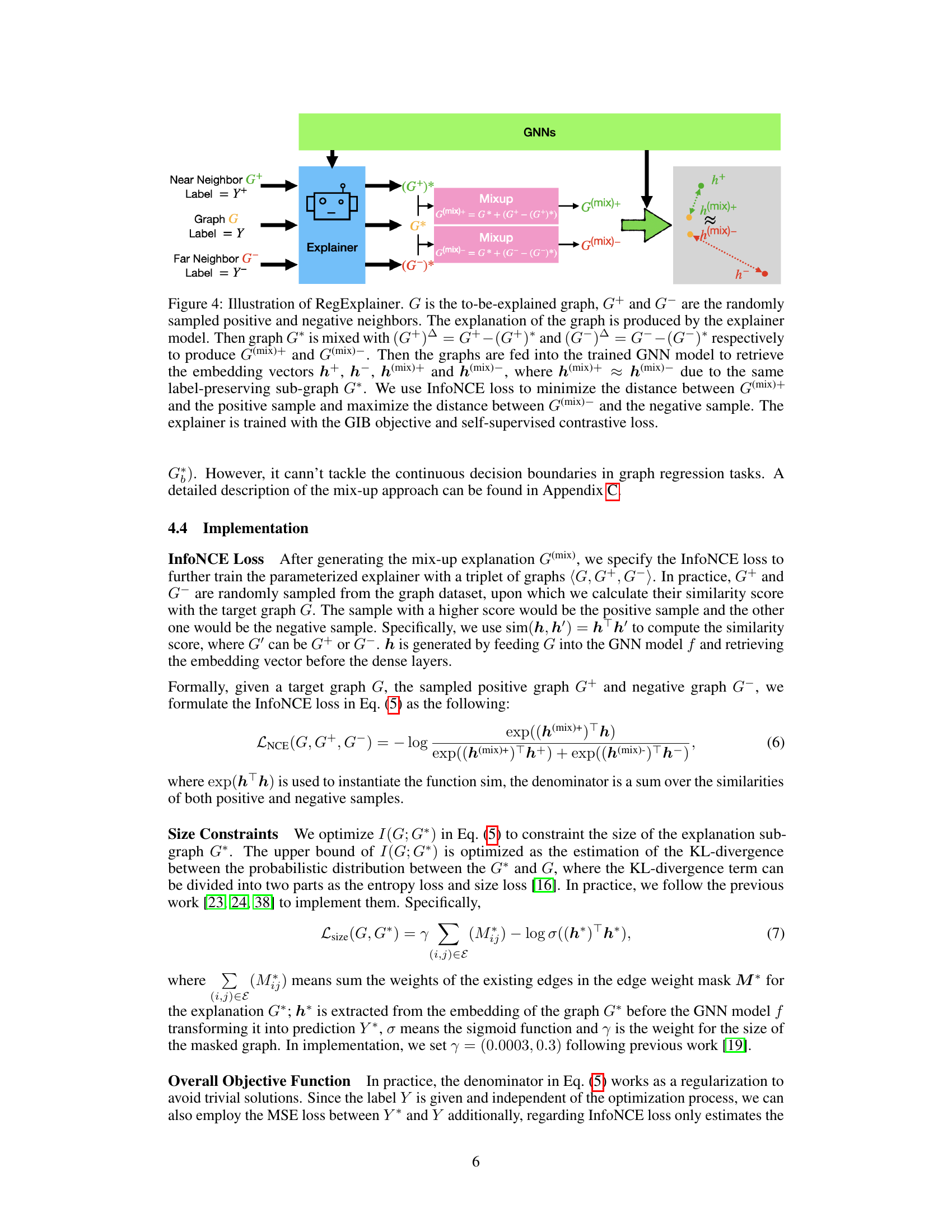
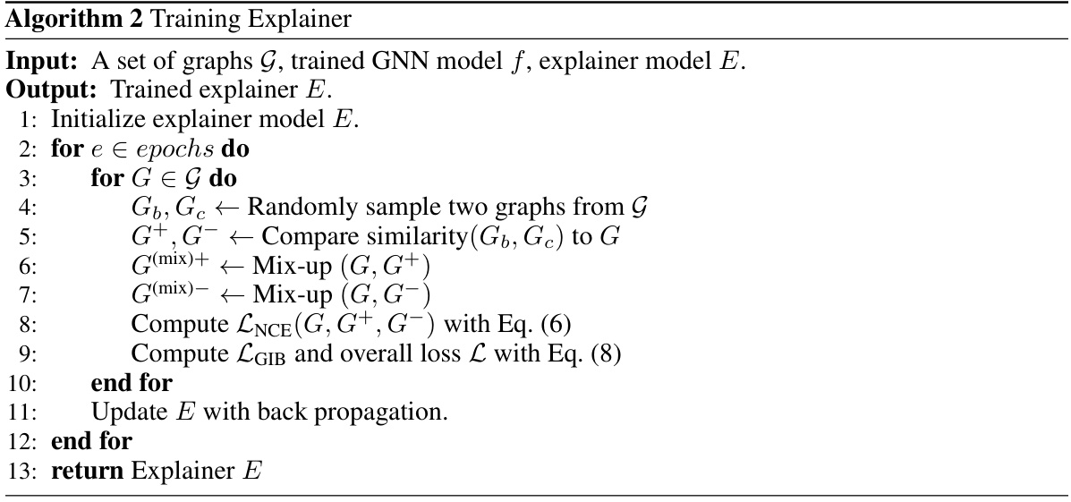
This figure illustrates the RegExplainer framework. It shows how the explainer model generates an explanation subgraph (G*) for a given graph (G). To address the distribution shift problem, a mix-up approach is used, combining G* with subgraphs from similar (G+) and dissimilar (G−) graphs. The resulting mixed graphs, G(mix)+ and G(mix)−, are then fed into a GNN to obtain their embeddings. The InfoNCE loss is employed to guide the training process.

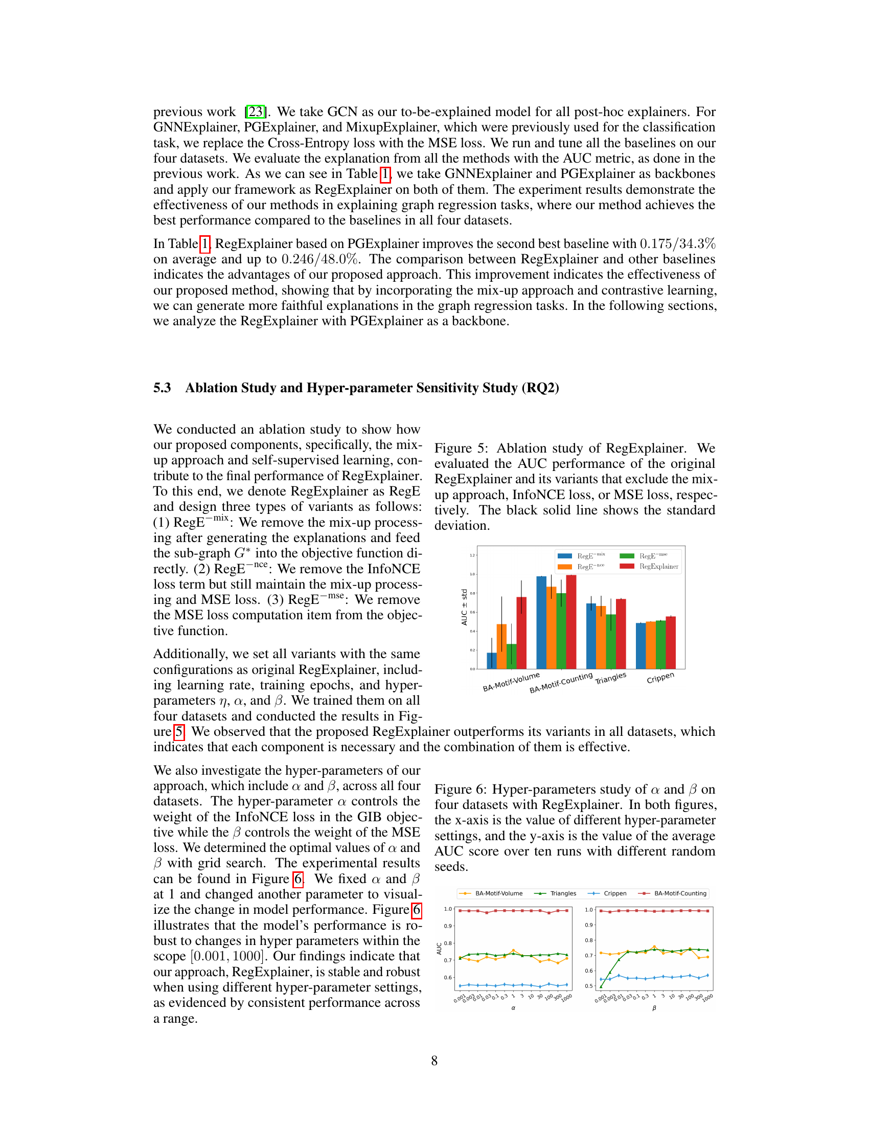
This figure shows the ablation study results for the RegExplainer model. The AUC performance (Area Under the Curve of the Receiver Operating Characteristic curve) is shown for four different datasets. Each bar represents the performance of a variant of the model where a component (mix-up, InfoNCE loss, or MSE loss) is removed. The original RegExplainer model’s performance is shown for comparison, highlighting the contribution of each removed component to overall performance. Error bars show standard deviations.

This figure shows the results of a hyperparameter sensitivity analysis performed on the RegExplainer model. Two hyperparameters, α and β, were varied across a range of values, and the resulting average AUC score (Area Under the Receiver Operating Characteristic curve) was calculated across ten runs for each setting. The x-axis represents the values of the hyperparameters, and the y-axis represents the average AUC score. The plot helps to understand the impact of these hyperparameters on model performance and to identify optimal values. Each line on the plot represents one of the four datasets used in the study.

This figure shows the distribution shift problem in graph regression tasks. It visualizes the regression values of the original graph (blue points), the GNN prediction of the original graph (red points), and the GNN prediction of the explanation sub-graph (green points) for four datasets (BA-Motif-Volume, BA-Motif-Counting, Triangles, and Crippen). The x-axis represents the graph indices sorted by their labels (Y). The figure demonstrates that the distribution of the explanation sub-graph predictions significantly shifts away from the distribution of the original graph predictions, highlighting the distribution shift problem which hinders the effectiveness of existing explanation methods for graph regression.
More on tables

This table presents a quantitative analysis of the distribution shifting problem by comparing the root mean squared error (RMSE) between different prediction pairs. The RMSE is calculated for three pairs: (1) the prediction from the original graph (f(G)) and the ground truth label (Y), (2) the prediction from the explanation subgraph (f(G*)) and the ground truth label (Y), and (3) the prediction from the original graph (f(G)) and the prediction from the explanation subgraph (f(G*)). The values reveal the degree of prediction shift introduced by using the explanation subgraph alone instead of the full graph in the prediction process.

This table presents the results of an experiment designed to measure how well the proposed method, RegExplainer, addresses the distribution shift problem. It compares embedding distances (Cosine and Euclidean) and prediction errors (RMSE) between the original graph, the explanation subgraph, and the mix-up graph. Lower Euclidean distances and RMSE values indicate better distribution repair, showing RegExplainer’s effectiveness in aligning the distribution of the explanation subgraph with the original graph.

This table presents four graph regression datasets used to evaluate the proposed method and compares its performance to other baselines. For each dataset, it shows the type of node features, the regression label used, the type of explanation generated (e.g., fixed or dynamic size subgraphs), and the AUC-ROC scores for different explanation methods. The table also includes visual representations of the original graphs and their corresponding explanations. The Crippen dataset is further described as a real-world dataset where node colors represent atom types and features are one-hot encoded.
This table presents four graph regression datasets used in the paper, along with results from different explanation methods (RegExplainer and baselines). For each dataset, it shows the type of node features, regression label, explanation type and AUC-ROC scores on edges. Visual representations of the original graph and explanation sub-graph are included for some datasets. The Crippen dataset uses node coloring to represent different atom types.
This table presents four graph regression datasets used to evaluate the proposed RegExplainer and several baseline methods. For each dataset, it illustrates the original graph structure, the type of node features used, the regression label, the type of explanation (subgraph) generated by different methods, and the AUC-ROC score measuring the faithfulness of these explanations. The Crippen dataset is unique in that node colors represent different atom types, while the node features are one-hot encodings of these atom types.
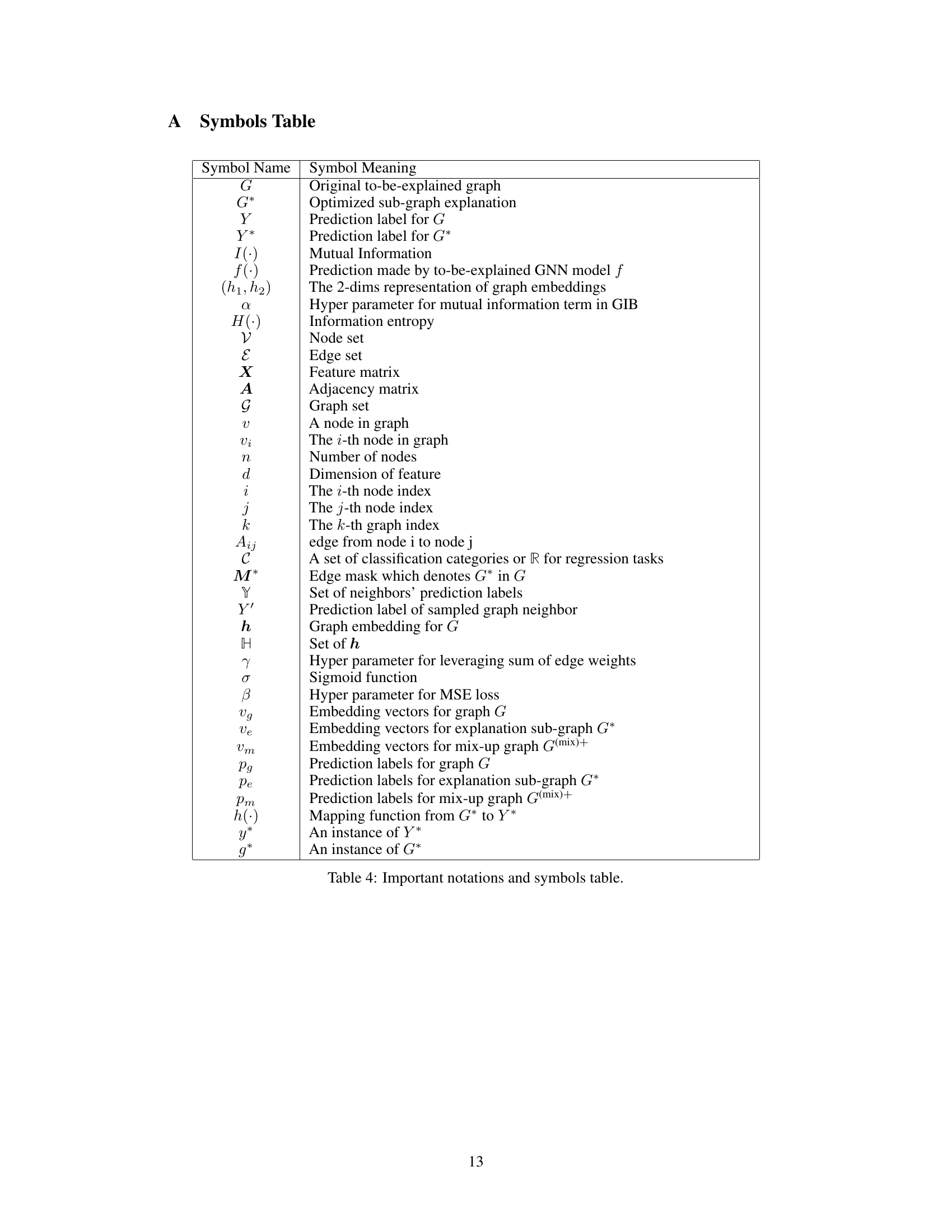
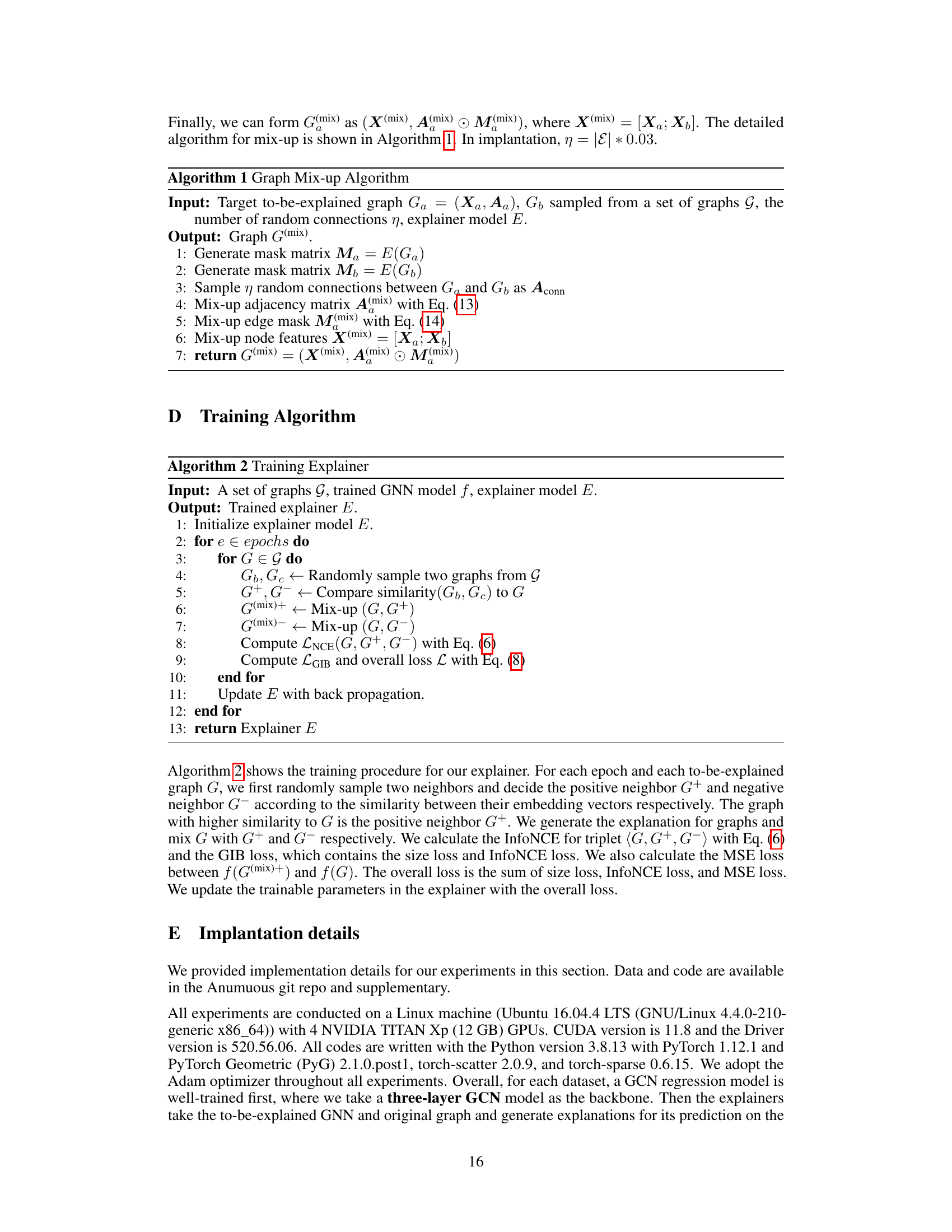
Full paper#
