TL;DR#
Fairness in machine learning is a key challenge; training models to minimize disparity across different groups often reduces accuracy. Existing methods for approximating this trade-off curve face limitations in computational efficiency and failure to account for uncertainty due to finite data. This paper introduces a novel framework using the You-Only-Train-Once (YOTO) method to efficiently approximate this curve, providing rigorous statistical guarantees.
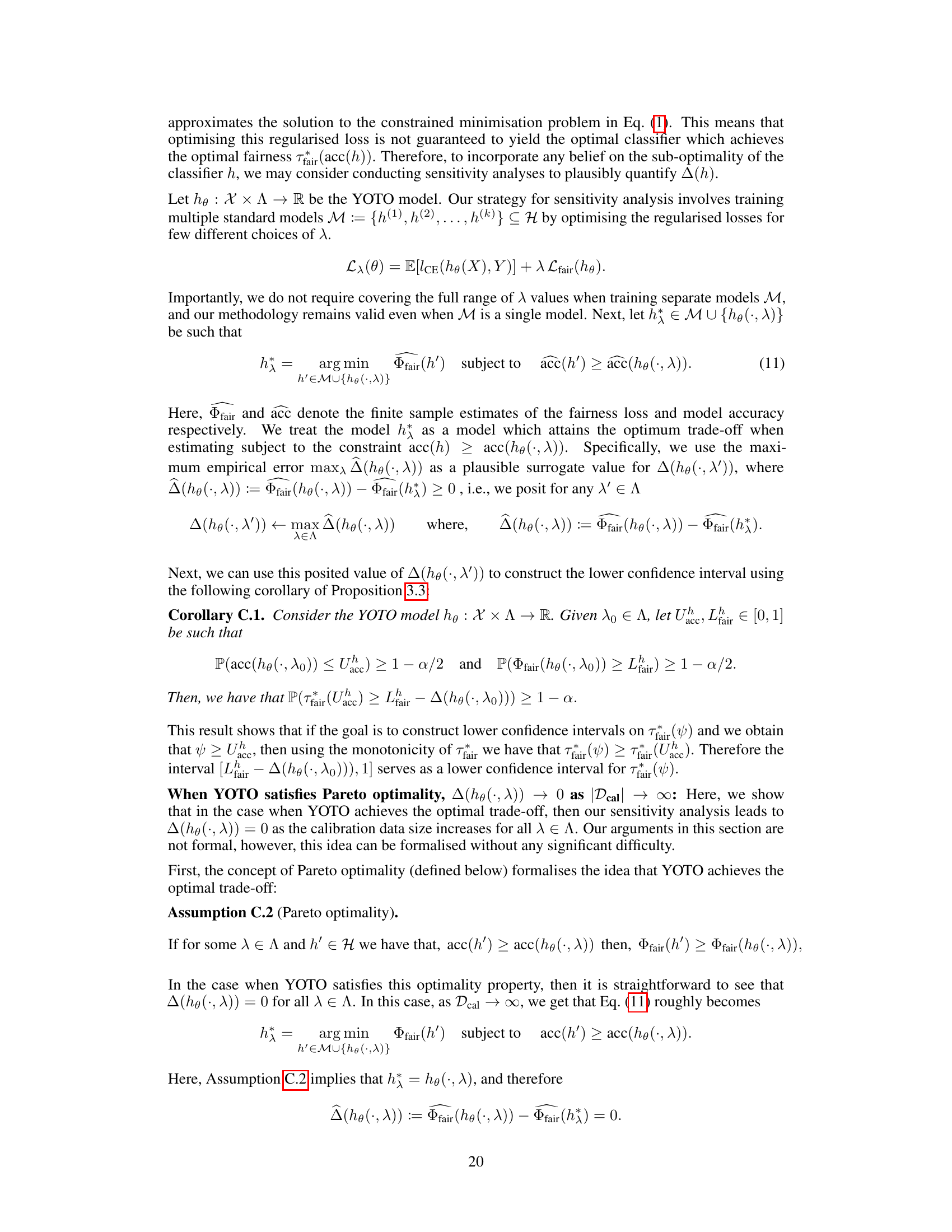
The new method addresses both computational issues and uncertainty quantification. It introduces a novel methodology for building confidence intervals that account for finite-sampling and estimation errors. Experiments across various data modalities (tabular, image, language) show that this approach reliably quantifies optimal trade-offs and can detect suboptimality in existing methods, making it a valuable tool for practitioners.
Key Takeaways#
Why does it matter?#
This paper is crucial because it addresses the critical challenge of fairness-accuracy trade-offs in machine learning, which often vary significantly across datasets. The proposed methodology offers a computationally efficient and statistically robust framework for evaluating and auditing model fairness, overcoming limitations of existing methods. This is important because it allows for more informed decision-making, considering the specific dataset characteristics when determining acceptable levels of fairness violation. The work opens avenues for future research in developing dataset-specific fairness guidelines and improving existing fairness methods.
Visual Insights#

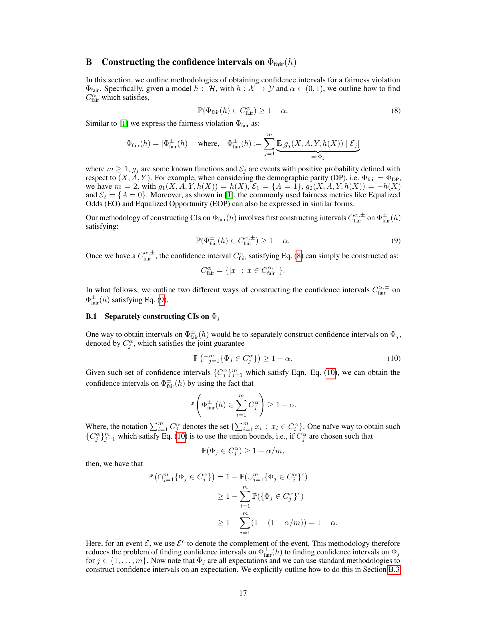
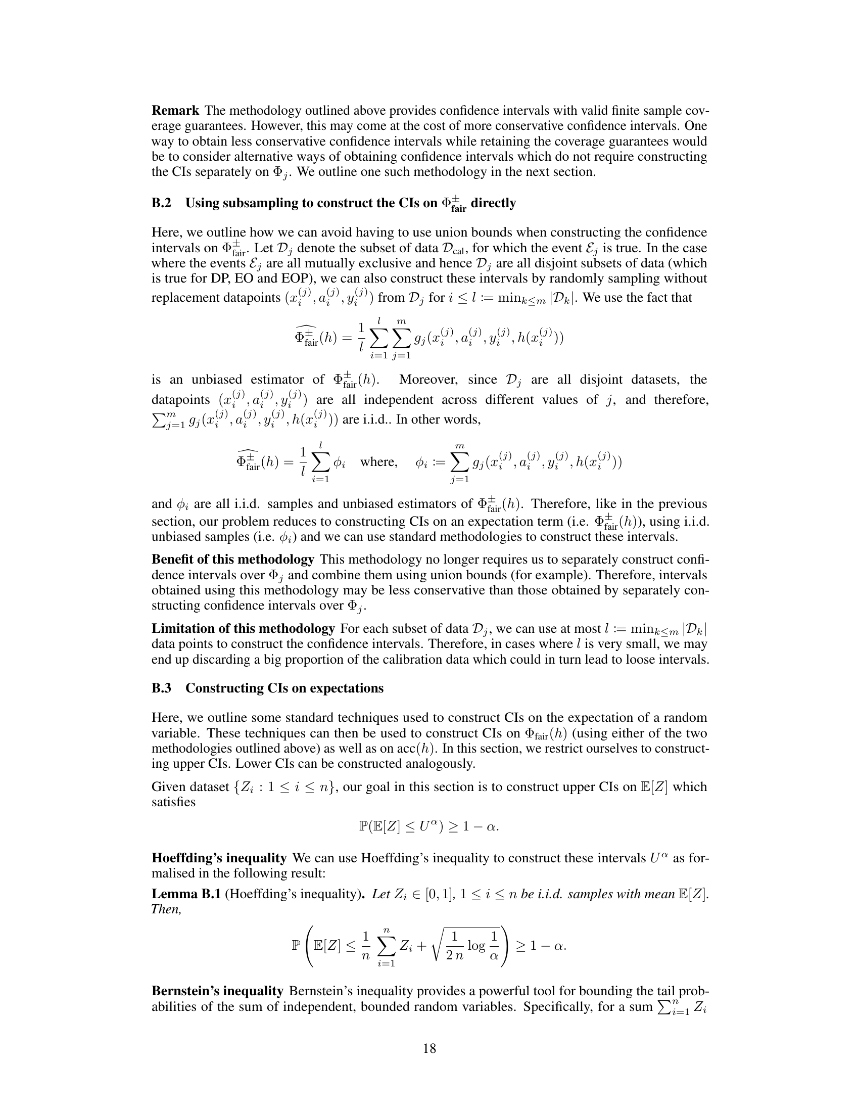
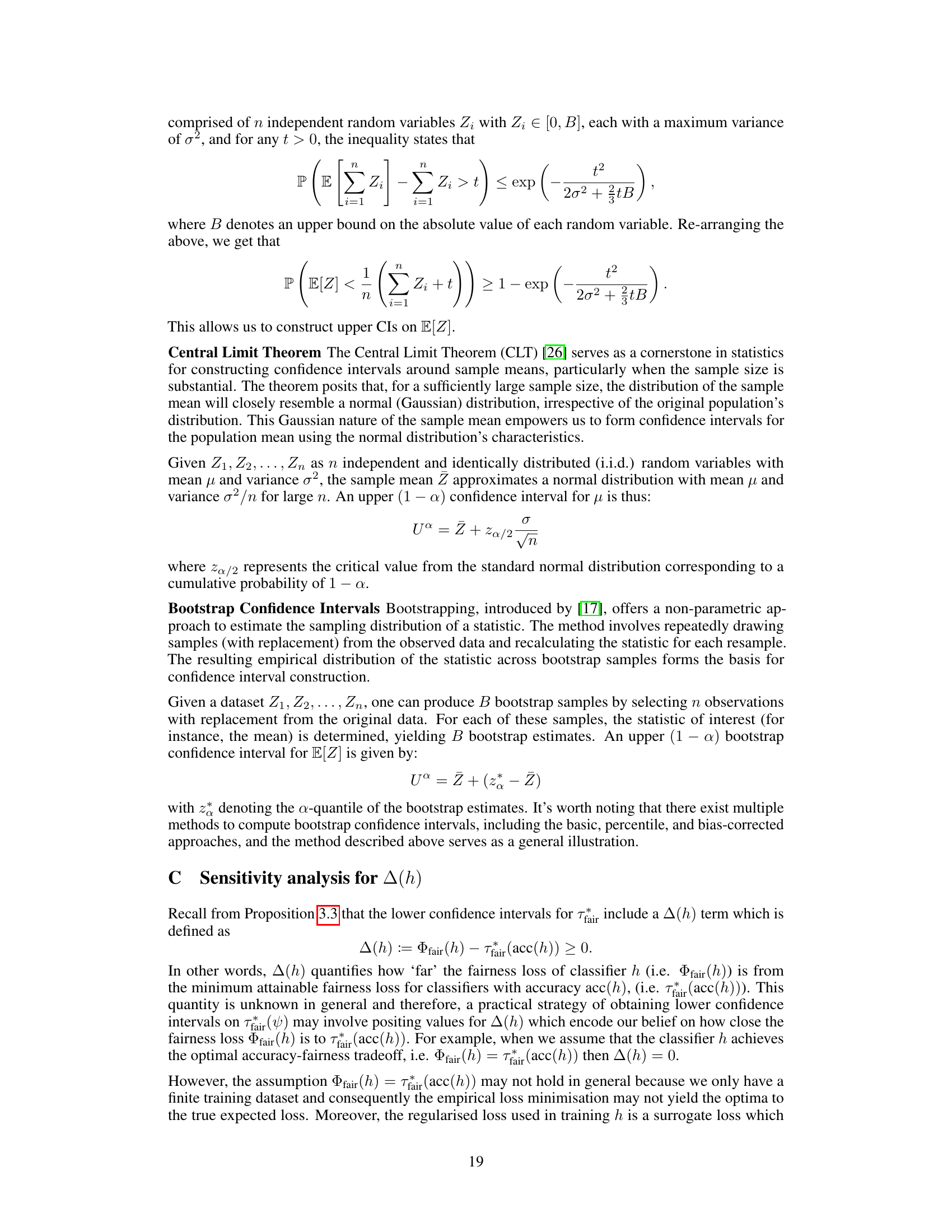
🔼 This figure shows accuracy-fairness trade-off curves for the COMPAS dataset. The black and red curves represent the trade-off from the same optimally trained model tested on two different data splits, highlighting the variability due to randomness in data splits. The blue curve shows a suboptimal model. The green shaded region represents the range of acceptable fairness violations (permissible trade-off region) for each accuracy level, according to the proposed method. Pink indicates a suboptimal accuracy-fairness trade-off (worse than achievable), and blue shows areas of unlikely achievable trade-offs (better than achievable). This illustrates the dataset-dependent nature of the fairness-accuracy trade-off and demonstrates the method’s ability to quantify the uncertainty in estimated trade-offs.
read the caption
Figure 1: Accuracy-fairness trade-offs for COMPAS dataset (on held-out data). The black and red curves are obtained using the same optimally trained model evaluated on different splits. The blue curve is obtained using a suboptimally trained model. The green area depicts the range of permissible fairness violations for each accuracy, pink area shows suboptimal accuracy-fairness trade-offs, and blue area shows unlikely-to-be-achieved ones. (Details in Appendix F.5)

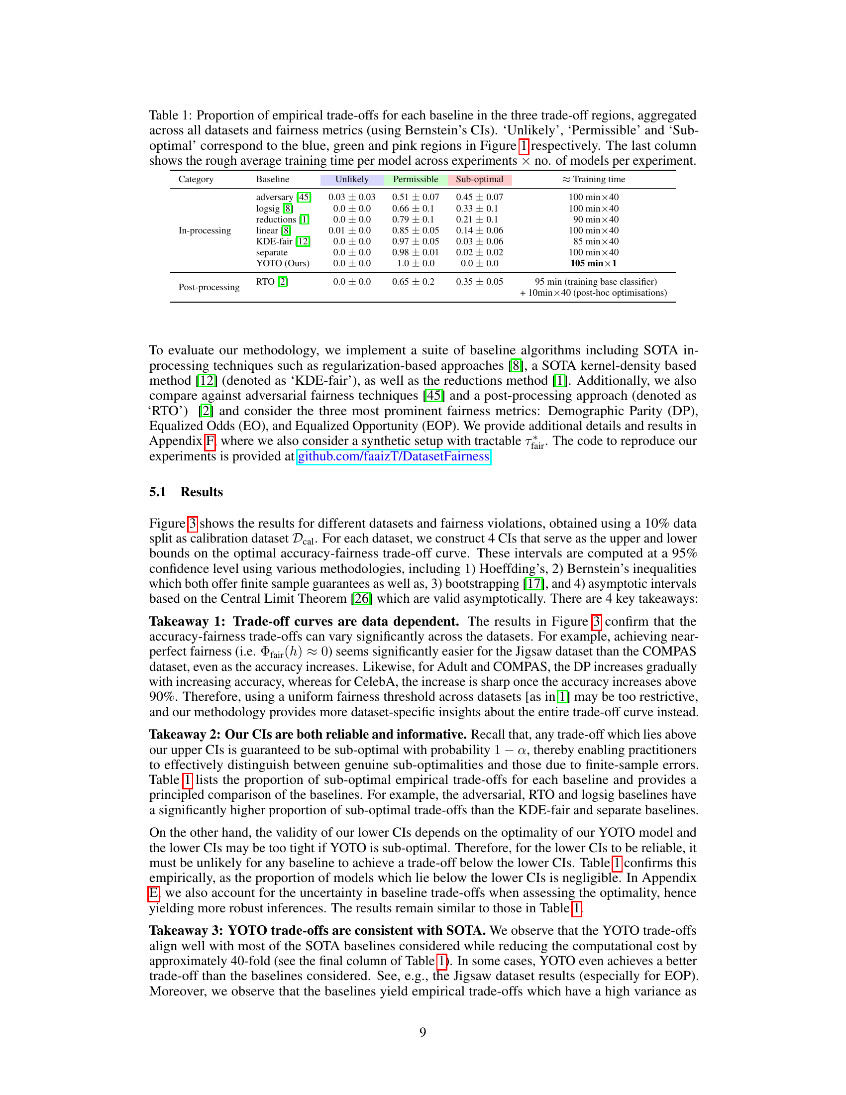
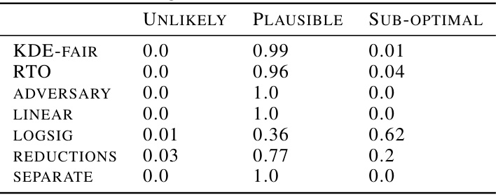
🔼 This table summarizes the performance of several fairness-aware machine learning models across various datasets. It shows the proportion of times each model’s performance fell into three categories: ‘Unlikely’ (achieving very low fairness violations), ‘Permissible’ (achieving moderate fairness violations), and ‘Sub-optimal’ (achieving high fairness violations). The table also provides an estimate of the training time for each model. The results are based on Bernstein’s Confidence Intervals and reflect performance across different datasets and fairness metrics.
read the caption
Table 1: Proportion of empirical trade-offs for each baseline in the three trade-off regions, aggregated across all datasets and fairness metrics (using Bernstein's CIs). 'Unlikely', 'Permissible' and 'Sub-optimal' correspond to the blue, green and pink regions in Figure 1 respectively. The last column shows the rough average training time per model across experiments × no. of models per experiment.
In-depth insights#
Fairness-Accuracy Tradeoff#
The fairness-accuracy tradeoff is a central challenge in fair machine learning. It highlights the inherent tension between achieving fairness across different demographic groups and maintaining high predictive accuracy. Simply prioritizing fairness often leads to a significant drop in accuracy, and vice versa. This tradeoff is not uniform across datasets; its severity depends on factors such as dataset biases, class imbalances, and the specific fairness metric employed. Understanding and quantifying this tradeoff is crucial for developing effective and ethical AI systems. The paper addresses this by presenting a computationally efficient method to approximate the tradeoff curve, tailored to individual datasets. This avoids the computationally expensive task of retraining numerous models for different fairness requirements, and provides a statistically robust framework for auditing model fairness, improving the practical application of fairness in machine learning. The approach incorporates a novel methodology for quantifying uncertainty in fairness estimates, which allows practitioners to identify and address suboptimalities in existing fairness methods, while avoiding false conclusions due to estimation errors.
YOTO Framework#
The You-Only-Train-Once (YOTO) framework is a computationally efficient training methodology designed to approximate the accuracy-fairness trade-off curve. Instead of training numerous models with varying regularization parameters, YOTO trains a single model that can be conditioned at inference time to produce predictions as if it had been trained with different parameter settings. This significantly reduces the computational burden of creating the curve, making it applicable to large datasets and complex models. The core innovation is in adapting a loss-conditional training strategy. This allows for a single model to simultaneously learn the optimal parameters for various fairness-accuracy trade-offs, thereby obviating the need for multiple training runs. While YOTO offers considerable efficiency gains, it’s crucial to consider its limitations, namely the assumption of sufficient model capacity. The accuracy of the approximated curve and its sensitivity to model capacity and dataset size require careful consideration. The use of YOTO within the context of fairness-accuracy trade-off estimation offers a promising direction for future research in fairness-aware machine learning, making the process of fairness auditing and model selection more practical and less computationally demanding.
Uncertainty Quantification#
In the realm of machine learning fairness, uncertainty quantification plays a crucial role in bridging the gap between theoretical guarantees and practical applications. The accuracy-fairness trade-off is inherently data-dependent, and a key challenge is evaluating how well a fairness-aware model performs in the face of finite sample data. Uncertainty quantification methods provide a mechanism to understand the reliability of fairness estimates, by acknowledging the influence of randomness, sampling variability, and approximation errors. This approach enables a more robust and nuanced evaluation of fairness, especially crucial in situations with limited data or complex datasets. Furthermore, quantifying uncertainty helps detect whether apparent sub-optimality in fairness methods is genuinely due to flaws in the approach or merely a result of random chance, thus guiding researchers and practitioners towards more effective and informed decisions. By acknowledging and properly communicating uncertainty, fairness-aware machine learning can be both more reliable and more trustworthy.
Empirical Validations#
An Empirical Validations section would thoroughly investigate the proposed methodology’s performance. This would involve applying the approach to multiple real-world datasets, spanning diverse data modalities (tabular, image, text) and fairness metrics (Demographic Parity, Equalized Odds, Equalized Opportunity). The results would showcase the method’s ability to accurately approximate the optimal accuracy-fairness trade-off curves. Crucially, it would demonstrate the reliability and informativeness of the associated confidence intervals by showing that they correctly capture the true trade-offs despite finite-sample and approximation errors, helping to distinguish genuine suboptimality from sampling noise. Finally, a comparison with state-of-the-art fairness methods would highlight the computational advantages while maintaining, or even exceeding, their performance. This section is critical for demonstrating the practical value and robustness of the proposed framework.
Method Limitations#
A thoughtful analysis of limitations inherent in the methodology of a research paper focusing on fairness in machine learning is crucial. Computational cost is a major concern; retraining numerous models to approximate the fairness-accuracy trade-off curve is often infeasible for large datasets. The reliance on finite-sampling datasets introduces significant uncertainty in evaluating model performance and estimating optimal trade-offs. Sub-optimality of baseline models could be wrongly attributed to flaws in their algorithms when the actual cause is inadequate dataset size. Approximations employed during the model training process, like using a smooth surrogate loss instead of non-smooth constrained optimization, can introduce inaccuracies. Generalizability of findings across diverse datasets and modalities is always questionable because the findings might be overly influenced by biases in the specific data used. Lastly, availability of sensitive attributes is another significant hurdle when evaluating fairness, particularly the creation of confidence intervals which needs the sensitive attributes for evaluation.
More visual insights#
More on figures

🔼 This figure shows the accuracy-fairness trade-off curves for the COMPAS dataset. Three curves are presented: one for an optimally trained model evaluated on two different data splits (black and red), and one for a sub-optimally trained model (blue). The shaded regions represent the range of permissible (green), suboptimal (pink), and practically unachievable (blue) trade-offs, illustrating how dataset characteristics affect the achievable fairness-accuracy balance. The figure highlights the challenges of using uniform fairness requirements across diverse datasets.
read the caption
Figure 1: Accuracy-fairness trade-offs for COMPAS dataset (on held-out data). The black and red curves are obtained using the same optimally trained model evaluated on different splits. The blue curve is obtained using a suboptimally trained model. The green area depicts the range of permissible fairness violations for each accuracy, pink area shows suboptimal accuracy-fairness trade-offs, and blue area shows unlikely-to-be-achieved ones. (Details in Appendix F.5)
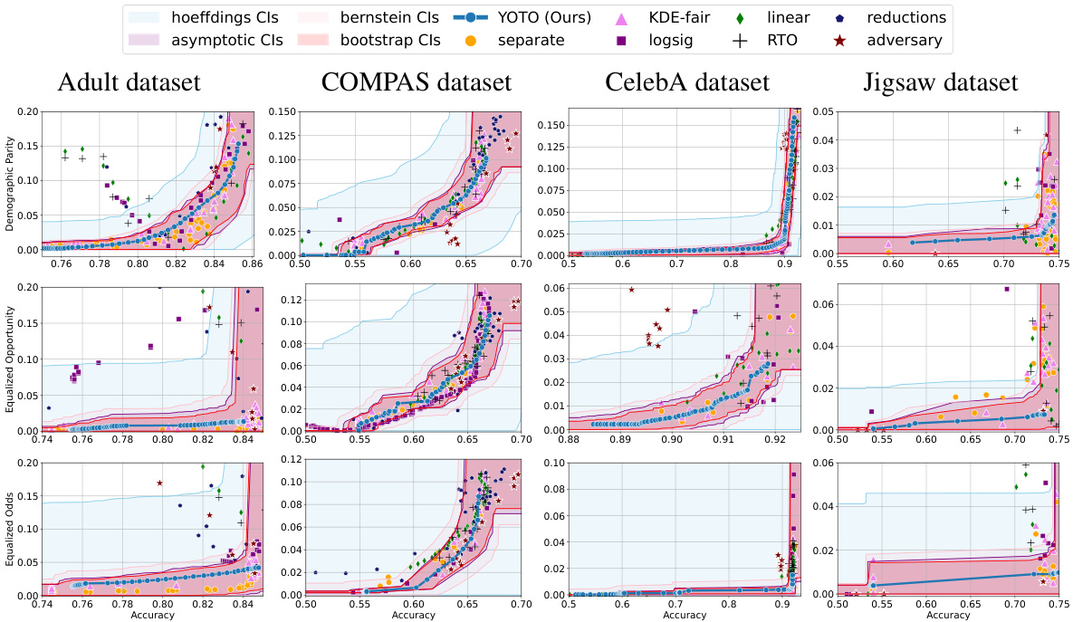
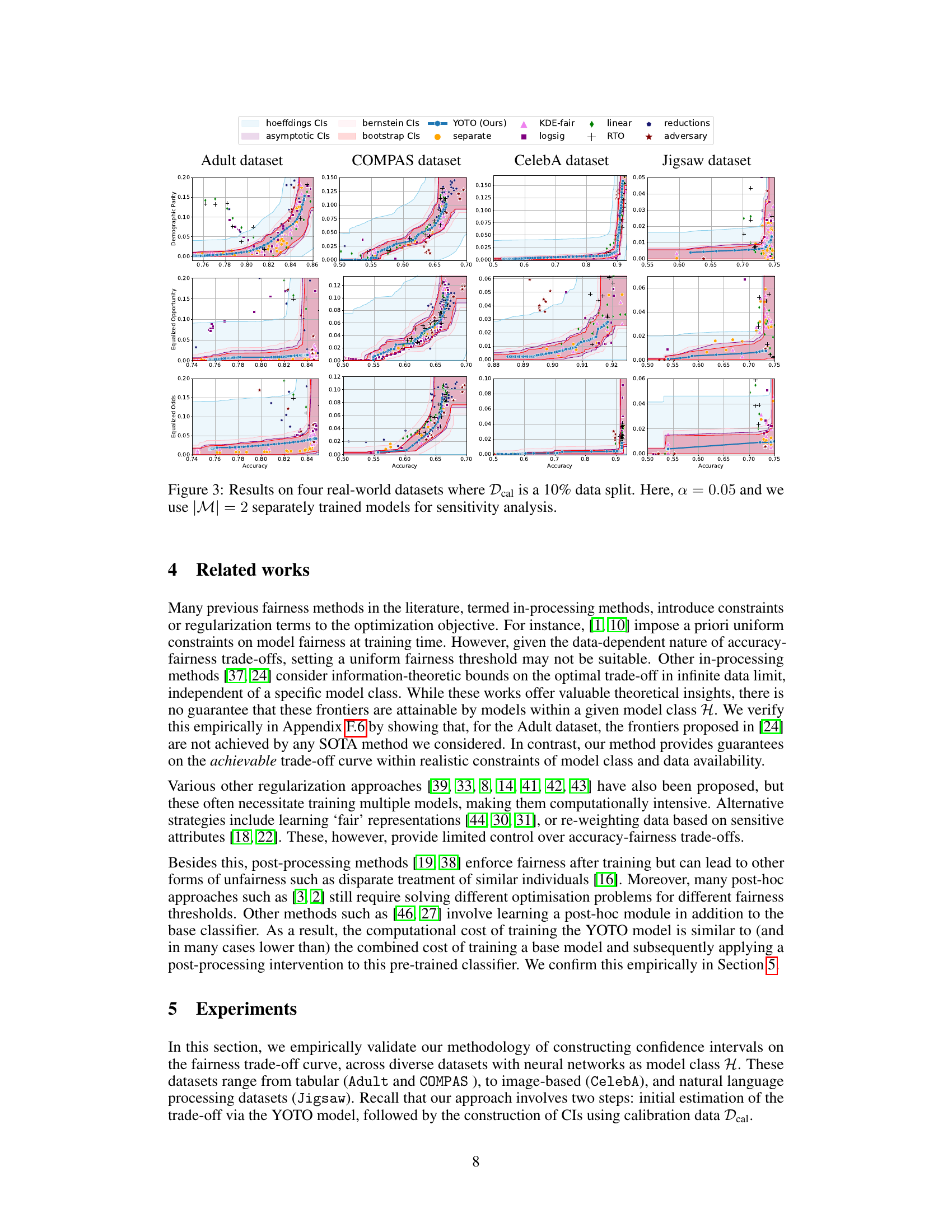
🔼 This figure displays the accuracy-fairness trade-off curves for four different datasets (Adult, COMPAS, CelebA, and Jigsaw) across three fairness metrics (Demographic Parity, Equalized Opportunity, and Equalized Odds). The black and red curves represent the empirical trade-offs from optimally trained models evaluated on two different data splits. The blue curve shows the trade-off from a suboptimally trained model. The green area represents the permissible trade-off region determined by the authors’ method, while the pink and blue areas show suboptimal and unlikely-to-be-achieved regions, respectively. The figure demonstrates how the trade-offs differ across datasets and fairness metrics.
read the caption
Figure 3: Results on four real-world datasets where Dcal is a 10% data split. Here, α = 0.05 and we use |M| = 2 separately trained models for sensitivity analysis.

🔼 This figure shows accuracy-fairness trade-off curves for the COMPAS dataset. Three curves are plotted, demonstrating different levels of optimality in model training. The black and red curves are from the same optimally trained model tested on different data splits, illustrating variance due to sampling. The blue curve is from a suboptimally trained model. Colored regions highlight ranges of permissible fairness violations for various accuracy levels, indicating potentially achievable, suboptimal, and unreachable trade-offs.
read the caption
Figure 1: Accuracy-fairness trade-offs for COMPAS dataset (on held-out data). The black and red curves are obtained using the same optimally trained model evaluated on different splits. The blue curve is obtained using a suboptimally trained model. The green area depicts the range of permissible fairness violations for each accuracy, pink area shows suboptimal accuracy-fairness trade-offs, and blue area shows unlikely-to-be-achieved ones. (Details in Appendix F.5)

🔼 This figure shows accuracy-fairness trade-off curves for the COMPAS dataset. Multiple curves are shown, illustrating the impact of different training methods and data splits on the trade-off. The key takeaway is that the optimal trade-off is dataset dependent and varies with accuracy levels. The figure also visualizes regions representing permissible, suboptimal, and unlikely-to-be-achieved fairness-accuracy combinations.
read the caption
Figure 1: Accuracy-fairness trade-offs for COMPAS dataset (on held-out data). The black and red curves are obtained using the same optimally trained model evaluated on different splits. The blue curve is obtained using a suboptimally trained model. The green area depicts the range of permissible fairness violations for each accuracy, pink area shows suboptimal accuracy-fairness trade-offs, and blue area shows unlikely-to-be-achieved ones. (Details in Appendix F.5)

🔼 This figure presents the accuracy-fairness trade-off curves for four real-world datasets: Adult, COMPAS, CelebA, and Jigsaw. For each dataset, the figure shows the trade-off curves for different fairness metrics (Demographic Parity, Equalized Opportunity, and Equalized Odds) obtained using various methods, including the proposed YOTO method, and several baseline methods. The confidence intervals (CIs) generated by four different methods (Hoeffding’s, asymptotic, Bernstein, and bootstrap) are also shown. The use of a 10% data split for calibration and two separately trained models for sensitivity analysis is highlighted in the caption. This visualization helps compare the performance of different fairness methods across different data modalities and highlights the data-dependent nature of the accuracy-fairness trade-off.
read the caption
Figure 3: Results on four real-world datasets where Dcal is a 10% data split. Here, α = 0.05 and we use |M| = 2 separately trained models for sensitivity analysis.

🔼 This figure shows the accuracy-fairness trade-off curves for the COMPAS dataset. Three curves are presented: black and red curves, obtained from the same optimally trained model but evaluated on different data splits; and a blue curve, obtained from a suboptimally trained model. The green shaded area represents the range of permissible fairness violations for each accuracy level, providing a benchmark for evaluating model fairness. The pink area highlights suboptimal accuracy-fairness trade-offs, while the blue area shows trade-offs that are unlikely to be achievable. The figure demonstrates how the accuracy-fairness trade-off varies depending on the model’s training and the data used for evaluation.
read the caption
Figure 1: Accuracy-fairness trade-offs for COMPAS dataset (on held-out data). The black and red curves are obtained using the same optimally trained model evaluated on different splits. The blue curve is obtained using a suboptimally trained model. The green area depicts the range of permissible fairness violations for each accuracy, pink area shows suboptimal accuracy-fairness trade-offs, and blue area shows unlikely-to-be-achieved ones. (Details in Appendix F.5)

🔼 This figure shows the accuracy-fairness trade-off curves for the COMPAS dataset. Three curves are shown: optimal model on two different data splits (black and red), and a suboptimal model (blue). The green shaded region represents the permissible fairness violations for each accuracy level, given by the proposed method. The pink region highlights suboptimal trade-offs, and the blue region shows unlikely-to-be-achieved trade-offs. This illustrates the dataset-dependent nature of the accuracy-fairness trade-off and the uncertainty in estimating this trade-off.
read the caption
Figure 1: Accuracy-fairness trade-offs for COMPAS dataset (on held-out data). The black and red curves are obtained using the same optimally trained model evaluated on different splits. The blue curve is obtained using a suboptimally trained model. The green area depicts the range of permissible fairness violations for each accuracy, pink area shows suboptimal accuracy-fairness trade-offs, and blue area shows unlikely-to-be-achieved ones. (Details in Appendix F.5)

🔼 This figure shows accuracy-fairness trade-offs for the COMPAS dataset. Three curves are presented: an optimal model evaluated on two different data splits (black and red), and a suboptimal model (blue). The shaded regions illustrate the range of achievable fairness violations for each accuracy level, differentiating between permissible (green), suboptimal (pink), and unlikely (blue) trade-offs. This highlights the dataset-dependent nature of the accuracy-fairness tradeoff and the uncertainty involved in estimating optimal tradeoffs.
read the caption
Figure 1: Accuracy-fairness trade-offs for COMPAS dataset (on held-out data). The black and red curves are obtained using the same optimally trained model evaluated on different splits. The blue curve is obtained using a suboptimally trained model. The green area depicts the range of permissible fairness violations for each accuracy, pink area shows suboptimal accuracy-fairness trade-offs, and blue area shows unlikely-to-be-achieved ones. (Details in Appendix F.5)

🔼 This figure shows the accuracy-fairness trade-off curves for the COMPAS dataset. Three curves illustrate the trade-off obtained using different training methods: optimal training (black and red curves, showing variation due to different data splits), and suboptimal training (blue curve). The green area represents the range of permissible fairness violations for each accuracy level, providing a benchmark for acceptable model performance. Pink shaded area indicates suboptimal performance, while the blue shaded area represents ranges unlikely to be achievable.
read the caption
Figure 1: Accuracy-fairness trade-offs for COMPAS dataset (on held-out data). The black and red curves are obtained using the same optimally trained model evaluated on different splits. The blue curve is obtained using a suboptimally trained model. The green area depicts the range of permissible fairness violations for each accuracy, pink area shows suboptimal accuracy-fairness trade-offs, and blue area shows unlikely-to-be-achieved ones. (Details in Appendix F.5)

🔼 This figure displays accuracy-fairness trade-off curves for the COMPAS dataset. Multiple curves are shown to illustrate the impact of different training methods and data splits on the trade-off. The black and red curves represent results from the same optimally trained model, evaluated on different data splits to highlight the impact of sampling variability. The blue curve shows results from a suboptimally trained model. Three regions are highlighted: a green region representing the permissible fairness-accuracy tradeoffs, a pink region showing suboptimal trade-offs, and a blue region representing trade-offs unlikely to be achievable. This visualization emphasizes the dataset-specific nature of the fairness-accuracy trade-off and the importance of accounting for uncertainty.
read the caption
Figure 1: Accuracy-fairness trade-offs for COMPAS dataset (on held-out data). The black and red curves are obtained using the same optimally trained model evaluated on different splits. The blue curve is obtained using a suboptimally trained model. The green area depicts the range of permissible fairness violations for each accuracy, pink area shows suboptimal accuracy-fairness trade-offs, and blue area shows unlikely-to-be-achieved ones. (Details in Appendix F.5)

🔼 This figure displays accuracy-fairness trade-off curves for the COMPAS dataset. Multiple curves illustrate the impact of model training methods and data splits on the trade-off. The green shaded area represents the achievable range of fairness given a certain accuracy; the pink area shows suboptimal trade-offs and the blue area shows unachievable trade-offs.
read the caption
Figure 1: Accuracy-fairness trade-offs for COMPAS dataset (on held-out data). The black and red curves are obtained using the same optimally trained model evaluated on different splits. The blue curve is obtained using a suboptimally trained model. The green area depicts the range of permissible fairness violations for each accuracy, pink area shows suboptimal accuracy-fairness trade-offs, and blue area shows unlikely-to-be-achieved ones. (Details in Appendix F.5)
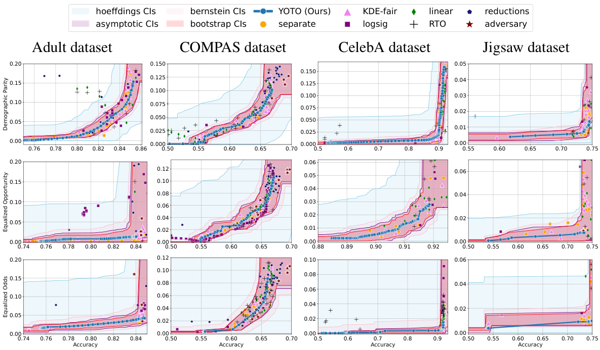
🔼 This figure shows the accuracy-fairness trade-off curves for four real-world datasets (Adult, COMPAS, CelebA, and Jigsaw) using different fairness metrics (Demographic Parity, Equalized Opportunity, and Equalized Odds). For each dataset and metric, multiple methods are compared, including the proposed YOTO method. The shaded regions represent confidence intervals for the optimal achievable trade-offs, calculated with a 95% confidence level. The results highlight the data-dependent nature of the accuracy-fairness trade-off.
read the caption
Figure 3: Results on four real-world datasets where Dcal is a 10% data split. Here, α = 0.05 and we use |M| = 2 separately trained models for sensitivity analysis.

🔼 This figure shows the accuracy-fairness trade-off curves for the COMPAS dataset. The black and red curves represent the trade-off obtained from the same optimally trained model evaluated on two different data splits, demonstrating the impact of data variability. The blue curve shows the trade-off of a suboptimally trained model. The green shaded region represents the permissible range of fairness violations at each accuracy level, the pink region represents suboptimal trade-offs, and the blue region represents the unlikely-to-be-achieved area. This visualization highlights the dataset-dependent nature of the accuracy-fairness trade-off and the uncertainty involved in estimating it.
read the caption
Figure 1: Accuracy-fairness trade-offs for COMPAS dataset (on held-out data). The black and red curves are obtained using the same optimally trained model evaluated on different splits. The blue curve is obtained using a suboptimally trained model. The green area depicts the range of permissible fairness violations for each accuracy, pink area shows suboptimal accuracy-fairness trade-offs, and blue area shows unlikely-to-be-achieved ones. (Details in Appendix F.5)

🔼 This figure displays the accuracy-fairness trade-off curves for four real-world datasets (Adult, COMPAS, CelebA, and Jigsaw) using different fairness metrics (Demographic Parity, Equalized Opportunity, and Equalized Odds). The curves are generated using various state-of-the-art (SOTA) fairness methods, including the proposed YOTO method. The shaded regions represent confidence intervals, showing the uncertainty in the estimated trade-off curves. The figure highlights how the optimal accuracy-fairness trade-off varies significantly across different datasets and fairness metrics.
read the caption
Figure 3: Results on four real-world datasets where Dcal is a 10% data split. Here, α = 0.05 and we use |M| = 2 separately trained models for sensitivity analysis.

🔼 This figure shows the accuracy-fairness trade-offs for four real-world datasets (Adult, COMPAS, CelebA, and Jigsaw) using different fairness metrics (Demographic Parity, Equalized Opportunity, and Equalized Odds). The black and red curves represent the trade-offs obtained from an optimal model evaluated on different data splits. The blue curve represents the trade-off from a suboptimal model. The green shaded area shows the permissible range of fairness violations for each accuracy level, the pink region represents suboptimal accuracy-fairness trade-offs, and the blue region highlights trade-offs unlikely to be achieved. The figure also demonstrates how the authors’ method provides confidence intervals (CIs) to quantify uncertainty in estimates and avoid false conclusions due to estimation errors.
read the caption
Figure 3: Results on four real-world datasets where Dcal is a 10% data split. Here, α = 0.05 and we use |M| = 2 separately trained models for sensitivity analysis.

🔼 This figure presents the accuracy-fairness trade-off curves for four real-world datasets (Adult, COMPAS, CelebA, and Jigsaw) using different fairness metrics (Demographic Parity, Equalized Opportunity, and Equalized Odds). The curves show the minimum fairness violation achievable for each accuracy level. The figure also displays confidence intervals (CIs) representing the uncertainty in the estimated trade-off curve, due to finite-sampling and estimation errors. These CIs provide a range of ‘permissible’ accuracy-fairness trade-offs. The figure demonstrates how the trade-offs vary across different datasets and fairness metrics and highlights the importance of dataset-specific fairness considerations.
read the caption
Figure 3: Results on four real-world datasets where Dcal is a 10% data split. Here, α = 0.05 and we use |M| = 2 separately trained models for sensitivity analysis.

🔼 This figure presents the accuracy-fairness trade-offs for four different real-world datasets: Adult, COMPAS, CelebA, and Jigsaw. For each dataset, it shows the trade-off curves for several fairness metrics (Demographic Parity, Equalized Opportunity, and Equalized Odds) and different fairness methods. The figure highlights the range of permissible fairness violations using confidence intervals calculated by the proposed method. The confidence intervals consider both finite-sampling and approximation errors, providing a robust framework for auditing fairness.
read the caption
Figure 3: Results on four real-world datasets where Dcal is a 10% data split. Here, α = 0.05 and we use |M| = 2 separately trained models for sensitivity analysis.

🔼 This figure presents accuracy-fairness trade-off curves for four real-world datasets (Adult, COMPAS, CelebA, and Jigsaw) using different fairness metrics (Demographic Parity, Equalized Opportunity, and Equalized Odds). The curves show the minimum fairness violation achievable for each accuracy level. The shaded areas represent confidence intervals constructed using different methods (Hoeffding’s, asymptotic, Bernstein’s, and bootstrap), showing the uncertainty in the estimated trade-off curves. The figure demonstrates that the optimal trade-offs can differ significantly across different datasets, highlighting the importance of considering dataset characteristics when setting fairness guidelines.
read the caption
Figure 3: Results on four real-world datasets where Dcal is a 10% data split. Here, α = 0.05 and we use |M| = 2 separately trained models for sensitivity analysis.

🔼 This figure shows the accuracy-fairness trade-off curves for four real-world datasets (Adult, COMPAS, CelebA, and Jigsaw) using different fairness metrics (Demographic Parity, Equalized Opportunity, and Equalized Odds). The curves represent the results of several state-of-the-art fairness methods and the authors’ YOTO method. Confidence intervals are shown to account for uncertainty in the estimates, highlighting the dataset-dependent nature of the accuracy-fairness trade-off and the uncertainty involved in estimating it. The figure shows that the YOTO method provides both reliable and informative intervals while offering significant computational savings compared to training multiple models. The sensitivity analysis is used to check for any suboptimality in YOTO’s performance.
read the caption
Figure 3: Results on four real-world datasets where Dcal is a 10% data split. Here, α = 0.05 and we use |M| = 2 separately trained models for sensitivity analysis.

🔼 This figure shows the accuracy-fairness trade-off curves for four real-world datasets (Adult, COMPAS, CelebA, and Jigsaw) using four different fairness metrics (Demographic Parity, Equalized Opportunity, Equalized Odds). The curves are generated using several state-of-the-art (SOTA) fairness methods and the proposed YOTO method. The confidence intervals (CIs) obtained using different methods (Hoeffding’s, Bernstein’s, asymptotic, and bootstrap) are also shown for comparison. The figure highlights the dataset-dependent nature of the accuracy-fairness trade-off and demonstrates the effectiveness of the proposed YOTO method in constructing reliable confidence intervals.
read the caption
Figure 3: Results on four real-world datasets where Dcal is a 10% data split. Here, α = 0.05 and we use |M| = 2 separately trained models for sensitivity analysis.

🔼 This figure visualizes the accuracy-fairness trade-offs for four real-world datasets (Adult, COMPAS, CelebA, Jigsaw) using different fairness metrics (Demographic Parity, Equalized Opportunity, Equalized Odds). The results show confidence intervals (CIs) calculated using four different methods (Hoeffding’s, asymptotic, Bernstein’s, bootstrap), and they are compared against several state-of-the-art (SOTA) fairness methods (KDE-fair, logsig, linear, reductions, RTO, adversary, separate). The figure highlights the dataset-dependent nature of these trade-offs and demonstrates the effectiveness of the proposed method in constructing reliable and informative confidence intervals.
read the caption
Figure 3: Results on four real-world datasets where Dcal is a 10% data split. Here, α = 0.05 and we use |M| = 2 separately trained models for sensitivity analysis.

🔼 This figure visualizes the accuracy-fairness trade-offs for four different real-world datasets (Adult, COMPAS, CelebA, and Jigsaw) using four different fairness metrics (Demographic Parity, Equalized Opportunity, Equalized Odds). The results are shown with 95% confidence intervals calculated using four different methods (Hoeffding’s, Bernstein’s, asymptotic, and bootstrap). The YOTO model’s performance is compared against several state-of-the-art (SOTA) fairness methods. The sensitivity analysis (|M|=2) is used to distinguish between sub-optimality due to finite samples and inherent limitations of the SOTA method. Each subplot represents a dataset and each line style/color shows performance with a particular fairness metric and SOTA method.
read the caption
Figure 3: Results on four real-world datasets where Dcal is a 10% data split. Here, α = 0.05 and we use |M| = 2 separately trained models for sensitivity analysis.

🔼 This figure displays the accuracy-fairness trade-offs for four datasets (Adult, COMPAS, CelebA, and Jigsaw) across three fairness metrics (Demographic Parity, Equalized Opportunity, and Equalized Odds). It compares the performance of the YOTO model with other state-of-the-art fairness methods. The confidence intervals generated by YOTO (representing the range of permissible fairness violations for each accuracy level) are shown as shaded green regions, providing a robust assessment of the model’s fairness and avoiding false conclusions due to estimation errors. Suboptimal and unachievable regions are also shown.
read the caption
Figure 3: Results on four real-world datasets where Dcal is a 10% data split. Here, α = 0.05 and we use |M| = 2 separately trained models for sensitivity analysis.

🔼 This figure presents the accuracy-fairness trade-off curves and their corresponding confidence intervals for four real-world datasets: Adult, COMPAS, CelebA, and Jigsaw. Each dataset is evaluated using three different fairness metrics: Demographic Parity, Equalized Opportunity, and Equalized Odds. The confidence intervals, calculated using four different methods (Hoeffding’s, asymptotic, Bernstein, and bootstrap), provide a range of permissible fairness violations for each accuracy level. The YOTO method’s trade-off curve is compared to those of several other state-of-the-art fairness methods. The figure also uses a sensitivity analysis (|M|=2) which refines the confidence intervals by taking into account the potential sub-optimality of the YOTO model. The use of 10% of data as Dcal for calibration is specified.
read the caption
Figure 3: Results on four real-world datasets where Dcal is a 10% data split. Here, α = 0.05 and we use |M| = 2 separately trained models for sensitivity analysis.

🔼 This figure shows how the difference between the YOTO model’s fairness trade-off and the optimal trade-off decreases as the size of the training data increases. The y-axis represents the maximum difference (across different regularization parameters lambda) between the YOTO model’s fairness tradeoff and the optimal fairness tradeoff at a given accuracy, relative to the optimal fairness tradeoff. The x-axis shows the training dataset size. Three lines represent three different fairness metrics: Demographic Parity (DP), Equalized Opportunity (EOP), and Equalized Odds (EO). The shaded area represents the confidence interval.
read the caption
Figure 29: Plot showing how ∆(hx) decreases (relative to the ground truth trade-off value τ^(acc(hx))) as the training data size |Dtr| increases. Here, we plot the worst (i.e. largest) value of maxλ∈Λ(acc(hx),τ^(acc(hx)) achieved by our YOTO model over a grid of λ values in [0, 5].
More on tables

🔼 This table shows the proportion of empirical trade-offs that fall into three categories (Unlikely, Permissible, Suboptimal) for different fairness baselines on the Adult dataset. It compares results with and without sensitivity analysis (using different numbers of additional models: |M| = 0, 2, and 5). The results are based on Bootstrap Confidence Intervals (CIs). The purpose is to demonstrate how the sensitivity analysis impacts the confidence intervals, helping to identify truly suboptimal trade-offs versus those seemingly suboptimal due to sampling variability.
read the caption
Table 2: Results for the Adult dataset and EO fairness violation with and without sensitivity analysis: Proportion of empirical trade-offs for each baseline which lie in the three trade-off regions (using Bootstrap CIs).

🔼 This table presents the results of experiments conducted on the Adult dataset using the Demographic Parity (DP) fairness metric. It shows the proportions of empirical trade-offs for various baselines that fall into three categories: ‘Sub-optimal’, ‘Permissible’, and ‘Unlikely’, based on the confidence intervals constructed using the Bootstrap method. The table compares the results with and without sensitivity analysis to evaluate the impact of this analysis on the accuracy of the results.
read the caption
Table 3: Results for the Adult dataset and DP fairness violation with and without sensitivity analysis: Proportion of empirical trade-offs for each baseline which lie in the three trade-off regions (using Bootstrap CIs).

🔼 This table presents the proportion of empirical accuracy-fairness trade-offs achieved by different fairness methods that fall into three categories: unlikely, permissible, and suboptimal. These categories are defined by the confidence intervals calculated using Bernstein’s method in the paper. The table summarizes results across multiple datasets and fairness metrics, providing a comparison of the methods’ performance. Training time is also provided, illustrating the computational efficiency of the proposed YOTO method.
read the caption
Table 1: Proportion of empirical trade-offs for each baseline in the three trade-off regions, aggregated across all datasets and fairness metrics (using Bernstein's CIs). 'Unlikely', 'Permissible' and 'Sub-optimal' correspond to the blue, green and pink regions in Figure 1 respectively. The last column shows the rough average training time per model across experiments × no. of models per experiment.
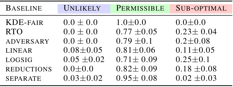
🔼 This table presents the proportion of empirical trade-offs for different fairness methods across four datasets (Adult, COMPAS, CelebA, Jigsaw) and three fairness metrics (Demographic Parity, Equalized Opportunity, Equalized Odds). It categorizes the results into three regions based on the constructed confidence intervals: ‘Unlikely’ (suboptimal), ‘Permissible’ (achievable), and ‘Sub-optimal’. The table highlights the relative performance and computational cost of various fairness methods and supports claims about the data-dependent nature of accuracy-fairness trade-offs.
read the caption
Table 1: Proportion of empirical trade-offs for each baseline in the three trade-off regions, aggregated across all datasets and fairness metrics (using Bernstein's CIs). 'Unlikely', 'Permissible' and 'Sub-optimal' correspond to the blue, green and pink regions in Figure 1 respectively. The last column shows the rough average training time per model across experiments × no. of models per experiment.

🔼 This table presents the approximate training times required for different fairness-achieving baselines across four datasets: Adult, COMPAS, CelebA, and Jigsaw. The baselines include various regularization approaches, the reductions method, KDE-fair, the YOTO method (the authors’ proposed method), and an adversarial approach. Training times are given per model, and for the RTO (Randomized Threshold Optimizer) method, separate timings are provided for the base classifier training and subsequent post-hoc optimizations. The table offers a comparison of the computational costs associated with these different methods.
read the caption
Table 6: Approximate training times per model for different baselines across various datasets.

🔼 This table summarizes the performance of various fairness methods across different datasets and fairness metrics. It shows the proportion of times each method resulted in trade-offs falling into three categories: unlikely to achieve (suboptimal), permissible, and suboptimal. The last column indicates the approximate training time for each method.
read the caption
Table 1: Proportion of empirical trade-offs for each baseline in the three trade-off regions, aggregated across all datasets and fairness metrics (using Bernstein's CIs). 'Unlikely', 'Permissible' and 'Sub-optimal' correspond to the blue, green and pink regions in Figure 1 respectively. The last column shows the rough average training time per model across experiments × no. of models per experiment.
🔼 This table shows the performance of various fairness methods across different datasets. It categorizes the empirical accuracy-fairness trade-offs into three regions: unlikely, permissible, and suboptimal, based on the confidence intervals generated by the proposed method. The table also provides an estimate of the training time required for each method.
read the caption
Table 1: Proportion of empirical trade-offs for each baseline in the three trade-off regions, aggregated across all datasets and fairness metrics (using Bernstein's CIs). 'Unlikely', 'Permissible' and 'Sub-optimal' correspond to the blue, green and pink regions in Figure 1 respectively. The last column shows the rough average training time per model across experiments × no. of models per experiment.

🔼 This table presents the proportion of empirical trade-offs for various fairness baselines that fall into three categories: unlikely, permissible, and suboptimal. These categories correspond to visual regions in Figure 1, representing the range of achievable accuracy-fairness tradeoffs. The table also provides an estimate of the training time required for each baseline.
read the caption
Table 1: Proportion of empirical trade-offs for each baseline in the three trade-off regions, aggregated across all datasets and fairness metrics (using Bernstein's CIs). 'Unlikely', 'Permissible' and 'Sub-optimal' correspond to the blue, green and pink regions in Figure 1 respectively. The last column shows the rough average training time per model across experiments × no. of models per experiment.

🔼 This table shows the performance of various fairness methods across different datasets. The proportion of empirical trade-offs that fall into the ‘Unlikely’, ‘Permissible’, and ‘Sub-optimal’ regions are presented. The ‘Unlikely’, ‘Permissible’, and ‘Sub-optimal’ regions refer to the classifications of achievable accuracy-fairness trade-offs from Figure 1 in the paper. The table also provides a rough estimate of the training time required for each method.
read the caption
Table 1: Proportion of empirical trade-offs for each baseline in the three trade-off regions, aggregated across all datasets and fairness metrics (using Bernstein's CIs). 'Unlikely', 'Permissible' and 'Sub-optimal' correspond to the blue, green and pink regions in Figure 1 respectively. The last column shows the rough average training time per model across experiments × no. of models per experiment.

🔼 This table shows the proportion of times different baseline models’ accuracy-fairness trade-offs fall into three categories: unlikely to be achieved, permissible, and suboptimal. It’s aggregated across all datasets and fairness metrics used in the paper. The categories are based on the confidence intervals calculated and visualized in Figure 1. The final column gives a relative comparison of the training time required for each model.
read the caption
Table 1: Proportion of empirical trade-offs for each baseline in the three trade-off regions, aggregated across all datasets and fairness metrics (using Bernstein's CIs). 'Unlikely', 'Permissible' and 'Sub-optimal' correspond to the blue, green and pink regions in Figure 1 respectively. The last column shows the rough average training time per model across experiments × no. of models per experiment.
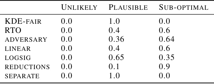
🔼 This table presents the proportion of empirical accuracy-fairness trade-offs for several fairness methods that fall into three categories: unlikely to be achievable, permissible, and suboptimal. The categories are defined by the confidence intervals calculated in the paper. The table also shows the approximate training time required for each method. This data helps quantify the effectiveness and efficiency of the different methods, considering both performance and computational cost.
read the caption
Table 1: Proportion of empirical trade-offs for each baseline in the three trade-off regions, aggregated across all datasets and fairness metrics (using Bernstein's CIs). 'Unlikely', 'Permissible' and 'Sub-optimal' correspond to the blue, green and pink regions in Figure 1 respectively. The last column shows the rough average training time per model across experiments × no. of models per experiment.
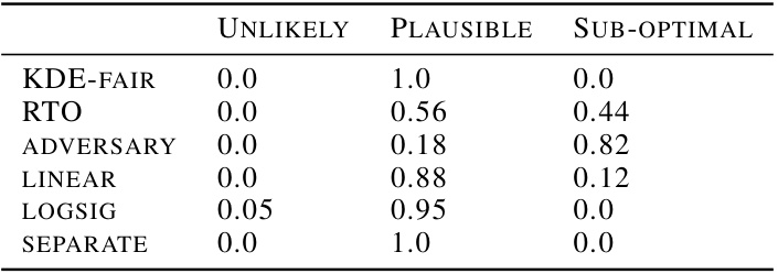
🔼 This table summarizes the performance of various fairness methods across different datasets and fairness metrics. For each method, it shows the proportion of times the accuracy-fairness trade-off falls into three categories: ‘Unlikely’ (below the lower bound of the confidence interval), ‘Permissible’ (within the confidence interval), and ‘Sub-optimal’ (above the upper bound). It also shows the approximate training time for each method.
read the caption
Table 1: Proportion of empirical trade-offs for each baseline in the three trade-off regions, aggregated across all datasets and fairness metrics (using Bernstein's CIs). 'Unlikely', 'Permissible' and 'Sub-optimal' correspond to the blue, green and pink regions in Figure 1 respectively. The last column shows the rough average training time per model across experiments × no. of models per experiment.

🔼 This table summarizes the performance of various fairness methods across different datasets, categorized into three regions based on the accuracy-fairness trade-off: unlikely, permissible, and suboptimal. The proportions of each method falling into each region are shown, along with approximate training times. This helps evaluate the effectiveness and efficiency of different approaches to achieving fairness in machine learning models.
read the caption
Table 1: Proportion of empirical trade-offs for each baseline in the three trade-off regions, aggregated across all datasets and fairness metrics (using Bernstein's CIs). 'Unlikely', 'Permissible' and 'Sub-optimal' correspond to the blue, green and pink regions in Figure 1 respectively. The last column shows the rough average training time per model across experiments × no. of models per experiment.

🔼 This table shows the proportion of empirical trade-offs for different fairness baselines that fall into three categories: unlikely, permissible, and suboptimal. The categories are based on the confidence intervals calculated in the paper and visualized in Figure 1. The table summarizes results across several datasets and fairness metrics, indicating the likelihood of baselines being suboptimal (falling outside the permissible range). It also provides a comparison of the training time required for each baseline.
read the caption
Table 1: Proportion of empirical trade-offs for each baseline in the three trade-off regions, aggregated across all datasets and fairness metrics (using Bernstein's CIs). 'Unlikely', 'Permissible' and 'Sub-optimal' correspond to the blue, green and pink regions in Figure 1 respectively. The last column shows the rough average training time per model across experiments × no. of models per experiment.

🔼 This table presents the proportion of empirical accuracy-fairness trade-offs that fall into three categories: ‘Unlikely’, ‘Permissible’, and ‘Sub-optimal’. These categories correspond to regions defined visually in Figure 1, representing trade-offs that are unlikely to be achievable, permissible, or suboptimal. The table shows these proportions for various fairness baselines across several datasets and fairness metrics, using Bernstein’s confidence intervals. The final column indicates the approximate training time for each baseline.
read the caption
Table 1: Proportion of empirical trade-offs for each baseline in the three trade-off regions, aggregated across all datasets and fairness metrics (using Bernstein's CIs). 'Unlikely', 'Permissible' and 'Sub-optimal' correspond to the blue, green and pink regions in Figure 1 respectively. The last column shows the rough average training time per model across experiments × no. of models per experiment.
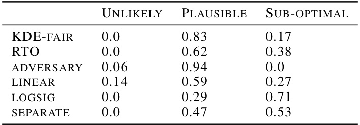
🔼 This table shows the proportion of empirical trade-offs for different fairness methods that fall into three categories: unlikely to be achievable, permissible, and suboptimal. The categorization is based on confidence intervals calculated using Bernstein’s method, and visualized in Figure 1 as colored regions. The table covers several datasets and fairness metrics (Demographic Parity, Equalized Odds, Equalized Opportunity), providing a comprehensive comparison across various in-processing and post-processing methods. The final column shows the approximate training time for each method.
read the caption
Table 1: Proportion of empirical trade-offs for each baseline in the three trade-off regions, aggregated across all datasets and fairness metrics (using Bernstein’s CIs). ‘Unlikely’, ‘Permissible’ and ‘Sub-optimal’ correspond to the blue, green and pink regions in Figure 1 respectively. The last column shows the rough average training time per model across experiments × no. of models per experiment.

🔼 This table presents the proportion of empirical trade-offs that fall into three different regions (Unlikely, Permissible, and Sub-optimal) for various baselines, aggregated across multiple datasets and fairness metrics. The regions correspond to the visual depiction in Figure 1. The table also offers an estimate of the training time for each model, factoring in the number of models trained per experiment.
read the caption
Table 1: Proportion of empirical trade-offs for each baseline in the three trade-off regions, aggregated across all datasets and fairness metrics (using Bernstein's CIs). 'Unlikely', 'Permissible' and 'Sub-optimal' correspond to the blue, green and pink regions in Figure 1 respectively. The last column shows the rough average training time per model across experiments × no. of models per experiment.
Full paper#


