TL;DR#
Current survival prediction models often focus on discrimination and marginal calibration, neglecting conditional calibration crucial for individual-level decisions. This leads to inaccurate predictions and suboptimal resource allocation. Existing calibration methods often compromise discrimination.
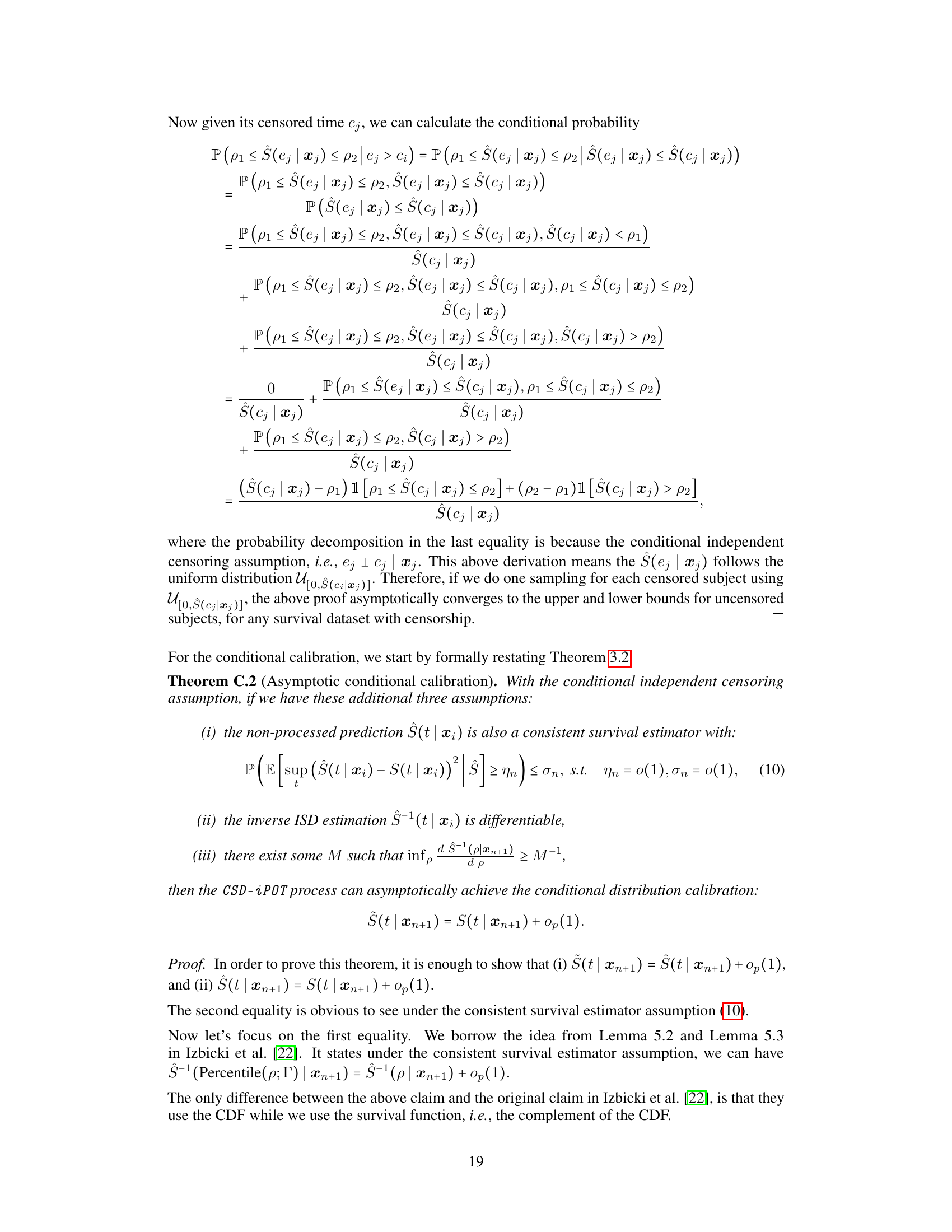
This paper introduces CSD-iPOT, a post-processing method using conformal prediction. CSD-iPOT leverages individual survival probability at observed time as conformity scores, effectively improving both marginal and conditional calibration without sacrificing discrimination. The method is computationally efficient and provides asymptotic theoretical guarantees for calibration, demonstrating its versatility across diverse real-world datasets.
Key Takeaways#
Why does it matter?#
This paper is crucial because it addresses the critical need for improved calibration in survival prediction models, especially conditional calibration which is vital for making accurate individual decisions. The proposed CSD-iPOT framework offers a practical and efficient solution to this problem, and its asymptotic guarantees and superior performance across diverse datasets make it a significant contribution to the field. This work also opens new avenues for research on conditional calibration and its applications in various domains.
Visual Insights#
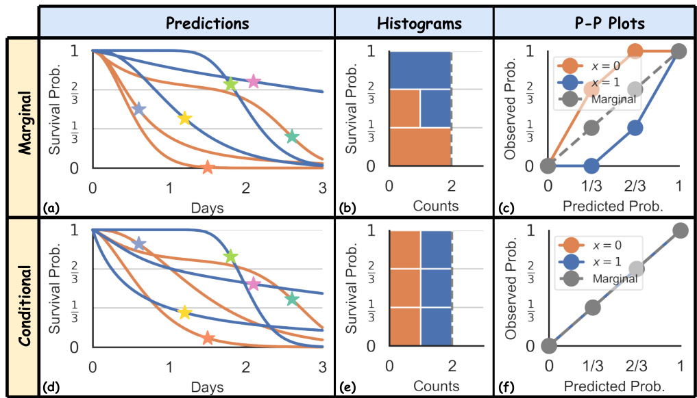
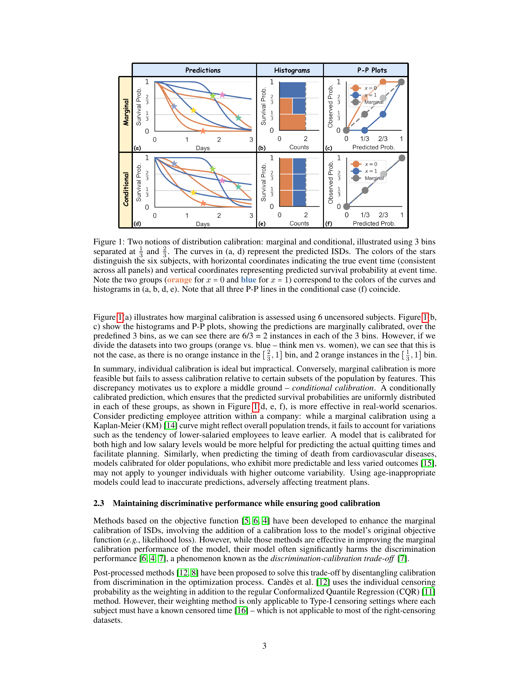
🔼 This figure illustrates two types of distribution calibration: marginal and conditional. The marginal calibration assesses the overall alignment of predicted survival probabilities with the actual distribution, while conditional calibration evaluates this alignment within specific subgroups defined by features. It uses predicted Individual Survival Distributions (ISDs) plotted against true event times for six subjects, separated into two groups (x=0 and x=1). Histograms and P-P plots further illustrate the calibration for both marginal and conditional scenarios, showcasing how conditional calibration ensures uniform distribution of predictions within subgroups, unlike marginal calibration.
read the caption
Figure 1: Two notions of distribution calibration: marginal and conditional, illustrated using 3 bins separated at and. The curves in (a, d) represent the predicted ISDs. The colors of the stars distinguish the six subjects, with horizontal coordinates indicating the true event time (consistent across all panels) and vertical coordinates representing predicted survival probability at event time. Note the two groups (orange for x = 0 and blue for x = 1) correspond to the colors of the curves and histograms in (a, b, d, e). Note that all three P-P lines in the conditional case (f) coincide.

🔼 This table compares the properties of two methods, CSD and CSD-iPOT, in terms of their ability to achieve marginal and conditional calibration, maintain monotonicity, and preserve discrimination. It shows that CSD-iPOT offers asymptotic guarantees for both marginal and conditional calibration and maintains monotonicity, while CSD only guarantees marginal calibration and monotonicity. Importantly, CSD-iPOT improves space complexity.
read the caption
Table 1: Properties of CSD and CSD-iPOT. Note that the calibration guarantees refer to asymptotic calibration guarantees. See Appendix E.5.
In-depth insights#
Survival Prediction#
Survival prediction, a critical area within machine learning, focuses on estimating the time until a specific event occurs. Censoring, where the event is not observed for all subjects, significantly complicates this task. This necessitates methods that can handle incomplete data, such as Kaplan-Meier estimation. Recent work highlights the importance of calibration in survival models, not only in the marginal sense (overall accuracy) but also conditionally (accuracy within subgroups defined by patient characteristics). Conformal prediction is a promising technique for improving both marginal and conditional calibration post-hoc, without compromising discrimination. By incorporating the model’s predicted probability at the observed time as a conformity score, and generating conformalized survival distributions, more precise individual predictions can be generated, leading to better real-world applicability, especially in clinical settings where individual-level decisions are paramount.
CSD-iPOT Method#
The CSD-iPOT method is a post-processing technique designed to calibrate survival distributions, addressing limitations of previous approaches. It leverages individual survival probability at observed time (iPOT) as conformity scores within a conformal prediction framework. CSD-iPOT’s key innovation is its use of iPOT, directly aligning with the definition of distribution calibration in survival analysis. This offers several advantages. First, it naturally handles censored data by using the censoring time as an upper bound for the true event time. Second, it adapts to feature variability, capturing the distribution variance of individual survival distributions. This adaptability is crucial in scenarios with heteroskedastic survival times. Finally, CSD-iPOT is computationally efficient, making it a practical solution for survival prediction tasks. Theoretical guarantees support its effectiveness in achieving marginal and conditional distribution calibration asymptotically, confirming its capability to provide well-calibrated predictions. The method’s versatility is highlighted through experimental results, showcasing its robustness and efficiency across diverse real-world datasets.
Calibration Metrics#
Proper calibration is crucial for reliable survival prediction models. Marginal calibration, assessing the overall alignment of predicted probabilities with observed outcomes, provides a general evaluation. However, it overlooks potential disparities across subgroups. Conditional calibration addresses this by examining calibration within specific subsets, ensuring fairness and accuracy in individual predictions. The choice of calibration metric significantly impacts the assessment. Harrell’s C-index measures the discrimination capability of a model. It’s essential to select metrics appropriate to the specific research question and the nature of the datasets. A multifaceted evaluation involving both marginal and conditional calibration, alongside discrimination metrics, offers a more comprehensive understanding of the model’s performance and limitations.
Experimental Results#
The Experimental Results section of a research paper is crucial for demonstrating the validity and effectiveness of the proposed methods. A strong presentation will meticulously detail the metrics used, comparing the new approach against established baselines across multiple datasets. Statistical significance should be rigorously addressed, possibly using error bars, confidence intervals, or p-values, indicating whether observed improvements are likely due to chance or represent a genuine advancement. The discussion should go beyond simple numerical comparisons, providing qualitative insights into the observed trends and relating them back to the paper’s core hypotheses. Limitations of the experimental setup should also be candidly acknowledged, such as dataset size or potential biases. A robust experimental section builds credibility, fostering confidence in the research and its broader implications.
Future Directions#
Future research could explore extending CSD-iPOT’s applicability to other survival analysis scenarios, such as competing risks and multi-state models. Investigating the impact of different conformity score choices and exploring alternative calibration methods is crucial for robustness. Theoretical guarantees could be strengthened to address limitations of current assumptions, focusing on finite sample scenarios and relaxing independence assumptions. Furthermore, developing efficient algorithms to handle high-dimensional datasets and large-scale problems would enhance practical applicability. Finally, investigating the fairness properties of CSD-iPOT under different demographic subgroups and exploring bias mitigation strategies are paramount given ethical considerations in real-world applications of survival analysis.
More visual insights#
More on figures
🔼 This figure illustrates the concepts of marginal and conditional distribution calibration using three bins. It shows how marginal calibration assesses whether predicted probabilities match the overall distribution, while conditional calibration assesses whether they match within specific subgroups (x=0 and x=1). The figure uses predicted individual survival distributions (ISDs), plotting the true event time vs. predicted survival probability. P-P plots demonstrate the calibration quality for both marginal and conditional cases.
read the caption
Figure 1: Two notions of distribution calibration: marginal and conditional, illustrated using 3 bins separated at and. The curves in (a, d) represent the predicted ISDs. The colors of the stars distinguish the six subjects, with horizontal coordinates indicating the true event time (consistent across all panels) and vertical coordinates representing predicted survival probability at event time. Note the two groups (orange for x = 0 and blue for x = 1) correspond to the colors of the curves and histograms in (a, b, d, e). Note that all three P-P lines in the conditional case (f) coincide.

🔼 This figure shows the performance comparison of the proposed CSD-iPOT method against seven baseline survival prediction models across 15 datasets. Violin plots illustrate the distribution of Harrell’s C-index (discrimination) and Calmargin (marginal calibration) scores for each method. The red dashed lines indicate the mean calibration performance of the Kaplan-Meier estimator (KM), which serves as a reference point for perfect marginal calibration.
read the caption
Figure 3: Violin plots of C-index and Calmargin performance of our method (CSD-iPOT) and benchmarks. The shape of each violin plot represents the probability density of the performance scores, with the black bar inside the violin indicating the mean performance. The red dashed lines in the lower panels represent the mean calibration performance for KM, serving as an empirical lower limit.

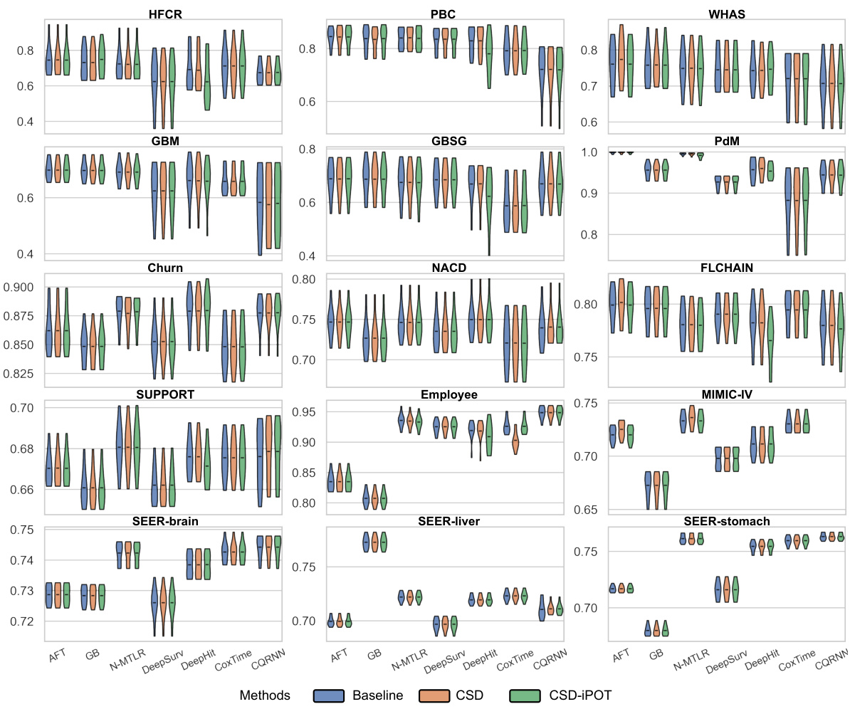
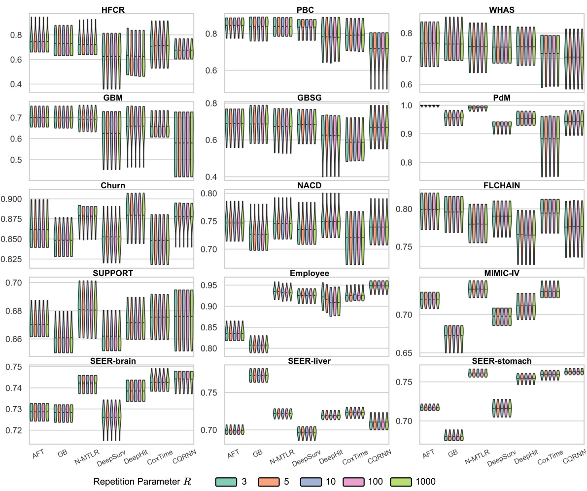
🔼 This figure shows the C-index performance of the proposed method CSD-iPOT compared to seven benchmark methods across 15 datasets. The C-index, a measure of discrimination, evaluates how well the model ranks subjects according to their true event times. Violin plots represent the distribution of C-index scores from ten independent trials for each dataset and method. The black bar in each violin denotes the mean C-index, enabling a direct comparison of the methods.
read the caption
Figure 10: Violin plots of C-index performance of our method (CSD-iPOT) and benchmarks. A higher value indicates better performance. The shape of each violin plot represents the probability density of the performance scores, with the black bar inside the violin indicating the mean performance.

🔼 This figure illustrates two types of distribution calibration: marginal and conditional. Marginal calibration assesses if the predicted survival probabilities across the entire population match the actual distribution. Conditional calibration assesses if predictions are well-calibrated within specific subgroups defined by features. The figure uses predicted individual survival distributions (ISDs), histograms of predicted probabilities, and probability-probability (P-P) plots to visually compare marginal and conditional calibration, highlighting the differences and demonstrating that marginal calibration alone may be insufficient for real-world applications.
read the caption
Figure 1: Two notions of distribution calibration: marginal and conditional, illustrated using 3 bins separated at and. The curves in (a, d) represent the predicted ISDs. The colors of the stars distinguish the six subjects, with horizontal coordinates indicating the true event time (consistent across all panels) and vertical coordinates representing predicted survival probability at event time. Note the two groups (orange for x = 0 and blue for x = 1) correspond to the colors of the curves and histograms in (a, b, d, e). Note that all three P-P lines in the conditional case (f) coincide.
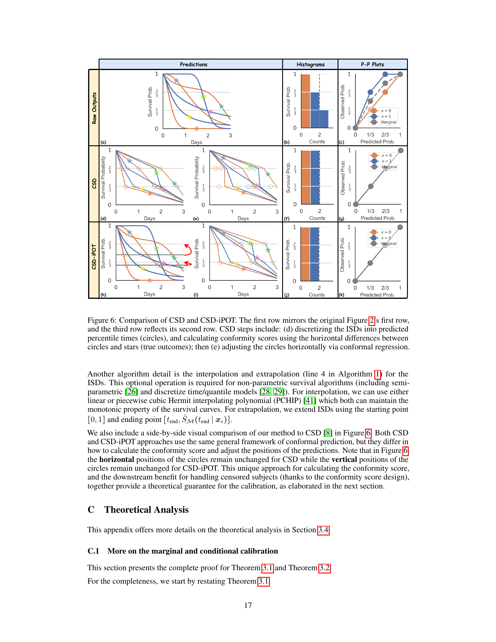
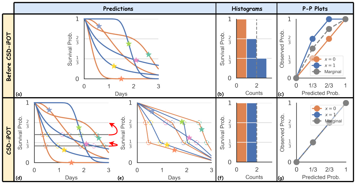
🔼 This figure visually compares the CSD and CSD-iPOT methods. The top row shows the raw predictions and their evaluation metrics, including histograms and P-P plots. The middle row illustrates the CSD method’s steps: discretizing predictions into percentiles and then performing conformal regression to adjust the predictions. The bottom row shows the CSD-iPOT method’s steps, which involve a different approach to calculating conformity scores and adjusting predictions. The figure highlights the differences in how each method calibrates the predictions.
read the caption
Figure 6: Comparison of CSD and CSD-iPOT. The first row mirrors the original Figure 2's first row, and the third row reflects its second row. CSD steps include: (d) discretizing the ISDs into predicted percentile times (circles), and calculating conformity scores using the horizontal differences between circles and stars (true outcomes); then (e) adjusting the circles horizontally via conformal regression.

🔼 This figure provides counterexamples to demonstrate that Harrell’s C-index and AUROC are not preserved by CSD-iPOT. Subfigure (a) shows two ISD curves crossing at a percentile level (25% < p* < 50%). Initially, the order of median survival times indicates that patient A precedes patient B. However, after applying the CSD-iPOT adjustment, which vertically shifts predictions, the order is reversed, demonstrating that Harrell’s C-index is not preserved. Subfigure (b) illustrates a scenario where CSD’s horizontal shifting of ISD curves can change the order of predictions, thus potentially affecting the AUROC score. The example illustrates that while CSD-iPOT preserves the relative order of survival probabilities at any single time point, it does not always preserve the relative order of median survival times.
read the caption
Figure 7: Counter examples of (a) Harrell's C-index performance is not preserved by CSD-iPOT; and (b) AUROC performance is not preserved by CSD.

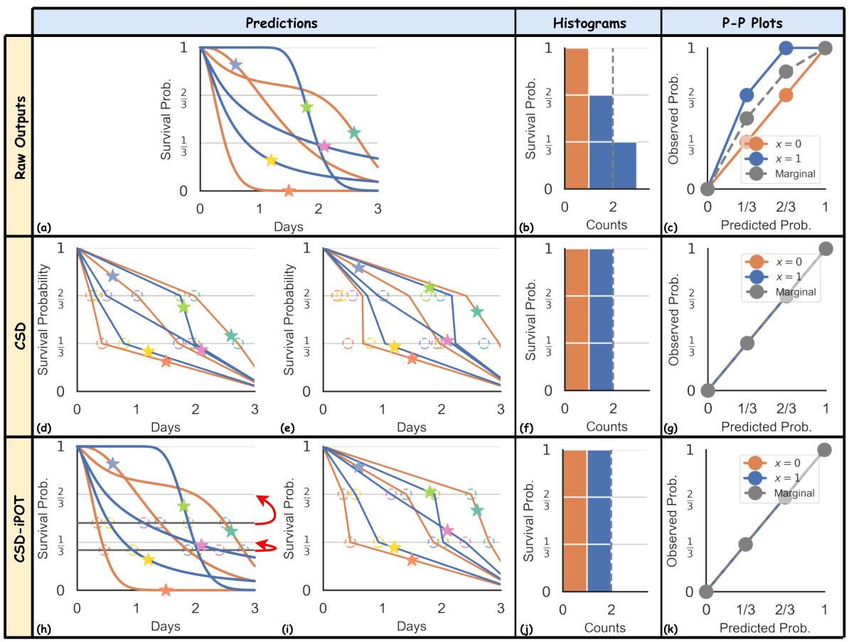
🔼 This figure visually compares the performance of CSD and CSD-iPOT methods. The first row shows the results from an arbitrary survival algorithm (a), its corresponding histogram (b), and P-P plot (c). The second row shows the same steps performed using the CSD method. The third row shows the same steps performed using the CSD-iPOT method. The figure highlights the differences in how these methods approach calibration: CSD adjusts the predictions horizontally, while CSD-iPOT adjusts them vertically.
read the caption
Figure 6: Comparison of CSD and CSD-iPOT. The first row mirrors the original Figure 2's first row, and the third row reflects its second row. CSD steps include: (d) discretizing the ISDs into predicted percentile times (circles), and calculating conformity scores using the horizontal differences between circles and stars (true outcomes); then (e) adjusting the circles horizontally via conformal regression.
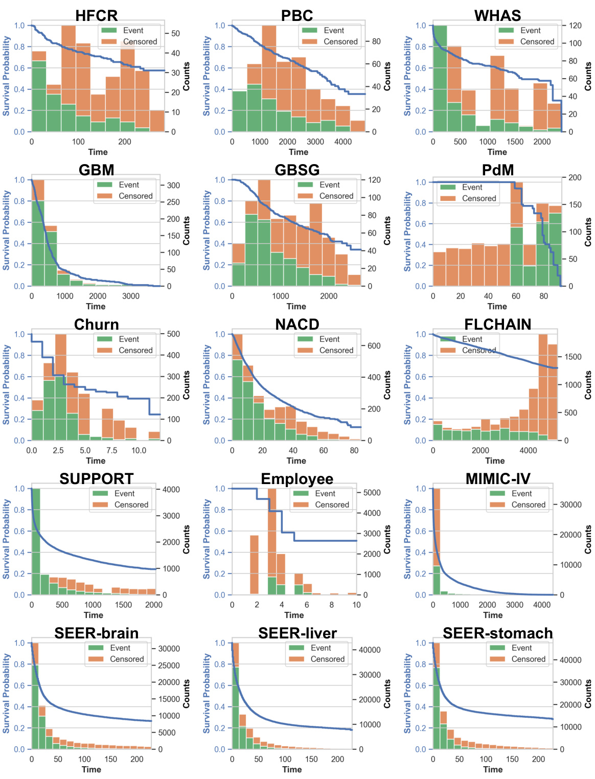
🔼 This figure presents Kaplan-Meier curves and histograms of event and censored times for each of the 15 datasets used in the study. The Kaplan-Meier curves visually represent the probability of survival over time, while the histograms illustrate the distribution of event and censoring times within each dataset. This visualization helps to understand the characteristics of each dataset regarding survival and censoring patterns, providing valuable context for the subsequent analysis and results.
read the caption
Figure 9: Kaplan Meier curves and event/censored histograms for all 15 datasets.
🔼 This figure compares the performance of the proposed CSD-iPOT method against seven baseline survival analysis methods across 15 datasets. It displays the C-index (discrimination) and Calmargin (marginal calibration) for each method using violin plots. The violin plots show the distribution of performance scores, with the black bar indicating the mean. Red dashed lines in the marginal calibration plots represent the average performance of the Kaplan-Meier estimator, serving as a lower bound.
read the caption
Figure 3: Violin plots of C-index and Calmargin performance of our method (CSD-iPOT) and benchmarks. The shape of each violin plot represents the probability density of the performance scores, with the black bar inside the violin indicating the mean performance. The red dashed lines in the lower panels represent the mean calibration performance for KM, serving as an empirical lower limit.

🔼 The figure shows the performance comparison of the proposed CSD-iPOT method and seven baseline methods using two metrics: Harrell’s C-index for discrimination and Calmargin for marginal calibration. Violin plots visually represent the distribution of C-index and Calmargin scores for each method across multiple datasets. The red dashed lines in the Calmargin plots indicate the average performance of the Kaplan-Meier (KM) estimator, which serves as a lower bound for marginal calibration. The plot helps to assess if the CSD-iPOT method improves upon existing methods in terms of both discrimination (C-index) and calibration (Calmargin).
read the caption
Figure 3: Violin plots of C-index and Calmargin performance of our method (CSD-iPOT) and benchmarks. The shape of each violin plot represents the probability density of the performance scores, with the black bar inside the violin indicating the mean performance. The red dashed lines in the lower panels represent the mean calibration performance for KM, serving as an empirical lower limit.

🔼 This figure presents violin plots comparing the C-index (discrimination) and Calmargin (marginal calibration) performance of the proposed CSD-iPOT method against seven baseline survival prediction methods and the CSD method. Violin plots show the probability density of performance scores for each method across multiple datasets. The black bar within each violin represents the mean performance, and red dashed lines in Calmargin plots indicate the mean KM calibration performance, used as an empirical lower bound. The plots illustrate that CSD-iPOT matches baseline methods in discrimination (C-index) and achieves better calibration (Calmargin) than both the baseline methods and the CSD method.
read the caption
Figure 3: Violin plots of C-index and Calmargin performance of our method (CSD-iPOT) and benchmarks. The shape of each violin plot represents the probability density of the performance scores, with the black bar inside the violin indicating the mean performance. The red dashed lines in the lower panels represent the mean calibration performance for KM, serving as an empirical lower limit.

🔼 This figure presents four case studies to visually compare the conditional calibration performance of CSD and CSD-iPOT. Each subfigure shows the calibration curve for a specific dataset (HFCR, FLCHAIN, Employee, MIMIC-IV) and a specific baseline model (AFT, GB, DeepSurv, MTLR), focusing on a particular subgroup defined by features (elder age, women, high salary, non-white-racial). The plots demonstrate that CSD-iPOT achieves better calibration within these subgroups than CSD, showcasing its superiority in handling conditional calibration.
read the caption
Figure 13: Case studies of the conditional calibration between CSD and CSD-iPOT. (a) For the elder age subgroup on HFCR, with AFT as the baseline; (b) For women subgroup on FLCHAIN, with GB as the baseline; (c) For the high salary subgroup on Employee, with DeepSurv as the baseline; (d) For the non-white-racial subgroup on MIMIC-IV, with MTLR as the baseline. All four cases show that CSD-iPOT is close to the ideal, while CSD is not.

🔼 This figure compares the performance of the proposed CSD-iPOT method against several baseline methods on 15 datasets. It presents violin plots showing the distribution of Harrell’s C-index (a discrimination metric) and Calmargin (a marginal calibration metric) for each method. The red dashed lines represent the average calibration performance of the Kaplan-Meier estimator, providing a baseline for comparison. The figure illustrates CSD-iPOT’s ability to improve calibration without sacrificing discrimination.
read the caption
Figure 3: Violin plots of C-index and Calmargin performance of our method (CSD-iPOT) and benchmarks. The shape of each violin plot represents the probability density of the performance scores, with the black bar inside the violin indicating the mean performance. The red dashed lines in the lower panels represent the mean calibration performance for KM, serving as an empirical lower limit.
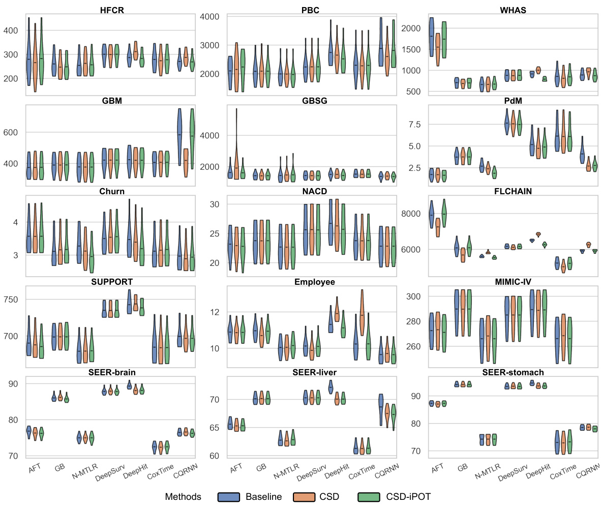
🔼 This figure presents violin plots illustrating the C-index and Calmargin performance of the proposed CSD-iPOT method in comparison to several benchmark methods across multiple datasets. Violin plots effectively display the probability distribution of the performance scores. The black bar within each violin represents the mean performance, giving a clear visual comparison of the methods’ performance. The red dashed lines in the Calmargin plots represent the mean calibration performance of the Kaplan-Meier (KM) estimator, serving as a benchmark for calibration.
read the caption
Figure 3: Violin plots of C-index and Calmargin performance of our method (CSD-iPOT) and benchmarks. The shape of each violin plot represents the probability density of the performance scores, with the black bar inside the violin indicating the mean performance. The red dashed lines in the lower panels represent the mean calibration performance for KM, serving as an empirical lower limit.
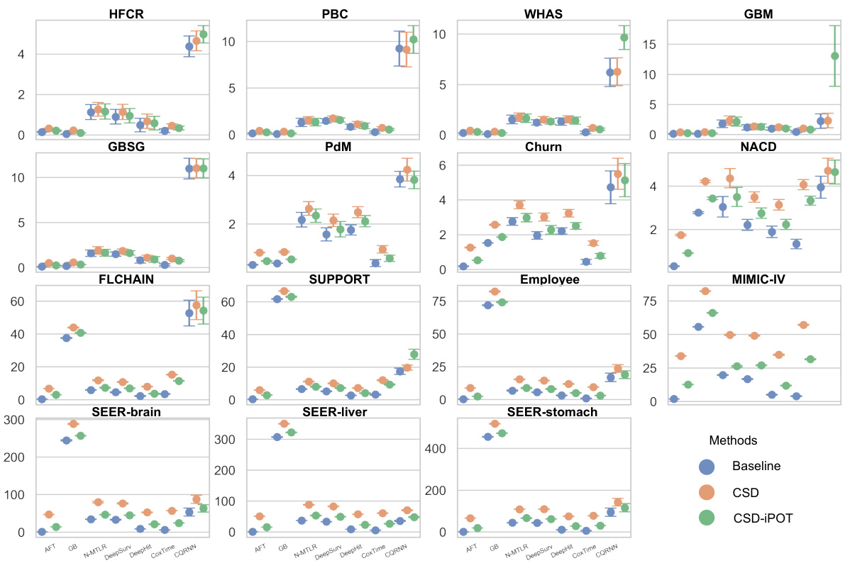
🔼 This figure displays violin plots that show the distribution of C-index and Calmargin scores for CSD-IPOT and seven benchmark survival analysis methods across 15 datasets. The C-index represents the model’s discrimination ability, while Calmargin measures the model’s marginal calibration performance. The red dashed lines in the Calmargin plots represent the mean calibration performance of the Kaplan-Meier (KM) estimator, which serves as an empirical lower bound. The wider the violin, the larger the variance of performance.
read the caption
Figure 3: Violin plots of C-index and Calmargin performance of our method (CSD-iPOT) and benchmarks. The shape of each violin plot represents the probability density of the performance scores, with the black bar inside the violin indicating the mean performance. The red dashed lines in the lower panels represent the mean calibration performance for KM, serving as an empirical lower limit.
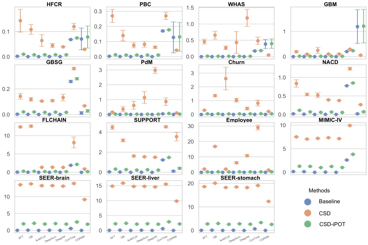
🔼 This figure presents violin plots that compare the performance of CSD-iPOT with seven benchmark methods across 15 datasets. Two metrics are used for the comparison: Harrell’s C-index (discrimination ability) and Calmargin (marginal calibration). The shape of each violin plot shows the distribution of the performance scores for each method across multiple runs, and the black bar within each violin shows the average performance. The red dashed lines in the Calmargin plots (lower panels) represent the average performance for the Kaplan-Meier (KM) method, a non-parametric method which serves as an empirical lower bound on marginal calibration. This visualization helps understand the distribution and mean of performance across different datasets and highlights the relative strengths of CSD-iPOT compared to other methods for both discrimination and calibration.
read the caption
Figure 3: Violin plots of C-index and Calmargin performance of our method (CSD-iPOT) and benchmarks. The shape of each violin plot represents the probability density of the performance scores, with the black bar inside the violin indicating the mean performance. The red dashed lines in the lower panels represent the mean calibration performance for KM, serving as an empirical lower limit.
🔼 This figure shows a comparison of three methods (baseline, CSD, CSD-iPOT) using the DeepHit model on the FLCHAIN dataset. Four test subjects’ predicted Individual Survival Distributions (ISDs) are shown, along with a Kaplan-Meier (KM) curve representing the overall survival distribution. The plots illustrate how each method generates predictions and whether they align with the observed survival probabilities (via P-P plots).
read the caption
Figure 8: An real example using DeepHit as the baseline, on the FLCHAIN dataset. The predicted curves in the panels are for the same 4 subjects in the test set. The dashed green line represents the KM curve on the test set. (a) Non post-processed baseline. (b) CSD method on DeepHit. (c) CSD-iPOT method on DeepHit. (d) P-P plots comparison of the three methods.
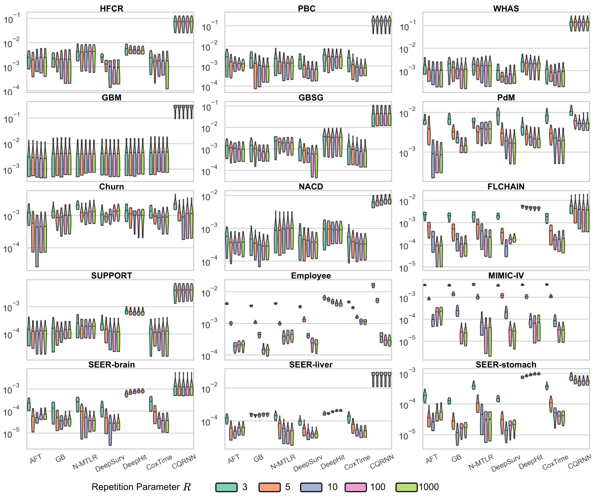
🔼 This figure presents violin plots showing the distribution of C-index and Calmargin scores for the proposed CSD-iPOT method and several baseline methods across multiple datasets. The C-index measures discrimination ability, while Calmargin assesses marginal calibration. The red dashed lines in the Calmargin plots indicate the mean performance of the Kaplan-Meier (KM) estimator, which serves as an empirical lower bound for calibration performance.
read the caption
Figure 3: Violin plots of C-index and Calmargin performance of our method (CSD-iPOT) and benchmarks. The shape of each violin plot represents the probability density of the performance scores, with the black bar inside the violin indicating the mean performance. The red dashed lines in the lower panels represent the mean calibration performance for KM, serving as an empirical lower limit.
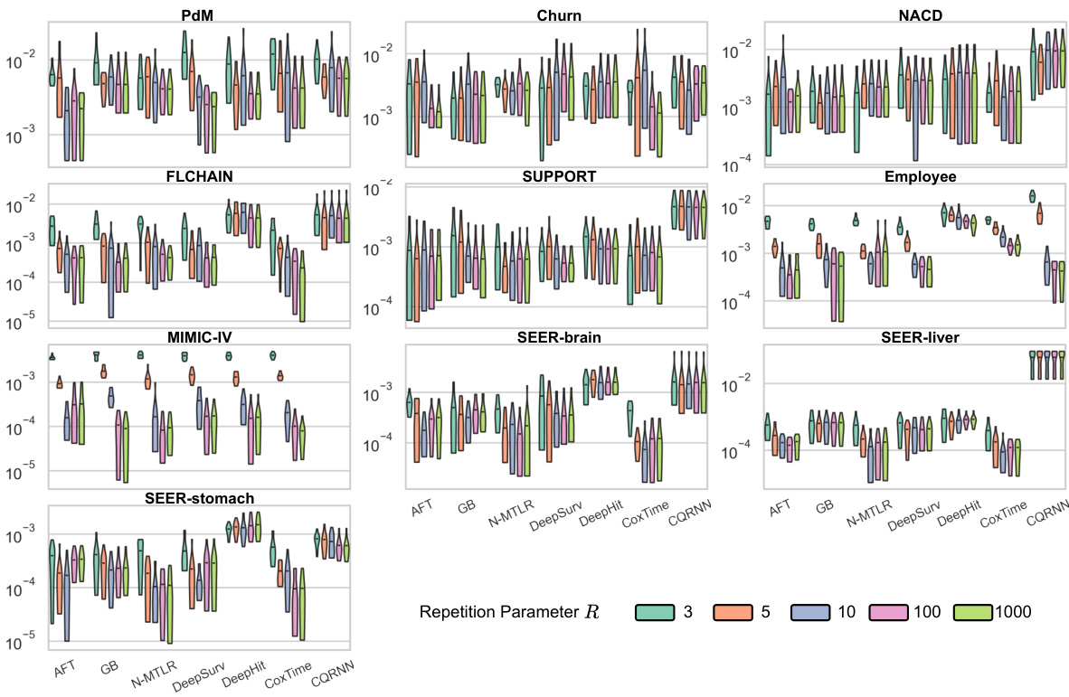
🔼 This figure shows the performance comparison between CSD-iPOT and other methods using Harrell’s C-index (discrimination) and Calmargin (marginal calibration). Violin plots visually represent the distribution of performance scores for each method across different datasets. The red dashed lines indicate the average performance of the Kaplan-Meier method, which serves as a baseline for calibration.
read the caption
Figure 3: Violin plots of C-index and Calmargin performance of our method (CSD-iPOT) and benchmarks. The shape of each violin plot represents the probability density of the performance scores, with the black bar inside the violin indicating the mean performance. The red dashed lines in the lower panels represent the mean calibration performance for KM, serving as an empirical lower limit.
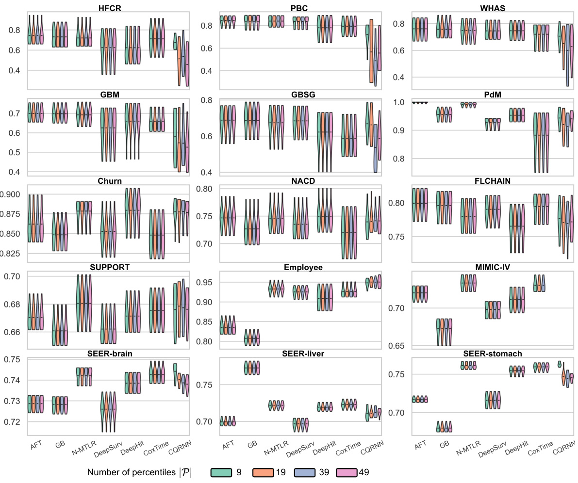
🔼 The figure shows the performance of the proposed CSD-iPOT method and several baseline methods across 15 datasets in terms of Harrell’s concordance index (C-index) and marginal calibration score (Calmargin). Violin plots visualize the distribution of performance scores for each method, with the mean score indicated. The C-index measures discrimination, while the Calmargin score measures calibration. The figure compares the results to a Kaplan-Meier (KM) curve, which represents the empirical lower bound for calibration performance.
read the caption
Figure 3: Violin plots of C-index and Calmargin performance of our method (CSD-iPOT) and benchmarks. The shape of each violin plot represents the probability density of the performance scores, with the black bar inside the violin indicating the mean performance. The red dashed lines in the lower panels represent the mean calibration performance for KM, serving as an empirical lower limit.
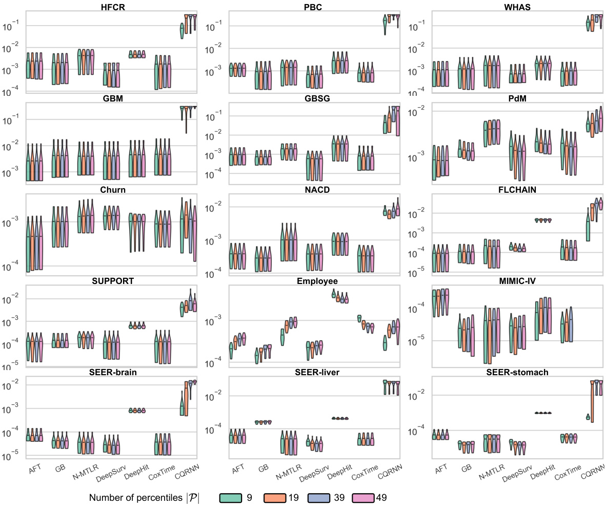
🔼 This figure illustrates the difference between marginal and conditional calibration using three bins. The predicted ISDs are shown, with stars representing subjects, horizontal coordinates indicating true event times, and vertical coordinates indicating predicted survival probabilities at event times. Marginal calibration checks whether the probabilities match the actual distribution across the entire population while conditional calibration checks if this matches for specific subgroups, improving precision for individual and group-level decisions.
read the caption
Figure 1: Two notions of distribution calibration: marginal and conditional, illustrated using 3 bins separated at and. The curves in (a, d) represent the predicted ISDs. The colors of the stars distinguish the six subjects, with horizontal coordinates indicating the true event time (consistent across all panels) and vertical coordinates representing predicted survival probability at event time. Note the two groups (orange for x = 0 and blue for x = 1) correspond to the colors of the curves and histograms in (a, b, d, e). Note that all three P-P lines in the conditional case (f) coincide.

🔼 This figure presents violin plots showing the C-index and Calmargin performance of the proposed CSD-iPOT method compared to several benchmark methods across multiple datasets. Violin plots display the distribution of performance scores for each method, indicating the density and central tendency (mean). The red dashed lines in the Calmargin plots represent the average KM calibration performance, acting as a lower bound of achievable calibration performance. This visual comparison helps to illustrate the relative improvement achieved by CSD-iPOT in both discrimination (C-index) and marginal calibration (Calmargin).
read the caption
Figure 3: Violin plots of C-index and Calmargin performance of our method (CSD-iPOT) and benchmarks. The shape of each violin plot represents the probability density of the performance scores, with the black bar inside the violin indicating the mean performance. The red dashed lines in the lower panels represent the mean calibration performance for KM, serving as an empirical lower limit.
More on tables

🔼 This table summarizes the performance of the proposed CSD-iPOT method compared to baselines and CSD across various metrics. It shows the number of wins, losses, and ties for each metric, indicating statistically significant improvements in marginal and conditional calibration without sacrificing discrimination.
read the caption
Table 2: Performance summary of CSD-iPOT. Values in parentheses indicate statistically significant differences (p < 0.05 using a two-sided t-test). A tie means the first 3 significant digits are the same. #The total number of comparisons for Calws is 69, while it is 104 for the other metrics.

🔼 This table presents key statistics for 15 datasets used in the paper’s experiments. It categorizes datasets by size (small, medium, large) based on the number of samples and highlights datasets with high censoring rates or Kaplan-Meier estimations ending at high probabilities. The number of features (after one-hot encoding) is also included.
read the caption
Table 3: Key statistics of the datasets. We categorize datasets into small, medium, and large, based on the number of instances, using thresholds of 1,000 and 10,000 instances. The bolded number represents datasets with a high percentage of censorship (≥ 60%) or its KM estimation ends at a high probability (≥ 50%). Numbers in parentheses indicate the number of features after one-hot encoding.
Full paper#


