TL;DR#
Large diffusion models show impressive compositional generalization—generating images with elements never seen together in training. However, the underlying mechanism is poorly understood, especially how models acquire this ability during training. Previous work has yielded mixed results on the relationship between feature factorization and compositional generalization. This paper investigates this crucial topic.
The researchers used a highly simplified, controlled setting (2D Gaussian bump images) to test whether and when diffusion models learn meaningful and factorized representations. They conducted extensive experiments on conditional denoising diffusion probabilistic models (DDPMs). The results demonstrated that the models learn factorized representations of features which lead to better compositional generalization but also highlight a surprising limitation: limited interpolation abilities. Furthermore, training with isolated factors of variation significantly boosted data efficiency. The findings are connected to percolation theory to explain the sudden onset of factorized representation learning.
Key Takeaways#
Why does it matter?#
This paper is crucial for AI researchers as it offers novel insights into the compositional generalization capabilities of diffusion models. By using a simplified setting, the study provides a deeper mechanistic understanding of how these models learn and generalize, which can inform the design of more efficient and effective training methods. The link between manifold learning and percolation theory adds a theoretical foundation to empirical observations, stimulating new avenues for research and potentially impacting various other areas of machine learning.
Visual Insights#
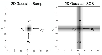
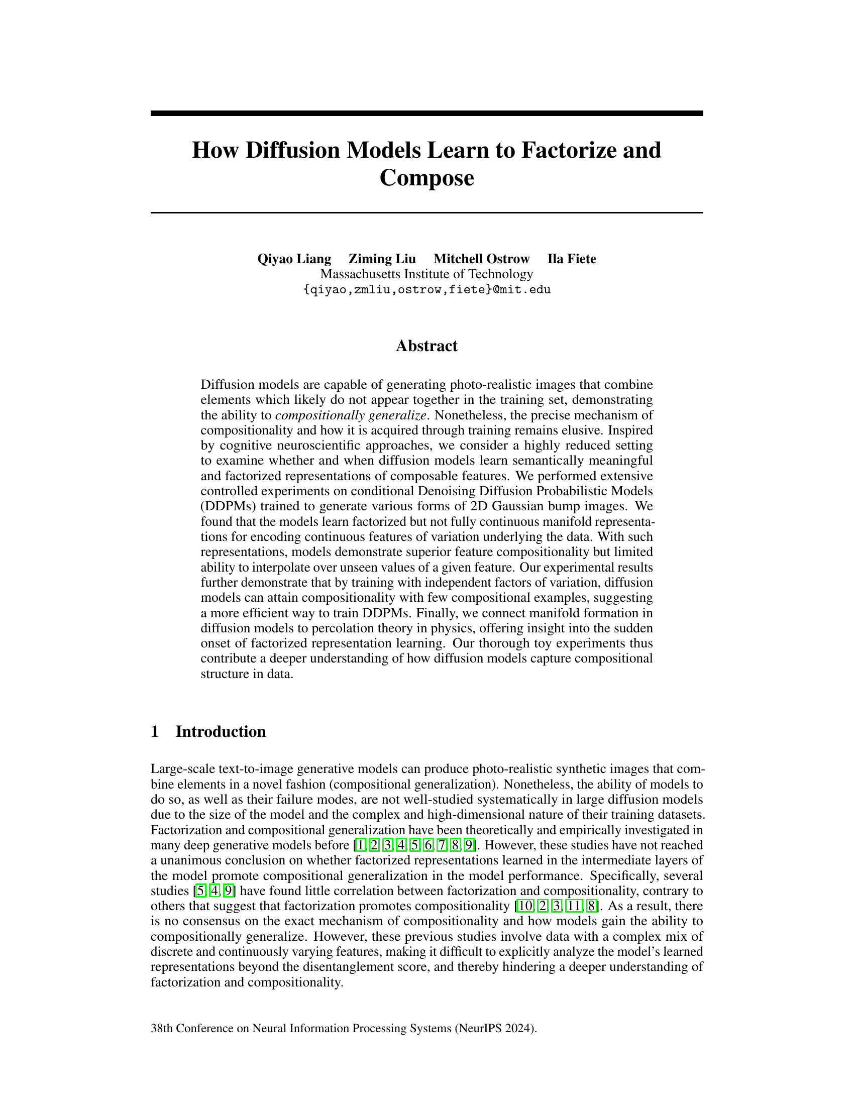
🔼 This figure shows example images of the two types of datasets used in the paper: 2D Gaussian bumps and 2D Gaussian sum of stripes (SOS). The left image shows a single 2D Gaussian blob, representing a single point in 2D space. The right image shows a 2D Gaussian SOS which is created by adding together two perpendicular 1D Gaussian stripes. Both images are 32x32 pixels and illustrate the core data types used in the experiments. The parameters µx, µy, σx, and σy represent the center and standard deviation of the Gaussian distributions along the x and y axes respectively.
read the caption
Figure 1: Example 32 × 32 image data of a 2D Gaussian bump (left) and a 2D Gaussian SOS (right).
In-depth insights#
Diffusion Model Compositionality#
The study of diffusion model compositionality delves into how these models generate novel combinations of features not explicitly present in their training data. The core question revolves around the mechanism by which these models achieve compositional generalization. The paper investigates this by employing controlled experiments on simplified datasets of 2D Gaussian bumps, focusing on the learning of factorized representations. Factorization, in this context, means the model learns independent representations for each feature, enabling effective composition. Crucially, while the models exhibit strong compositional generalization, they show limited interpolative abilities. This suggests that although they master combining features in novel ways, they struggle with smoothly transitioning between feature values, indicating a non-continuous manifold representation. The study further highlights the importance of training data. Specifically, it demonstrates that models trained with independent factors of variation, augmented with a small number of explicitly compositional examples, exhibit remarkable sample efficiency, achieving compositional generalization with significantly fewer examples compared to models trained solely on coupled data. This finding offers potential ways to improve training strategies for diffusion models, promoting efficient learning of compositional structure.
Factorized Representations#
The concept of “Factorized Representations” in the context of diffusion models centers on how these models disentangle underlying factors of variation within data. A factorized representation efficiently encodes these independent factors, enabling the model to learn complex relationships between them and generalize effectively to novel combinations not seen during training. The paper investigates whether and how diffusion models learn such representations. Successful factorization is key to compositional generalization, meaning the model can generate images that combine features in unseen ways, demonstrating a deeper understanding of the data’s underlying structure than merely memorization. The analysis likely involves examining the model’s internal representations, perhaps through dimensionality reduction techniques or by observing how the model’s output changes as independent factors are manipulated. The degree of factorization achieved informs the model’s capacity for compositional generalization; a fully factorized representation allows for seamless compositionality while partial or incomplete factorization results in limitations in generating novel combinations. The investigation would likely assess the efficiency of learning factorized representations, possibly comparing models trained with datasets emphasizing independent factors against those trained on datasets with mixed features. Percolation theory may offer insights into the conditions under which factorized representations emerge, revealing a threshold for data quantity and correlation that facilitates efficient learning of these representations.
Percolation Theory Link#
The paper explores a novel connection between the emergence of compositional generalization in diffusion models and percolation theory. It posits that the formation of a continuous manifold representation in the model’s latent space is analogous to the percolation transition observed in physics. Below a critical threshold of training data, the model’s representation remains fragmented, hindering compositional generalization. However, above this threshold, interconnected regions in the latent space emerge, enabling the model to effectively compose features that may not have appeared together in the training data. This insightful link suggests that the sudden onset of compositional ability is not simply due to increased model capacity, but rather a critical transition in the model’s internal representation, mirroring phase transitions studied in percolation theory. This provides a microscopic, mechanistic explanation for the observed phenomenon, moving beyond simple empirical observations to offer a deeper theoretical understanding of diffusion models’ capacity for compositional generalization.
Limited Interpolation#
The concept of ‘Limited Interpolation’ within the context of diffusion models highlights a crucial limitation despite their impressive compositional generalization capabilities. While these models excel at generating novel combinations of features, they struggle to smoothly transition between existing feature values. This limitation stems from the models’ tendency to learn a hyper-factorized representation, where feature values are encoded in a manner that is not fully continuous. Essentially, the model maps continuous features onto a discrete or semi-discrete manifold. Therefore, attempting interpolation—generating intermediate points along a continuous feature trajectory—results in poor performance. This disconnect between the continuous nature of the underlying features and the discretized manifold representation is a key area for future research, particularly in exploring techniques that could create more continuous representations. The efficiency gains from employing sparsely-sampled data suggests a potential trade-off between data efficiency and continuous representation learning. Further research needs to address this trade-off to enable diffusion models to both efficiently learn and generate seamless interpolations across feature variations.
Data Efficiency Gains#
The concept of “Data Efficiency Gains” in the context of diffusion models centers on achieving high performance with significantly less training data. The paper likely explores how modifications to the training data, such as incorporating isolated factors of variation and a small number of compositional examples, drastically improves model performance. This suggests that carefully curated datasets, focusing on disentangled features and a few key compositional examples, might be far more efficient than massive, unorganized datasets for training diffusion models. The results likely demonstrate a dramatic reduction in the amount of data required to reach a given level of accuracy, highlighting potential cost savings and computational efficiency in diffusion model training. Percolation theory might be used to explain the observed phenomenon, suggesting a threshold amount of data is needed before compositional generalization emerges. The study likely quantifies these gains and investigates the scaling properties with dataset size and model complexity. The findings could be pivotal in guiding future research on data augmentation techniques and efficient model training strategies for diffusion models, ultimately paving the way for creating high-performing models with significantly reduced computational costs and data requirements.
More visual insights#
More on figures

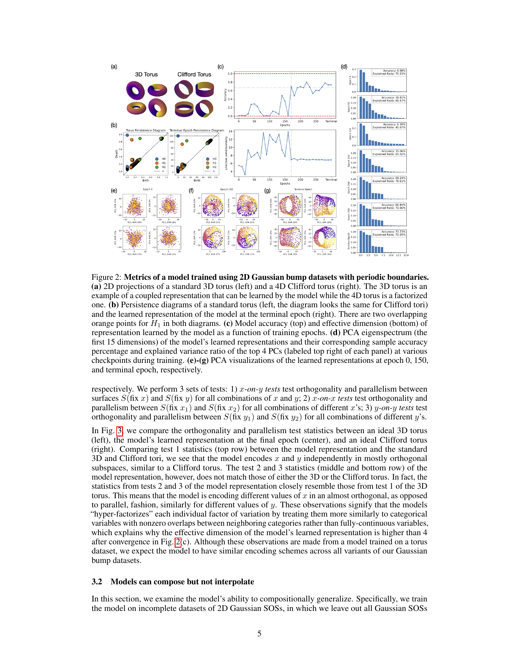
🔼 This figure shows the results of experiments conducted to investigate the topology of the model’s learned representation when trained on a periodic 2D Gaussian bump dataset. Panel (a) displays 2D projections of a 3D torus (coupled representation) and a 4D Clifford torus (factorized representation). Panel (b) compares persistence diagrams of a standard torus to the learned representation, indicating a torus-like structure. Panel (c) plots model accuracy and effective dimensionality over training epochs. Panel (d) presents the PCA eigenspectrum at different training stages. Finally, panels (e)-(g) show PCA visualizations of the learned representation at epochs 0, 150, and the terminal epoch, respectively, illustrating its evolution toward a Clifford torus-like structure.
read the caption
Figure 2: Metrics of a model trained using 2D Gaussian bump datasets with periodic boundaries. (a) 2D projections of a standard 3D torus (left) and a 4D Clifford torus (right). The 3D torus is an example of a coupled representation that can be learned by the model while the 4D torus is a factorized one. (b) Persistence diagrams of a standard torus (left, the diagram looks the same for Clifford tori) and the learned representation of the model at the terminal epoch (right). There are two overlapping orange points for H₁ in both diagrams. (c) Model accuracy (top) and effective dimension (bottom) of representation learned by the model as a function of training epochs. (d) PCA eigenspectrum (the first 15 dimensions) of the model's learned representations and their corresponding sample accuracy percentage and explained variance ratio of the top 4 PCs (labeled top right of each panel) at various checkpoints during training. (e)-(g) PCA visualizations of the learned representations at epoch 0, 150, and terminal epoch, respectively.
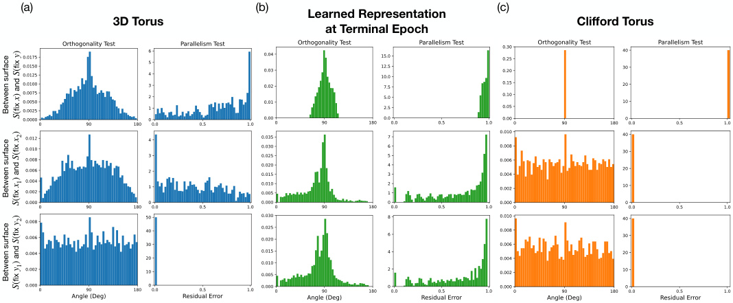
🔼 This figure compares the results of orthogonality and parallelism tests on three different types of tori: a 3D torus, the learned representation from the diffusion model at the terminal epoch, and a Clifford torus. Each test is performed in three variations (x-on-y, x-on-x, y-on-y) and measures two properties (orthogonality and parallelism). The histograms visualize the distributions of the test statistics, showing the differences in how the three types of tori encode x and y independently. This helps determine if the model’s representation is factorized (Clifford-like) or coupled (3D-like).
read the caption
Figure 3: Comparison of orthogonality and parallelism test statistics between 3D torus, model’s learned representation, and Clifford torus. x-on-y (top row), x-on-x (middle row), y-on-y (bottom row) orthogonality (left column) and parallelism (right column) test statistics are compared between (a) an ideal 3D torus (blue), (b) the learned representation by the model (green), and (c) an ideal Clifford torus (orange).
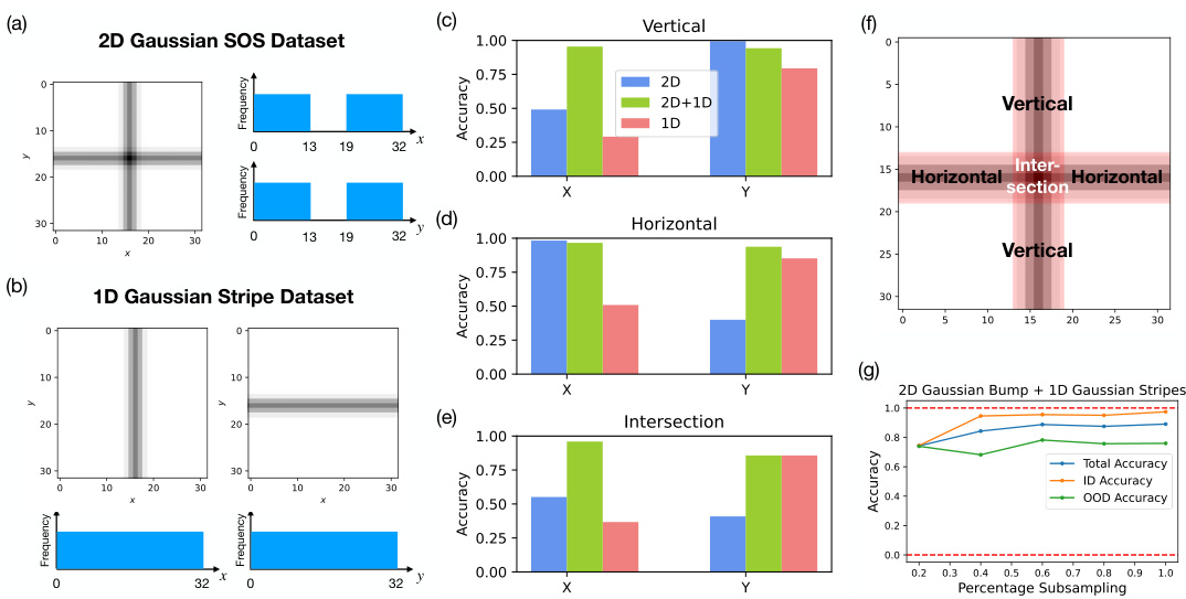
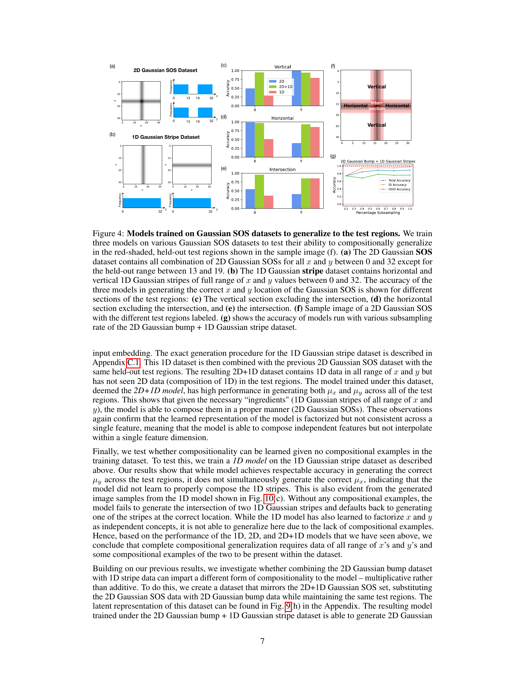
🔼 This figure shows the results of three experiments designed to test the model’s ability to generalize beyond its training data. Three models were trained on different datasets of 2D Gaussian SOSs (sums of Gaussians) and 1D Gaussian stripes. The datasets varied in their completeness (some excluded data in specific regions), and the models were tested on their ability to generate SOSs in those missing regions (compositional generalization) and to generate SOSs in between the existing datapoints (interpolation). The results, shown as accuracy in generating x and y coordinates, illustrate the different capabilities of models trained on different datasets.
read the caption
Figure 4: Models trained on Gaussian SOS datasets to generalize to the test regions. We train three models on various Gaussian SOS datasets to test their ability to compositionally generalize in the red-shaded, held-out test regions shown in the sample image (f). (a) The 2D Gaussian SOS dataset contains all combination of 2D Gaussian SOSs for all x and y between 0 and 32 except for the held-out range between 13 and 19. (b) The 1D Gaussian stripe dataset contains horizontal and vertical 1D Gaussian stripes of full range of x and y values between 0 and 32. The accuracy of the three models in generating the correct x and y location of the Gaussian SOS is shown for different sections of the test regions: (c) The vertical section excluding the intersection, (d) the horizontal section excluding the intersection, and (e) the intersection. (f) Sample image of a 2D Gaussian SOS with the different test regions labeled. (g) shows the accuracy of models run with various subsampling rate of the 2D Gaussian bump + 1D Gaussian stripe dataset.

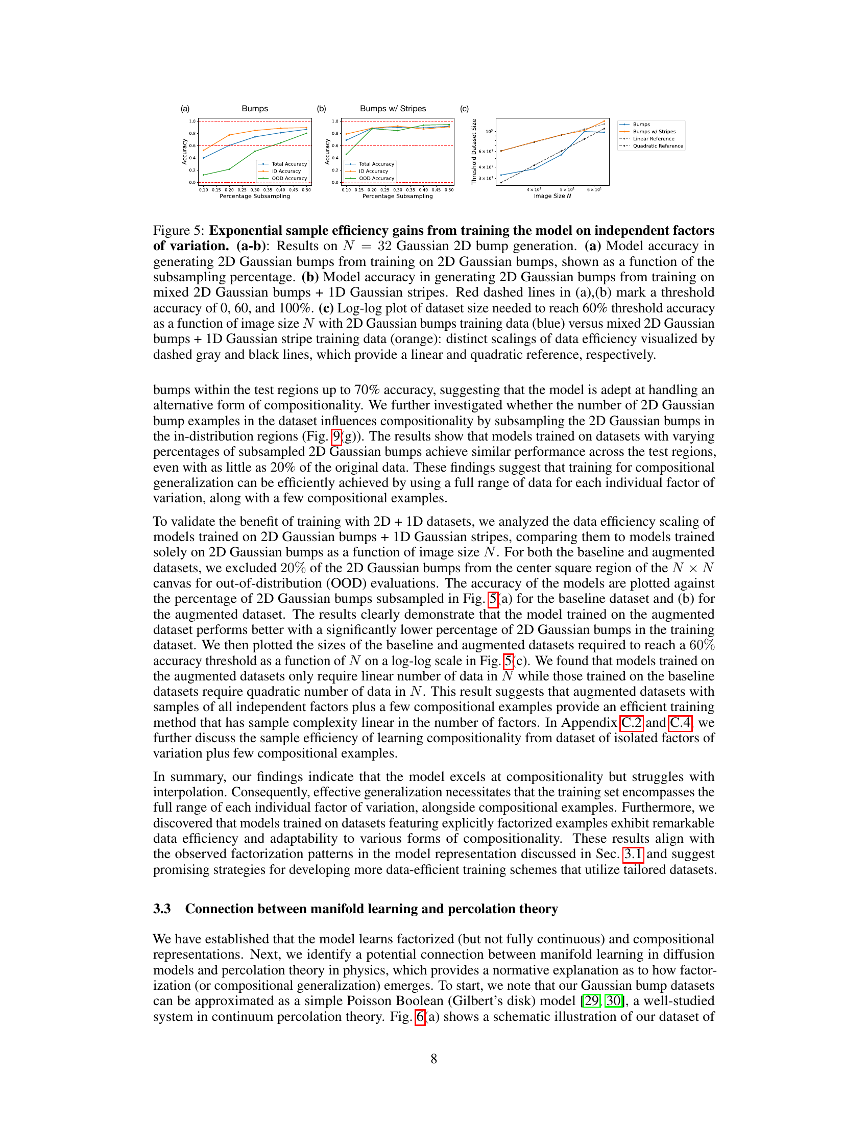
🔼 This figure demonstrates the significant improvement in sample efficiency when training diffusion models on datasets with independent factors of variation. Subplots (a) and (b) show the model’s accuracy in generating 2D Gaussian bumps with different training datasets (2D Gaussian bumps only vs. mixed 2D Gaussian bumps and 1D Gaussian stripes) at varying subsampling percentages. (c) uses a log-log plot to illustrate the difference in dataset sizes required to achieve a 60% accuracy threshold as the image size increases. The results highlight a drastic reduction in data needed when using the augmented dataset (mixed 2D and 1D features).
read the caption
Figure 5: Exponential sample efficiency gains from training the model on independent factors of variation. (a-b): Results on N = 32 Gaussian 2D bump generation. (a) Model accuracy in generating 2D Gaussian bumps from training on 2D Gaussian bumps, shown as a function of the subsampling percentage. (b) Model accuracy in generating 2D Gaussian bumps from training on mixed 2D Gaussian bumps + 1D Gaussian stripes. Red dashed lines in (a),(b) mark a threshold accuracy of 0, 60, and 100%. (c) Log-log plot of dataset size needed to reach 60% threshold accuracy as a function of image size N with 2D Gaussian bumps training data (blue) versus mixed 2D Gaussian bumps + 1D Gaussian stripe training data (orange): distinct scalings of data efficiency visualized by dashed gray and black lines, which provide a linear and quadratic reference, respectively.
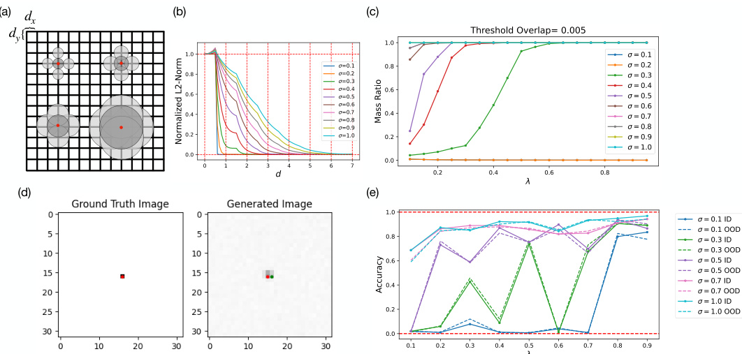
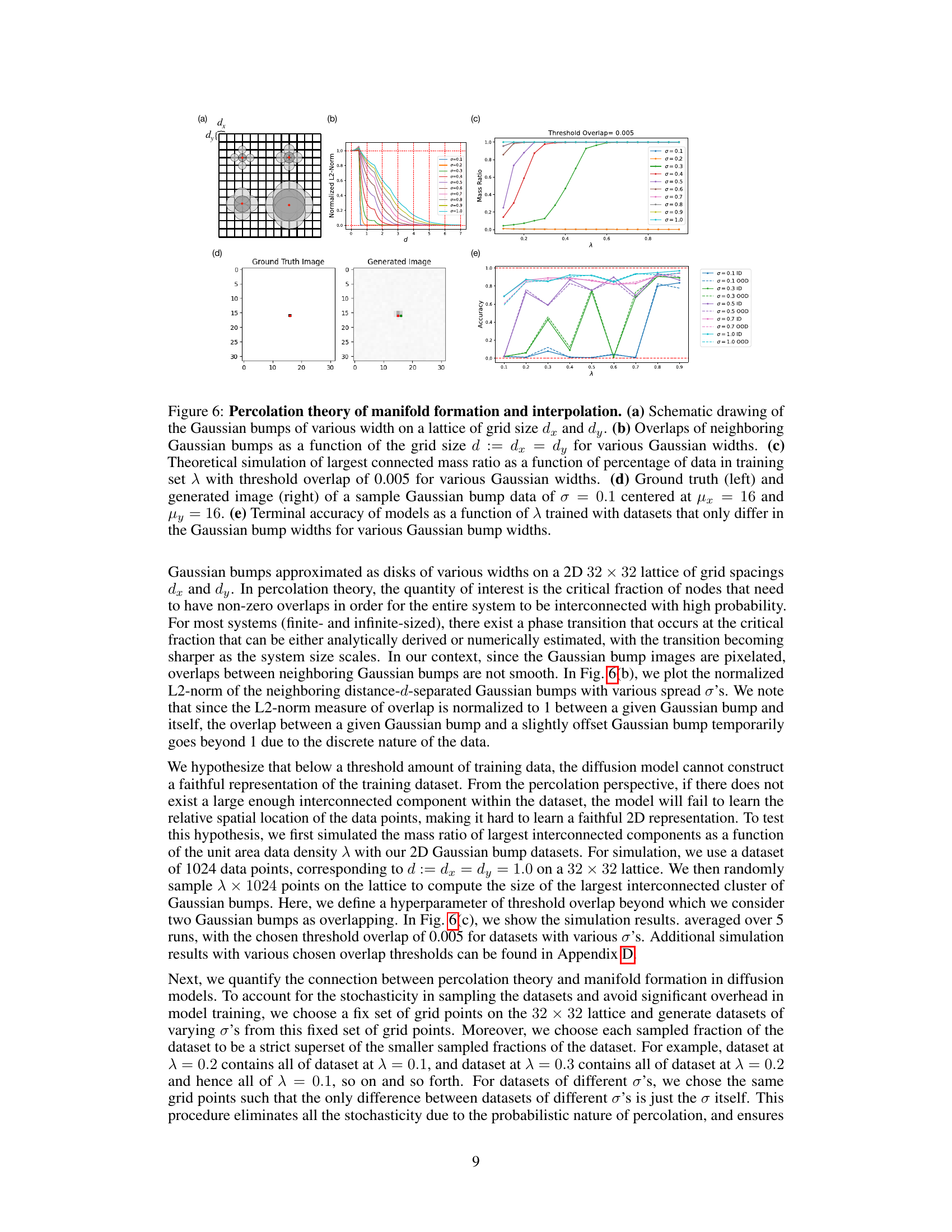
🔼 This figure demonstrates the connection between manifold learning in diffusion models and percolation theory. Panel (a) shows a schematic of Gaussian bumps on a grid. Panel (b) plots the overlap between neighboring bumps as a function of grid spacing and bump width (σ). Panel (c) shows a theoretical simulation of the largest connected component size (mass ratio) as a function of the dataset size (λ) and bump width. Panel (d) compares ground truth and generated images for a single Gaussian bump. Panel (e) presents model accuracy as a function of dataset size and bump width, illustrating the relationship between data density, model performance, and percolation theory.
read the caption
Figure 6: Percolation theory of manifold formation and interpolation. (a) Schematic drawing of the Gaussian bumps of various width on a lattice of grid size dx and dy. (b) Overlaps of neighboring Gaussian bumps as a function of the grid size d := dx = dy for various Gaussian widths. (c) Theoretical simulation of largest connected mass ratio as a function of percentage of data in training set λ with threshold overlap of 0.005 for various Gaussian widths. (d) Ground truth (left) and generated image (right) of a sample Gaussian bump data of σ = 0.1 centered at μx = 16 and μy = 16. (e) Terminal accuracy of models as a function of λ trained with datasets that only differ in the Gaussian bump widths for various Gaussian bump widths.
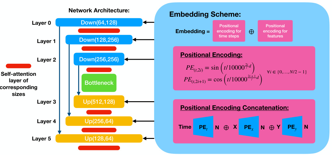
🔼 This figure shows the architecture of the conditional diffusion model used in the paper. It’s a UNet architecture with three downsampling and upsampling blocks, self-attention layers, and skip connections. The conditional information (timestep and x/y positions) is added to each block via positional encoding.
read the caption
Figure 7: The UNet architecture of the conditional diffusion model. The schematic diagram of the standard UNet architecture consisting of three downsampling/upsampling blocks with interlaced self-attention layers and skip connections is shown on the left. The conditional information consisting of a concatenation of positional encodings of timestep and x/y-positions is passed in at each block as shown on the right.
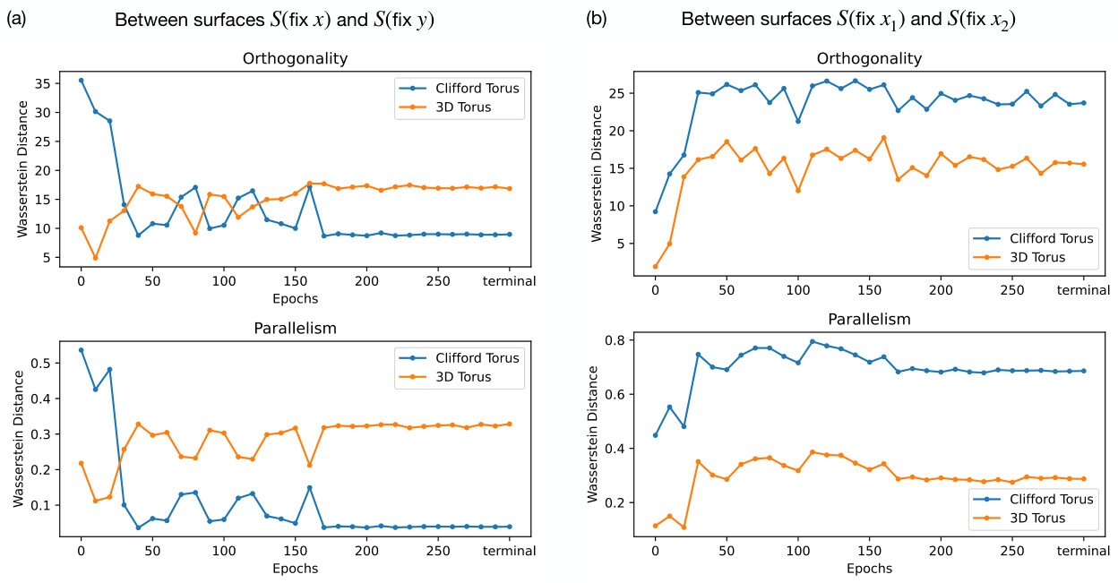
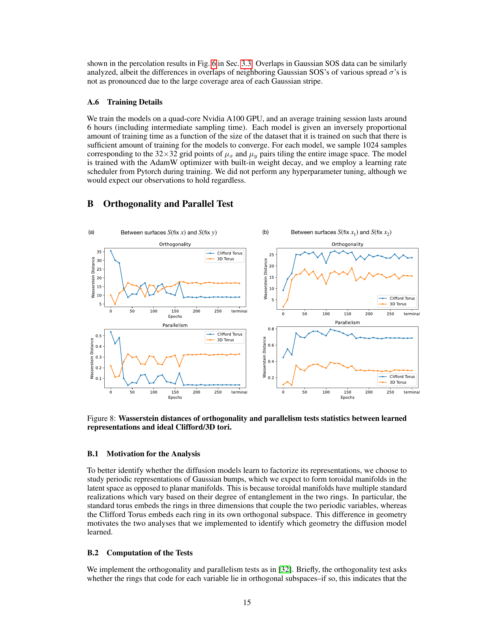
🔼 This figure compares the orthogonality and parallelism test statistics between an ideal 3D torus, the model’s learned representation, and an ideal Clifford torus. The tests assess whether the model’s representation of the two independent features x and y in the dataset resembles the factorized representation of the Clifford torus or the coupled representation of the 3D torus. Three sets of tests are performed: x-on-y, x-on-x, and y-on-y, each with orthogonality and parallelism tests. The results are presented in histograms, comparing the distributions of the test statistics for the model to the ideal tori. This visualization helps to determine whether the model learns a factorized or coupled representation.
read the caption
Figure 3: Comparison of orthogonality and parallelism test statistics between 3D torus, model's learned representation, and Clifford torus. x-on-y (top row), x-on-x (middle row), y-on-y (bottom row) orthogonality (left column) and parallelism (right column) test statistics are compared between (a) an ideal 3D torus (blue), (b) the learned representation by the model (green), and (c) an ideal Clifford torus (orange).
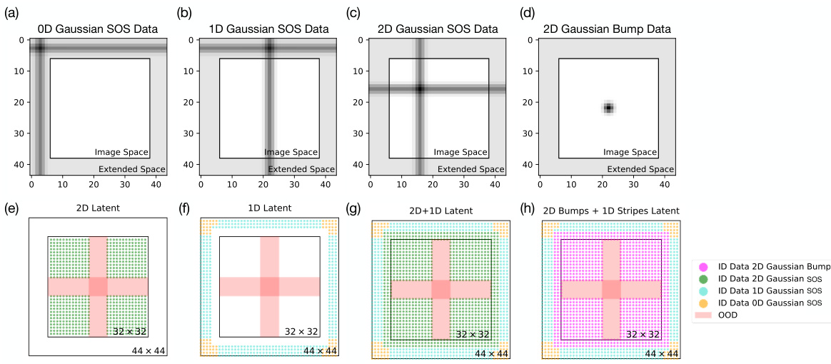
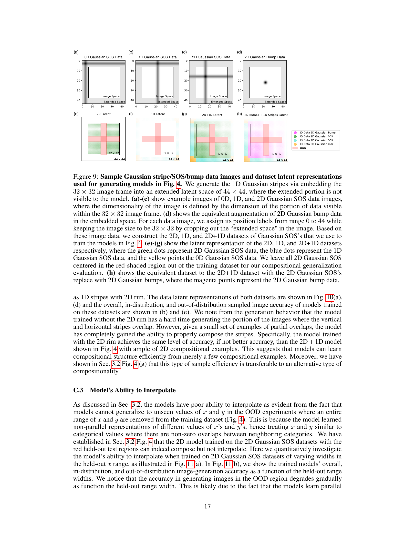
🔼 Figure 9 shows sample images and latent representations of the datasets used to train the models in Figure 4. It illustrates how 1D Gaussian stripe data is embedded in a larger 44x44 latent space, while keeping the visible image size at 32x32. The figure shows examples of 0D, 1D, and 2D Gaussian SOS data, along with their corresponding latent representations (2D, 1D, and 2D+1D datasets). The figure also highlights the held-out OOD (out-of-distribution) test region, and the inclusion of 2D Gaussian bump data in a separate example.
read the caption
Figure 9: Sample Gaussian stripe/SOS/bump data images and dataset latent representations used for generating models in Fig. 4. We generate the 1D Gaussian stripes via embedding the 32 × 32 image frame into an extended latent space of 44 × 44, where the extended portion is not visible to the model. (a)-(c) show example images of 0D, 1D, and 2D Gaussian SOS data images, where the dimensionality of the image is defined by the dimension of the portion of data visible within the 32 × 32 image frame. (d) shows the equivalent augmentation of 2D Gaussian bump data in the embedded space. For each data image, we assign its position labels from range 0 to 44 while keeping the image size to be 32 × 32 by cropping out the “extended space
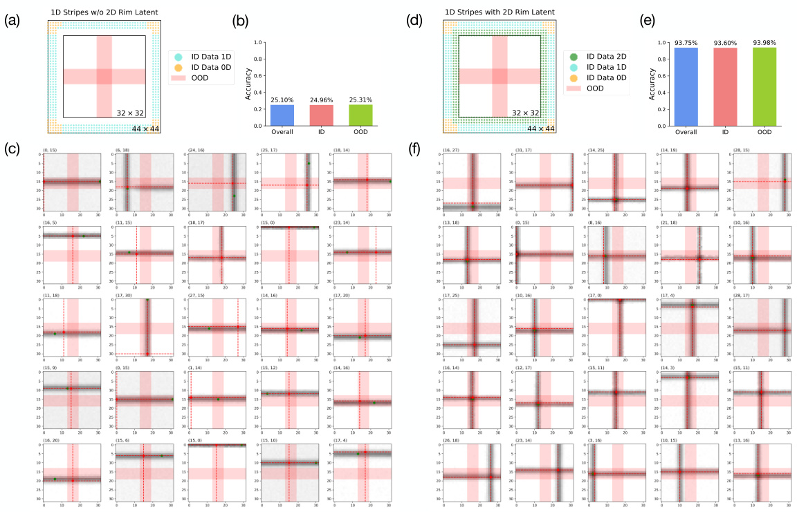
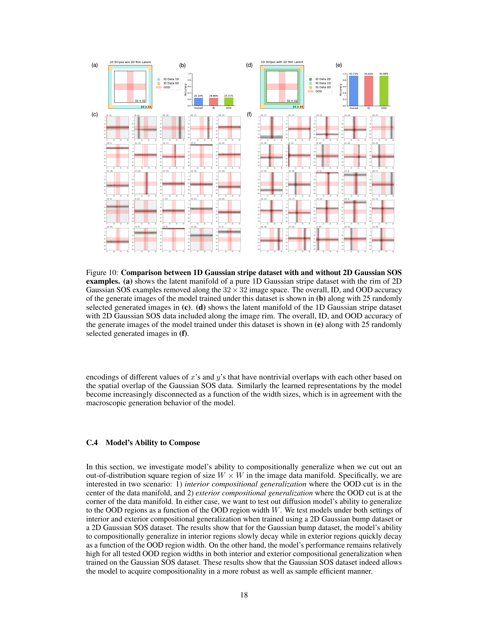
🔼 This figure compares the performance of two models trained on 1D Gaussian stripe datasets with and without 2D Gaussian SOS examples along the image rim. The first model (a, b, c) is trained on a pure 1D dataset, while the second (d, e, f) includes a small amount of compositional examples. The figure shows the latent manifolds and accuracy results (overall, in-distribution, and out-of-distribution), as well as example generated images from each model. The results highlight the importance of compositional examples for improved generalization.
read the caption
Figure 10: Comparison between 1D Gaussian stripe dataset with and without 2D Gaussian SOS examples. (a) shows the latent manifold of a pure 1D Gaussian stripe dataset with the rim of 2D Gaussian SOS examples removed along the 32 × 32 image space. The overall, ID, and OOD accuracy of the generate images of the model trained under this dataset is shown in (b) along with 25 randomly selected generated images in (c). (d) shows the latent manifold of the 1D Gaussian stripe dataset with 2D Gaussian SOS data included along the image rim. The overall, ID, and OOD accuracy of the generate images of the model trained under this dataset is shown in (e) along with 25 randomly selected generated images in (f).
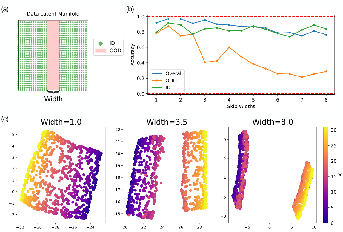
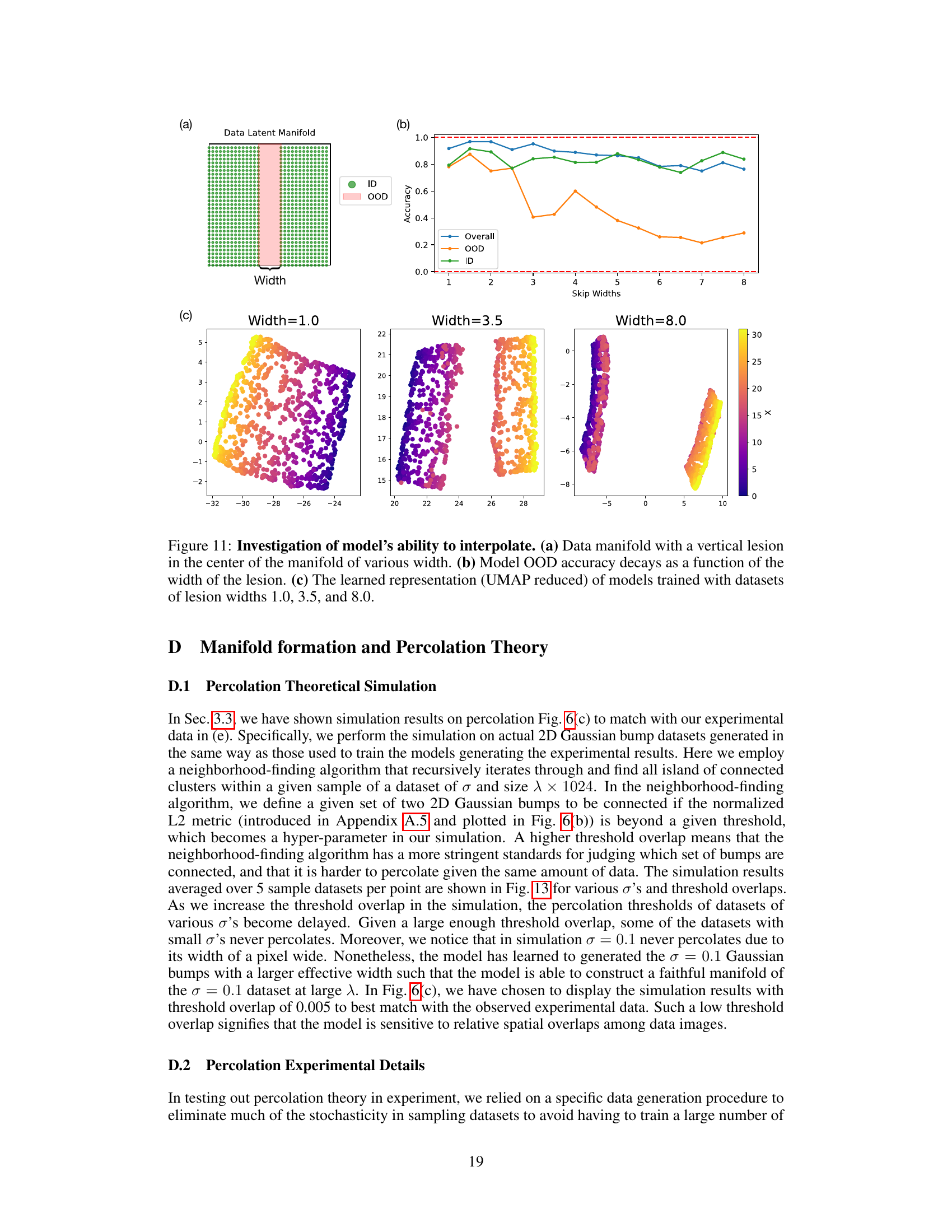
🔼 This figure shows the results of an experiment designed to test the model’s ability to interpolate. Panel (a) illustrates a data manifold with a vertical section removed (’lesion’) of varying widths. Panel (b) presents a graph showing that the model’s out-of-distribution (OOD) accuracy decreases as the width of the removed section increases. Finally, panel (c) displays UMAP-reduced visualizations of the learned representations, demonstrating how the structure of the learned representation changes with different lesion widths.
read the caption
Figure 11: Investigation of model’s ability to interpolate. (a) Data manifold with a vertical lesion in the center of the manifold of various width. (b) Model OOD accuracy decays as a function of the width of the lesion. (c) The learned representation (UMAP reduced) of models trained with datasets of lesion widths 1.0, 3.5, and 8.0.
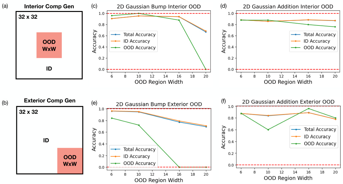
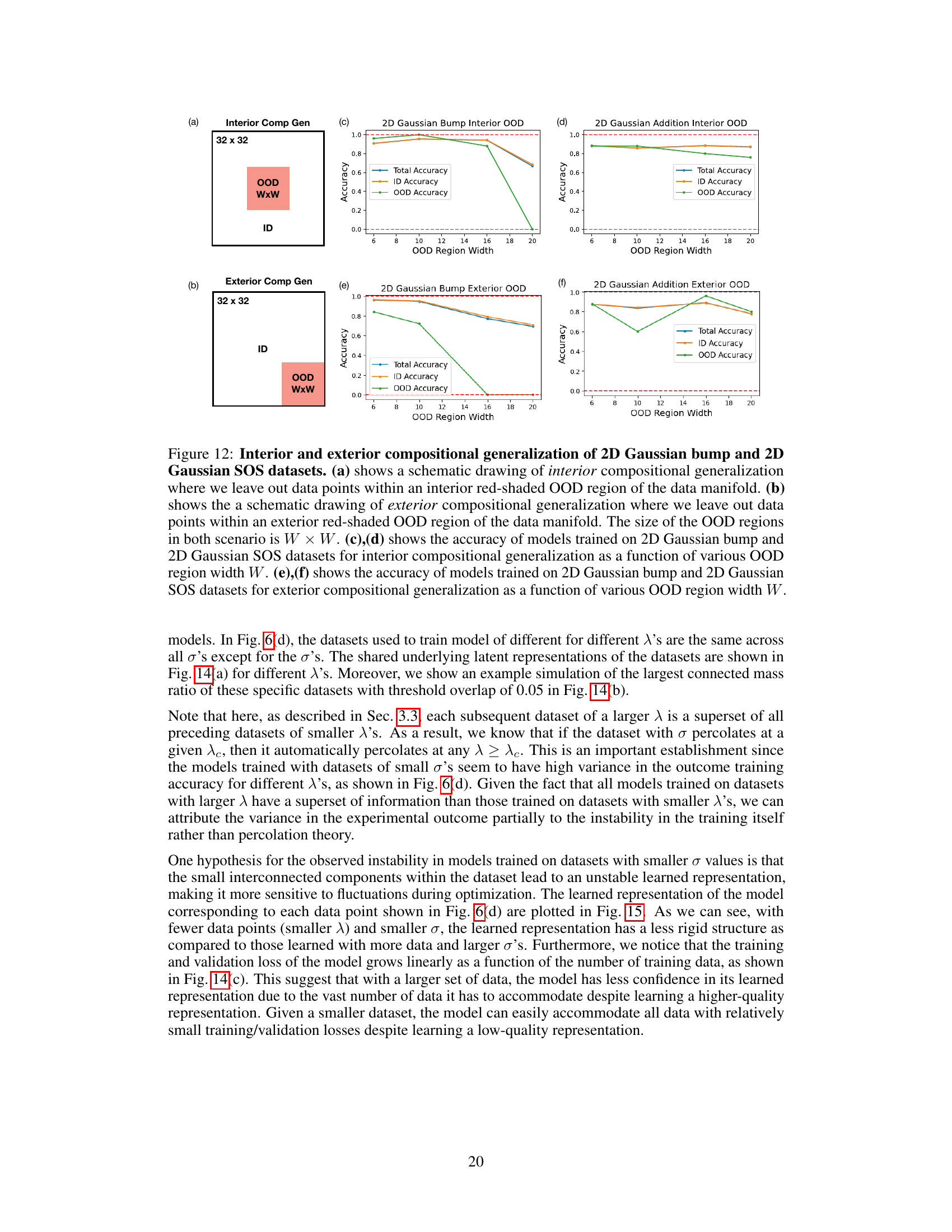
🔼 This figure demonstrates the compositional generalization performance of diffusion models trained on 2D Gaussian bump and SOS datasets. It shows how well the models generalize to out-of-distribution (OOD) regions when those regions are located in the center (interior) or at the edges (exterior) of the data manifold. The results are plotted as a function of the width of the OOD regions, comparing performance for models trained on both datasets.
read the caption
Figure 12: Interior and exterior compositional generalization of 2D Gaussian bump and 2D Gaussian SOS datasets. (a) shows a schematic drawing of interior compositional generalization where we leave out data points within an interior red-shaded OOD region of the data manifold. (b) shows the a schematic drawing of exterior compositional generalization where we leave out data points within an exterior red-shaded OOD region of the data manifold. The size of the OOD regions in both scenario is W × W. (c), (d) shows the accuracy of models trained on 2D Gaussian bump and 2D Gaussian SOS datasets for interior compositional generalization as a function of various OOD region width W. (e), (f) shows the accuracy of models trained on 2D Gaussian bump and 2D Gaussian SOS datasets for exterior compositional generalization as a function of various OOD region width W.
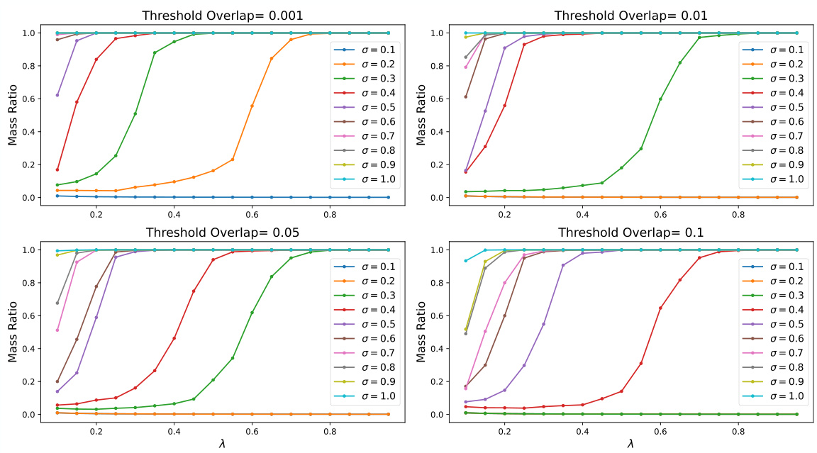
🔼 This figure shows the results of percolation simulations for different Gaussian widths (σ) and overlap thresholds. Each subplot represents a different threshold, and each line within a subplot shows the largest connected mass ratio as a function of the data density (λ) for a specific Gaussian width. The figure visually demonstrates how the critical fraction of nodes needed for the system to be interconnected (percolation) varies depending on the Gaussian width and the overlap threshold.
read the caption
Figure 13: Percolation simulation of various σ′s with different overlap thresholds.
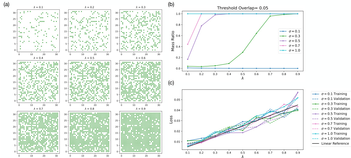
🔼 This figure provides supporting information for the percolation theory analysis presented in the paper. Panel (a) shows the latent representations of datasets used in the experiments of Figure 6 from the main text. Panel (b) displays the results of a percolation simulation, showing the mass ratio of the largest connected component as a function of the dataset size (λ) for different Gaussian bump widths (σ). Finally, panel (c) presents the training and validation losses for the models trained on these datasets, demonstrating how loss changes with dataset size and Gaussian bump width.
read the caption
Figure 14: Supporting figures for percolation simulation and experiments from Fig. 6. (a) Latent representation of datasets used to generate results in Fig. 6. (b) Simulation of largest connecting cluster mass ratio with threshold overlap of 0.05 for σ's corresponding to those shown in Fig. 6(e). (c) The final training and validation losses as a function of λ of models in Fig. 6(e).
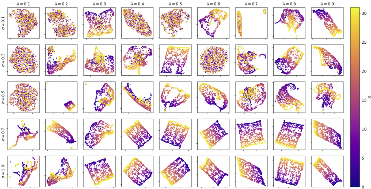
🔼 This figure shows the UMAP reduced 2D representations of the learned representations of the models trained for different Gaussian widths (σ) and data sampling rates (λ). Each subplot represents the learned representation for a specific combination of σ and λ from Fig. 6(e). Color indicates the value of λ. The figure demonstrates how the structure of the learned representation changes depending on σ and λ. For larger σ and λ values, the representation tends to become more continuous and less fragmented. This visual representation provides further insight into the relationship between the model’s internal representation, its generalization capabilities, and the parameters of the data.
read the caption
Figure 15: Final learned representations corresponding to models that generated results in Fig. 6.
Full paper#
