↗ OpenReview ↗ NeurIPS Homepage ↗ Chat
TL;DR#
Many methods exist for interpreting machine learning models’ predictions. However, these methods often assume that the inputs are independent or make other assumptions that are not always valid. This can lead to inaccurate or misleading explanations. For instance, existing visualization methods like Partial Dependence Plots (PDPs) might show a weak relationship between an input and the outcome, even if the actual relationship is strong, if they fail to account for confounding factors.
This paper introduces Causal Dependence Plots (CDPs), a new approach to visualizing relationships between model inputs and outputs. Unlike previous methods, CDPs explicitly account for causal relationships between variables. By doing so, they provide a more accurate and nuanced view of how changes in one variable affect model predictions, even when other variables are affected as well. The authors show how this method generalizes previous methods and can offer more insightful interpretations. The combination of visualizations with causal models makes it particularly useful for understanding complex relationships within systems.
Key Takeaways#
Why does it matter?#
This paper is crucial for researchers in AI and related fields because it introduces Causal Dependence Plots (CDPs), a novel visualization tool that addresses limitations in existing model interpretation methods. CDPs provide a more accurate and insightful understanding of how models depend on inputs, resolving issues with independence assumptions. This is especially significant for scientific machine learning, algorithmic fairness, and other scenarios where causal relationships are important. Furthermore, the paper contributes formally to existing methods like Partial Dependence Plots (PDPs). This advances the field of Explainable AI (XAI) and opens avenues for future research in causal inference and model explainability.
Visual Insights#
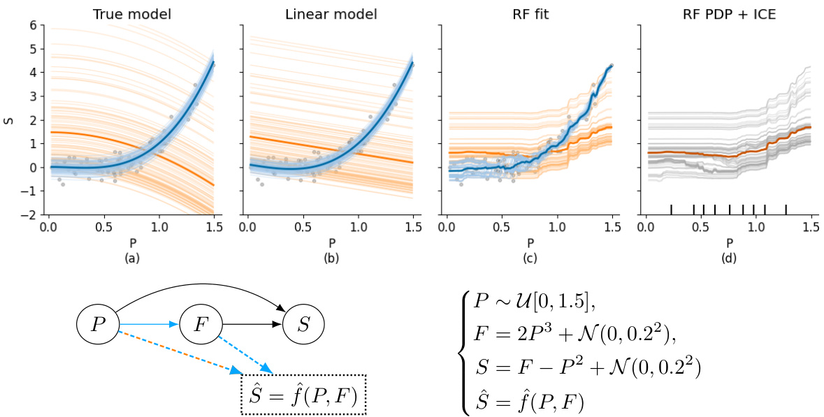
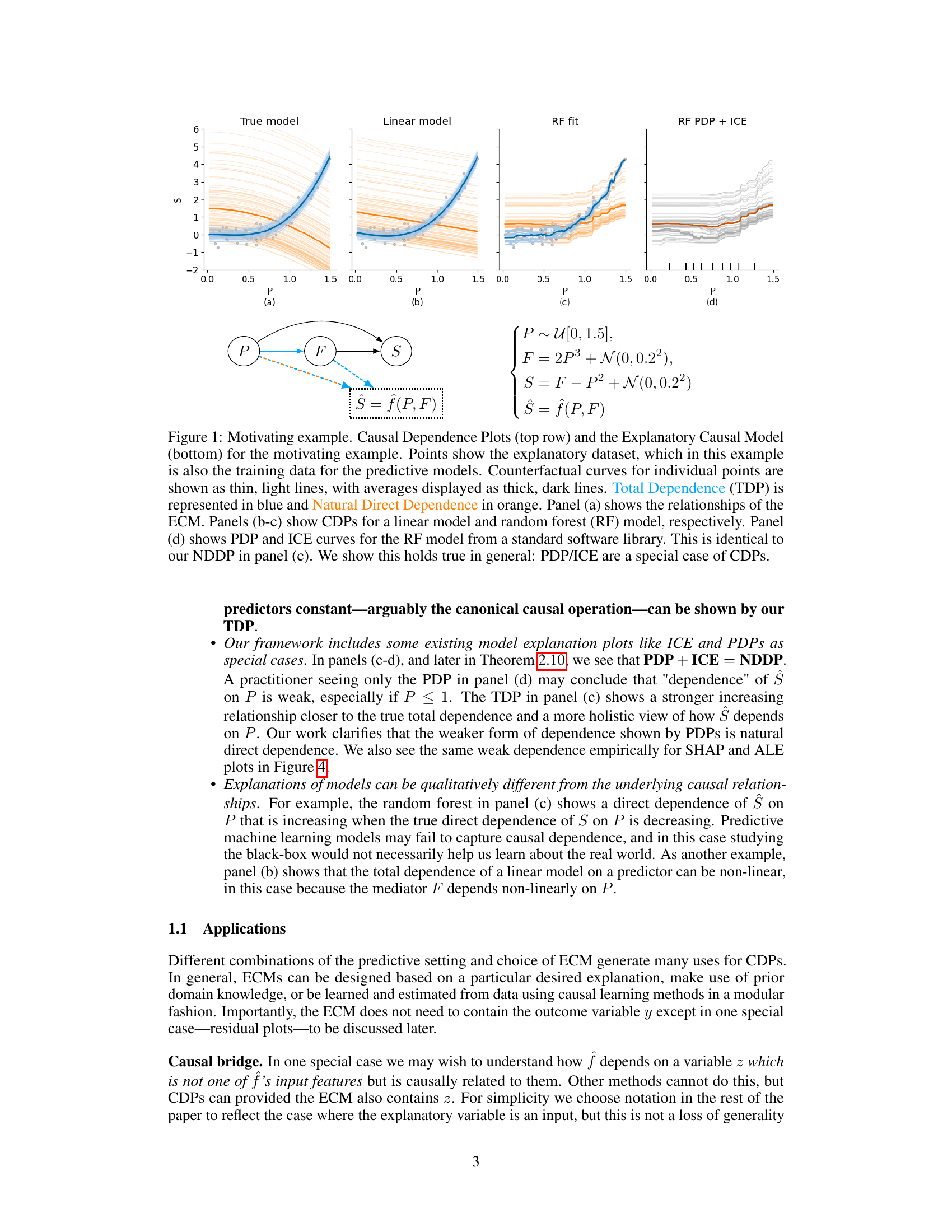
This figure demonstrates a motivating example of Causal Dependence Plots (CDPs) by comparing them with Partial Dependence Plots (PDPs) and Individual Conditional Expectation (ICE) plots. It shows how a model’s predictions depend on changes in a given predictor, considering causal changes in other variables, unlike PDPs/ICE that assume independence or hold other variables constant. The top row visualizes CDPs for different predictive models (linear model, Random Forest) showing Total Dependence (TDP) in blue and Natural Direct Dependence (NDDP) in orange. The bottom panel displays the Explanatory Causal Model (ECM) used to generate the data.
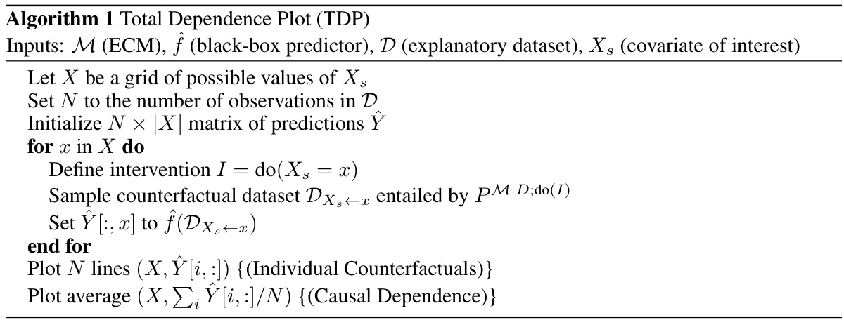
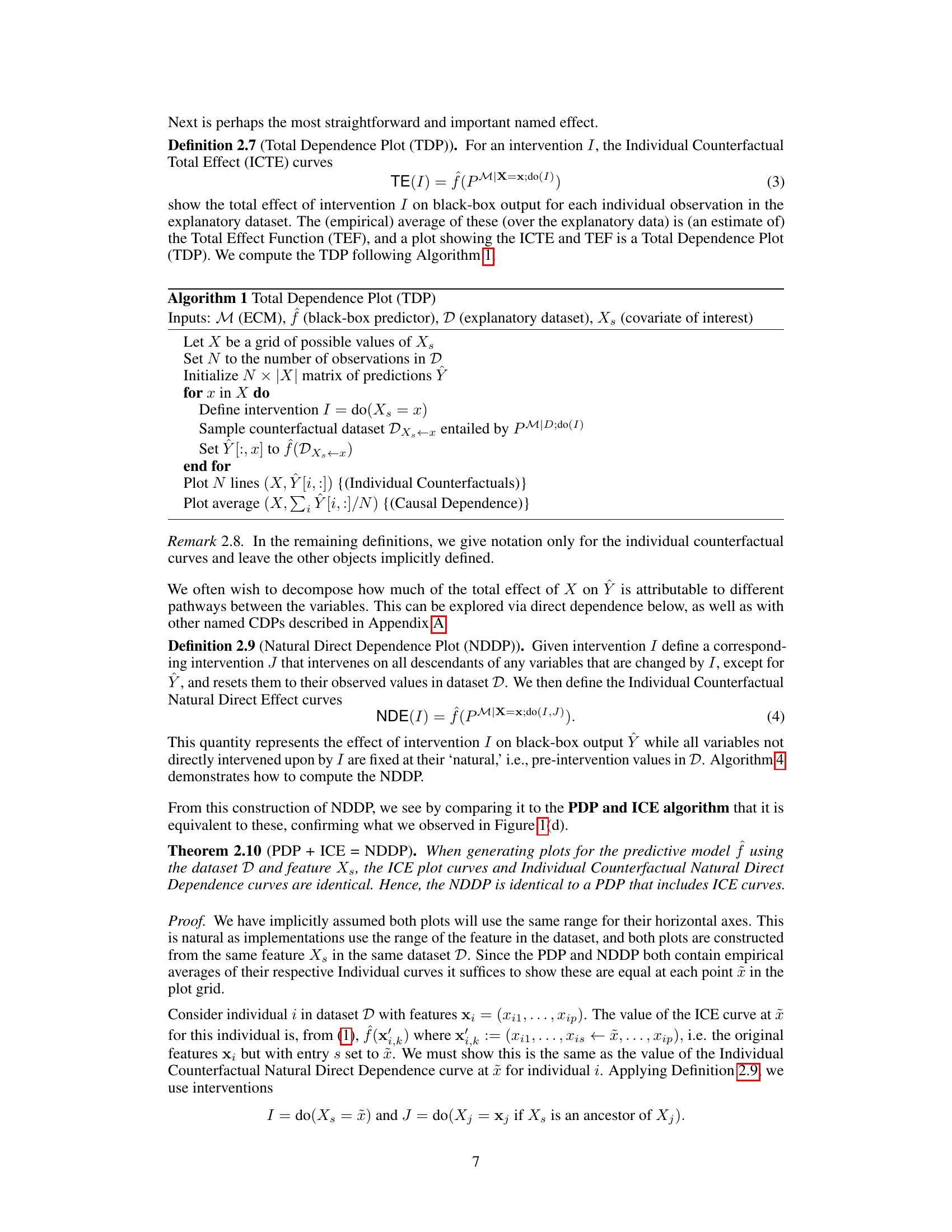
This algorithm details the steps for constructing a Total Dependence Plot (TDP). It begins by defining an intervention on the covariate of interest and uses an explanatory causal model (ECM) to simulate counterfactual data. The algorithm then applies the predictive model to this counterfactual data to generate predictions. Finally, individual counterfactual curves are plotted, along with their average, to visualize the causal dependence.
In-depth insights#
Causal Explanations#
The concept of “Causal Explanations” in the context of machine learning models is crucial for responsible AI development. It moves beyond simply observing correlations to understanding the underlying causal mechanisms driving model predictions. This is especially important for model transparency and building trust, as it enables users to understand not only what the model predicts, but why it predicts that. The authors highlight the limitations of traditional model-agnostic explanation methods. These methods, such as Partial Dependence Plots (PDPs), often assume independence between predictor variables, which is frequently violated in real-world scenarios. The development of Causal Dependence Plots (CDPs) addresses this shortcoming, allowing for a richer and more nuanced explanation that incorporates causal relationships between predictors. CDPs use an Explanatory Causal Model (ECM) to simulate how changes in one predictor variable impact other variables, providing a more comprehensive understanding of how model predictions change. The modular nature of CDPs facilitates their integration with various methods for causal learning and sensitivity analysis. This adaptability extends their applicability to diverse machine learning applications, including scientific machine learning and algorithmic fairness. The careful consideration of causality enhances the explanatory power and utility of CDPs, ultimately promoting more responsible and interpretable AI.
CDP Methodology#
The CDP methodology section of a research paper would detail the statistical and computational procedures used to create Causal Dependence Plots (CDPs). This would likely involve a description of how a causal model (ECM) is specified or learned, the algorithms for generating counterfactual predictions using the ECM, and the methods for visualizing the results. Key aspects to consider include how the choice of causal model impacts the interpretation of CDPs and how uncertainty in the causal model is addressed. The methodology should also clarify how various forms of CDPs (Total Dependence Plots, Natural Direct Dependence Plots, etc.) are constructed and how these plots relate to existing methods such as Partial Dependence Plots. Finally, a well-written methodology section would emphasize the generalizability and robustness of the CDP approach, demonstrating its application to various model types and data characteristics.
Model Dependence#
The concept of ‘Model Dependence,’ while not explicitly a heading in the provided research paper, is central to the paper’s core argument. It explores how a model’s predictions are causally influenced by its input features. This moves beyond simple correlations, acknowledging that changes in one input can trigger downstream effects on others, impacting the final prediction. The authors challenge traditional model explanation methods that often assume input independence, highlighting how this assumption can lead to misleading interpretations. Instead, they propose Causal Dependence Plots (CDPs) as a novel approach, emphasizing the importance of integrating causal knowledge to ensure accurate and insightful model explanations. CDPs visualize how model outputs change under interventions that account for existing causal relationships between inputs, leading to more reliable and effective interpretability. The implications are profound, impacting model fairness, scientific machine learning, and algorithmic design where causal understanding is paramount.
Explanatory Power#
The concept of ’explanatory power’ in the context of a research paper, likely focusing on machine learning models, centers on the ability of an explanation to enhance human understanding of a model’s predictions. A strong explanation not only clarifies how a model arrives at its outputs but also provides insights into the underlying causal mechanisms. This goes beyond simply showing feature importance; it addresses questions of why specific features matter and how changes in one feature causally affect others, leading to the observed predictions. Causal dependence plots (CDPs), for example, directly tackle this by visualizing the causal impacts of input variations. However, achieving true explanatory power necessitates a robust evaluation framework. This requires acknowledging the limitations inherent in all explanation methods, including the dependence on underlying causal assumptions (which may be incomplete or incorrect) and the potential for misinterpretations due to model inaccuracies. The goal isn’t just to explain the black box but to connect the model’s behavior to a deeper, often causal, understanding of the phenomenon being modeled. It’s essential to evaluate whether the explanation fosters better decision-making and enhances the user’s ability to trust and critically engage with the model.
Limitations of CDPs#
Causal Dependence Plots (CDPs), while offering a powerful approach to visualizing model dependence, are not without limitations. A major limitation stems from the reliance on an Explanatory Causal Model (ECM). The accuracy and validity of CDP interpretations hinge critically on the ECM’s accuracy, which may be challenging to achieve in practice. Misspecification of the ECM can lead to misleading or even entirely incorrect conclusions about the model’s causal dependencies. Another limitation concerns the computational cost, especially when dealing with large datasets or complex interventions within the ECM. The simulation of counterfactual scenarios required for CDP construction can be computationally intensive, potentially limiting scalability. Furthermore, CDPs, like many model-agnostic methods, are sensitive to the quality and representativeness of the training data used to estimate the predictive model. If the data are insufficient or biased, the CDPs may fail to provide meaningful insights. Finally, while CDPs offer insights into causal relationships, they cannot completely replace the need for domain expertise. The appropriate selection of an ECM and interpretation of the results still require careful judgment and understanding of the underlying causal processes.
More visual insights#
More on figures

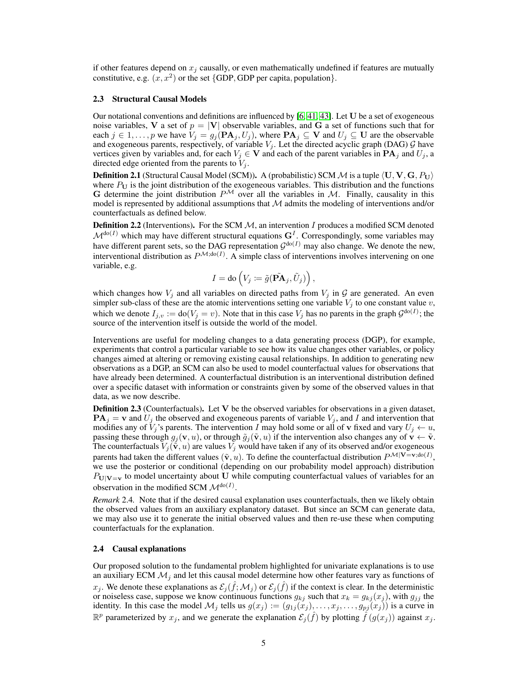
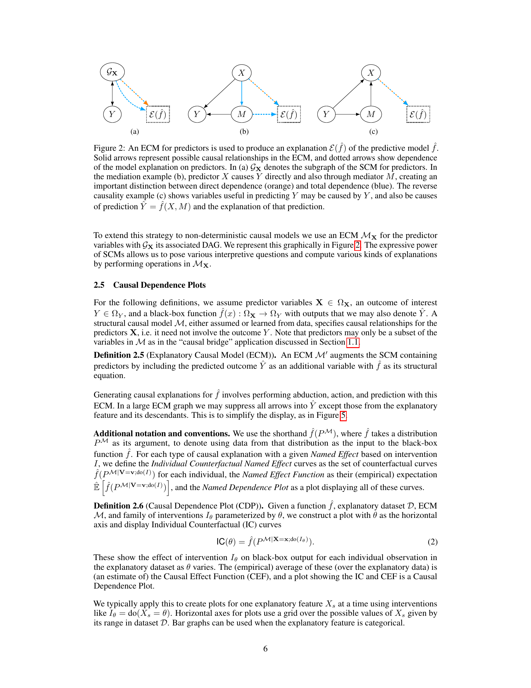
This figure demonstrates how an Explanatory Causal Model (ECM) can be used to generate explanations for a predictive model. It shows three scenarios: (a) direct prediction without mediation, (b) mediation where X influences Y both directly and indirectly through M, and (c) reverse causality where Y also affects the predictors. The solid arrows in the diagrams represent causal relationships within the ECM, while the dashed arrows indicate the dependence of the model explanation on the predictors. Each scenario highlights how the structure of the ECM affects the interpretation of the model’s predictions.

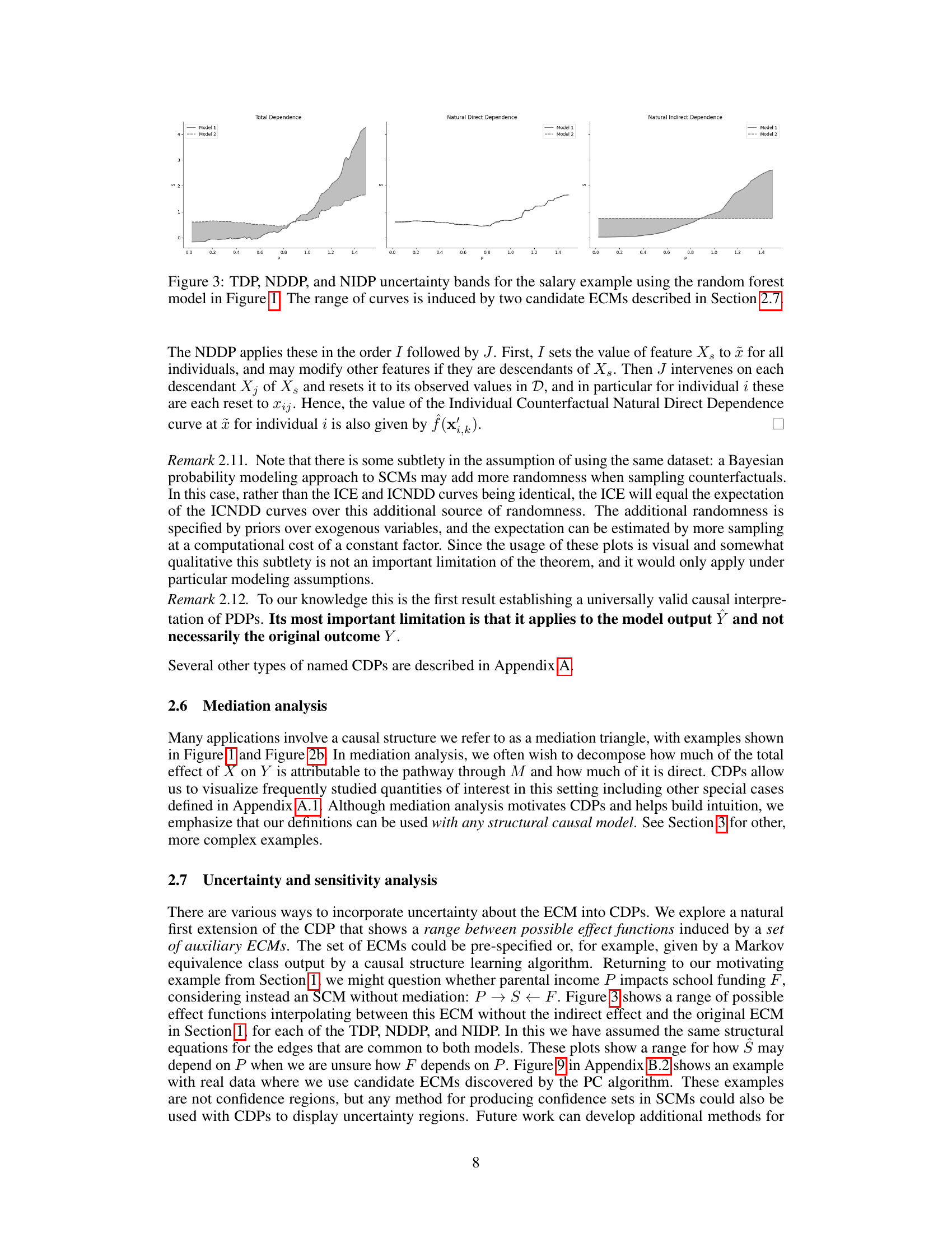
This figure compares the Total Dependence Plot (TDP), Natural Direct Dependence Plot (NDDP), and Natural Indirect Dependence Plot (NIDP) for the salary example introduced in Figure 1. The key takeaway is that the range of curves (uncertainty bands) for each plot is generated by using two different candidate Explanatory Causal Models (ECMs), highlighting the sensitivity of the plots to the choice of causal model. This illustrates how uncertainty in the causal structure can affect the interpretation of causal relationships between input features and the model predictions.

This figure compares the Causal Dependence Plot (CDP) with other model-agnostic explanation methods such as Partial Dependence Plots (PDP), Accumulated Local Effects (ALE), and SHAP plots. The comparison uses the salary prediction example from Figure 1, illustrating the differences in how these methods visualize the relationship between a predictor (parental income) and the predicted outcome (salary). The key takeaway is that the CDP provides a unique and distinct perspective compared to the others, suggesting its value in model interpretation.
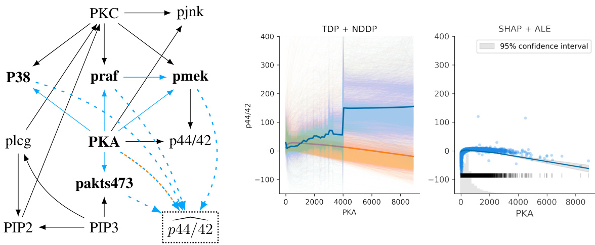
This figure shows an ECM (Explanatory Causal Model) for the Sachs et al. dataset of protein expression levels, CDPs (Causal Dependence Plots) for a multi-layer perceptron (MLP) predictive model, and ALE (Accumulated Local Effects) and SHAP (SHapley Additive exPlanations) plots. It compares different ways of visualizing the effect of PKA (protein kinase A) on the prediction of p44/42. The CDPs, particularly the TDP (Total Dependence Plot), highlight the importance of causal modeling in interpreting the relationships between variables, as the TDP shows an increase in p44/42 with increased PKA, contrasting with the decrease shown by NDDP (Natural Direct Dependence Plot), ALE, and SHAP. This difference emphasizes how different methods can lead to different conclusions depending on the specific question being asked. The figure also demonstrates how causal modeling can help to address uncertainty in model interpretation.

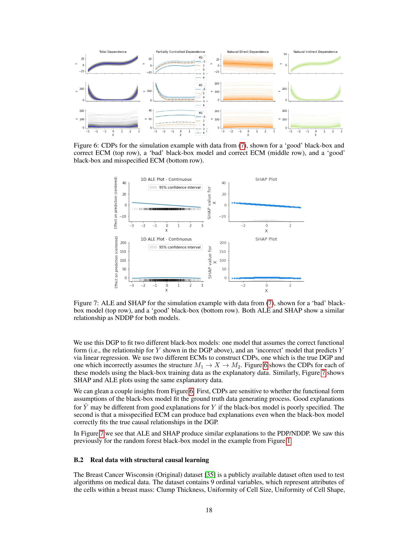
This figure shows the effect of using different black-box models and explanatory causal models (ECMs) on the resulting causal dependence plots (CDPs). The top row demonstrates the case where the black-box model is accurate and the ECM is correct, which should produce accurate and reliable CDPs. The middle row shows a case where the black-box model is inaccurate while using the correct ECM. This would reveal information about the flaws of the black-box model rather than providing useful inferences about the true data generation process. Finally, the bottom row presents a case where the black-box model is accurate but the ECM is misspecified. This shows the sensitivity of the CDPs to the specification of the causal model. In short, this figure highlights the importance of both an accurate black-box predictive model and a correctly specified ECM for reliable causal analysis and visualization.

This figure compares the Causal Dependence Plot (CDP) with three other model-agnostic explanation methods: Partial Dependence Plot (PDP), Accumulated Local Effects (ALE), and SHAP. The comparison uses data from a simulated salary prediction example (Figure 1). The figure highlights that the CDP provides a qualitatively different explanation compared to the others, suggesting a unique perspective stemming from its causal modeling approach. The other methods, while providing visualizations of predictor impact, appear quite similar.
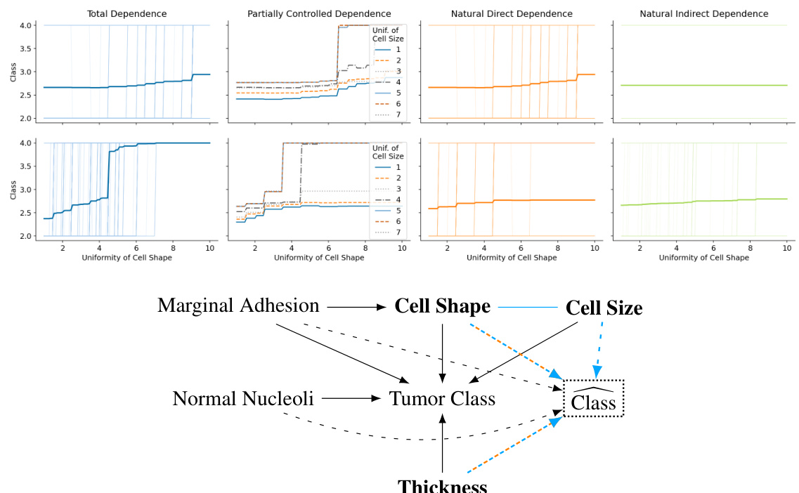
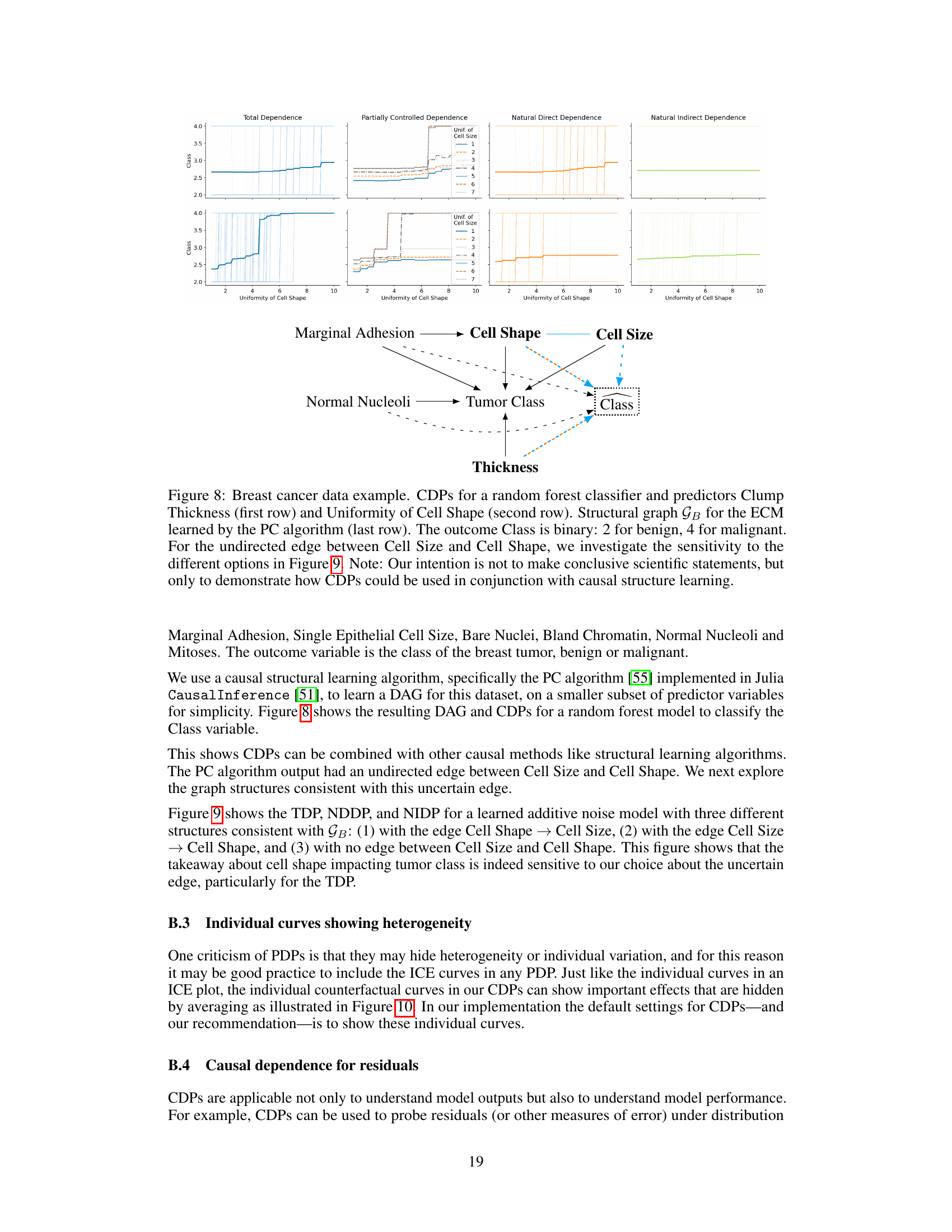
This figure shows Causal Dependence Plots (CDPs) for a random forest classifier trained on a breast cancer dataset. It visualizes the relationship between the predicted tumor class (benign or malignant) and two specific input features: Clump Thickness and Uniformity of Cell Shape. Different types of CDPs (Total Dependence, Partially Controlled Dependence, Natural Direct Dependence, and Natural Indirect Dependence) are shown for each feature. The bottom panel displays the explanatory causal model (ECM) used, learned from the data using the PC algorithm, showing the causal relationships between the predictor variables. This demonstrates how CDPs can be used alongside causal structure learning for model interpretation.

This figure compares three different causal dependence plots (Total Dependence, Natural Direct Dependence, and Natural Indirect Dependence) for a breast cancer prediction model. The plots show how the predicted outcome (tumor class) changes depending on the ‘Uniformity of Cell Shape’ feature. Three different models are used, each representing a different causal relationship between ‘Uniformity of Cell Shape’ and ‘Cell Size’, demonstrating how these causal relationships influence the interpretation of the dependence plots.

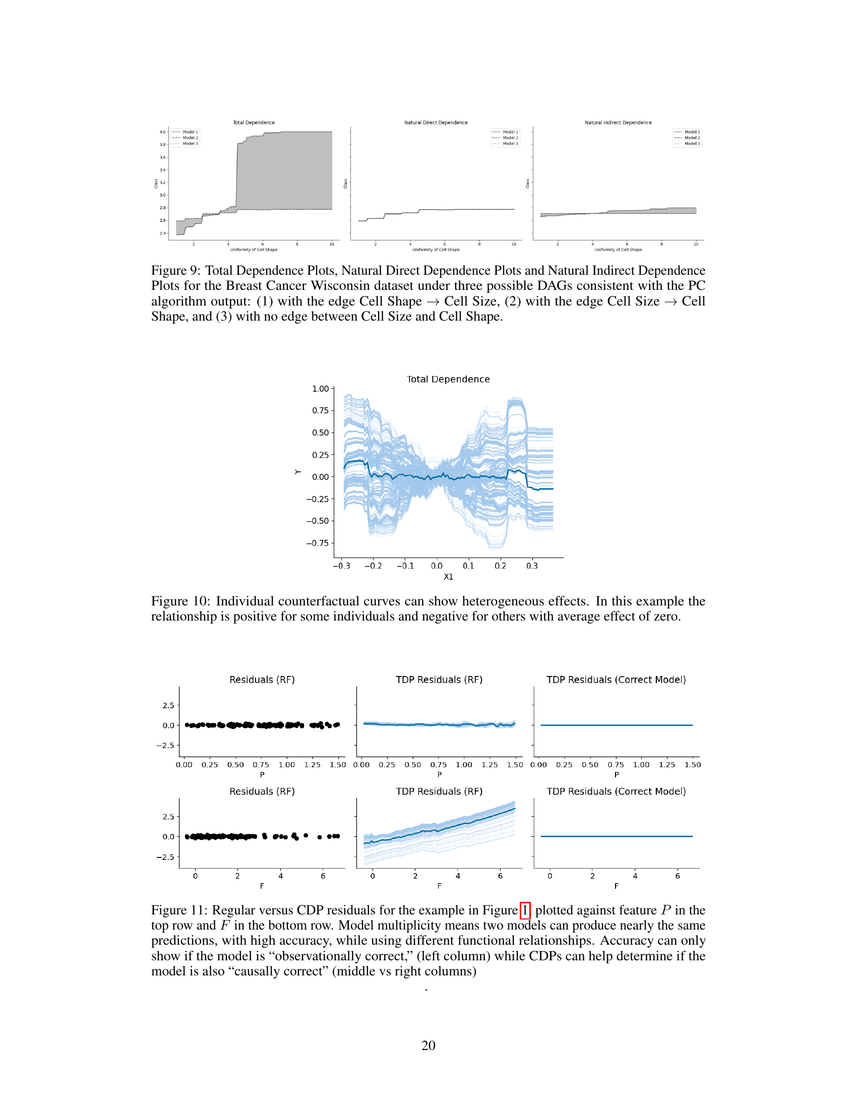
This figure displays individual counterfactual curves for a Total Dependence Plot (TDP). Each light blue line represents the causal effect of an intervention on a single data point, showing the model’s prediction after an intervention on predictor X1. The thick teal line shows the average of these individual effects (the Causal Effect Function, or CEF). The key takeaway is that the average effect masks substantial heterogeneity; the individual curves reveal both positive and negative causal relationships of varying strength, despite an overall average effect near zero. This highlights the importance of examining individual-level effects rather than relying solely on the average effect.

This figure compares different ways of visualizing model residuals. The top row shows residuals plotted against parental income (P), and the bottom row shows them plotted against school funding (F). Three visualizations are shown for each feature: 1. Residuals (RF): A standard residual plot from a random forest model. This shows the raw prediction errors without any causal consideration. 2. TDP Residuals (RF): A causal dependence plot (CDP) of the residuals using the Total Dependence (TDP) method. This shows the causal relationship between residuals and the feature while accounting for other factors in the model. 3. TDP Residuals (Correct Model): A CDP of the residuals using a model with the correct causal structure. This serves as a baseline for comparison to show what the residual plot should ideally look like if the model perfectly captured the causal relationships. The comparison highlights that simply having accurate predictions (as measured by standard residuals) isn’t enough to ensure a model’s explanation is causally valid. CDPs offer a way to check if the model understands the causal relationships, going beyond just prediction accuracy.
More on tables

This figure compares the Total Dependence Plot (TDP), Natural Direct Dependence Plot (NDDP), and Natural Indirect Dependence Plot (NIDP) for the salary example using a random forest model. The uncertainty bands shown are generated from two different Explanatory Causal Models (ECMs) presented in Section 2.7 of the paper, highlighting how the choice of ECM impacts the interpretation of causal dependence in the model.

This figure compares Total Dependence Plots (TDPs), Natural Direct Dependence Plots (NDDPs), and Natural Indirect Dependence Plots (NIDPs) for a salary prediction model. The uncertainty bands shown arise from using two different Explanatory Causal Models (ECMs). The figure illustrates how model explanations can be sensitive to the choice of causal assumptions.
Full paper#
